Preview image. Unlock full-res
Sales-focused features block stacking three big alternating feature rows with product UI plus a four-up icon list, on warm off-white.
Summary
A sales-use-case features section that stacks three large alternating feature rows, each pairing a short pitch with a product UI panel, then closes with a four-up icon list of related agents.
Visual description
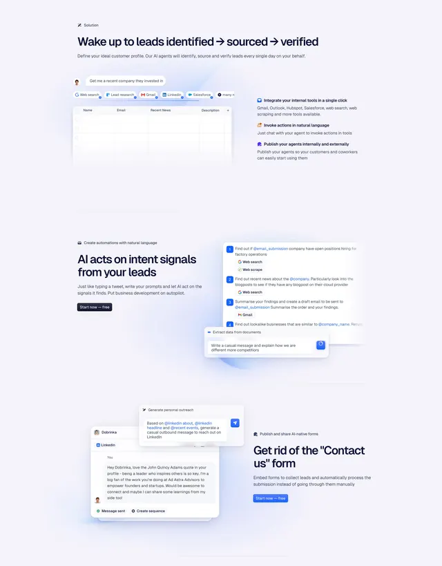
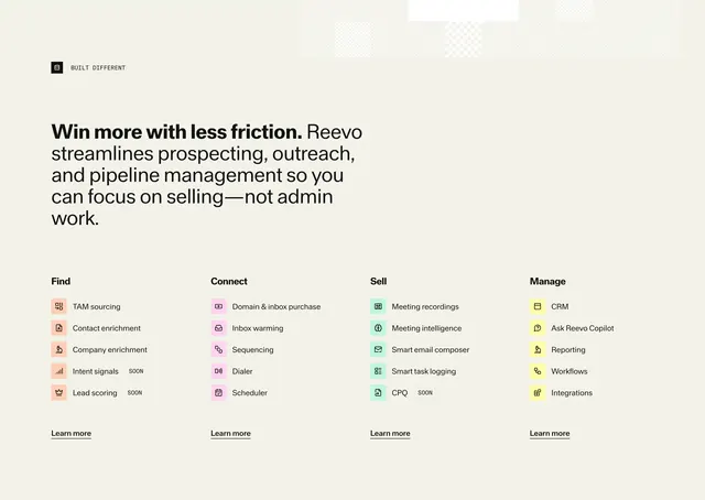
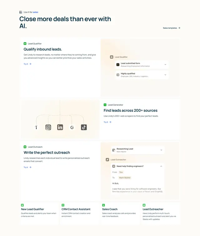
Top-left a small icon and eyebrow "Use it for sales", a two-line bold headline "Close more deals than ever with AI.", and a right-aligned "Sales templates" link. Below, three full-width feature rows. Row one: "Qualify inbound leads" copy on the left, a "Lead Qualifier" UI card with submitted-form and qualified-lead rows on a peach panel right. Row two: a peach panel left showing a dotted connector diagram linking five social-source icons, with "Find leads across 200+ sources" copy on the right. Row three: "Write the perfect outreach" copy left, a "Lead Outreacher" UI showing a drafted email on a peach panel right. A thin divider separates a bottom four-column list, each with a small green icon, a bold title (New Lead Qualifier, CRM Contact Assistant, Sales Coach, Lead Outreacher) and a one-line description.
Key takeaway
Alternating the product panel left/right down the stack keeps a long multi-feature section moving without repetition. Capping it with a compact four-up icon list lets you mention extra capabilities without giving each its own full row.
Reuse notes
Good template for a use-case landing page (here, sales) where each capability needs its own UI proof. The alternating layout scales to as many rows as needed; the four-up footer is a tidy way to gesture at the long tail. Needs consistent panel tinting or the rows feel disconnected.