Preview image. Unlock full-res
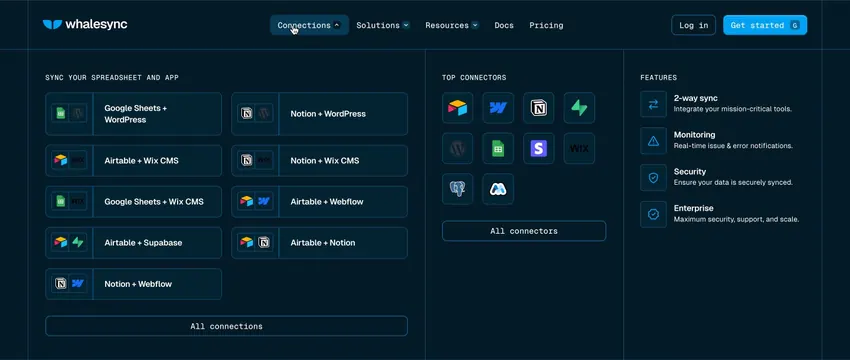
Dark-mode navbar dropdown with three columns for sync pairs, top connector icons, and feature links with descriptions.
Summary
An expanded Connections mega menu on a dark navy nav bar organizes sync pair cards, a connector icon grid, and feature descriptions into three bordered columns.
Visual description
Dark navy header with Whalesync logo, nav links (Connections active with blue highlight, Solutions, Resources, Docs, Pricing), Log in text, and bright blue Get started button. Dropdown spans full width in three columns separated by thin blue lines. Left: SYNC YOUR SPREADSHEET AND APP header above a two-column grid of horizontal pair cards (Google Sheets + WordPress, Airtable + Wix CMS, etc.) with dual app icons, ending in an All connections outlined button. Middle: TOP CONNECTORS with a 4x3 icon grid and All connectors button. Right: FEATURES list with blue-outlined icons for 2-way sync, Monitoring, Security, and Enterprise, each with a one-line description.
Key takeaway
Three-column mega menu separates browse-by-pair, browse-by-app, and product capabilities without mixing metaphors. Monospace caps section headers add developer credibility. Pair cards with dual logos make the integration concept instantly scannable.
Reuse notes
Best for integration or data platforms with many connection options. Dark dropdown on dark nav needs strong border contrast. Desktop-only pattern; mobile needs a simplified drawer.
More navbar sections
See all






More like this
Keep what you find
A free account saves references to boards and can send you a weekly email of picks based on what you save.
To see every result, go Pro.