Preview image. Unlock full-res
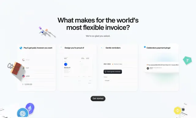
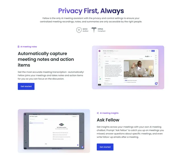
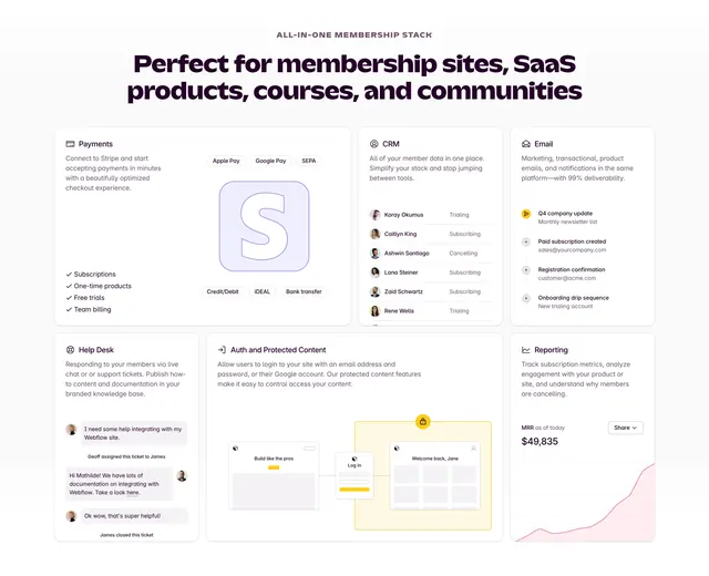
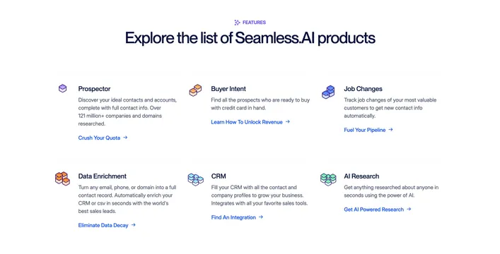
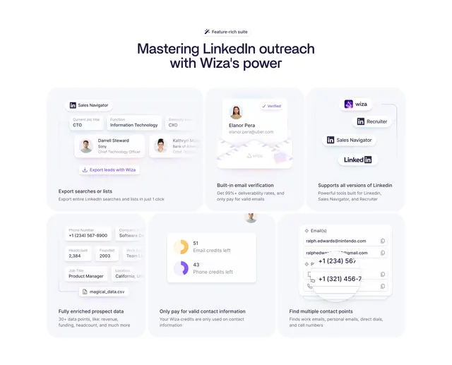
Light bento features grid of six soft-lilac cards, each showing a stylized product-UI mock above a short title and one-line caption.
Summary
A bento features grid of six rounded lilac cards, each topping a short title and caption with a small abstracted snippet of the product UI. The defining move is illustrating every feature with a clean, simplified UI mock rather than an icon.
Visual description
White page, deep-purple type. A centered "Feature-rich suite" pill badge sits above a two-line headline "Mastering LinkedIn outreach with Wiza's power." Below is a six-card bento on soft pale-lilac panels arranged in two rows of three, with the top row slightly varied in height. Each card carries a stylized product-UI fragment near the top: a Sales Navigator filter mock with avatar rows; a "Verified" contact card with a profile photo and email; a stack of source pills (wiza, Recruiter, Sales Navigator, LinkedIn); an enriched data card with phone, company, headcount fields and a CSV row; a credits panel with two donut indicators ("51 Email credits left," "43 Phone credits left"); and a multi-contact email list. Under each mock sits a small bold title and a one-line grey caption.
Key takeaway
Drawing a tidy, abstracted mock of the actual product UI inside each feature card, so the grid previews real functionality instead of generic icons. The pale-lilac cards plus a single accent purple keep six dense cards calm and cohesive.
Reuse notes
Great features overview for a data or prospecting tool with many small UI moments worth showing. The mocks must be simplified and consistent in style or the grid gets noisy. The bento's mixed heights add rhythm; keep captions to one line so cards stay even.