Preview image. Unlock full-res
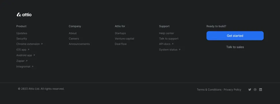
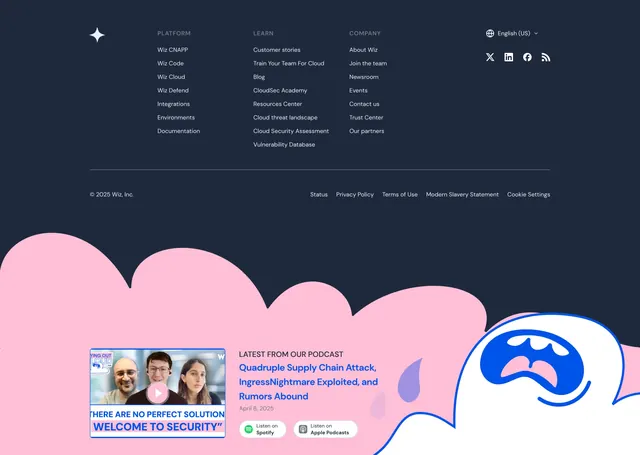
Dark four-column link footer above a playful pink cloud band carrying a podcast promo with a video thumbnail and listen buttons.
Summary
A dark navy link footer with four labeled link columns and social icons, sitting above a playful pink cloud band that hosts a podcast promo. The contrast between the businesslike dark grid and the pastel illustrated cloud below defines it.
Visual description
The upper footer is dark navy: a star wordmark at left, then three columns of uppercase-headed links (PLATFORM with Wiz CNAPP, Wiz Code, Wiz Cloud, etc.; LEARN with Customer stories, Blog, CloudSec Academy, etc.; COMPANY with About Wiz, Newsroom, Trust Center, etc.), with a language switcher ("English (US)") and a row of social icons (X, LinkedIn, Facebook, RSS) at top right. A hairline divider separates a bottom legal row: copyright at left and Status, Privacy Policy, Terms of Use, Modern Slavery Statement and Cookie Settings at right. Below the footer, a large flat-illustrated pink cloud shape with blue rain droplets fills the band. Over it, "LATEST FROM OUR PODCAST" introduces an episode title in blue beside a rounded video thumbnail with a play button, plus "Listen on Spotify" and "Listen on Apple Podcasts" pill buttons.
Key takeaway
Pairing a strict, scannable dark link grid with a playful illustrated band underneath so the footer ends on personality rather than legal text. Embedding a latest-podcast promo with a thumbnail and platform buttons turns dead footer space into a content hook.
Reuse notes
Good for a brand that wants a serious navigational footer but a friendly sign-off, especially one with ongoing content like a podcast. The illustrated cloud is a strong on-brand motif but needs custom art. Works on dark; the pastel band only lands against the darker grid above it.