Preview image. Unlock full-res
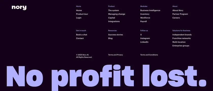
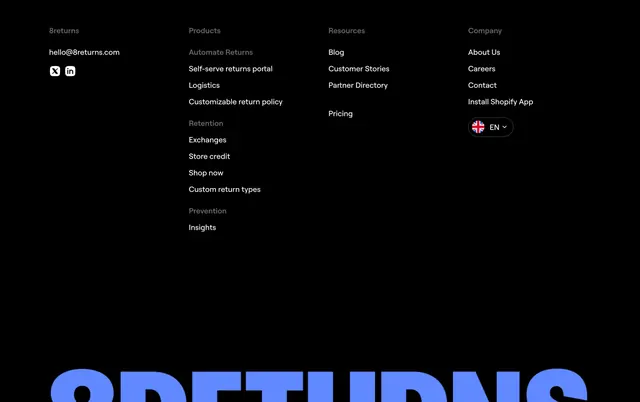
Dark four-column link footer with a giant blue brand wordmark bleeding off the bottom edge beneath the navigation columns.
Summary
A black footer organized as four grouped link columns over a massive electric-blue "8RETURNS" wordmark that runs off the bottom edge. The defining move is the oversized brand mark used as the footer's visual anchor.
Visual description
On a pure black field, four columns of links sit at the top: a brand column with contact email and X and LinkedIn icons, a Products column subgrouped under faint grey labels (Automate Returns, Retention, Prevention), a Resources column, and a Company column ending in a rounded EN language switcher with a UK flag. Active links are white, group headers are dimmed grey. Filling the lower third, the brand name is set in enormous bold blue type that is cropped by the bottom of the frame, so only the upper portion of the letters shows.
Key takeaway
Turning the company name into a giant, partially cropped graphic anchors the footer and reinforces the brand without any logo lockup. The dimmed-label subgrouping keeps a long product list scannable inside one column.
Reuse notes
Best when the brand name is short and bold enough to survive being blown up. Works on dark backgrounds where a single saturated accent color can carry the oversized wordmark. Keep the link columns tidy and high-contrast so they do not get lost above the large type.