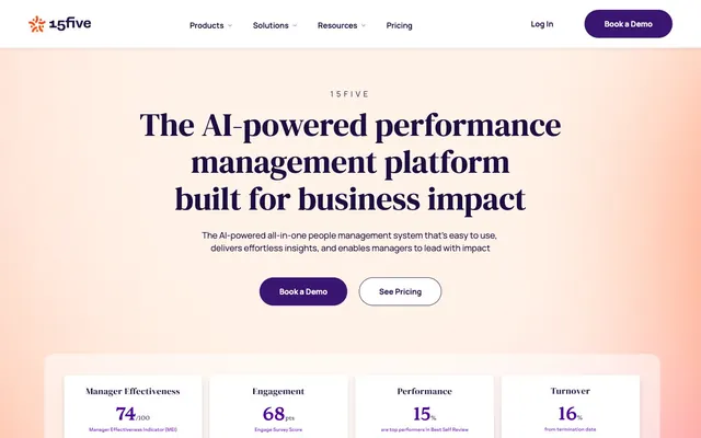
Preview image. Unlock full-res
Violet-tinged sunrise on white marble
Color palette
Muted text, secondary button text, decorative borders, helper text
Primary text, bold accents, outlined button borders, key interactive elements
Prominent headings and body text, providing high contrast on light backgrounds
Primary action button background fill, active states for interactive elements — a rich, vibrant brand identifier; Prominent background for hero sections and testimonials, establishing a vibrant brand tone
Highlight backgrounds, secondary action buttons, gradient accents
Outlined button borders, subtle highlights and decorative accents
Page backgrounds, card surfaces, ghost button backgrounds, default text for dark elements
Subtle background for secondary cards and elevated surface sections, providing visual separation
Typography
- Weights
- 300, 400, 500, 600, 700
- Sizes
- 14px, 16px, 18px, 22px, 24px
- Line height
- 1, 1.33, 1.43, 1.44, 1.5, 1.63, 1.64, 2.57
- Letter spacing
- 0.0020em (at 14px), 0.3750em (for specific uppercase elements)
- Fallback
- system-ui
Primary sans-serif for all body text, navigation, buttons, and helper content. Its varied weights offer flexibility for hierarchy, maintaining legibility and a contemporary feel across the interface.
- Weights
- 400
- Sizes
- 24px, 40px, 52px, 66px
- Line height
- 1.15, 1.2, 1.25, 1.33
- Letter spacing
- normal
- Fallback
- serif
Distinguished serif typeface for prominent headings, creating a sophisticated and editorial impact with its elegant curves and generous scale.
Spacing & shape
Elevation
Components
Filled with Accent Violet (#3b1572), white text, 68px border-radius, 16px padding on top/bottom, 40px on left/right. Commands attention for key actions.
White background, Deep Violet (#2f115b) text, 68px border-radius, 16px padding on top/bottom, 40px on left/right. Provides a subtle interactive element that doesn't compete with primary actions.
Transparent background, Violet Shadow (#5e5777) text, 16px border-radius, 20px padding. Minimally styled for navigation, with a soft border-radius that hints at interactivity.
Transparent background, Midnight Indigo (#1a0d3f) text, no border-radius or padding. Used for simple text links within body content or lists.
Transparent background, 0px border-radius, 0px padding on top/bottom, 20px on left/right. Used for presenting information without strong visual boundaries, allowing content to breathe.
White background, 12px border-radius, no padding. A clean, contained surface for showcasing performance metrics or brief information.
Pink Sunset (#ffdacf) background, 16px border-radius, with decorative gradient accents. No internal padding defined, relies on content spacing.
Features a white background, 10px border-radius, and a soft shadow (rgba(0, 0, 0, 0.1) 0px 12px 30px 0px). Used for clickable elements that require a distinct elevated presence.
Guidelines
- Use Midnight Indigo (#1a0d3f) for all main headings and primary body text to ensure high contrast and readability.
- Apply Canvas White (#ffffff) as the default background for all primary page content sections and cards.
- Implement the 68px border-radius for all button elements, including both filled and outlined variants, to maintain a consistent soft, approachable shape.
- Utilize Manrope for all functional typography (buttons, nav, body text) and DM Serif Display for major page headings to leverage their distinct roles.
- Incorporate the Hero Gradient (linear-gradient(90deg, #3b1572 0%, #1a0d3f 100%)) as a background for high-impact sections like hero banners and testimonials.
- Maintain a comfortable density with an element gap of 20px and a section gap of 24px between major content blocks.
- Use Accent Violet (#3b1572) as the primary fill color for active buttons and key interactive elements, drawing immediate attention.
- Avoid using multiple border styles or weights for interactive elements; stick to 1px solid for subtle hints and no border for purely textual links.
- Do not introduce new typefaces; rely solely on Manrope and DM Serif Display to preserve typographic consistency.
- Resist using harsh or high-contrast shadows; only apply the soft, diffused shadow (rgba(0, 0, 0, 0.1) 0px 12px 30px 0px) for specific elevated components like link cards.
- Do not deviate from the established border radii; avoid sharp corners or excessively small radii as they contradict the system's approachable aesthetic.
- Refrain from using saturated colors other than Accent Violet, Pink Sunset, or Fiery Orange for UI elements; other vibrant hues are reserved for data visualization or illustrations.
- Do not expand the primary color palette with additional blues, greens, or reds unless they are specifically for semantic status indications (success, error).
- Avoid arbitrary letter-spacing adjustments; adhere to the defined Manrope letter-spacing values or normal for DM Serif Display.
About this system
ShowHide
15Five employs a vibrant, confident design language with clean white canvases, softened cards, and a striking violet-to-pink gradient. Typography is a blend of bold, impactful headlines and accessible body text. The system uses a specific 'hero' violet as its primary accent, contrasted with touches of warm orange and pink, creating an energetic yet grounded feel. Components are lightweight with generous rounded corners, emphasizing an approachable and modern presentation.
The page adheres to a max-width of 1363px, centered for most content, but the initial hero section appears full-bleed with a gradient background. The hero features a large, centered headline and subtext, followed by two prominent call-to-action buttons. Sections below alternate between a white canvas and a subtle Warm Mist (#fff2e8) background, often employing a two-column layout with text on one side and product UI screenshots or data visualizations on the other. A three or four-column card grid is used for feature showcases. Vertical spacing is consistent and comfortable, with a section gap of 24px fostering readability. The navigation is a sticky top bar with a 'Book a Demo' button prominently featured.
The site predominantly uses clean, product-focused illustrations and data visualizations. Illustrations are often abstract, geometric, and brand-colored, featuring soft gradients. Photography is largely absent, replaced by UI screenshots of the product. Icons are filled, with a consistent stroke weight, and mostly monochromatic or brand-colored. Imagery serves an explanatory and illustrative role, showcasing product features and data outputs rather than decorative atmosphere, contributing to a high-density, text-supported visual experience.
Reminiscent of Lattice, BetterUp, Culture Amp, Brightwheel.
# 15five — Style Reference
> Violet-tinged sunrise on white marble

**Theme:** light

**Site:** https://www.15five.com

15Five employs a vibrant, confident design language with clean white canvases, softened cards, and a striking violet-to-pink gradient. Typography is a blend of bold, impactful headlines and accessible body text. The system uses a specific 'hero' violet as its primary accent, contrasted with touches of warm orange and pink, creating an energetic yet grounded feel. Components are lightweight with generous rounded corners, emphasizing an approachable and modern presentation.

## Tokens — Colors

| Name | Value | Token | Role |
|------|------|------|------|
| Violet Shadow | `#5e5777` | `--color-violet-shadow` | Muted text, secondary button text, decorative borders, helper text |
| Deep Violet | `#2f115b` | `--color-deep-violet` | Primary text, bold accents, outlined button borders, key interactive elements |
| Midnight Indigo | `#1a0d3f` | `--color-midnight-indigo` | Prominent headings and body text, providing high contrast on light backgrounds |
| Accent Violet | `#3b1572` | `--color-accent-violet` | Primary action button background fill, active states for interactive elements — a rich, vibrant brand identifier; Prominent background for hero sections and testimonials, establishing a vibrant brand tone |
| Pink Sunset | `#ffdacf` | `--color-pink-sunset` | Highlight backgrounds, secondary action buttons, gradient accents |
| Fiery Orange | `#ff4b11` | `--color-fiery-orange` | Outlined button borders, subtle highlights and decorative accents |
| Canvas White | `#ffffff` | `--color-canvas-white` | Page backgrounds, card surfaces, ghost button backgrounds, default text for dark elements |
| Warm Mist | `#fff2e8` | `--color-warm-mist` | Subtle background for secondary cards and elevated surface sections, providing visual separation |

## Tokens — Typography

### Manrope
- **Substitute:** system-ui
- **Weights:** 300, 400, 500, 600, 700
- **Sizes:** 14px, 16px, 18px, 22px, 24px
- **Line height:** 1, 1.33, 1.43, 1.44, 1.5, 1.63, 1.64, 2.57
- **Letter spacing:** 0.0020em (at 14px), 0.3750em (for specific uppercase elements)
- **Role:** Primary sans-serif for all body text, navigation, buttons, and helper content. Its varied weights offer flexibility for hierarchy, maintaining legibility and a contemporary feel across the interface.

### DM Serif Display
- **Substitute:** serif
- **Weights:** 400
- **Sizes:** 24px, 40px, 52px, 66px
- **Line height:** 1.15, 1.2, 1.25, 1.33
- **Letter spacing:** normal
- **Role:** Distinguished serif typeface for prominent headings, creating a sophisticated and editorial impact with its elegant curves and generous scale.

## Tokens — Type Scale

| Role | Size | Line height | Letter spacing |
|------|------|------|------|
| caption | 14px | 1.43 | 0.002em |
| body | 16px | 1.5 | — |
| subheading | 18px | 1.63 | — |
| heading-sm | 22px | 1.64 | — |
| heading | 24px | 1.33 | — |
| heading-lg | 40px | 1.25 | — |
| display | 66px | 1.15 | — |

## Tokens — Spacing

- **Max width:** 1363px
- **Section gap:** 24px
- **Card padding:** 20px
- **Element gap:** 20px

## Tokens — Radius

- **General:** 10px
- **Buttons:** 68px
- **Cards:** 16px

## Tokens — Elevation

- **Shadowed Link Box:** `rgba(0, 0, 0, 0.1) 0px 12px 30px 0px`

## Layout

The page adheres to a max-width of 1363px, centered for most content, but the initial hero section appears full-bleed with a gradient background. The hero features a large, centered headline and subtext, followed by two prominent call-to-action buttons. Sections below alternate between a white canvas and a subtle Warm Mist (#fff2e8) background, often employing a two-column layout with text on one side and product UI screenshots or data visualizations on the other. A three or four-column card grid is used for feature showcases. Vertical spacing is consistent and comfortable, with a section gap of 24px fostering readability. The navigation is a sticky top bar with a 'Book a Demo' button prominently featured.

## Imagery

The site predominantly uses clean, product-focused illustrations and data visualizations. Illustrations are often abstract, geometric, and brand-colored, featuring soft gradients. Photography is largely absent, replaced by UI screenshots of the product. Icons are filled, with a consistent stroke weight, and mostly monochromatic or brand-colored. Imagery serves an explanatory and illustrative role, showcasing product features and data outputs rather than decorative atmosphere, contributing to a high-density, text-supported visual experience.

## Components

### Primary Filled Button
*Call to action.*

Filled with Accent Violet (#3b1572), white text, 68px border-radius, 16px padding on top/bottom, 40px on left/right. Commands attention for key actions.

### Light Outlined Button
*Secondary action or ghost button.*

White background, Deep Violet (#2f115b) text, 68px border-radius, 16px padding on top/bottom, 40px on left/right. Provides a subtle interactive element that doesn't compete with primary actions.

### Subtle Nav Link
*Navigation or in-page links.*

Transparent background, Violet Shadow (#5e5777) text, 16px border-radius, 20px padding. Minimally styled for navigation, with a soft border-radius that hints at interactivity.

### Text Only Link
*Inline textual links.*

Transparent background, Midnight Indigo (#1a0d3f) text, no border-radius or padding. Used for simple text links within body content or lists.

### Information Card (Transparent)
*Content container for data or features.*

Transparent background, 0px border-radius, 0px padding on top/bottom, 20px on left/right. Used for presenting information without strong visual boundaries, allowing content to breathe.

### Data Insight Card
*Displays data metrics or key insights.*

White background, 12px border-radius, no padding. A clean, contained surface for showcasing performance metrics or brief information.

### Highlighted Testimonial Card
*Prominently features customer testimonials.*

Pink Sunset (#ffdacf) background, 16px border-radius, with decorative gradient accents. No internal padding defined, relies on content spacing.

### Shadowed Link Box
*Interactive link blocks with elevation.*

Features a white background, 10px border-radius, and a soft shadow (rgba(0, 0, 0, 0.1) 0px 12px 30px 0px). Used for clickable elements that require a distinct elevated presence.

## Guidelines

### Do

- Use Midnight Indigo (#1a0d3f) for all main headings and primary body text to ensure high contrast and readability.
- Apply Canvas White (#ffffff) as the default background for all primary page content sections and cards.
- Implement the 68px border-radius for all button elements, including both filled and outlined variants, to maintain a consistent soft, approachable shape.
- Utilize Manrope for all functional typography (buttons, nav, body text) and DM Serif Display for major page headings to leverage their distinct roles.
- Incorporate the Hero Gradient (linear-gradient(90deg, #3b1572 0%, #1a0d3f 100%)) as a background for high-impact sections like hero banners and testimonials.
- Maintain a comfortable density with an element gap of 20px and a section gap of 24px between major content blocks.
- Use Accent Violet (#3b1572) as the primary fill color for active buttons and key interactive elements, drawing immediate attention.

### Don't

- Avoid using multiple border styles or weights for interactive elements; stick to 1px solid for subtle hints and no border for purely textual links.
- Do not introduce new typefaces; rely solely on Manrope and DM Serif Display to preserve typographic consistency.
- Resist using harsh or high-contrast shadows; only apply the soft, diffused shadow (rgba(0, 0, 0, 0.1) 0px 12px 30px 0px) for specific elevated components like link cards.
- Do not deviate from the established border radii; avoid sharp corners or excessively small radii as they contradict the system's approachable aesthetic.
- Refrain from using saturated colors other than Accent Violet, Pink Sunset, or Fiery Orange for UI elements; other vibrant hues are reserved for data visualization or illustrations.
- Do not expand the primary color palette with additional blues, greens, or reds unless they are specifically for semantic status indications (success, error).
- Avoid arbitrary letter-spacing adjustments; adhere to the defined Manrope letter-spacing values or normal for DM Serif Display.

## Agent Prompt Guide

Quick Color Reference:
- text: #1a0d3f
- background: #ffffff
- border: #5e5777
- accent: #3b1572
- primary action: #ffdacf (filled action)

Example Component Prompts:
- Create a Primary Action Button: #ffdacf background, #ffffff text, 9999px radius, compact pill padding. Use this filled treatment for the main CTA.
- Create a data insight card: White background, 12px border-radius, showing a statistic with heading at 24px Manrope weight 700, #1a0d3f, and body text at 16px Manrope weight 400, #5e5777.
- Create a testimonial component: Pink Sunset (#ffdacf) background, 16px border-radius. Quote text at 18px DM Serif Display weight 400, #1a0d3f. A Light Outlined Button below with text 'Read full story'.

## Motion Philosophy

The system utilizes expressive motion, primarily with 0.4s and 0.3s durations, and 'ease' timing functions. Transitions are common on background, transform, padding, and box-shadow properties, creating fluid and responsive interactions without being overly animated. Subtle changes in state are preferred over jarring, immediate shifts.
More like this








Keep what you find
A free account saves references to boards and can send you a weekly email of picks based on what you save.
To see every result, go Pro.