Preview image. Unlock full-res
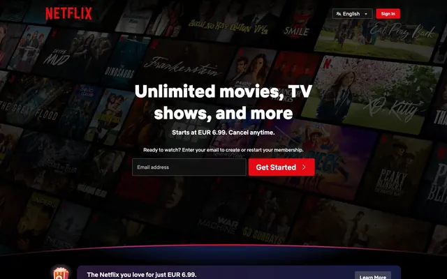
The Infinite Digital Shelf. A cinematic experience where an endless library of content is presented against a pure black, theatrical backdrop.
Color palette
Brand logo, primary CTAs, active indicators — the single, powerful accent that drives action and defines identity.
Background for secondary feature cards, adding a subtle, deep-space dimensionality without using shadows.
Primary page and section backgrounds, creating a pure black canvas for content.
Subtle background surfaces, component backgrounds.
Component backgrounds, inactive elements.
Borders on inputs and interactive elements.
Placeholder text in input fields.
Footer links and secondary, non-critical body copy.
All primary headings, body text, and icon fills.
Typography
- Weights
- 400, 500, 700, 900
- Sizes
- 10px, 12px, 13px, 14px, 16px, 20px, 24px, 56px, 100px
- Line height
- 1, 1.17, 1.2, 1.25, 1.5, 1.6
- Fallback
- Roboto, Inter
The singular typographic voice of the brand. Its slightly condensed and geometric form scales from 13px body copy to massive 56px+ headlines, delivering information with clarity and confidence.
Spacing & shape
Components
Background: Netflix Red (#e50914). Text: Chalk White (#ffffff). Font: Netflix Sans 700 at 24px. Radius: 4px. Padding: 16px 24px.
Background: Netflix Red (#e50914). Text: Chalk White (#ffffff). Font: Netflix Sans 500 at 14px. Radius: 4px. Padding: 4px 16px.
Background: rgba(0, 0, 0, 0.4). Text: Chalk White (#ffffff). Border: 1px solid #808080. Radius: 4px. Padding: 6px 16px.
Background: rgba(22, 22, 22, 0.7). Border: 1px solid #5a5a5a. Text: Chalk White (#ffffff) at 16px. Placeholder text: Ash (#808080). Radius: 4px. Padding: 20px 16px.
A vertical aspect-ratio image container showing show/movie key art. A large number (1-5) is overlaid at the bottom-left using Netflix Sans 900, approximately 100px.
Text color: Silver (#b3b3b3). Font: Netflix Sans 400 at 14px. No underline by default.
Background: Graphite (#232323). Radius: 8px. Contains an icon, text in Chalk White (#ffffff), and a link-style button.
Guidelines
- Use pure black (#000000) for all main page backgrounds to maximize immersion.
- Reserve Netflix Red (#e50914) exclusively for the brand logo, primary CTAs, and key interactive moments.
- Employ the Netflix Sans font for all typography, from headlines to microcopy.
- Utilize content carousels and card grids as the primary method for displaying content.
- For feature cards, use the 'Feature Card Gradient' to create depth instead of shadows.
- Maintain minimal corner rounding: 4px for buttons and inputs, 16px for large content cards.
- Ensure all primary text on dark backgrounds is Chalk White (#ffffff) for maximum contrast.
- Don't use any saturated accent colors other than Netflix Red.
- Don't apply traditional box-shadows to any element.
- Don't use light or gray page backgrounds; the entire experience must be dark.
- Don't outline buttons; use solid fills for primary and secondary actions.
- Don't clutter the header with navigation; keep it minimal and focused on signup/signin.
- Don't use multiple font families; Netflix Sans is the sole typeface.
- Don't introduce complex shapes; stick to simple rectangles with slight corner rounding.
About this system
ShowHide
The design system feels like the house lights dimming in a theater, creating an immersive, cinematic space. The foundation is a pure black (#000000) void, against which content carousels appear as an infinite, browsable library. The single, iconic 'Netflix Red' (#e50914) is used with extreme restraint, reserved for the brand mark and primary calls-to-action, serving as the sole point of visual urgency. The custom font, Netflix Sans, is the confident and utilitarian voice, scaling from microcopy to massive 56px headlines without flourish. Feature cards add subtle dimensionality not with shadows, but with a deep, cosmic gradient of blue and purple, making them glow softly in the darkness.
The layout is full-bleed, with a cinematic hero that fills the viewport. Core content is centered within a wide max-width container (~1280px) on a pure black background. The page structure is a rhythmic vertical stack of horizontally-scrolling content carousels and multi-column card grids. This creates a powerful sense of an infinitely browsable library. Section spacing is generous, allowing each content row to breathe. The header is minimal, funneling the user journey towards the primary email signup flow, which itself uses a prominent Z-pattern.
The visual language is defined by high-quality photography and video stills from the content library. Imagery is the primary product showcase. The hero section uses a full-bleed, dimmed collage of these visuals as a rich, atmospheric backdrop. In content carousels, images are presented as clean, sharp, vertical posters with no additional framing. Icons used in feature blocks are illustrative and dimensional, with subtle gradients, contrasting with the flat UI. Visual density is high; the UI is a vessel designed to surface as much compelling visual content as possible.
Reminiscent of Disney+, Max (formerly HBO Max), Spotify, YouTube (Theater Mode).
# Netflix — Style Reference
> The Infinite Digital Shelf. A cinematic experience where an endless library of content is presented against a pure black, theatrical backdrop.

**Theme:** dark

**Site:** https://netflix.com

The design system feels like the house lights dimming in a theater, creating an immersive, cinematic space. The foundation is a pure black (#000000) void, against which content carousels appear as an infinite, browsable library. The single, iconic 'Netflix Red' (#e50914) is used with extreme restraint, reserved for the brand mark and primary calls-to-action, serving as the sole point of visual urgency. The custom font, Netflix Sans, is the confident and utilitarian voice, scaling from microcopy to massive 56px headlines without flourish. Feature cards add subtle dimensionality not with shadows, but with a deep, cosmic gradient of blue and purple, making them glow softly in the darkness.

## Tokens — Colors

| Name | Value | Token | Role |
|------|------|------|------|
| Netflix Red | `#e50914` | `--color-netflix-red` | Brand logo, primary CTAs, active indicators — the single, powerful accent that drives action and defines identity. |
| Feature Card Gradient | `#1d153f` | `--color-feature-card-gradient` | Background for secondary feature cards, adding a subtle, deep-space dimensionality without using shadows. |
| Deep Space | `#000000` | `--color-deep-space` | Primary page and section backgrounds, creating a pure black canvas for content. |
| Graphite | `#2d2d2d` | `--color-graphite` | Subtle background surfaces, component backgrounds. |
| Charcoal | `#414141` | `--color-charcoal` | Component backgrounds, inactive elements. |
| Slate | `#5a5a5a` | `--color-slate` | Borders on inputs and interactive elements. |
| Ash | `#808080` | `--color-ash` | Placeholder text in input fields. |
| Silver | `#b3b3b3` | `--color-silver` | Footer links and secondary, non-critical body copy. |
| Chalk White | `#ffffff` | `--color-chalk-white` | All primary headings, body text, and icon fills. |

## Tokens — Typography

### Netflix Sans
- **Substitute:** Roboto, Inter
- **Weights:** 400, 500, 700, 900
- **Sizes:** 10px, 12px, 13px, 14px, 16px, 20px, 24px, 56px, 100px
- **Line height:** 1, 1.17, 1.2, 1.25, 1.5, 1.6
- **Role:** The singular typographic voice of the brand. Its slightly condensed and geometric form scales from 13px body copy to massive 56px+ headlines, delivering information with clarity and confidence.

## Tokens — Type Scale

Perfect Fifth (1.5) from 16px base.

| Role | Size | Line height | Letter spacing |
|------|------|------|------|
| caption | 13px | 1.5 | — |
| body | 16px | 1.5 | — |
| subheading | 20px | 1.25 | — |
| heading-sm | 24px | 1.2 | — |
| heading | 56px | 1.17 | — |
| display | 100px | 1 | — |

## Tokens — Spacing

- **Max width:** 1280px
- **Section gap:** 48px
- **Card padding:** 24px
- **Element gap:** 16px

## Tokens — Radius

- **Buttons:** 4px
- **Inputs:** 4px
- **Cards:** 16px

## Layout

The layout is full-bleed, with a cinematic hero that fills the viewport. Core content is centered within a wide max-width container (~1280px) on a pure black background. The page structure is a rhythmic vertical stack of horizontally-scrolling content carousels and multi-column card grids. This creates a powerful sense of an infinitely browsable library. Section spacing is generous, allowing each content row to breathe. The header is minimal, funneling the user journey towards the primary email signup flow, which itself uses a prominent Z-pattern.

## Imagery

The visual language is defined by high-quality photography and video stills from the content library. Imagery is the primary product showcase. The hero section uses a full-bleed, dimmed collage of these visuals as a rich, atmospheric backdrop. In content carousels, images are presented as clean, sharp, vertical posters with no additional framing. Icons used in feature blocks are illustrative and dimensional, with subtle gradients, contrasting with the flat UI. Visual density is high; the UI is a vessel designed to surface as much compelling visual content as possible.

## Components

### Hero Email CTA

### More Reasons to Join — Feature Cards

### Promotional Banner

### Hero CTA Button
*The primary 'Get Started' call-to-action.*

Background: Netflix Red (#e50914). Text: Chalk White (#ffffff). Font: Netflix Sans 700 at 24px. Radius: 4px. Padding: 16px 24px.

### Header Sign-In Button
*Secondary sign-in action in the header.*

Background: Netflix Red (#e50914). Text: Chalk White (#ffffff). Font: Netflix Sans 500 at 14px. Radius: 4px. Padding: 4px 16px.

### Translucent Header Button
*Language selector and other minor header actions.*

Background: rgba(0, 0, 0, 0.4). Text: Chalk White (#ffffff). Border: 1px solid #808080. Radius: 4px. Padding: 6px 16px.

### Hero Email Input
*The primary email capture field in the hero.*

Background: rgba(22, 22, 22, 0.7). Border: 1px solid #5a5a5a. Text: Chalk White (#ffffff) at 16px. Placeholder text: Ash (#808080). Radius: 4px. Padding: 20px 16px.

### Trending Poster Card
*Showcases trending content as interactive posters.*

A vertical aspect-ratio image container showing show/movie key art. A large number (1-5) is overlaid at the bottom-left using Netflix Sans 900, approximately 100px.

### Footer Link
*Tertiary navigation links in the page footer.*

Text color: Silver (#b3b3b3). Font: Netflix Sans 400 at 14px. No underline by default.

### Promotional Banner
*A persistent banner at the bottom of the viewport for offers.*

Background: Graphite (#232323). Radius: 8px. Contains an icon, text in Chalk White (#ffffff), and a link-style button.

## Guidelines

### Do

- Use pure black (#000000) for all main page backgrounds to maximize immersion.
- Reserve Netflix Red (#e50914) exclusively for the brand logo, primary CTAs, and key interactive moments.
- Employ the Netflix Sans font for all typography, from headlines to microcopy.
- Utilize content carousels and card grids as the primary method for displaying content.
- For feature cards, use the 'Feature Card Gradient' to create depth instead of shadows.
- Maintain minimal corner rounding: 4px for buttons and inputs, 16px for large content cards.
- Ensure all primary text on dark backgrounds is Chalk White (#ffffff) for maximum contrast.

### Don't

- Don't use any saturated accent colors other than Netflix Red.
- Don't apply traditional box-shadows to any element.
- Don't use light or gray page backgrounds; the entire experience must be dark.
- Don't outline buttons; use solid fills for primary and secondary actions.
- Don't clutter the header with navigation; keep it minimal and focused on signup/signin.
- Don't use multiple font families; Netflix Sans is the sole typeface.
- Don't introduce complex shapes; stick to simple rectangles with slight corner rounding.

## Agent Prompt Guide

### Quick Color Reference
- **Background**: `#000000` (Deep Space)
- **Text**: `#ffffff` (Chalk White)
- **Secondary Text**: `#b3b3b3` (Silver)
- **CTA**: `#e50914` (Netflix Red)
- **Card Background**: `linear-gradient(149deg, #192247, #210e17)`
- **Border**: `#5a5a5a` (Slate)

### Example Component Prompts
1. **Hero Section:** "Create a hero section on a pure black background with a semi-transparent, dark collage of movie posters behind the text. Center a headline 'Unlimited movies, TV shows, and more' in `Netflix Sans` weight 700 at 56px, color `#ffffff`. Below it, add an email signup form with a text input (background `rgba(22, 22, 22, 0.7)`, 1px `#5a5a5a` border, 4px radius) next to a large 'Get Started' button (background `#e50914`, text `#ffffff`, 4px radius, padding 16px 24px)."
2. **Feature Card:** "Create a feature card with a 16px corner radius and a background of `linear-gradient(149deg, #192247, #210e17)`. Set padding to 24px. The heading should be 'Watch everywhere' in `Netflix Sans` weight 900, 24px, color `#ffffff`. The body text below it should be `Netflix Sans` weight 400, 16px, color `#ffffff`."
3. **Header:** "Design a header for the top of the page on a transparent background. On the left, place the Netflix logo in `#e50914`. On the right, include a 'Sign In' button with a `#e50914` background, `#ffffff` text, 4px radius, and 4px 16px padding."
More like this








Keep what you find
A free account saves references to boards and can send you a weekly email of picks based on what you save.
To see every result, go Pro.