Preview image. Unlock full-res
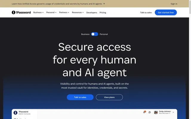
Secure Airlock Behind Glass. A system that moves from the protective dark of an airlock to the bright clarity of a control room.
Color palette
Primary CTAs, active links, focus indicators — the single point of interactive confirmation.
Hero background — creates a deep, atmospheric transition from dark space to brand blue.
Main content backgrounds, card surfaces, text on dark backgrounds.
Primary text on light backgrounds.
Hero and footer backgrounds.
Secondary dark surfaces.
Secondary text on light backgrounds, navigation links.
Borders on light backgrounds, disabled states.
Typography
- Weights
- 300, 350, 400, 500
- Sizes
- 14px, 16px, 18px, 20px, 32px, 40px, 48px, 64px, 88px, 128px
- Line height
- 1.1, 1.2, 1.25, 1.43, 1.5, 1.6
- Letter spacing
- -0.0230em, -0.0200em
- Fallback
- Inter, Manrope
The primary brand font, used for everything from display headlines to body copy. Its tight negative letter-spacing at large sizes creates a dense, architectural look. Lighter weights (300) are reserved for the largest headlines, creating authority through restraint, while mid-weights (400, 500) are used for body copy and UI elements.
- Weights
- 400
- Sizes
- 16px
- Line height
- 1.5
- Fallback
- System UI
Used for minor body text, likely as a fallback or for specific cross-platform UI contexts where the custom font might not load.
Spacing & shape
Elevation
Components
A pill-shaped button. Background: Brand Blue (#145fe4). Text: White (#ffffff). Radius: 9999px. Padding: 10px 24px. Font: agileSans, weight 500.
A pill-shaped outline button. Background: transparent. Border: 1px solid White (#ffffff). Text: White (#ffffff). Radius: 9999px. Padding: 10px 24px.
A clickable row with a White (#ffffff) background. Padding: 16px 24px. Radius: 8px. Border: 1px solid Ash (#d7d7db). Contains a logo, title text, and a chevron icon.
A pill-shaped switch with a static background. An inner, smaller pill of Brand Blue (#145fe4) indicates the selected state ('Business' or 'Personal'). Radius: 9999px.
White (#ffffff) background with a 1px bottom border in Ash (#d7d7db). Navigation links use Graphite (#303136) text. The primary 'Get started free' button is a filled Primary CTA Button.
Text in Brand Blue (#145fe4), typically followed by a '→' character. No underline by default, likely added on hover.
A full-width bar with a Warning Tan (#cbb88e) background. Text is Onyx (#000000).
Guidelines
- Use Brand Blue (#145fe4) exclusively for primary CTAs, links, and active state indicators.
- Apply tight negative letter-spacing (-1px to -2px) to all headlines (48px and larger).
- Employ 9999px radius for all buttons to create the signature pill shape.
- Contrast fully-rounded buttons with modestly rounded cards (16px) and list items (8px).
- Use the Deep Space (#1d1d21) to Brand Blue gradient solely for hero sections.
- Maintain a clear visual hierarchy with generous vertical spacing between sections (80px+).
- Use Agile Sans for all typography to maintain brand consistency.
- Do not use Brand Blue for static headlines or body text.
- Avoid using rounded corners on main layout containers; reserve rounding for interactive elements and cards.
- Do not apply shadows to buttons or in-line elements.
- Avoid introducing new saturated colors; the palette is intentionally monochrome with a single blue accent.
- Do not use system fonts for headings; the custom font is a critical brand element.
- Avoid small padding on cards; use a minimum of 24px to ensure they feel spacious.
- Do not use outlines on primary filled buttons.
About this system
ShowHide
The design feels like a high-security airlock transitioning into a well-lit control room. An immersive, deep-space dark hero (#1D1D21) establishes a serious, secure atmosphere, which gives way to crisp white (#FFFFFF) content sections focused on informational clarity. The signature brand blue (#145FE4) is used exclusively for calls-to-action and active states, acting like an indicator light confirming interaction. Typography is a key differentiator; the custom font `agileSans` at large sizes with tight negative letter-spacing creates dense, architectural headlines. Buttons are distinctly full-pill (9999px radius), contrasting with the generally sharp, un-rounded cards, creating a focused tension between interactive and container elements.
Starts with a full-bleed, viewport-height hero section featuring a centered headline stack over a dark gradient background. The main content that follows is contained within a centered max-width layout (~1200px) on a white background. Sections alternate between centered headline blocks, 3-column feature card grids, and 2-column text-and-image blocks. The navigation header is sticky, starting transparent over the hero and transitioning to a solid white with a bottom border upon scrolling.
The visual language is product-centric and informational. It primarily uses clean product UI screenshots, often contained within abstract shapes or simplified browser chrome. There is no lifestyle photography. Icons are monochrome and line-style. A grid of grayscale customer logos provides social proof. The overall approach is to use visuals to explain functionality and build trust, not to create abstract mood.
Reminiscent of Linear, Vercel, Stripe, Figma.
# 1Password — Style Reference
> Secure Airlock Behind Glass. A system that moves from the protective dark of an airlock to the bright clarity of a control room.

**Theme:** mixed

**Site:** https://1password.com

The design feels like a high-security airlock transitioning into a well-lit control room. An immersive, deep-space dark hero (#1D1D21) establishes a serious, secure atmosphere, which gives way to crisp white (#FFFFFF) content sections focused on informational clarity. The signature brand blue (#145FE4) is used exclusively for calls-to-action and active states, acting like an indicator light confirming interaction. Typography is a key differentiator; the custom font `agileSans` at large sizes with tight negative letter-spacing creates dense, architectural headlines. Buttons are distinctly full-pill (9999px radius), contrasting with the generally sharp, un-rounded cards, creating a focused tension between interactive and container elements.

## Tokens — Colors

| Name | Value | Token | Role |
|------|------|------|------|
| Brand Blue | `#145fe4` | `--color-brand-blue` | Primary CTAs, active links, focus indicators — the single point of interactive confirmation. |
| Hero Fade | `#145fe4` | `--color-hero-fade` | Hero background — creates a deep, atmospheric transition from dark space to brand blue. |
| White | `#ffffff` | `--color-white` | Main content backgrounds, card surfaces, text on dark backgrounds. |
| Onyx | `#000000` | `--color-onyx` | Primary text on light backgrounds. |
| Deep Space | `#1d1d21` | `--color-deep-space` | Hero and footer backgrounds. |
| Void | `#242529` | `--color-void` | Secondary dark surfaces. |
| Graphite | `#303136` | `--color-graphite` | Secondary text on light backgrounds, navigation links. |
| Ash | `#d7d7db` | `--color-ash` | Borders on light backgrounds, disabled states. |

## Tokens — Typography

### agileSans
- **Substitute:** Inter, Manrope
- **Weights:** 300, 350, 400, 500
- **Sizes:** 14px, 16px, 18px, 20px, 32px, 40px, 48px, 64px, 88px, 128px
- **Line height:** 1.1, 1.2, 1.25, 1.43, 1.5, 1.6
- **Letter spacing:** -0.0230em, -0.0200em
- **Role:** The primary brand font, used for everything from display headlines to body copy. Its tight negative letter-spacing at large sizes creates a dense, architectural look. Lighter weights (300) are reserved for the largest headlines, creating authority through restraint, while mid-weights (400, 500) are used for body copy and UI elements.

### ui-sans-serif
- **Substitute:** System UI
- **Weights:** 400
- **Sizes:** 16px
- **Line height:** 1.5
- **Role:** Used for minor body text, likely as a fallback or for specific cross-platform UI contexts where the custom font might not load.

## Tokens — Type Scale

Perfect Fourth (1.333) from 16px base.

| Role | Size | Line height | Letter spacing |
|------|------|------|------|
| caption | 14px | 1.5 | — |
| body | 16px | 1.5 | — |
| subheading | 20px | 1.43 | — |
| heading-sm | 32px | 1.25 | -0.74px |
| heading | 48px | 1.2 | -1.1px |
| heading-lg | 64px | 1.1 | -1.47px |
| display | 88px | 1.1 | -2.02px |

## Tokens — Spacing

- **Max width:** 1200px
- **Section gap:** 80-120px
- **Card padding:** 24px
- **Element gap:** 8-16px

## Tokens — Radius

- **Buttons:** 9999px
- **Inputs:** 8px
- **Cards:** 16px

## Tokens — Elevation

- **Feature Card:** `box-shadow: 0 4px 12px 0 rgba(0, 0, 0, 0.05);`

## Layout

Starts with a full-bleed, viewport-height hero section featuring a centered headline stack over a dark gradient background. The main content that follows is contained within a centered max-width layout (~1200px) on a white background. Sections alternate between centered headline blocks, 3-column feature card grids, and 2-column text-and-image blocks. The navigation header is sticky, starting transparent over the hero and transitioning to a solid white with a bottom border upon scrolling.

## Imagery

The visual language is product-centric and informational. It primarily uses clean product UI screenshots, often contained within abstract shapes or simplified browser chrome. There is no lifestyle photography. Icons are monochrome and line-style. A grid of grayscale customer logos provides social proof. The overall approach is to use visuals to explain functionality and build trust, not to create abstract mood.

## Components

### Button Group — Primary + Secondary CTAs

### Business / Personal Toggle

### Feature Cards — Discover, Secure, Audit

### Primary CTA Button
*The main call-to-action.*

A pill-shaped button. Background: Brand Blue (#145fe4). Text: White (#ffffff). Radius: 9999px. Padding: 10px 24px. Font: agileSans, weight 500.

### Secondary CTA Button
*A secondary call-to-action, typically used on dark backgrounds.*

A pill-shaped outline button. Background: transparent. Border: 1px solid White (#ffffff). Text: White (#ffffff). Radius: 9999px. Padding: 10px 24px.

### Integration List Item
*Represents a linked third-party service in a list.*

A clickable row with a White (#ffffff) background. Padding: 16px 24px. Radius: 8px. Border: 1px solid Ash (#d7d7db). Contains a logo, title text, and a chevron icon.

### Business/Personal Toggle
*Switches between two primary user segments.*

A pill-shaped switch with a static background. An inner, smaller pill of Brand Blue (#145fe4) indicates the selected state ('Business' or 'Personal'). Radius: 9999px.

### Navigation Header
*Sticky header for primary site navigation.*

White (#ffffff) background with a 1px bottom border in Ash (#d7d7db). Navigation links use Graphite (#303136) text. The primary 'Get started free' button is a filled Primary CTA Button.

### Interactive Text Link
*An in-text link to another page or section.*

Text in Brand Blue (#145fe4), typically followed by a '→' character. No underline by default, likely added on hover.

### Announcement Banner
*A site-wide, non-critical notification at the top of the page.*

A full-width bar with a Warning Tan (#cbb88e) background. Text is Onyx (#000000).

## Guidelines

### Do

- Use Brand Blue (#145fe4) exclusively for primary CTAs, links, and active state indicators.
- Apply tight negative letter-spacing (-1px to -2px) to all headlines (48px and larger).
- Employ 9999px radius for all buttons to create the signature pill shape.
- Contrast fully-rounded buttons with modestly rounded cards (16px) and list items (8px).
- Use the Deep Space (#1d1d21) to Brand Blue gradient solely for hero sections.
- Maintain a clear visual hierarchy with generous vertical spacing between sections (80px+).
- Use Agile Sans for all typography to maintain brand consistency.

### Don't

- Do not use Brand Blue for static headlines or body text.
- Avoid using rounded corners on main layout containers; reserve rounding for interactive elements and cards.
- Do not apply shadows to buttons or in-line elements.
- Avoid introducing new saturated colors; the palette is intentionally monochrome with a single blue accent.
- Do not use system fonts for headings; the custom font is a critical brand element.
- Avoid small padding on cards; use a minimum of 24px to ensure they feel spacious.
- Do not use outlines on primary filled buttons.

## Agent Prompt Guide

### Quick Color Reference

- **Text (Light BG):** `#000000` (Onyx)
- **Text (Dark BG):** `#ffffff` (White)
- **Background (Light):** `#ffffff` (White)
- **Background (Dark):** `#1d1d21` (Deep Space)
- **CTA / Accent:** `#145fe4` (Brand Blue)
- **Border:** `#d7d7db` (Ash)

### Example Component Prompts

1.  **Hero Section:** "Create a full-bleed hero section with a `linear-gradient(180deg, #1d1d21 25%, #145fe4 70%)` background. Add a headline 'Secure access for every human' using `agileSans` at 88px, weight 300, color `#ffffff`, with -2.02px letter-spacing. Below it, add a sub-headline 'Visibility and control for humans' at 20px, weight 400, color `#ffffff`. Include a primary CTA button: background `#145fe4`, text `#ffffff`, radius 9999px, padding `10px 24px`."

2.  **Feature Card Grid:** "On a white page background, generate a 3-column grid of cards. Each card must have: `backgroundColor: #ffffff`, `padding: 24px`, `borderRadius: 16px`, and a subtle `box-shadow: 0 4px 12px 0 rgba(0,0,0,0.05)`. The card headline should be `agileSans` 32px weight 400 color `#000000`, body text 16px weight 400 color `#303136`, and a link with text `Learn more →` in 16px weight 500 color `#145fe4`."

3.  **Integration List Item:** "Design a clickable list item for a technology integration. The container should be a white rectangle with `padding: 16px 24px`, `borderRadius: 8px`, and a `1px solid #d7d7db` border. Inside, align left a 24x24px placeholder for a logo and the text 'GitHub Actions' in `agileSans` 16px weight 500, color `#000000`. On the right, place a black chevron-right icon."
More like this








Keep what you find
A free account saves references to boards and can send you a weekly email of picks based on what you save.
To see every result, go Pro.