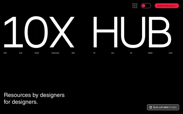
Preview image. Unlock full-res
High-contrast dynamic ledger. Stark black and white pages punctuated by sharp red markers.
Color palette
Primary CTA buttons, interactive elements, highlights — demanding immediate attention.
Link color on dark backgrounds, suggesting deeper engagement without overpowering.
Subtle visual indicator, not primary brand color but used for hidden interactive elements.
Primary background for dark sections, text color on light backgrounds, input borders.
Primary background for light sections, text color on dark backgrounds, secondary button fills.
Subtle border color for some interactive elements, providing division without starkness.
Border colors for disabled or secondary elements, providing visual distinction.
Subtle icons and secondary visual elements.
Typography
- Weights
- 400
- Sizes
- 10px, 13px
- Line height
- 1.2
- Fallback
- Arial
System font for small UI elements, buttons, and general body text where efficiency is key.
- Weights
- 400
- Sizes
- 13px, 14px, 15px, 18px, 31px, 45px
- Line height
- 1, 1.2, 1.4, 1.6
- Fallback
- Helvetica Neue
Standard body text, subheadings, and form labels. Its neutrality underpins the visual hierarchy.
- Weights
- 400
- Sizes
- 24px, 298px
- Line height
- 1
- Fallback
- Roboto Mono
Used for large, impactful display headings (e.g., '10X HUB'). The monospaced nature at extreme sizes provides a technical, almost blueprint-like authority.
- Weights
- 400
- Sizes
- 187px
- Line height
- 1.2
- Letter spacing
- -0.064
- Fallback
- Inter
Signature display font for hero headlines. Its extreme size and negative letter-spacing create a visual tension and modern, impactful statement.
Spacing & shape
Components
Filled button with Scarlet Flash background (#ff1841), Pure White text, and a 999px border radius for a soft, pill-like appearance. Padding is concentrated horizontally to emphasize width. Example: 'Submit resource'.
Transparent background, Pitch Black text, with a thin Pitch Black border and 744.047px border-radius. Minimal padding, used for secondary actions or navigation in the header. Example: 'Built with Wix Studio'.
Transparent background, Pitch Black text, with a 0px border-radius and a bottom border of Pitch Black. Padding for text 3px top/bottom. Used for data entry like 'Name', 'Email'. No visible focus state in provided data, implies border color change.
Transparent background, Pitch Black text, with an Accent Gray (#c7c7c7) border and 2px border radius. Padding is 0 all around, relying on text content for size. Used for file upload actions.
A small, pill-shaped toggle with a Scarlet Flash (#ff1841) background when active. Used for binary state changes like 'Turn page grid view on or off'.
Guidelines
- Do use Pitch Black (#000000) and Pure White (#ffffff) as primary background and text colors to maintain high contrast.
- Do apply Scarlet Flash (#ff1841) exclusively for primary calls to action and critical interactive elements.
- Do use a 999px border radius for all high-emphasis buttons, creating a pill shape.
- Do employ Helvetica Neue at size 18px and line-height 1.4 for clear, readable body text.
- Do reserve the large, negatively tracked Inter font for impactful display headlines only.
- Do use 0px border radius with a bottom border for all form inputs to maintain a stark, functional aesthetic.
- Do ensure a generous 40px vertical spacing between major sections to provide visual breathing room.
- Don't dilute Scarlet Flash (#ff1841) by using it on non-interactive or purely decorative elements.
- Don't use gradients or soft shadows; the design relies on flat colors and stark contrasts.
- Don't introduce additional font families; restrict usage to Arial, Helvetica Neue, Roboto Mono, and Inter.
- Don't round the corners of input fields; they should remain sharply rectilinear at 0px radius.
- Don't use subtle or low-contrast text colors; maintain high contrast ratios for readability.
- Don't apply more than 3px of padding to form inputs, keeping them visually lean.
- Don't clutter the layout; utilize generous negative space around headlines and sections.
About this system
ShowHide
This design system is a bold, high-contrast exploration of dark and light, creating a dynamic visual experience. The core aesthetic is defined by striking red accents against stark black and white backgrounds, evoking a sense of urgency and directness. The interplay of oversized, widely tracked display typography with minimalist body text establishes a hierarchy that feels both dominant and precise.
The layout primarily alternates between full-bleed black and vibrant red sections, contrasted with periods of white. The initial hero section is a full-bleed black canvas with a dramatically oversized, centered headline. Content generally adheres to a centered maximum-width model, except for the hero. Sections are delineated by stark color changes rather than overt spacing. Form layouts are often multi-column grids or stacked text inputs, maintaining consistent minimal padding for elements like input fields.
The site's visual language is almost entirely UI and typography-driven; it avoids traditional photography or complex illustrations. When present, graphics are minimal, such as a simple grid icon for toggling view or basic 'upload file' icons. The imagery's role is purely functional and supportive of the text. There's a notable absence of decorative visuals, amplifying the direct, tool-like feel of the platform.
Reminiscent of Figma, Linear, Arc Browser, Are.na.
# 10X HUB — Style Reference
> High-contrast dynamic ledger. Stark black and white pages punctuated by sharp red markers.

**Theme:** mixed

**Site:** https://10xdesigners.co

This design system is a bold, high-contrast exploration of dark and light, creating a dynamic visual experience. The core aesthetic is defined by striking red accents against stark black and white backgrounds, evoking a sense of urgency and directness. The interplay of oversized, widely tracked display typography with minimalist body text establishes a hierarchy that feels both dominant and precise.

## Tokens — Colors

| Name | Value | Token | Role |
|------|------|------|------|
| Scarlet Flash | `#ff1841` | `--color-scarlet-flash` | Primary CTA buttons, interactive elements, highlights — demanding immediate attention. |
| Crimson Link | `#7b0016` | `--color-crimson-link` | Link color on dark backgrounds, suggesting deeper engagement without overpowering. |
| Indicator Blue | `#5e97ff` | `--color-indicator-blue` | Subtle visual indicator, not primary brand color but used for hidden interactive elements. |
| Pitch Black | `#000000` | `--color-pitch-black` | Primary background for dark sections, text color on light backgrounds, input borders. |
| Pure White | `#ffffff` | `--color-pure-white` | Primary background for light sections, text color on dark backgrounds, secondary button fills. |
| Input Gray | `#e8e6e6` | `--color-input-gray` | Subtle border color for some interactive elements, providing division without starkness. |
| Accent Gray | `#949494` | `--color-accent-gray` | Border colors for disabled or secondary elements, providing visual distinction. |
| Icon Gray | `#757575` | `--color-icon-gray` | Subtle icons and secondary visual elements. |

## Tokens — Typography

### Arial
- **Substitute:** Arial
- **Weights:** 400
- **Sizes:** 10px, 13px
- **Line height:** 1.2
- **Role:** System font for small UI elements, buttons, and general body text where efficiency is key.

### helvetica-w01-roman
- **Substitute:** Helvetica Neue
- **Weights:** 400
- **Sizes:** 13px, 14px, 15px, 18px, 31px, 45px
- **Line height:** 1, 1.2, 1.4, 1.6
- **Role:** Standard body text, subheadings, and form labels. Its neutrality underpins the visual hierarchy.

### wfont_9aea05_daebdda91ced4d119f7837b7bae26e19
- **Substitute:** Roboto Mono
- **Weights:** 400
- **Sizes:** 24px, 298px
- **Line height:** 1
- **Role:** Used for large, impactful display headings (e.g., '10X HUB'). The monospaced nature at extreme sizes provides a technical, almost blueprint-like authority.

### madefor-text
- **Substitute:** Inter
- **Weights:** 400
- **Sizes:** 187px
- **Line height:** 1.2
- **Letter spacing:** -0.064
- **Role:** Signature display font for hero headlines. Its extreme size and negative letter-spacing create a visual tension and modern, impactful statement.

## Tokens — Type Scale

| Role | Size | Line height | Letter spacing |
|------|------|------|------|
| body-lg | 18px | 1.4 | — |
| heading-sm | 24px | 1 | — |
| heading | 45px | 1 | — |
| display-lg | 187px | 1.2 | -0.064em |
| display-xl | 298px | 1 | — |

## Tokens — Spacing

- **Section gap:** 40px
- **Card padding:** 20px
- **Element gap:** 8px

## Tokens — Radius

- **Buttons:** 999px
- **Inputs:** 0px
- **misc:** 12px

## Layout

The layout primarily alternates between full-bleed black and vibrant red sections, contrasted with periods of white. The initial hero section is a full-bleed black canvas with a dramatically oversized, centered headline. Content generally adheres to a centered maximum-width model, except for the hero. Sections are delineated by stark color changes rather than overt spacing. Form layouts are often multi-column grids or stacked text inputs, maintaining consistent minimal padding for elements like input fields.

## Imagery

The site's visual language is almost entirely UI and typography-driven; it avoids traditional photography or complex illustrations. When present, graphics are minimal, such as a simple grid icon for toggling view or basic 'upload file' icons. The imagery's role is purely functional and supportive of the text. There's a notable absence of decorative visuals, amplifying the direct, tool-like feel of the platform.

## Components

### Submit Resource CTA Button

### Submit Resource Form

### Toggle Switch & Header Controls

### Primary Call to Action Button
*Interactive element*

Filled button with Scarlet Flash background (#ff1841), Pure White text, and a 999px border radius for a soft, pill-like appearance. Padding is concentrated horizontally to emphasize width. Example: 'Submit resource'.

### Ghost Header Button
*Interactive element*

Transparent background, Pitch Black text, with a thin Pitch Black border and 744.047px border-radius. Minimal padding, used for secondary actions or navigation in the header. Example: 'Built with Wix Studio'.

### Large Primary Input
*Form element*

Transparent background, Pitch Black text, with a 0px border-radius and a bottom border of Pitch Black. Padding for text 3px top/bottom. Used for data entry like 'Name', 'Email'. No visible focus state in provided data, implies border color change.

### Upload File Button
*Interactive element*

Transparent background, Pitch Black text, with an Accent Gray (#c7c7c7) border and 2px border radius. Padding is 0 all around, relying on text content for size. Used for file upload actions.

### Toggle Switch
*Interactive element*

A small, pill-shaped toggle with a Scarlet Flash (#ff1841) background when active. Used for binary state changes like 'Turn page grid view on or off'.

## Guidelines

### Do

- Do use Pitch Black (#000000) and Pure White (#ffffff) as primary background and text colors to maintain high contrast.
- Do apply Scarlet Flash (#ff1841) exclusively for primary calls to action and critical interactive elements.
- Do use a 999px border radius for all high-emphasis buttons, creating a pill shape.
- Do employ Helvetica Neue at size 18px and line-height 1.4 for clear, readable body text.
- Do reserve the large, negatively tracked Inter font for impactful display headlines only.
- Do use 0px border radius with a bottom border for all form inputs to maintain a stark, functional aesthetic.
- Do ensure a generous 40px vertical spacing between major sections to provide visual breathing room.

### Don't

- Don't dilute Scarlet Flash (#ff1841) by using it on non-interactive or purely decorative elements.
- Don't use gradients or soft shadows; the design relies on flat colors and stark contrasts.
- Don't introduce additional font families; restrict usage to Arial, Helvetica Neue, Roboto Mono, and Inter.
- Don't round the corners of input fields; they should remain sharply rectilinear at 0px radius.
- Don't use subtle or low-contrast text colors; maintain high contrast ratios for readability.
- Don't apply more than 3px of padding to form inputs, keeping them visually lean.
- Don't clutter the layout; utilize generous negative space around headlines and sections.

## Agent Prompt Guide

### Quick Color Reference
- Text: #000000
- Background Dark: #000000
- Background Light: #ffffff
- CTA: #ff1841
- Link: #7b0016
- Input Border: #000000

### 3-5 Example Component Prompts
1. Create a hero section: full-bleed Pitch Black background. Centered headline '10X HUB' using wfont_9aea05_daebdda91ced4d119f7837b7bae26e19, 298px, weight 400, Pure White text, line-height 1.0. Below it, a single line of text 'Get and share resources that let you do better work' using Arial, 13px, weight 400, Pure White text, line-height 1.2.
2. Develop a primary CTA button: 'Submit resource' with Scarlet Flash background (#ff1841), Pure White text, 999px border-radius, Arial font 13px, weight 400. Padding of 0px top/bottom and 40px right/20px left.
3. Design an input field for a form: 'Name' as a label, with a transparent background, Pitch Black text, a 0px border-radius, and a Pitch Black bottom border. Font for input text is helvetica-w01-roman, 13px, weight 400. Padding 3px top/bottom, 3px right, 0px left.
4. Construct a secondary Ghost button: 'Built with Wix Studio' text in Pitch Black, transparent background, a 1px Pitch Black border, and a 744.047px border-radius. Font is Arial, 13px, weight 400. Padding 0px top/bottom, 10px right/left.
More like this




Keep what you find
A free account saves references to boards and can send you a weekly email of picks based on what you save.
To see every result, go Pro.