Preview image. Unlock full-res
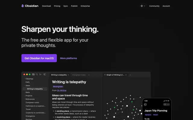
Crystalline Knowledge Vault. A sharp, faceted digital space built for clarity and focus, with glowing violet veins of interaction.
Color palette
Primary CTA buttons—a sharp, functional accent against the dark theme
Links, badge text, and active states—the secondary, brighter interaction color
Background for tag/badge elements, used at 15% opacity
Bright text on dark CTAs, inset glows for definition
Primary body text, headings
Secondary text, navigation links
Tertiary text, subtle metadata
Borders, UI element dividers
Main page background
Success states or syntax highlighting within the app UI
Warning states or syntax highlighting within the app UI
Error states or syntax highlighting within the app UI
Typography
- Weights
- 400, 500, 600, 700
- Sizes
- 8px, 9px, 10px, 11px, 12px, 13px, 14px, 16px, 18px, 20px, 24px, 28px, 36px, 60px
- Line height
- 1.25
- Letter spacing
- Negative tracking (-0.02em) on larger sizes tightens headlines for a more compact, solid appearance.
- Fallback
- "SF Pro Display", "Roboto", "Segoe UI", sans-serif
Used for all text. The choice of a system font is deliberate, making the website feel like a native application—a functional tool for thought.
Spacing & shape
Components
Solid Amethyst (#7c3aed) background with White (#ffffff) text. Padding is 16px 24px. Corner radius is 8px.
Transparent background with Medium Gray (#bcbcbc) text. Padding is 8px. Corner radius is 8px. No border.
Surface (#1e1e1e) background with Bright Gray (#eeeeee) text. Padding is 24px. Corner radius is 12px. Features a 1px white inset glow `rgba(255, 255, 255, 0.05) 0px 0px 0px 1px inset`.
Pill-shaped (9999px radius). Background is Tag Background (#8a5cf5) at 15% opacity. Text is Lavender (#a78bfa). Padding is 2px 8px.
A detailed screenshot or rendered view of the Obsidian application, showing elements like the note editor, sidebar file browser, and distinctive graph view. Follows the site's dark theme.
A squircle-shaped icon (approx 20% border-radius) depicting a faceted purple and black gem. Has a subtle internal gloss and shadow to give it dimension.
Medium Gray (#bcbcbc) text using the system UI font at 16px. No background or borders. Hover state is likely a color change to Bright Gray (#eeeeee).
Guidelines
- Use the system UI font for all text to maintain the native-app feel.
- Reserve Amethyst (#7c3aed) and Lavender (#a78bfa) exclusively for interactive elements like buttons and links.
- Employ subtle 1px inset white glows for definition on dark cards and buttons.
- Maintain high contrast with light gray text (#eeeeee) on near-black backgrounds (#171717).
- Use pill-shaped radii (9999px) for tags and badges only; keep other elements sharp.
- Keep layouts centered and spacious, with generous vertical rhythm between sections.
- Do not use traditional drop shadows for elevation; prefer the inset glow effect.
- Do not introduce other saturated colors into the primary UI; stick to the violet-on-dark palette.
- Do not use decorative or serif fonts; the brand identity is utilitarian.
- Do not use bright or light-themed backgrounds for primary content sections.
- Do not use large border radii on cards or buttons; stick to the 8-12px range.
- Do not use lifestyle photography; focus on the product UI as the primary visual.
About this system
ShowHide
The design feels like being inside a piece of precision software—a dark, focused digital workspace where thoughts crystallize. The foundation is a near-black, void-like background (#171717), creating a high-contrast canvas. A single, electric violet accent (#7c3aed, #a78bfa) is used strictly for interactive elements like CTAs and links, acting as functional beacons in the dark. Typography is exclusively the system's native UI font, reinforcing its identity as a functional tool rather than a stylized marketing site. Instead of drop shadows, surfaces use a subtle, 1px white inset highlight, giving them an internal luminescence as if lit from within.
Reminiscent of Raycast, Linear, VS Code, Superhuman.
# Obsidian — Style Reference
> Crystalline Knowledge Vault. A sharp, faceted digital space built for clarity and focus, with glowing violet veins of interaction.

**Theme:** dark

**Site:** https://obsidian.md

The design feels like being inside a piece of precision software—a dark, focused digital workspace where thoughts crystallize. The foundation is a near-black, void-like background (#171717), creating a high-contrast canvas. A single, electric violet accent (#7c3aed, #a78bfa) is used strictly for interactive elements like CTAs and links, acting as functional beacons in the dark. Typography is exclusively the system's native UI font, reinforcing its identity as a functional tool rather than a stylized marketing site. Instead of drop shadows, surfaces use a subtle, 1px white inset highlight, giving them an internal luminescence as if lit from within.

## Tokens — Colors

| Name | Value | Token | Role |
|------|------|------|------|
| Amethyst | `#7c3aed` | `--color-amethyst` | Primary CTA buttons—a sharp, functional accent against the dark theme |
| Lavender | `#a78bfa` | `--color-lavender` | Links, badge text, and active states—the secondary, brighter interaction color |
| Tag Background | `#8a5cf5` | `--color-tag-background` | Background for tag/badge elements, used at 15% opacity |
| White | `#ffffff` | `--color-white` | Bright text on dark CTAs, inset glows for definition |
| Bright Gray | `#eeeeee` | `--color-bright-gray` | Primary body text, headings |
| Medium Gray | `#bcbcbc` | `--color-medium-gray` | Secondary text, navigation links |
| Muted Gray | `#a3a3a3` | `--color-muted-gray` | Tertiary text, subtle metadata |
| Graphite | `#3f3f3f` | `--color-graphite` | Borders, UI element dividers |
| Abyss | `#171717` | `--color-abyss` | Main page background |
| Success Green | `#4ade80` | `--color-success-green` | Success states or syntax highlighting within the app UI |
| Warning Yellow | `#facc15` | `--color-warning-yellow` | Warning states or syntax highlighting within the app UI |
| Error Red | `#f87171` | `--color-error-red` | Error states or syntax highlighting within the app UI |

## Tokens — Typography

### ui-sans-serif, system-ui
- **Substitute:** "SF Pro Display", "Roboto", "Segoe UI", sans-serif
- **Weights:** 400, 500, 600, 700
- **Sizes:** 8px, 9px, 10px, 11px, 12px, 13px, 14px, 16px, 18px, 20px, 24px, 28px, 36px, 60px
- **Line height:** 1.25
- **Letter spacing:** Negative tracking (-0.02em) on larger sizes tightens headlines for a more compact, solid appearance.
- **Role:** Used for all text. The choice of a system font is deliberate, making the website feel like a native application—a functional tool for thought.

## Tokens — Type Scale

Major Third (1.25) from 16px base.

| Role | Size | Line height | Letter spacing |
|------|------|------|------|
| caption | 12px | 1.5 | -0.24px |
| body-sm | 14px | 1.5 | -0.28px |
| body | 16px | 1.5 | -0.32px |
| subheading | 18px | 1.4 | -0.36px |
| heading-sm | 24px | 1.33 | -0.48px |
| heading | 28px | 1.25 | -0.56px |
| heading-lg | 36px | 1.25 | -0.72px |
| display | 60px | 1.1 | -1.2px |

## Tokens — Spacing

- **Max width:** 1120px
- **Section gap:** 96px
- **Card padding:** 24px
- **Element gap:** 16px

## Tokens — Radius

- **Buttons:** 8px
- **Inputs:** 8px
- **Cards:** 12px
- **tags:** 9999px

## Components

### Primary CTA Button Group

### Tag Badge Collection

### Feature List Cards

### Primary CTA Button
*The main call-to-action button.*

Solid Amethyst (#7c3aed) background with White (#ffffff) text. Padding is 16px 24px. Corner radius is 8px.

### Secondary Ghost Button
*A less prominent action, often for secondary choices like 'More platforms'.*

Transparent background with Medium Gray (#bcbcbc) text. Padding is 8px. Corner radius is 8px. No border.

### Community Link Card
*Large, clickable cards used to link to community resources.*

Surface (#1e1e1e) background with Bright Gray (#eeeeee) text. Padding is 24px. Corner radius is 12px. Features a 1px white inset glow `rgba(255, 255, 255, 0.05) 0px 0px 0px 1px inset`.

### Tag Badge
*Used inside the app UI to display tags on notes.*

Pill-shaped (9999px radius). Background is Tag Background (#8a5cf5) at 15% opacity. Text is Lavender (#a78bfa). Padding is 2px 8px.

### App Showcase
*Displays the product UI directly on the page.*

A detailed screenshot or rendered view of the Obsidian application, showing elements like the note editor, sidebar file browser, and distinctive graph view. Follows the site's dark theme.

### App Icon
*The primary brand mark and application icon.*

A squircle-shaped icon (approx 20% border-radius) depicting a faceted purple and black gem. Has a subtle internal gloss and shadow to give it dimension.

### Navigation Link
*Text links in the main header navigation.*

Medium Gray (#bcbcbc) text using the system UI font at 16px. No background or borders. Hover state is likely a color change to Bright Gray (#eeeeee).

## Guidelines

### Do

- Use the system UI font for all text to maintain the native-app feel.
- Reserve Amethyst (#7c3aed) and Lavender (#a78bfa) exclusively for interactive elements like buttons and links.
- Employ subtle 1px inset white glows for definition on dark cards and buttons.
- Maintain high contrast with light gray text (#eeeeee) on near-black backgrounds (#171717).
- Use pill-shaped radii (9999px) for tags and badges only; keep other elements sharp.
- Keep layouts centered and spacious, with generous vertical rhythm between sections.

### Don't

- Do not use traditional drop shadows for elevation; prefer the inset glow effect.
- Do not introduce other saturated colors into the primary UI; stick to the violet-on-dark palette.
- Do not use decorative or serif fonts; the brand identity is utilitarian.
- Do not use bright or light-themed backgrounds for primary content sections.
- Do not use large border radii on cards or buttons; stick to the 8-12px range.
- Do not use lifestyle photography; focus on the product UI as the primary visual.

## Agent Prompt Guide

### Quick Color Reference
- **Page Background**: `Abyss (#171717)`
- **Card Background**: `Surface (#1e1e1e)`
- **Default Text**: `Bright Gray (#eeeeee)`
- **Primary CTA**: `Amethyst (#7c3aed)`
- **Accent / Link**: `Lavender (#a78bfa)`
- **Border Glow**: `rgba(255, 255, 255, 0.05)`

### Example Component Prompts
1.  **Hero Section:** Create a hero section with a full-bleed Abyss (#171717) background. Add a centered headline 'Knowledge, connected.' in 60px system UI font, weight 600, color Bright Gray (#eeeeee), with -1.2px letter-spacing. Below it, add a sub-headline 'Your second brain, for life.' in 24px system font, weight 400, color Medium Gray (#bcbcbc), with -0.48px letter-spacing. Add a primary CTA button below that.
2.  **Primary CTA Button:** Create a button with text 'Get Started'. The background is Amethyst (#7c3aed) with White (#ffffff) text. Use a 16px system UI font, weight 500. Padding is 16px vertical and 24px horizontal. Corner radius is 8px.
3.  **Feature Card:** Create a feature card with a Surface (#1e1e1e) background. Padding is 24px. The corner radius is 12px. Add an inset box-shadow of `rgba(255, 255, 255, 0.05) 0px 0px 0px 1px inset`. Inside, add a heading in Bright Gray (#eeeeee) and body text in Medium Gray (#bcbcbc).
More like this





Keep what you find
A free account saves references to boards and can send you a weekly email of picks based on what you save.
To see every result, go Pro.