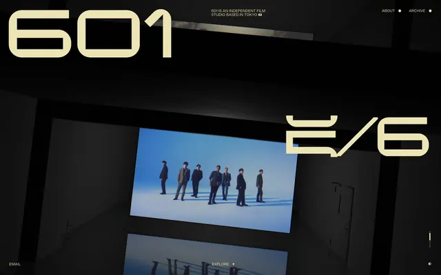
Preview image. Unlock full-res
Architectural film canvas
Color palette
Display text, interactive elements (links, nav, borders), and decorative accents – providing the sole chromatic highlight against dark neutrals
Deepest canvas background, primary text on light surfaces
Primary background for sections and cards, creating a subtle contrast against the matte black
Typography
- Weights
- 400
- Sizes
- 42px, 230px, 280px
- Line height
- normal
- Letter spacing
- -0.0400em
- Fallback
- Montserrat
Large display headings and primary branding elements. Its expansive letter-spacing combined with oversized scale creates a bold, almost sculptural presence that defines the brand's visual identity.
Spacing & shape
Components
Uses Aged Gold (#ece4b4) text with 12px vertical padding and 21px horizontal padding. On hover, a 1px Aged Gold (#ece4b4) border appears under the text.
Features 'changeling-neo' font at 230px or 280px, weight 400, in Aged Gold (#ece4b4), with -0.0400em letter-spacing. These numbers are central to the visual rhythm of the page.
Presents as Aged Gold (#ece4b4) normal weight text. A 1px Aged Gold border outlines on hover, typical padding is 21px horizontal and 12px vertical.
Guidelines
- Use Midnight Matte (#090909) as the base background for the overall page, creating a deep, dark canvas.
- Apply Greyscale Concrete (#4f4d3c) for distinct section backgrounds, providing subtle depth against the main canvas.
- Reserve Aged Gold (#ece4b4) exclusively for large display text, interactive elements, and thin borders, ensuring its impact as the sole accent color.
- Employ 'changeling-neo' weight 400 for all large headings and numerical displays, maintaining a consistent, architectural typographic presence.
- Utilize -0.0400em letter-spacing for 'changeling-neo' font across all sizes to uphold its distinctive compressed look.
- Maintain a comfortable density with element spacing based on a 4px grid, frequently using 9px for smaller element gaps and larger values like 21-30px for padding within interactive components.
- Apply an 11.9952px border radius to all rounded elements, such as interactive containers or image frames, for a consistent geometric softening.
- Avoid introducing additional chromatic colors; limit the palette strictly to Midnight Matte, Greyscale Concrete, and Aged Gold.
- Do not use thin or light font weights, as the system relies on the singular weight 400 of 'changeling-neo' for visual impact.
- Do not use deep drop shadows or heavy elevation, as the design emphasizes flat planes and distinct sections.
- Refrain from using generic sans-serif fonts for primary headings or key numeric displays; 'changeling-neo' is intrinsic to the brand's voice.
- Do not break the established letter-spacing for 'changeling-neo'; its -0.0400em tracking is a core visual characteristic.
- Avoid full-bleed imagery that overwhelms the structured, framed nature of visual content; images should be contained and presented deliberately.
About this system
ShowHide
601 Inc. wields a cinematic utilitarian aesthetic, characterized by stark contrasts and a highly structured, almost architectural presentation. A dominant dark canvas is punctuated by a single, muted golden accent color, used sparingly for oversized typography and interactive elements. The design emphasizes content through dramatic scaling of display fonts and clear, unornamented UI elements, creating an immersive, focused experience. Layouts are spacious and deliberate, allowing visual content to breathe within defined areas, much like frames in a film.
The page employs a full-bleed structure for its dark background, but content within individual sections operates with a contained, centered width. The hero section is characterized by a very large, numeric display in Aged Gold alongside a more functional description. Sections transition seamlessly without hard dividers, relying on shifts between Midnight Matte and Greyscale Concrete for visual rhythm. Content is arranged asynchronously with large typographic elements often flanking framed imagery. Navigation is a minimalist top-right menu. The overall density is spacious, with considerable negative space emphasizing the scale of primary typography and the visual weight of content blocks.
This site uses large, impactful photography within contained frames, reminiscent of film stills or gallery pieces. Images are presented full-color, often featuring individuals or groups in composed, cinematic shots, generally with minimalist backgrounds. There are no illustrations or abstract graphics. Icons are minimal, implied, or very basic, maintaining a focus on photography and large typography. The role of imagery is primarily content presentation and atmospheric setting, integrating directly with the section structure rather than acting as decorative background.
Reminiscent of A24 Films, Studio Dumbar, B&O (Bang & Olufsen).
# 601 Inc. — Style Reference
> Architectural film canvas

**Theme:** dark

**Site:** https://www.rokumaruichi.tokyo

601 Inc. wields a cinematic utilitarian aesthetic, characterized by stark contrasts and a highly structured, almost architectural presentation. A dominant dark canvas is punctuated by a single, muted golden accent color, used sparingly for oversized typography and interactive elements. The design emphasizes content through dramatic scaling of display fonts and clear, unornamented UI elements, creating an immersive, focused experience. Layouts are spacious and deliberate, allowing visual content to breathe within defined areas, much like frames in a film.

## Tokens — Colors

| Name | Value | Token | Role |
|------|------|------|------|
| Aged Gold | `#ece4b4` | `--color-aged-gold` | Display text, interactive elements (links, nav, borders), and decorative accents – providing the sole chromatic highlight against dark neutrals |
| Midnight Matte | `#090909` | `--color-midnight-matte` | Deepest canvas background, primary text on light surfaces |
| Greyscale Concrete | `#4f4d3c` | `--color-greyscale-concrete` | Primary background for sections and cards, creating a subtle contrast against the matte black |

## Tokens — Typography

### changeling-neo
- **Substitute:** Montserrat
- **Weights:** 400
- **Sizes:** 42px, 230px, 280px
- **Line height:** normal
- **Letter spacing:** -0.0400em
- **Role:** Large display headings and primary branding elements. Its expansive letter-spacing combined with oversized scale creates a bold, almost sculptural presence that defines the brand's visual identity.

## Tokens — Type Scale

| Role | Size | Line height | Letter spacing |
|------|------|------|------|
| caption | 42px | 1.3 | — |
| body-sm | 230px | 1.3 | — |
| body | 280px | 1.3 | — |

## Tokens — Spacing

- **Section gap:** 48px
- **Card padding:** 21px
- **Element gap:** 9px

## Tokens — Radius

- **Default:** 11.9952px

## Layout

The page employs a full-bleed structure for its dark background, but content within individual sections operates with a contained, centered width. The hero section is characterized by a very large, numeric display in Aged Gold alongside a more functional description. Sections transition seamlessly without hard dividers, relying on shifts between Midnight Matte and Greyscale Concrete for visual rhythm. Content is arranged asynchronously with large typographic elements often flanking framed imagery. Navigation is a minimalist top-right menu. The overall density is spacious, with considerable negative space emphasizing the scale of primary typography and the visual weight of content blocks.

## Imagery

This site uses large, impactful photography within contained frames, reminiscent of film stills or gallery pieces. Images are presented full-color, often featuring individuals or groups in composed, cinematic shots, generally with minimalist backgrounds. There are no illustrations or abstract graphics. Icons are minimal, implied, or very basic, maintaining a focus on photography and large typography. The role of imagery is primarily content presentation and atmospheric setting, integrating directly with the section structure rather than acting as decorative background.

## Components

### Navigation Link
*Interactive text link for primary navigation.*

Uses Aged Gold (#ece4b4) text with 12px vertical padding and 21px horizontal padding. On hover, a 1px Aged Gold (#ece4b4) border appears under the text.

### Display Number Block
*Large, decorative numerical text for section headers or visual markers.*

Features 'changeling-neo' font at 230px or 280px, weight 400, in Aged Gold (#ece4b4), with -0.0400em letter-spacing. These numbers are central to the visual rhythm of the page.

### Interactive Text Button
*Text-based calls to action or navigation elements.*

Presents as Aged Gold (#ece4b4) normal weight text. A 1px Aged Gold border outlines on hover, typical padding is 21px horizontal and 12px vertical.

## Guidelines

### Do

- Use Midnight Matte (#090909) as the base background for the overall page, creating a deep, dark canvas.
- Apply Greyscale Concrete (#4f4d3c) for distinct section backgrounds, providing subtle depth against the main canvas.
- Reserve Aged Gold (#ece4b4) exclusively for large display text, interactive elements, and thin borders, ensuring its impact as the sole accent color.
- Employ 'changeling-neo' weight 400 for all large headings and numerical displays, maintaining a consistent, architectural typographic presence.
- Utilize -0.0400em letter-spacing for 'changeling-neo' font across all sizes to uphold its distinctive compressed look.
- Maintain a comfortable density with element spacing based on a 4px grid, frequently using 9px for smaller element gaps and larger values like 21-30px for padding within interactive components.
- Apply an 11.9952px border radius to all rounded elements, such as interactive containers or image frames, for a consistent geometric softening.

### Don't

- Avoid introducing additional chromatic colors; limit the palette strictly to Midnight Matte, Greyscale Concrete, and Aged Gold.
- Do not use thin or light font weights, as the system relies on the singular weight 400 of 'changeling-neo' for visual impact.
- Do not use deep drop shadows or heavy elevation, as the design emphasizes flat planes and distinct sections.
- Refrain from using generic sans-serif fonts for primary headings or key numeric displays; 'changeling-neo' is intrinsic to the brand's voice.
- Do not break the established letter-spacing for 'changeling-neo'; its -0.0400em tracking is a core visual characteristic.
- Avoid full-bleed imagery that overwhelms the structured, framed nature of visual content; images should be contained and presented deliberately.

## Agent Prompt Guide

**Quick Color Reference:**
text: dependent on surface (Midnight Matte or Aged Gold)
background: #090909
border: #ece4b4
accent: #ece4b4
primary action: #ece4b4 (outlined action border)

**3-5 Example Component Prompts:**
1. Create a hero section: Midnight Matte (#090909) background. Large display number '6 0 1' in changeling-neo 280px weight 400, Aged Gold (#ece4b4), letter-spacing -11.2px. Subtext '601 IS AN INDEPENDENT FILM STUDIO BASED IN TOKYO' in a neutral font (e.g., Arial) 14px, #ece4b4.
2. Design an interactive navigation link: 'ABOUT' text in a neutral font (e.g., Arial) 16px, Aged Gold (#ece4b4). Add 12px vertical and 21px horizontal padding. On hover, apply a 1px Aged Gold (#ece4b4) bottom border.
3. Build a content section with an interactive prompt: Greyscale Concrete (#4f4d3c) background. A large 'EXPLORE' link in Aged Gold (#ece4b4) with a similar 1px Aged Gold border on hover, using 12px vertical and 21px horizontal padding.
More like this





Keep what you find
A free account saves references to boards and can send you a weekly email of picks based on what you save.
To see every result, go Pro.