Preview image. Unlock full-res
Gallery in an Empty Room
Color palette
Page backgrounds, card surfaces, primary text for dark backgrounds
Hairline borders, dividers, input outlines, and card edges on light surfaces. Do not promote it to the primary CTA color
Illustrative fill for icons and SVG elements, creating subtle depth against darker backgrounds
Typography
- Weights
- 400
- Sizes
- 16px, 20px
- Line height
- 1.4, 1.5
- Letter spacing
- normal
- Fallback
- system-ui
Body copy and navigation links — a functional, legible sans-serif for everyday content.
- Weights
- 400
- Sizes
- 16px, 20px, 24px, 96px
- Line height
- 1, 1.33, 1.4, 1.5
- Letter spacing
- normal
- Fallback
- sans-serif
Headings and prominent display text — a custom geometric sans-serif that provides a distinct, modern voice without excessive ornamentation.
Spacing & shape
Components
Inter font, 16px, weight 400, Canvas White text (#f8f8f8) on Void Black background (#080808). Hover state shows a subtle underline. Radius 9999px for rounded visual shape on hover/active.
Cabinet Grotesk font, 96px, weight 400, Canvas White text (#f8f8f8).
Canvas White text (#f8f8f8) with a 1px Canvas White border (#f8f8f8). Void Black background (#080808). Inter font, 16px, weight 400. Padding 12px vertical, 24px horizontal. Full pill shape radius 9999px.
Void Black background (#080808). Text in Canvas White (#f8f8f8). Features a significantly rounded border radius of 160px, making the cards distinctively soft-edged.
A circular button with a 2px Canvas White stroke (#f8f8f8) and an Onyx Shadow fill (#000000) for the icon. Radius 9999px for a perfect circle.
Guidelines
- Prioritize Void Black (#080808) for all primary background surfaces and Canvas White (#f8f8f8) for primary text to maintain high contrast.
- Use Cabinet Grotesk for all primary headings and display text, reserving Inter for body copy and navigation.
- Employ a 9999px border-radius for all interactive buttons and navigation elements to achieve a fully rounded, 'pill' shape.
- Apply a 160px border-radius to all content-bearing cards, giving them a distinctively soft, organic container.
- Maintain a comfortable rhythm with element gaps set to 15px and general section padding at 48px.
- Ensure all interactive elements, where not a solid fill, use a 1px border of Canvas White (#f8f8f8) against the dark background.
- Do not introduce strong accent colors; the palette is intentionally monochrome, letting imagery provide visual interest.
- Avoid using filled buttons as primary calls to action; prefer ghost buttons with Canvas White borders.
- Do not use generic square or slightly rounded corners for cards; the 160px radius is a signature element.
- Do not deviate from the specified font families; Cabinet Grotesk and Inter are integral to the brand's typographic identity.
- Avoid tight spacing; maintain the comfortable density established by 15px element gaps and 48px section padding.
About this system
ShowHide
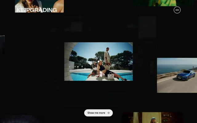
KeepGrading employs a deep, dark canvas as its primary backdrop, featuring a striking black and white contrast. Typography is the main vehicle for conveying information, appearing in clean geometric sans-serifs. Interactive elements are subtly outlined rather than boldly filled, maintaining the overall sleek, low-key aesthetic, ensuring that images and video content are the focal point.
The page operates on a full-bleed black background (#080808) that expands to the edges of the viewport, with content centered. Featured image/video content is displayed within distinctively rounded cards (160px radius) that float within this dark space. The hero section likely features a large, impacting visual due to the nature of the brand. Sections appear to maintain consistent vertical spacing of 48px, creating clear divisions. Content is primarily image-dominant, using a grid-like arrangement for projects.
This site prominently features high-quality, full-color photography and video stills. Imagery is generally contained within cards with 160px rounded corners, creating a soft-edged visual presentation. The visuals serve as the primary content, showcasing work examples and creating atmospheric context for the studio's services. The density is image-heavy, with substantial visual real estate dedicated to showcasing product shots often in lifestyle or professional contexts, appearing unmasked with raw edges within their rounded containers. Icons are kept minimal, outlined, and monochromatic, serving purely functional roles like menu toggles.
Reminiscent of Aardman Digital, Unit9, PostPanic.
# KeepGrading — Style Reference
> Gallery in an Empty Room

**Theme:** dark

**Site:** https://www.keepgrading.com

KeepGrading employs a deep, dark canvas as its primary backdrop, featuring a striking black and white contrast. Typography is the main vehicle for conveying information, appearing in clean geometric sans-serifs. Interactive elements are subtly outlined rather than boldly filled, maintaining the overall sleek, low-key aesthetic, ensuring that images and video content are the focal point.

## Tokens — Colors

| Name | Value | Token | Role |
|------|------|------|------|
| Void Black | `#080808` | `--color-void-black` | Page backgrounds, card surfaces, primary text for dark backgrounds |
| Canvas White | `#f8f8f8` | `--color-canvas-white` | Hairline borders, dividers, input outlines, and card edges on light surfaces. Do not promote it to the primary CTA color |
| Onyx Shadow | `#000000` | `--color-onyx-shadow` | Illustrative fill for icons and SVG elements, creating subtle depth against darker backgrounds |

## Tokens — Typography

### Inter
- **Substitute:** system-ui
- **Weights:** 400
- **Sizes:** 16px, 20px
- **Line height:** 1.4, 1.5
- **Letter spacing:** normal
- **Role:** Body copy and navigation links — a functional, legible sans-serif for everyday content.

### Cabinet Grotesk
- **Substitute:** sans-serif
- **Weights:** 400
- **Sizes:** 16px, 20px, 24px, 96px
- **Line height:** 1, 1.33, 1.4, 1.5
- **Letter spacing:** normal
- **Role:** Headings and prominent display text — a custom geometric sans-serif that provides a distinct, modern voice without excessive ornamentation.

## Tokens — Type Scale

| Role | Size | Line height | Letter spacing |
|------|------|------|------|
| caption | 16px | 1.4 | — |
| body-sm | 20px | 1.4 | — |
| body | 24px | 1.3 | — |
| body-lg | 96px | 1.3 | — |

## Tokens — Spacing

- **Section gap:** 48px
- **Card padding:** 24px
- **Element gap:** 15px

## Tokens — Radius

- **Buttons:** 9999px
- **Cards:** 160px
- **navigation:** 9999px

## Layout

The page operates on a full-bleed black background (#080808) that expands to the edges of the viewport, with content centered. Featured image/video content is displayed within distinctively rounded cards (160px radius) that float within this dark space. The hero section likely features a large, impacting visual due to the nature of the brand. Sections appear to maintain consistent vertical spacing of 48px, creating clear divisions. Content is primarily image-dominant, using a grid-like arrangement for projects.

## Imagery

This site prominently features high-quality, full-color photography and video stills. Imagery is generally contained within cards with 160px rounded corners, creating a soft-edged visual presentation. The visuals serve as the primary content, showcasing work examples and creating atmospheric context for the studio's services. The density is image-heavy, with substantial visual real estate dedicated to showcasing product shots often in lifestyle or professional contexts, appearing unmasked with raw edges within their rounded containers. Icons are kept minimal, outlined, and monochromatic, serving purely functional roles like menu toggles.

## Components

### Navigation Link
*Top-level navigation items and secondary links.*

Inter font, 16px, weight 400, Canvas White text (#f8f8f8) on Void Black background (#080808). Hover state shows a subtle underline. Radius 9999px for rounded visual shape on hover/active.

### Primary Heading
*Main page titles and large section headings.*

Cabinet Grotesk font, 96px, weight 400, Canvas White text (#f8f8f8).

### Ghost Button
*Secondary calls to action or navigation elements.*

Canvas White text (#f8f8f8) with a 1px Canvas White border (#f8f8f8). Void Black background (#080808). Inter font, 16px, weight 400. Padding 12px vertical, 24px horizontal. Full pill shape radius 9999px.

### Media Card
*Containers for images and videos with associated text.*

Void Black background (#080808). Text in Canvas White (#f8f8f8). Features a significantly rounded border radius of 160px, making the cards distinctively soft-edged.

### Menu Toggle Button
*Hamburger menu icon for mobile or hidden navigation.*

A circular button with a 2px Canvas White stroke (#f8f8f8) and an Onyx Shadow fill (#000000) for the icon. Radius 9999px for a perfect circle.

## Guidelines

### Do

- Prioritize Void Black (#080808) for all primary background surfaces and Canvas White (#f8f8f8) for primary text to maintain high contrast.
- Use Cabinet Grotesk for all primary headings and display text, reserving Inter for body copy and navigation.
- Employ a 9999px border-radius for all interactive buttons and navigation elements to achieve a fully rounded, 'pill' shape.
- Apply a 160px border-radius to all content-bearing cards, giving them a distinctively soft, organic container.
- Maintain a comfortable rhythm with element gaps set to 15px and general section padding at 48px.
- Ensure all interactive elements, where not a solid fill, use a 1px border of Canvas White (#f8f8f8) against the dark background.

### Don't

- Do not introduce strong accent colors; the palette is intentionally monochrome, letting imagery provide visual interest.
- Avoid using filled buttons as primary calls to action; prefer ghost buttons with Canvas White borders.
- Do not use generic square or slightly rounded corners for cards; the 160px radius is a signature element.
- Do not deviate from the specified font families; Cabinet Grotesk and Inter are integral to the brand's typographic identity.
- Avoid tight spacing; maintain the comfortable density established by 15px element gaps and 48px section padding.

## Agent Prompt Guide

Quick Color Reference:
text: #f8f8f8
background: #080808
border: #f8f8f8
accent: no distinct accent color
primary action: no distinct CTA color

Example Component Prompts:
1. Create a ghost 'Show me more' button: Canvas White (#f8f8f8) text, 16px Inter font, weight 400. 1px Canvas White border (#f8f8f8), Void Black background (#080808), 12px vertical padding, 24px horizontal padding, 9999px radius.
2. Design a Media Card containing an image: 160px border-radius, Void Black background (#080808). Display 'Louis Vuitton - By The Pool' as a title in Cabinet Grotesk font, 24px, weight 400, Canvas White text (#f8f8f8).
3. Generate a primary heading for a new section: 'OUR WORK' in Cabinet Grotesk font, 96px, weight 400, Canvas White text (#f8f8f8).
More like this




Keep what you find
A free account saves references to boards and can send you a weekly email of picks based on what you save.
To see every result, go Pro.