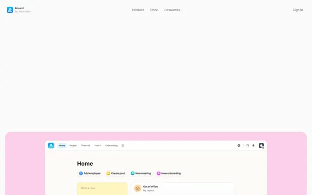
Preview image. Unlock full-res
Joyful pastel workspace
Color palette
Spot color for icons, specific text highlights, small decorative elements
Spot color for icons, specific text highlights, small decorative elements
Spot color for icons, specific text highlights, small decorative elements
Blue outline accent for tags, dividers, and focused UI edges. Do not promote it to the primary CTA color
Background for secondary action buttons, subtle highlights
Decorative card backgrounds, playful highlight sections
Decorative card backgrounds, soft thematic accents
Decorative card backgrounds, refreshing soft highlights
Decorative card backgrounds, light background accents
Decorative card backgrounds, bright accent blocks
Page backgrounds, primary surface for cards and clean sections
Primary text, headline text, bold iconography, strong borders
Secondary text, subheadings, internal UI labels; Decorative background gradient used for dynamic visual interest, typically in hero sections or prominent feature blocks
Tertiary text, navigation links, decorative border lines
Subtle border colors, divider lines, soft box shadows for elements
Typography
- Weights
- 400, 500, 600
- Sizes
- 12px, 15px, 16px, 18px, 20px, 24px, 44px, 56px, 64px
- Line height
- 1, 1.1, 1.2, 1.3, 1.4, 1.5, 1.56, 1.6, 2
- Letter spacing
- -0.0100em
- Fallback
- Inter
All primary interface text, headings, body text, and links. The varied weights and precise letter-spacing create a clear, modern voice that feels simultaneously friendly and authoritative.
- Weights
- 400
- Sizes
- 12px
- Line height
- 1.2
- Letter spacing
- normal
- Fallback
- Roboto
Fallback for system-ui, used for general UI elements where specific styling is less critical, ensuring broad compatibility.
Spacing & shape
Components
Rounded pill-shaped button with a border of Deep Blue (#008ae8), transparent background, and Deep Blue (#008ae8) text. Padding: 10px vertical, 24px horizontal. Radius: 99px.
Rounded pill-shaped button with a Sky Blue (#e0f2fe) background, Deep Blue (#008ae8) text. Padding: 10px vertical, 24px horizontal. Radius: 99px.
Card with varied backgrounds like Cotton Candy Pink (#fbcfe8) or Misty Lavender (#e6dafd). Features a 24px border radius, with 40px padding on top, right, and left, and 0px padding at the bottom for content flow into the next section.
Square card with a 24px border radius and generous 32px padding on all sides. Backgrounds include Buttercup Yellow (#ffe77a), Aquamarine Tint (#b6edee), or Powder Blue (#afe4ff), creating a vibrant, inviting visual. No box shadow.
Guidelines
- Use Graphite Black (#000000) for all main headings and primary body text to maintain visual clarity and contrast.
- Apply a 99px border radius to all interactive buttons and tags to consistently convey an approachable, friendly aesthetic.
- Utilize Canvas White (#fafafa) as the dominant background for all main page content and primary cards.
- Incorporate the accent colors (Cotton Candy Pink, Misty Lavender, Aquamarine Tint, Powder Blue, Buttercup Yellow) primarily for distinct card backgrounds and decorative sections.
- Maintain a comfortable density with an element gap of 10px and card padding of 32px to ensure readability and spaciousness.
- Headers and page titles should use system-ui at appropriate sizes from the type scale with negative letter-spacing for a refined look.
- Use Deep Blue (#008ae8) exclusively for interactive link text and button borders to clearly signal interactivity.
- Avoid using the accent pastel colors for text or borders; they are reserved for background washes and decorative surfaces.
- Do not introduce sharp corners or small radii (less than 24px) for cards or larger containers; consistency in rounded shapes is key.
- Refrain from using strong, dark shadows. The system relies on light-colored borders and background variations for element separation.
- Do not apply the Gradient Aura to small UI elements or text; it is intended for large, impactful background sections only.
- Avoid deviating from the defined system-ui and sans-serif fonts; no custom fonts should be introduced.
- Do not use generic gray tones for interactive elements; leverage Deep Blue (#008ae8) for all actionable states.
- Do not clutter layouts; prioritize comfortable spacing with 10px element gaps and 32px card padding.
About this system
ShowHide
Aboard projects a playful, human-centered HR experience through its soft, pastel color palette and friendly, rounded interfaces. The system combines crisp, dark typography with a clean, light canvas, punctuated by cheerful accent colors and varied card backgrounds. Components are lightweight with generous padding and prominent border radii, creating an approachable and inviting visual environment. The overall design feels like a thoughtful, organized space that prioritizes user comfort and visual delight.
Reminiscent of Braid, Rippling, Notion.
# Aboard — Style Reference
> Joyful pastel workspace

**Theme:** light

**Site:** https://aboardhr.com

Aboard projects a playful, human-centered HR experience through its soft, pastel color palette and friendly, rounded interfaces. The system combines crisp, dark typography with a clean, light canvas, punctuated by cheerful accent colors and varied card backgrounds. Components are lightweight with generous padding and prominent border radii, creating an approachable and inviting visual environment. The overall design feels like a thoughtful, organized space that prioritizes user comfort and visual delight.

## Tokens — Colors

| Name | Value | Token | Role |
|------|------|------|------|
| Vivid Violet | `#975aff` | `--color-vivid-violet` | Spot color for icons, specific text highlights, small decorative elements |
| Warm Orange | `#ff6800` | `--color-warm-orange` | Spot color for icons, specific text highlights, small decorative elements |
| Bright Teal | `#00babf` | `--color-bright-teal` | Spot color for icons, specific text highlights, small decorative elements |
| Deep Blue | `#008ae8` | `--color-deep-blue` | Blue outline accent for tags, dividers, and focused UI edges. Do not promote it to the primary CTA color |
| Sky Blue | `#e0f2fe` | `--color-sky-blue` | Background for secondary action buttons, subtle highlights |
| Cotton Candy Pink | `#fbcfe8` | `--color-cotton-candy-pink` | Decorative card backgrounds, playful highlight sections |
| Misty Lavender | `#e6dafd` | `--color-misty-lavender` | Decorative card backgrounds, soft thematic accents |
| Aquamarine Tint | `#b6edee` | `--color-aquamarine-tint` | Decorative card backgrounds, refreshing soft highlights |
| Powder Blue | `#afe4ff` | `--color-powder-blue` | Decorative card backgrounds, light background accents |
| Buttercup Yellow | `#ffe77a` | `--color-buttercup-yellow` | Decorative card backgrounds, bright accent blocks |
| Canvas White | `#fafafa` | `--color-canvas-white` | Page backgrounds, primary surface for cards and clean sections |
| Graphite Black | `#000000` | `--color-graphite-black` | Primary text, headline text, bold iconography, strong borders |
| Ink Gray | `#262626` | `--color-ink-gray` | Secondary text, subheadings, internal UI labels; Decorative background gradient used for dynamic visual interest, typically in hero sections or prominent feature blocks |
| Muted Ash | `#757577` | `--color-muted-ash` | Tertiary text, navigation links, decorative border lines |
| Light Shadow | `#cdcdcd` | `--color-light-shadow` | Subtle border colors, divider lines, soft box shadows for elements |

## Tokens — Typography

### system-ui
- **Substitute:** Inter
- **Weights:** 400, 500, 600
- **Sizes:** 12px, 15px, 16px, 18px, 20px, 24px, 44px, 56px, 64px
- **Line height:** 1, 1.1, 1.2, 1.3, 1.4, 1.5, 1.56, 1.6, 2
- **Letter spacing:** -0.0100em
- **Role:** All primary interface text, headings, body text, and links. The varied weights and precise letter-spacing create a clear, modern voice that feels simultaneously friendly and authoritative.

### sans-serif
- **Substitute:** Roboto
- **Weights:** 400
- **Sizes:** 12px
- **Line height:** 1.2
- **Letter spacing:** normal
- **Role:** Fallback for system-ui, used for general UI elements where specific styling is less critical, ensuring broad compatibility.

## Tokens — Type Scale

Major Third (1.25) from 12px base.

| Role | Size | Line height | Letter spacing |
|------|------|------|------|
| caption | 12px | 1.2 | -0.12px |
| body-sm | 15px | 1.5 | -0.15px |
| subheading | 18px | 1.5 | -0.162px |
| heading-sm | 20px | 1.3 | -0.18px |
| heading | 24px | 1.4 | -0.24px |
| heading-lg | 44px | 1.1 | -0.44px |
| display | 56px | 1 | -0.56px |
| display-lg | 64px | 1 | -0.64px |

## Tokens — Spacing

- **Section gap:** 48px
- **Card padding:** 32px
- **Element gap:** 10px

## Tokens — Radius

- **General:** 10px
- **Buttons:** 99px
- **Cards:** 24px
- **body:** 2px
- **small:** 6px

## Components

### Outline Pill Button
*Primary action, navigation items*

Rounded pill-shaped button with a border of Deep Blue (#008ae8), transparent background, and Deep Blue (#008ae8) text. Padding: 10px vertical, 24px horizontal. Radius: 99px.

### Light Blue Pill Button
*Secondary action, call to action*

Rounded pill-shaped button with a Sky Blue (#e0f2fe) background, Deep Blue (#008ae8) text. Padding: 10px vertical, 24px horizontal. Radius: 99px.

### Hero Section Card
*Content container, information display*

Card with varied backgrounds like Cotton Candy Pink (#fbcfe8) or Misty Lavender (#e6dafd). Features a 24px border radius, with 40px padding on top, right, and left, and 0px padding at the bottom for content flow into the next section.

### Feature Card (Playful)
*Feature showcase, data visualization*

Square card with a 24px border radius and generous 32px padding on all sides. Backgrounds include Buttercup Yellow (#ffe77a), Aquamarine Tint (#b6edee), or Powder Blue (#afe4ff), creating a vibrant, inviting visual. No box shadow.

## Guidelines

### Do

- Use Graphite Black (#000000) for all main headings and primary body text to maintain visual clarity and contrast.
- Apply a 99px border radius to all interactive buttons and tags to consistently convey an approachable, friendly aesthetic.
- Utilize Canvas White (#fafafa) as the dominant background for all main page content and primary cards.
- Incorporate the accent colors (Cotton Candy Pink, Misty Lavender, Aquamarine Tint, Powder Blue, Buttercup Yellow) primarily for distinct card backgrounds and decorative sections.
- Maintain a comfortable density with an element gap of 10px and card padding of 32px to ensure readability and spaciousness.
- Headers and page titles should use system-ui at appropriate sizes from the type scale with negative letter-spacing for a refined look.
- Use Deep Blue (#008ae8) exclusively for interactive link text and button borders to clearly signal interactivity.

### Don't

- Avoid using the accent pastel colors for text or borders; they are reserved for background washes and decorative surfaces.
- Do not introduce sharp corners or small radii (less than 24px) for cards or larger containers; consistency in rounded shapes is key.
- Refrain from using strong, dark shadows. The system relies on light-colored borders and background variations for element separation.
- Do not apply the Gradient Aura to small UI elements or text; it is intended for large, impactful background sections only.
- Avoid deviating from the defined system-ui and sans-serif fonts; no custom fonts should be introduced.
- Do not use generic gray tones for interactive elements; leverage Deep Blue (#008ae8) for all actionable states.
- Do not clutter layouts; prioritize comfortable spacing with 10px element gaps and 32px card padding.

## Agent Prompt Guide

Quick Color Reference:
text: #000000
background: #fafafa
border: #cdcdcd
accent: #fbcfe8
primary action: no distinct CTA color

Example Component Prompts:
1. Create a hero section with a large centered headline using system-ui 64px weight 600, Graphite Black (#000000), letter-spacing -0.64px. Below it, a Light Blue Pill Button saying 'Book a demo'. The button has a Sky Blue (#e0f2fe) background, Deep Blue (#008ae8) text, and a 99px border-radius.
2. Design a feature card with a Buttercup Yellow (#ffe77a) background, 24px border radius, and 32px padding on all sides. Inside, include a heading (system-ui 24px weight 500, Ink Gray #262626) and a body paragraph (system-ui 16px weight 400, Ink Gray #262626).
3. Build a navigation bar using Canvas White (#fafafa) as background. Include the brand logo on the left. On the right, use Muted Ash (#757577) for navigation links (e.g., 'Product', 'Price'). The 'Sign In' button is an Outline Pill Button with Deep Blue (#008ae8) border and text, 99px radius.
4. Create a content section with a Cotton Candy Pink (#fbcfe8) background, 24px border radius, 40px top/right/left padding. Include a subheading (system-ui 44px weight 600, Graphite Black #000000, letter-spacing -0.44px) followed by a short body paragraph (system-ui 18px weight 400, Ink Gray #262626).
More like this









Keep what you find
A free account saves references to boards and can send you a weekly email of picks based on what you save.
To see every result, go Pro.