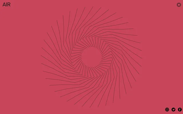
Preview image. Unlock full-res
Crimson Canvas, Dark Ink
Color palette
Primary background color, dominant page canvas
Dark borders and separators for elevated surfaces and inverted UI. Do not promote it to the primary CTA color
Decorative icon fills, subtle background elements
Typography
- Weights
- 300, 400
- Sizes
- 14px, 16px, 18px, 20px
- Line height
- 1.14, 1.33, 1.5
- Fallback
- Inter
Primary typeface for all UI elements, headings, body text, and links. Its utilitarian feel contributes to the system's directness.
Spacing & shape
Components
Text in Charcoal Slate (#1a1b1b) with a 1px border on interaction. No background, no padding.
Guidelines
- Prioritize Deep Raspberry (#b42c4b) for large background areas to set the primary mood.
- Use akzidenz-grotesk at weight 400 for all primary text content and headings.
- Employ Charcoal Slate (#1a1b1b) as the default text color, ensuring high contrast against Deep Raspberry or similar backgrounds.
- Render interactive elements like links and navigation items using Charcoal Slate (#1a1b1b) text and a subtle 1px border in the same color for interaction.
- Maintain minimal padding (10px or 20px) around elements only where essential for legibility, avoiding excessive whitespace.
- Utilize 0px border-radius across all components to reinforce the sharp, conceptual aesthetic.
- Do not introduce strong accent colors or gradients; color should be used sparingly and functionally.
- Avoid decorative shadows or complex elevation schemes; interfaces should remain flat and direct.
- Do not use type sizes smaller than 14px or larger than 20px for primary content or navigation.
- Refrain from large, illustrative imagery that might detract from the focus on core content.
- Do not apply rounded corners to any UI elements; maintain sharp, angular forms.
- Avoid prominent call-to-action buttons with solid backgrounds; interactive elements should be understated.
About this system
ShowHide
AIR Studios employs a spare, conceptual UI, prioritizing content over ornamental elements. Bold background colors serve as the primary visual anchor, punctuated by fine line art and stark monochrome typography. Interaction is subtle, using ghost borders and minimal hover effects. The system feels direct and unencumbered, focusing attention on the brand's creative output rather than the interface itself.
The page operates on a full-bleed layout, where the dominant background color (Deep Raspberry) extends to the edges of the viewport. Content is subtly constrained by implied margins, giving the impression of a single, expansive canvas. The hero section is characterized by a full-viewport, centered abstract graphic. Navigation is sparse, positioned at the top-left and top-right, while social links are tucked into the bottom-right. The overall density is low, emphasizing breathing room and the visual impact of the central graphic.
The site uses minimal imagery, primarily relying on fine, geometric line art as a central visual motif. This abstract graphic is integrated directly into the background, providing texture and movement without depicting specific objects or people. Icons are monochrome, simple, and functional, maintaining the stark visual vocabulary. The approach is graphics-dominant rather than image-dominant, using abstract forms to convey mood.
Reminiscent of A24, Pentagram (select projects), The Designer's Studio.
# AIR Studios — Style Reference
> Crimson Canvas, Dark Ink

**Theme:** dark

**Site:** https://airstudios.com

AIR Studios employs a spare, conceptual UI, prioritizing content over ornamental elements. Bold background colors serve as the primary visual anchor, punctuated by fine line art and stark monochrome typography. Interaction is subtle, using ghost borders and minimal hover effects. The system feels direct and unencumbered, focusing attention on the brand's creative output rather than the interface itself.

## Tokens — Colors

| Name | Value | Token | Role |
|------|------|------|------|
| Deep Raspberry | `#b42c4b` | `--color-deep-raspberry` | Primary background color, dominant page canvas |
| Charcoal Slate | `#1a1b1b` | `--color-charcoal-slate` | Dark borders and separators for elevated surfaces and inverted UI. Do not promote it to the primary CTA color |
| Midnight Void | `#000000` | `--color-midnight-void` | Decorative icon fills, subtle background elements |

## Tokens — Typography

### akzidenz-grotesk
- **Substitute:** Inter
- **Weights:** 300, 400
- **Sizes:** 14px, 16px, 18px, 20px
- **Line height:** 1.14, 1.33, 1.5
- **Role:** Primary typeface for all UI elements, headings, body text, and links. Its utilitarian feel contributes to the system's directness.

## Tokens — Type Scale

Major Second (1.125) from 16px base.

| Role | Size | Line height | Letter spacing |
|------|------|------|------|
| body-sm | 14px | 1.5 | — |
| body | 16px | 1.5 | — |
| subheading | 18px | 1.33 | — |
| heading | 20px | 1.14 | — |

## Tokens — Spacing

- **Card padding:** 20px
- **Element gap:** 16px

## Tokens — Radius

- **none:** 0px

## Layout

The page operates on a full-bleed layout, where the dominant background color (Deep Raspberry) extends to the edges of the viewport. Content is subtly constrained by implied margins, giving the impression of a single, expansive canvas. The hero section is characterized by a full-viewport, centered abstract graphic. Navigation is sparse, positioned at the top-left and top-right, while social links are tucked into the bottom-right. The overall density is low, emphasizing breathing room and the visual impact of the central graphic.

## Imagery

The site uses minimal imagery, primarily relying on fine, geometric line art as a central visual motif. This abstract graphic is integrated directly into the background, providing texture and movement without depicting specific objects or people. Icons are monochrome, simple, and functional, maintaining the stark visual vocabulary. The approach is graphics-dominant rather than image-dominant, using abstract forms to convey mood.

## Components

### Ghost Border Link
*Navigation and footer links*

Text in Charcoal Slate (#1a1b1b) with a 1px border on interaction. No background, no padding.

## Guidelines

### Do

- Prioritize Deep Raspberry (#b42c4b) for large background areas to set the primary mood.
- Use akzidenz-grotesk at weight 400 for all primary text content and headings.
- Employ Charcoal Slate (#1a1b1b) as the default text color, ensuring high contrast against Deep Raspberry or similar backgrounds.
- Render interactive elements like links and navigation items using Charcoal Slate (#1a1b1b) text and a subtle 1px border in the same color for interaction.
- Maintain minimal padding (10px or 20px) around elements only where essential for legibility, avoiding excessive whitespace.
- Utilize 0px border-radius across all components to reinforce the sharp, conceptual aesthetic.

### Don't

- Do not introduce strong accent colors or gradients; color should be used sparingly and functionally.
- Avoid decorative shadows or complex elevation schemes; interfaces should remain flat and direct.
- Do not use type sizes smaller than 14px or larger than 20px for primary content or navigation.
- Refrain from large, illustrative imagery that might detract from the focus on core content.
- Do not apply rounded corners to any UI elements; maintain sharp, angular forms.
- Avoid prominent call-to-action buttons with solid backgrounds; interactive elements should be understated.

## Agent Prompt Guide

Quick Color Reference:
text: #1a1b1b
background: #b42c4b
border: no distinct border color
accent: no distinct accent color
primary action: no distinct CTA color

Example Component Prompts:
1. Create a page header with 'AIR' as the logo text: text color #1a1b1b, font akzidenz-grotesk weight 400, size 20px, line height 1.14, on Deep Raspberry background #b42c4b. Position top-left.
2. Create a footer social link: text color #1a1b1b, font akzidenz-grotesk weight 400, size 14px, line height 1.5. On hover, apply a 1px border in #1a1b1b.
More like this

Keep what you find
A free account saves references to boards and can send you a weekly email of picks based on what you save.
To see every result, go Pro.