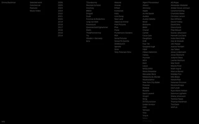
Preview image. Unlock full-res
Minimalist digital archive; stark canvas, monochrome text
Color palette
Page background, primary canvas
Dark borders and separators for elevated surfaces and inverted UI. Do not promote it to the primary CTA color
Typography
- Weights
- 400
- Sizes
- 14px, 16px
- Line height
- 1.2, 1.29
- Letter spacing
- normal
- Fallback
- Inter
The sole typeface for all content, from headings and navigation links to body copy and lists. Its uniform weight contributes to the system's understated and consistent informational aesthetic, ensuring legibility without visual hierarchy through weight changes.
Spacing & shape
Components
Text in Ghost Gray (#666666) using Soehne 16px/1.29, weight 400. This is the primary interactive element on the page, with its active and hover states implied only through interaction, not distinct color changes.
Text in Ghost Gray (#666666) using Soehne 16px/1.29, weight 400, presented within lists. The spacing between list items is driven by the element gap of 12px.
Each year is a text item in Ghost Gray (#666666) using Soehne 14px/1.2, weight 400. Individual items are spaced 12px vertically (element gap).
Small text link at the bottom of the page in Ghost Gray (#666666) using Soehne 14px/1.2, weight 400. It has 10px top and bottom padding within its container.
Guidelines
- Prioritize text as the primary visual element; minimize decorative graphics or imagery.
- Use Midnight Void (#000000) as the universal page background.
- Apply Ghost Gray (#666666) for all instances of text, including headings, body copy, and interactive links.
- Maintain a default Soehne 400 font for all text elements.
- Utilize 12px as the standard horizontal padding for content sections and the vertical spacing between most elements.
- Set the primary section gap to 48px for clear content separation.
- Do not introduce strong accent colors; rely solely on the monochrome palette.
- Avoid using distinct background colors for cards or elevated surfaces; maintain a flat, unified background.
- Do not vary font weights for emphasis or hierarchy; manage hierarchy through size or implicit structure only.
- Do not apply `border-radius` to any elements; everything should have sharp, implied corners.
- Do not use explicit buttons or strong visual calls to action; all interaction should be text-based with minimal visual cues.
About this system
ShowHide
Emma Backman's visual system evokes a raw, direct archival feel: a stark dark canvas with text as the primary visual element. The layout prioritizes clear, unembellished information display, relying on consistent dark backgrounds and subtle text-based interactions. Typography is the hero, serving as both content and navigation, with a singular, restrained text color for all elements.
The page employs a full-bleed, max-width layout with content organized into distinct, left-aligned columns. The hero section is characterized by a prominent heading at the top-left, followed by stacked text-based navigation. Content is presented in multiple vertical columns of text lists. Sections are distinct through consistent vertical spacing (48px section gap). The rhythm is defined by a dense, vertically stacked textual information display, with a simple footer link at the very bottom. The page does not use a centered or alternating content arrangement.
No imagery or graphical elements are present. The visual language is entirely text-based, using typography as the sole means of communication and visual structure. Icons are absent.
Reminiscent of Are.na, Read.cv, Index.co.
# Emma Backman — Style Reference
> Minimalist digital archive; stark canvas, monochrome text

**Theme:** dark

**Site:** https://www.emmabackman.com

Emma Backman's visual system evokes a raw, direct archival feel: a stark dark canvas with text as the primary visual element. The layout prioritizes clear, unembellished information display, relying on consistent dark backgrounds and subtle text-based interactions. Typography is the hero, serving as both content and navigation, with a singular, restrained text color for all elements.

## Tokens — Colors

| Name | Value | Token | Role |
|------|------|------|------|
| Midnight Void | `#000000` | `--color-midnight-void` | Page background, primary canvas |
| Ghost Gray | `#666666` | `--color-ghost-gray` | Dark borders and separators for elevated surfaces and inverted UI. Do not promote it to the primary CTA color |

## Tokens — Typography

### Soehne
- **Substitute:** Inter
- **Weights:** 400
- **Sizes:** 14px, 16px
- **Line height:** 1.2, 1.29
- **Letter spacing:** normal
- **Role:** The sole typeface for all content, from headings and navigation links to body copy and lists. Its uniform weight contributes to the system's understated and consistent informational aesthetic, ensuring legibility without visual hierarchy through weight changes.

## Tokens — Type Scale

| Role | Size | Line height | Letter spacing |
|------|------|------|------|
| caption | 14px | 1.2 | — |
| body | 16px | 1.29 | — |

## Tokens — Spacing

- **Section gap:** 48px
- **Card padding:** 12px
- **Element gap:** 12px

## Tokens — Radius

- **none:** 0px

## Layout

The page employs a full-bleed, max-width layout with content organized into distinct, left-aligned columns. The hero section is characterized by a prominent heading at the top-left, followed by stacked text-based navigation. Content is presented in multiple vertical columns of text lists. Sections are distinct through consistent vertical spacing (48px section gap). The rhythm is defined by a dense, vertically stacked textual information display, with a simple footer link at the very bottom. The page does not use a centered or alternating content arrangement.

## Imagery

No imagery or graphical elements are present. The visual language is entirely text-based, using typography as the sole means of communication and visual structure. Icons are absent.

## Components

### Main Navigation Link
*Interactive text link*

Text in Ghost Gray (#666666) using Soehne 16px/1.29, weight 400. This is the primary interactive element on the page, with its active and hover states implied only through interaction, not distinct color changes.

### Content List Item
*Informational list entry*

Text in Ghost Gray (#666666) using Soehne 16px/1.29, weight 400, presented within lists. The spacing between list items is driven by the element gap of 12px.

### Year Filter List
*Navigational/filtering list*

Each year is a text item in Ghost Gray (#666666) using Soehne 14px/1.2, weight 400. Individual items are spaced 12px vertically (element gap).

### Footer Info Link
*Small informational link*

Small text link at the bottom of the page in Ghost Gray (#666666) using Soehne 14px/1.2, weight 400. It has 10px top and bottom padding within its container.

## Guidelines

### Do

- Prioritize text as the primary visual element; minimize decorative graphics or imagery.
- Use Midnight Void (#000000) as the universal page background.
- Apply Ghost Gray (#666666) for all instances of text, including headings, body copy, and interactive links.
- Maintain a default Soehne 400 font for all text elements.
- Utilize 12px as the standard horizontal padding for content sections and the vertical spacing between most elements.
- Set the primary section gap to 48px for clear content separation.

### Don't

- Do not introduce strong accent colors; rely solely on the monochrome palette.
- Avoid using distinct background colors for cards or elevated surfaces; maintain a flat, unified background.
- Do not vary font weights for emphasis or hierarchy; manage hierarchy through size or implicit structure only.
- Do not apply `border-radius` to any elements; everything should have sharp, implied corners.
- Do not use explicit buttons or strong visual calls to action; all interaction should be text-based with minimal visual cues.

## Agent Prompt Guide

Quick Color Reference:
text: #666666
background: #000000
border: no distinct border color
accent: no distinct accent color
primary action: no distinct CTA color

Example Component Prompts:
Create a main navigation entry: Text 'Selected work' in #666666 using Soehne 400 at 16px/1.29.
Create a content list entry: Text '72andsunny' in #666666 using Soehne 400 at 16px/1.29, with 12px vertical spacing from adjacent items.
Create a year filter entry: Text '2026' in #666666 using Soehne 400 at 14px/1.2.
Create a footer link: Text 'Info' in #666666 using Soehne 400 at 14px/1.2, with 10px vertical padding.
More like this




Keep what you find
A free account saves references to boards and can send you a weekly email of picks based on what you save.
To see every result, go Pro.