Preview image. Unlock full-res
Polished Workflow, Vibrant Efficiency — like a perfectly organized, brightly lit command center.
Color palette
Brand accent, used for specific interactive elements and highlighting key information, hinting at information or success.
Brand accent, used in specific illustrative contexts and text highlighting, indicates urgency or warning.
Brand accent, used for success indications and positive feedback, often in illustrative elements.
Brand accent, used decoratively in illustrations and data visualizations for visual separation.
Brand accent, used for highlighting and decorative elements, adds a vibrant pop.
Background for specific card variations, provides a strong, warm contrast.
Background for specific interactive elements or badges, a softer version of the orange accent.
Darker shade of green, for text against lighter green backgrounds or specific brand elements.
Darker shade of yellow-brown, primarily for headings in certain branded contexts.
Call-to-action buttons, active navigation links, and interactive elements. Stands out clearly.
Subtle accent, often appears as a box shadow for active elements or focus states.
Page background, primary surface color for cards and major sections.
Secondary background, subtle visual break for content cards and sections.
Dominant canvas color, offers a slight warmth compared to pure white, establishing the overall page tone.
Primary heading color, strong body text, and background for primary action buttons. The core dark neutral.
General text color, provides strong contrast against light backgrounds.
Default body text, slightly softer than Deep Graphite for secondary text information.
Subtle borders, dividers, and disabled button backgrounds.
Less prominent body text, link text in paragraphs.
Navigation text, inactive icons, subtle borders.
Light background shade, used on some interactive elements when hovered.
Very dark text color, appears for headings and body text, a deeper contrast option.
Typography
- Weights
- 400, 900
- Sizes
- 20px, 48px
- Line height
- 1.5
- Letter spacing
- 0
- Fallback
- IBM Plex Sans
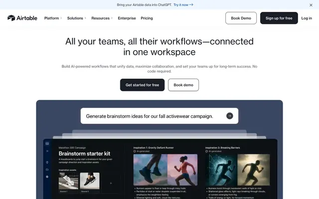
Headline font. Used for prominent headings and titles like 'All your teams, all their workflows'. The thick weight at 48px creates a bold, authoritative statement without being overly aggressive due to the spacious line height.
- Weights
- 400, 500, 600
- Sizes
- 14px, 16px, 18px, 20px, 24px, 32px, 40px
- Line height
- 1.15, 1.2, 1.25, 1.3, 1.35, 1.5
- Letter spacing
- 0.007
- Fallback
- Inter
Primary UI font for body text, navigation, and most interactive elements. Weight 400 maintains approachability. Sizes range from small captions to larger subheadings, ensuring versatility. Letter spacing is slightly positive on smaller text to enhance legibility, tightening to normal at larger sizes.
- Weights
- 400, 500, 600
- Sizes
- 14px, 16px, 18px, 20px, 24px, 32px, 40px
- Line height
- 1.15, 1.2, 1.25, 1.3, 1.35, 1.5
- Letter spacing
- 0.006
- Fallback
- Inter
Medium weight for secondary interactive elements, button text, and emphasized body copy. Provides a subtle distinction from regular body text without becoming too heavy.
- Weights
- 400, 500, 600
- Sizes
- 14px, 16px, 18px, 20px, 24px, 32px, 40px
- Line height
- 1.15, 1.2, 1.25, 1.3, 1.35, 1.5
- Letter spacing
- 0.005
- Fallback
- Inter
Semibold weight used for navigation headings, strong labels, and section titles where additional emphasis is paramount. It provides hierarchy and readability against lighter backgrounds.
Spacing & shape
Elevation
Components
Solid background in Slate Ink (#181D26), text in White Canvas (#FFFFFF). Rounded with 12px border-radius. Padding 16px vertical, 24px horizontal. Used for primary actions like 'Get started for free'.
Transparent background, text and border in Slate Ink (#181D26), no border-radius. Padding 0px. Used for navigation items or subtle secondary actions like 'Book demo'.
Solid background in White Canvas (#FFFFFF), text in Slate Ink (#181D26). Rounded with 12px border-radius. Padding 16px vertical, 24px horizontal. Used when a light background is needed against a dark section.
Transparent background, text color in Muted Stone (rgba(7, 12, 20, 0.82)), no border-radius. Minimal padding 1px vertical, 6px horizontal. Used for compact links within text or less prominent actions.
Transparent background, no border-radius, no shadow. Padding 0px vertical, 48px horizontal. Used for content sections where the background provides the visual separation.
Background in Cloud Whisper (#F8FAFC), 16px border-radius, no shadow. Padding 0px. Used for grouping related content with a soft visual lift.
Background in Mars Red (#912E1F), 24px border-radius, no shadow. Padding 0px. Used for prominent, branded content blocks.
Background in White Canvas (#ffffff), 24px border-radius, no shadow. Padding 0px. Used for main content sections that stand out.
Background in White Canvas (#ffffff), text in Slate Ink (#181D26). Border is implied or very subtle. Active state likely shows a subtle blue shadow (#C4DBFD) with `rgba(0, 0, 0, 0.32) 0px 0px 1px 0px` for depth. Rounded corners with a 12px radius.
White Canvas (#ffffff) background, with a subtle shadow (`rgba(15, 48, 106, 0.05) 0px 0px 20px 0px`) for elevation. Contains various links and buttons. Height is around 90-120px.
Guidelines
- Prioritize Slate Ink (#181D26) for headlines and primary actions against light backgrounds for strong contrast.
- Use Ocean Accent (#1B61C9) exclusively for interactive elements like primary CTAs and active navigation links.
- Apply 12px border-radius consistently to all buttons and similar interactive elements for a softened feel.
- Maintain comfortable spacing with 16px for elementGap and 24-48px for cardPadding to ensure visual breathing room.
- Utilize Haas Groot Disp (or IBM Plex Sans fallback) at its 900 weight for eye-catching, high-impact headlines.
- Employ the full palette of vivid brand accents (Amethyst, Burnt Sienna, Forest Nudge, Sweet Pink, Sunburst) for illustrative elements, badges, or specific content blocks, not for core UI text or backgrounds.
- Elevate primary navigation and critical interactive buttons with subtle box shadows to indicate hierarchy and interactivity.
- Do not use Gray Mist (#E0E2E6) for primary text or backgrounds that require strong contrast.
- Avoid using the vivid brand accent colors for standard text or backgrounds; reserve them for highlighting and illustration.
- Do not introduce sharp corners on interactive components; maintain the established 12px or 16px radius for buttons and cards.
- Avoid excessive use of shadows; most elevation is achieved through color contrast and subtle background shades.
- Do not use letter-spacing on display-sized text; keep it normal for Haas Groot Disp at 48px.
- Do not condense spacing beyond 16px for element gaps; preserve the comfortable density.
About this system
ShowHide
The Airtable design system conveys an approachable enterprise workflow platform. Its light theme and ample spacing provide a sense of clarity, grounded by a distinctive dark blue (#181D26) for strong text elements and primary actions. Functional interactivity is highlighted by a bright blue (#1B61C9) while a palette of vivid, multi-colored accents introduces a playful, almost illustrative quality, suggesting flexibility and creativity within a structured environment. Rounded corners and subtle shadows soften the experience, making complex AI tools feel less intimidating.
The page primarily follows a max-width contained layout, centering content within a flexible width, likely around 1280px. The hero section features a full-width background (often a solid color or subtle gradient) behind a centered headline and subtext, followed by a large product demonstration graphic that visually breaks the top fold. Sections below alternate between varying background shades (White Canvas, Cloud Whisper, Warm Parchment) and feature common patterns: centered content stacks, text-left/image-right (or vice-versa) modules, and multi-column grid layouts for features and testimonials. Vertical spacing between sections is generous (40-80px), creating a comfortable, open rhythm. The navigation is a sticky top bar, providing persistent access.
The visual language blends product screenshots with abstract, illustrative elements. Product screenshots are typically centered, slightly elevated as if floating, and feature an inner shadow suggesting depth and interaction. Illustrations are often in a flat, geometric style, using the full spectrum of brand accent colors (Amethyst, Burnt Sienna, Forest Nudge, Sweet Pink, Sunburst) to depict data flow, connections, or metaphorical concepts related to workflows and AI. Icons are minimal, either outlined or filled in a mono color (Slate Ink or a brand accent), used functionally rather than decoratively to guide UI. The density is image-moderate, with illustrations breaking up text-heavy sections and product shots showcasing key features directly.
Reminiscent of monday.com, asana, notion, Linear.
# Airtable — Style Reference
> Polished Workflow, Vibrant Efficiency — like a perfectly organized, brightly lit command center.

**Theme:** light

**Site:** https://airtable.com

The Airtable design system conveys an approachable enterprise workflow platform. Its light theme and ample spacing provide a sense of clarity, grounded by a distinctive dark blue (#181D26) for strong text elements and primary actions. Functional interactivity is highlighted by a bright blue (#1B61C9) while a palette of vivid, multi-colored accents introduces a playful, almost illustrative quality, suggesting flexibility and creativity within a structured environment. Rounded corners and subtle shadows soften the experience, making complex AI tools feel less intimidating.

## Tokens — Colors

| Name | Value | Token | Role |
|------|------|------|------|
| Amethyst | `#254fad` | `--color-amethyst` | Brand accent, used for specific interactive elements and highlighting key information, hinting at information or success. |
| Burnt Sienna | `#aa2d00` | `--color-burnt-sienna` | Brand accent, used in specific illustrative contexts and text highlighting, indicates urgency or warning. |
| Forest Nudge | `#0a2e00` | `--color-forest-nudge` | Brand accent, used for success indications and positive feedback, often in illustrative elements. |
| Sweet Pink | `#fa91e0` | `--color-sweet-pink` | Brand accent, used decoratively in illustrations and data visualizations for visual separation. |
| Sunburst | `#fcb42a` | `--color-sunburst` | Brand accent, used for highlighting and decorative elements, adds a vibrant pop. |
| Mars Red | `#912e1f` | `--color-mars-red` | Background for specific card variations, provides a strong, warm contrast. |
| Tropical Orange | `#fcab79` | `--color-tropical-orange` | Background for specific interactive elements or badges, a softer version of the orange accent. |
| Dark Forrest | `#214224` | `--color-dark-forrest` | Darker shade of green, for text against lighter green backgrounds or specific brand elements. |
| Warm Gold | `#423719` | `--color-warm-gold` | Darker shade of yellow-brown, primarily for headings in certain branded contexts. |
| Ocean Accent | `#1b61c9` | `--color-ocean-accent` | Call-to-action buttons, active navigation links, and interactive elements. Stands out clearly. |
| Sky Veil | `#c4dbfd` | `--color-sky-veil` | Subtle accent, often appears as a box shadow for active elements or focus states. |
| White Canvas | `#ffffff` | `--color-white-canvas` | Page background, primary surface color for cards and major sections. |
| Cloud Whisper | `#f8fafc` | `--color-cloud-whisper` | Secondary background, subtle visual break for content cards and sections. |
| Warm Parchment | `#faf5e8` | `--color-warm-parchment` | Dominant canvas color, offers a slight warmth compared to pure white, establishing the overall page tone. |
| Slate Ink | `#181d26` | `--color-slate-ink` | Primary heading color, strong body text, and background for primary action buttons. The core dark neutral. |
| Deep Graphite | `#333333` | `--color-deep-graphite` | General text color, provides strong contrast against light backgrounds. |
| Soft Steel | `#333840` | `--color-soft-steel` | Default body text, slightly softer than Deep Graphite for secondary text information. |
| Silver Mist | `#e0e2e6` | `--color-silver-mist` | Subtle borders, dividers, and disabled button backgrounds. |
| Muted Stone | `#41454d` | `--color-muted-stone` | Less prominent body text, link text in paragraphs. |
| Cool Gray | `#9297a0` | `--color-cool-gray` | Navigation text, inactive icons, subtle borders. |
| Frost | `#c7e5f2` | `--color-frost` | Light background shade, used on some interactive elements when hovered. |
| Dark Shadow | `#040e20` | `--color-dark-shadow` | Very dark text color, appears for headings and body text, a deeper contrast option. |

## Tokens — Typography

### Haas Groot Disp
- **Substitute:** IBM Plex Sans
- **Weights:** 400, 900
- **Sizes:** 20px, 48px
- **Line height:** 1.5
- **Letter spacing:** 0
- **Role:** Headline font. Used for prominent headings and titles like 'All your teams, all their workflows'. The thick weight at 48px creates a bold, authoritative statement without being overly aggressive due to the spacious line height.

### Haas
- **Substitute:** Inter
- **Weights:** 400, 500, 600
- **Sizes:** 14px, 16px, 18px, 20px, 24px, 32px, 40px
- **Line height:** 1.15, 1.2, 1.25, 1.3, 1.35, 1.5
- **Letter spacing:** 0.007
- **Role:** Primary UI font for body text, navigation, and most interactive elements. Weight 400 maintains approachability. Sizes range from small captions to larger subheadings, ensuring versatility. Letter spacing is slightly positive on smaller text to enhance legibility, tightening to normal at larger sizes.

### Haas
- **Substitute:** Inter
- **Weights:** 400, 500, 600
- **Sizes:** 14px, 16px, 18px, 20px, 24px, 32px, 40px
- **Line height:** 1.15, 1.2, 1.25, 1.3, 1.35, 1.5
- **Letter spacing:** 0.006
- **Role:** Medium weight for secondary interactive elements, button text, and emphasized body copy. Provides a subtle distinction from regular body text without becoming too heavy.

### Haas
- **Substitute:** Inter
- **Weights:** 400, 500, 600
- **Sizes:** 14px, 16px, 18px, 20px, 24px, 32px, 40px
- **Line height:** 1.15, 1.2, 1.25, 1.3, 1.35, 1.5
- **Letter spacing:** 0.005
- **Role:** Semibold weight used for navigation headings, strong labels, and section titles where additional emphasis is paramount. It provides hierarchy and readability against lighter backgrounds.

## Tokens — Type Scale

Minor Third (1.2) from 16px base.

| Role | Size | Line height | Letter spacing |
|------|------|------|------|
| caption | 14px | 1.35 | 0.007em |
| body | 16px | 1.3 | 0.007em |
| subheading | 18px | 1.25 | 0.007em |
| heading-sm | 20px | 1.2 | 0.006em |
| heading | 24px | 1.2 | 0.006em |
| heading-lg | 32px | 1.15 | 0.005em |
| display | 48px | 1.5 | — |

## Tokens — Spacing

- **Max width:** 1280px
- **Section gap:** 40-80px
- **Card padding:** 24-48px
- **Element gap:** 16px

## Tokens — Radius

- **Buttons:** 12px
- **Cards:** 16px
- **links:** 12px
- **nav:** 12px

## Tokens — Elevation

- **Navigation Bar:** `rgba(15, 48, 106, 0.05) 0px 0px 20px 0px`
- **Interactive Buttons/Focus States:** `rgba(0, 0, 0, 0.32) 0px 0px 1px 0px, rgba(0, 0, 0, 0.08) 0px 0px 2px 0px, rgba(45, 127, 249, 0.28) 0px 1px 3px 0px, rgba(0, 0, 0, 0.06) 0px 0px 0px 0.5px inset`

## Layout

The page primarily follows a max-width contained layout, centering content within a flexible width, likely around 1280px. The hero section features a full-width background (often a solid color or subtle gradient) behind a centered headline and subtext, followed by a large product demonstration graphic that visually breaks the top fold. Sections below alternate between varying background shades (White Canvas, Cloud Whisper, Warm Parchment) and feature common patterns: centered content stacks, text-left/image-right (or vice-versa) modules, and multi-column grid layouts for features and testimonials. Vertical spacing between sections is generous (40-80px), creating a comfortable, open rhythm. The navigation is a sticky top bar, providing persistent access.

## Imagery

The visual language blends product screenshots with abstract, illustrative elements. Product screenshots are typically centered, slightly elevated as if floating, and feature an inner shadow suggesting depth and interaction. Illustrations are often in a flat, geometric style, using the full spectrum of brand accent colors (Amethyst, Burnt Sienna, Forest Nudge, Sweet Pink, Sunburst) to depict data flow, connections, or metaphorical concepts related to workflows and AI. Icons are minimal, either outlined or filled in a mono color (Slate Ink or a brand accent), used functionally rather than decoratively to guide UI. The density is image-moderate, with illustrations breaking up text-heavy sections and product shots showcasing key features directly.

## Components

### Primary Filled Button
*Call to Action*

Solid background in Slate Ink (#181D26), text in White Canvas (#FFFFFF). Rounded with 12px border-radius. Padding 16px vertical, 24px horizontal. Used for primary actions like 'Get started for free'.

### Secondary Outline Button
*Secondary Action*

Transparent background, text and border in Slate Ink (#181D26), no border-radius. Padding 0px. Used for navigation items or subtle secondary actions like 'Book demo'.

### White Filled Button
*Tertiary/Alternate Action*

Solid background in White Canvas (#FFFFFF), text in Slate Ink (#181D26). Rounded with 12px border-radius. Padding 16px vertical, 24px horizontal. Used when a light background is needed against a dark section.

### Compact Nav Link
*In-line Navigation Link/Tag*

Transparent background, text color in Muted Stone (rgba(7, 12, 20, 0.82)), no border-radius. Minimal padding 1px vertical, 6px horizontal. Used for compact links within text or less prominent actions.

### Base Card
*Content container*

Transparent background, no border-radius, no shadow. Padding 0px vertical, 48px horizontal. Used for content sections where the background provides the visual separation.

### Subtle Card
*Content container*

Background in Cloud Whisper (#F8FAFC), 16px border-radius, no shadow. Padding 0px. Used for grouping related content with a soft visual lift.

### Accent Card - Mars Red
*Highlighted Content Container*

Background in Mars Red (#912E1F), 24px border-radius, no shadow. Padding 0px. Used for prominent, branded content blocks.

### White Elevated Card
*Prominent Content Container*

Background in White Canvas (#ffffff), 24px border-radius, no shadow. Padding 0px. Used for main content sections that stand out.

### Input / Search Bar
*Data Entry Field*

Background in White Canvas (#ffffff), text in Slate Ink (#181D26). Border is implied or very subtle. Active state likely shows a subtle blue shadow (#C4DBFD) with `rgba(0, 0, 0, 0.32) 0px 0px 1px 0px` for depth. Rounded corners with a 12px radius.

### Navigation Bar
*Site Navigation*

White Canvas (#ffffff) background, with a subtle shadow (`rgba(15, 48, 106, 0.05) 0px 0px 20px 0px`) for elevation. Contains various links and buttons. Height is around 90-120px.

## Guidelines

### Do

- Prioritize Slate Ink (#181D26) for headlines and primary actions against light backgrounds for strong contrast.
- Use Ocean Accent (#1B61C9) exclusively for interactive elements like primary CTAs and active navigation links.
- Apply 12px border-radius consistently to all buttons and similar interactive elements for a softened feel.
- Maintain comfortable spacing with 16px for elementGap and 24-48px for cardPadding to ensure visual breathing room.
- Utilize Haas Groot Disp (or IBM Plex Sans fallback) at its 900 weight for eye-catching, high-impact headlines.
- Employ the full palette of vivid brand accents (Amethyst, Burnt Sienna, Forest Nudge, Sweet Pink, Sunburst) for illustrative elements, badges, or specific content blocks, not for core UI text or backgrounds.
- Elevate primary navigation and critical interactive buttons with subtle box shadows to indicate hierarchy and interactivity.

### Don't

- Do not use Gray Mist (#E0E2E6) for primary text or backgrounds that require strong contrast.
- Avoid using the vivid brand accent colors for standard text or backgrounds; reserve them for highlighting and illustration.
- Do not introduce sharp corners on interactive components; maintain the established 12px or 16px radius for buttons and cards.
- Avoid excessive use of shadows; most elevation is achieved through color contrast and subtle background shades.
- Do not use letter-spacing on display-sized text; keep it normal for Haas Groot Disp at 48px.
- Do not condense spacing beyond 16px for element gaps; preserve the comfortable density.

## Agent Prompt Guide

**Quick Color Reference:**
- Text (Strong): `#181D26` (Slate Ink)
- Text (Body): `#333840` (Soft Steel)
- Background (Canvas): `#faf5e8` (Warm Parchment)
- Background (Surface 1): `#ffffff` (White Canvas)
- CTA Button (Background): `#181D26` (Slate Ink)
- Accent (Interactive): `#1b61c9` (Ocean Accent)
- Border (Subtle): `#e0e2e6` (Silver Mist)

**3-5 Example Component Prompts:**
1. **Create a hero section:** Background is Warm Parchment (#faf5e8). Centered headline: 'All your teams, all their workflows—connected in one workspace' using Haas Groot Disp, 48px, weight 900, Slate Ink (#181D26). Subtext: 'Build AI-powered workflows...' using Haas, 18px, weight 400, Soft Steel (#333840). Follow with a Primary Filled Button: 'Get started for free' (Slate Ink background, White Canvas text, 12px radius, 16px/24px padding). Below this, an image of the product UI, featuring a search bar component (White Canvas background, 12px radius, subtle shadow, containing an input with Slate Ink text).
2. **Generate a feature card:** Background Cloud Whisper (#f8fafc), 16px border-radius, 24px internal padding. Title: 'Production apps at prototype speed' using Haas, 24px, weight 600, Slate Ink (#181D26). Body text 'Streamline your team’s critical data...' using Haas, 16px, weight 400, Soft Steel (#333840). Include a 'Learn more' Primary Filled Button (Ocean Accent background, White Canvas text, 12px radius, 16px/24px padding) aligned right.
3. **Design a customer logo band:** White Canvas (#ffffff) background, with a top border of Silver Mist (#E0E2E6). Section padding 40px top/bottom. Centered heading 'Trusted by 500,000 leading teams' using Haas, 20px, weight 600, Dark Shadow (#040e20). Display 5-6 customer logos, each treated as a transparent image against the white background, with 32px column and row gaps between them.
More like this









Keep what you find
A free account saves references to boards and can send you a weekly email of picks based on what you save.
To see every result, go Pro.