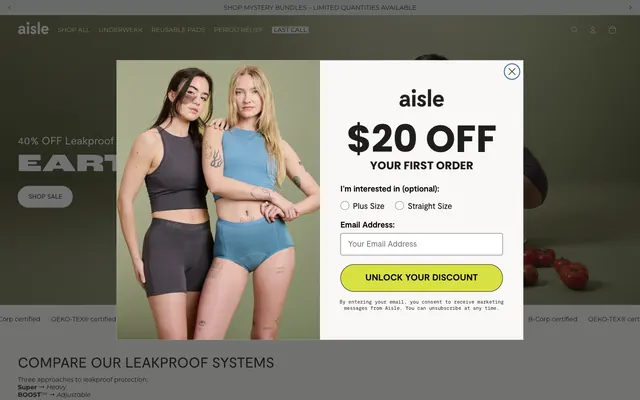
Preview image. Unlock full-res
earthy comfort, quiet confidence
Color palette
Primary action background, decorative accents, button borders, and subtle inset shadows. This deep, muted green grounds interactive elements
Backgrounds for informational sections or decorative elements
Backgrounds for informational sections or decorative elements
Backgrounds for informational sections or decorative elements
Backgrounds for informational sections or decorative elements
Promotional call-to-action buttons for discounts, signifying a distinct, attention-grabbing interactive state
Primary text, prominent headings, borders. Forms the core dark contrast for content
Base page background, light surface cards, primary text on dark backgrounds
Elevated modal backgrounds, input fields, and text on dark elements. Distinct from Canvas White for higher contrast needs
Subtle card backgrounds, section dividers, and muted borders. Provides a soft, almost imperceptible separation
Secondary text, icons, and input borders. Used for deeper contrast than Graphite
Fine borders and subtle dividers
Card backgrounds, very light borders, and subtle inset shadows
Subtly darker text and border elements for slight emphasis
Muted icon strokes and input borders
Button borders for a very dark, grounding edge
Typography
- Weights
- 400, 600, 700
- Sizes
- 10px, 12px, 14px, 16px
- Line height
- 1, 1.1, 1.2, 1.67
- Fallback
- system-ui
Default body text, links, navigation items, and small informational text. Its clean, geometric sans-serif form offers high legibility across various sizes.
- Weights
- 400, 600, 700
- Sizes
- 14px, 18px, 20px, 24px, 32px
- Line height
- 1, 1.1, 1.2, 1.4
- Fallback
- Inter
Secondary headings, button text, and slightly more prominent body copies. Provides a subtle contemporary touch with its humanist sans-serif characteristics.
- Weights
- 400, 700
- Sizes
- 12px
- Line height
- 1.1, 1.4
- Letter spacing
- 0.030em
- Fallback
- Oswald
Labels, captions, and emphasized small text. Its wide, tracked-out styling creates a distinct, modern identity.
- Weights
- 400
- Sizes
- 13px
- Line height
- 1.2
- Fallback
- Arial
Fallback text, mainly used for small, functional elements.
- Weights
- 400
- Sizes
- 48px, 56px
- Line height
- 1
- Fallback
- Oswald
Large display headings and hero section typography. The extra-wide setting conveys strength and emphasis without hyper-bold weights.
- Weights
- 400, 700
- Sizes
- 25px, 85px
- Line height
- 1.1
- Fallback
- Montserrat
Specific display text for impactful statements and large numerical values. Its friendly, geometric forms add personality.
- Weights
- 400
- Sizes
- 11px
- Line height
- 1
- Fallback
- Space Mono
Monospaced text for product codes or technical details, offering a distinct visual break.
- Weights
- 400
- Sizes
- 14px
- Line height
- 1.5
GTStandard-M — detected in extracted data but not described by AI
Spacing & shape
Elevation
Components
Background rgba(211, 206, 197, 0.09) fading to transparent. Text color Forest Green (#144747). Border Forest Green (#144747). Radius 39px. Padding 16px vertical, 24px horizontal. Features a 2px inset shadow of Forest Green (#144747).
Background transparent. Text color Pure White (#ffffff). Border Pure White (#ffffff). Radius 0px. Padding 0px. Used in overlays or dark sections.
Background Harvest Gold (#d9e142). Text color Jet Black (#000000). Border Jet Black (#000000). Radius 39px. Padding 16px vertical, 24px horizontal.
Background transparent. Text color Graphite (#292623). Border Graphite (#292623). Radius 0px. Padding 0px.
Background transparent. No border. No shadow. Radius 0px. Padding 0px.
Background Cream Tint (#f5f5f2). No border. No shadow. Radius 0px. Padding 0px.
Background Pure White (#ffffff). Text color jet Black (#000000). Border Slate Gray (#606a72). Radius 4px. Left padding 16px. Vertical padding 12px.
Background transparent. Text color Graphite (#292623). Border Jet Black (#000000). Radius 50% (circular). No padding. These are likely custom radio buttons or checkboxes.
Guidelines
- Use Forest Green (#144747) for all primary interactive elements and subtle inset button shadows to maintain a cohesive brand feel.
- Apply a 39px border-radius to all primary buttons for a soft, pill-like appearance.
- Prioritize Montserrat for all body text and general interface labels in weights 400, 600, or 700 with standard letter spacing.
- Employ RocGrotesk-ExtraWide at 48px or 56px, weight 400, for heroic headlines to convey prominence with minimalist impact.
- Structure layouts with a default 4px element gap for compact content, expanding to 10px for card padding, and 120px for section separation.
- Utilize Pale Ash (#e3e8df) or Cream Tint (#f5f5f2) for backgrounds of distinct content blocks to create subtle layering against the Canvas White (#fffffb) page background.
- Ensure input fields have a Pure White (#ffffff) background, Jet Black (#000000) text, and a Slate Gray (#606a72) border with a 4px radius.
- Avoid harsh, strong shadows; use only the defined inset shadows for buttons.
- Do not use saturated brand colors like Deep Plum, Rose Bloom, Ocean Stone, or Warm Clay as primary text or border colors; reserve them for background blocks.
- Do not vary border-radius for cards; maintain a sharp 0px radius for all card components.
- Avoid using generic blue for links; all links should primarily use Graphite (#292623) or Pure White (#ffffff) based on context.
- Do not overuse the Harvest Gold (#d9e142) accent; reserve it strictly for high-impact promotional buttons.
- Do not introduce new typefaces; restrict typography to Montserrat, Moderat, roc-grotesk-wide, RocGrotesk-ExtraWide, Poppins, ModeratMono, and Arial.
- Avoid complex gradients; the system operates on solid colors and subtle color shifts.
About this system
ShowHide
Aisle uses a natural, organic visual language with a focus on soft, inviting textures and a grounding palette. Typography balances modern, geometric forms with humanistic touches, creating approachability. Surfaces are generally flat and minimal, with subtle borders and inset shadows providing depth rather than heavy elevation. The design promotes a sense of calm and natural comfort, utilizing earth tones and a singular vibrant accent for key interactive elements.
The page primarily uses a full-bleed layout, particularly for hero sections and lifestyle imagery that spans the viewport width. Content within sections tends to be centrally aligned or uses alternating text-left/image-right compositions. Vertical rhythm is established through consistent section gaps, creating a spacious and unhurried browsing experience. Navigation is a prominent sticky header at the top, offering primary categories and utility icons.
Photography is dominant, featuring natural-looking models in casual, relatable poses, often against muted or earthy backdrops, emphasizing comfort and authenticity. Product shots are typically clean, close-up crops, minimizing distractions. Iconography is simple and outlined, often in black or a supporting neutral, maintaining the minimalist and natural aesthetic. Imagery is used expansively, sometimes full-bleed beneath text, contributing significantly to the atmospheric quality of the design.
Reminiscent of Everlane, Outdoor Voices, Warby Parker, Allbirds.
# Aisle — Style Reference
> earthy comfort, quiet confidence

**Theme:** light

**Site:** https://periodaisle.com

Aisle uses a natural, organic visual language with a focus on soft, inviting textures and a grounding palette. Typography balances modern, geometric forms with humanistic touches, creating approachability. Surfaces are generally flat and minimal, with subtle borders and inset shadows providing depth rather than heavy elevation. The design promotes a sense of calm and natural comfort, utilizing earth tones and a singular vibrant accent for key interactive elements.

## Tokens — Colors

| Name | Value | Token | Role |
|------|------|------|------|
| Forest Green | `#144747` | `--color-forest-green` | Primary action background, decorative accents, button borders, and subtle inset shadows. This deep, muted green grounds interactive elements |
| Deep Plum | `#162a91` | `--color-deep-plum` | Backgrounds for informational sections or decorative elements |
| Rose Bloom | `#c52242` | `--color-rose-bloom` | Backgrounds for informational sections or decorative elements |
| Ocean Stone | `#516b84` | `--color-ocean-stone` | Backgrounds for informational sections or decorative elements |
| Warm Clay | `#bdab9b` | `--color-warm-clay` | Backgrounds for informational sections or decorative elements |
| Harvest Gold | `#d9e142` | `--color-harvest-gold` | Promotional call-to-action buttons for discounts, signifying a distinct, attention-grabbing interactive state |
| Graphite | `#292623` | `--color-graphite` | Primary text, prominent headings, borders. Forms the core dark contrast for content |
| Canvas White | `#fffffb` | `--color-canvas-white` | Base page background, light surface cards, primary text on dark backgrounds |
| Pure White | `#ffffff` | `--color-pure-white` | Elevated modal backgrounds, input fields, and text on dark elements. Distinct from Canvas White for higher contrast needs |
| Pale Ash | `#e3e8df` | `--color-pale-ash` | Subtle card backgrounds, section dividers, and muted borders. Provides a soft, almost imperceptible separation |
| Jet Black | `#000000` | `--color-jet-black` | Secondary text, icons, and input borders. Used for deeper contrast than Graphite |
| Light Pebble | `#d6d4d3` | `--color-light-pebble` | Fine borders and subtle dividers |
| Cream Tint | `#f5f5f2` | `--color-cream-tint` | Card backgrounds, very light borders, and subtle inset shadows |
| Dark Charcoal | `#201d1d` | `--color-dark-charcoal` | Subtly darker text and border elements for slight emphasis |
| Slate Gray | `#606a72` | `--color-slate-gray` | Muted icon strokes and input borders |
| True Black | `#10131c` | `--color-true-black` | Button borders for a very dark, grounding edge |

## Tokens — Typography

### Montserrat
- **Substitute:** system-ui
- **Weights:** 400, 600, 700
- **Sizes:** 10px, 12px, 14px, 16px
- **Line height:** 1, 1.1, 1.2, 1.67
- **Role:** Default body text, links, navigation items, and small informational text. Its clean, geometric sans-serif form offers high legibility across various sizes.

### Moderat
- **Substitute:** Inter
- **Weights:** 400, 600, 700
- **Sizes:** 14px, 18px, 20px, 24px, 32px
- **Line height:** 1, 1.1, 1.2, 1.4
- **Role:** Secondary headings, button text, and slightly more prominent body copies. Provides a subtle contemporary touch with its humanist sans-serif characteristics.

### roc-grotesk-wide
- **Substitute:** Oswald
- **Weights:** 400, 700
- **Sizes:** 12px
- **Line height:** 1.1, 1.4
- **Letter spacing:** 0.030em
- **Role:** Labels, captions, and emphasized small text. Its wide, tracked-out styling creates a distinct, modern identity.

### Arial
- **Substitute:** Arial
- **Weights:** 400
- **Sizes:** 13px
- **Line height:** 1.2
- **Role:** Fallback text, mainly used for small, functional elements.

### RocGrotesk-ExtraWide
- **Substitute:** Oswald
- **Weights:** 400
- **Sizes:** 48px, 56px
- **Line height:** 1
- **Role:** Large display headings and hero section typography. The extra-wide setting conveys strength and emphasis without hyper-bold weights.

### Poppins
- **Substitute:** Montserrat
- **Weights:** 400, 700
- **Sizes:** 25px, 85px
- **Line height:** 1.1
- **Role:** Specific display text for impactful statements and large numerical values. Its friendly, geometric forms add personality.

### ModeratMono
- **Substitute:** Space Mono
- **Weights:** 400
- **Sizes:** 11px
- **Line height:** 1
- **Role:** Monospaced text for product codes or technical details, offering a distinct visual break.

### GTStandard-M
- **Weights:** 400
- **Sizes:** 14px
- **Line height:** 1.5
- **Role:** GTStandard-M — detected in extracted data but not described by AI

## Tokens — Type Scale

Major Third (1.25) from 14px base.

| Role | Size | Line height | Letter spacing |
|------|------|------|------|
| caption | 10px | 1 | — |
| body | 14px | 1.1 | — |
| body-lg | 16px | 1.2 | — |
| subheading | 18px | 1.2 | — |
| heading-sm | 20px | 1.2 | — |
| heading | 24px | 1.4 | — |
| heading-lg | 32px | 1.4 | — |
| display-sm | 48px | 1 | — |
| display | 56px | 1 | — |
| display-lg | 85px | 1.1 | — |

## Tokens — Spacing

- **Section gap:** 120px
- **Card padding:** 10px
- **Element gap:** 4px

## Tokens — Radius

- **Buttons:** 39px
- **Inputs:** 4px
- **Cards:** 0px
- **pills:** 100px

## Tokens — Elevation

- **Primary Ghost Button:** `inset 0px 0px 0px 2px rgb(20, 71, 71)`
- **Secondary Ghost Button (white border):** `inset 0px 0px 0px 2px rgb(255, 255, 255)`
- **Alternative Ghost Button (cream border):** `inset 0px 0px 0px 2px rgb(245, 245, 242)`

## Layout

The page primarily uses a full-bleed layout, particularly for hero sections and lifestyle imagery that spans the viewport width. Content within sections tends to be centrally aligned or uses alternating text-left/image-right compositions. Vertical rhythm is established through consistent section gaps, creating a spacious and unhurried browsing experience. Navigation is a prominent sticky header at the top, offering primary categories and utility icons.

## Imagery

Photography is dominant, featuring natural-looking models in casual, relatable poses, often against muted or earthy backdrops, emphasizing comfort and authenticity. Product shots are typically clean, close-up crops, minimizing distractions. Iconography is simple and outlined, often in black or a supporting neutral, maintaining the minimalist and natural aesthetic. Imagery is used expansively, sometimes full-bleed beneath text, contributing significantly to the atmospheric quality of the design.

## Components

### Primary Ghost Button
*Standard interactive element for calls to action.*

Background rgba(211, 206, 197, 0.09) fading to transparent. Text color Forest Green (#144747). Border Forest Green (#144747). Radius 39px. Padding 16px vertical, 24px horizontal. Features a 2px inset shadow of Forest Green (#144747).

### Secondary Ghost Button
*Less prominent interactive elements, often used for navigation or supplementary actions.*

Background transparent. Text color Pure White (#ffffff). Border Pure White (#ffffff). Radius 0px. Padding 0px. Used in overlays or dark sections.

### Promotional Button
*Highlighting special offers or urgent calls to action.*

Background Harvest Gold (#d9e142). Text color Jet Black (#000000). Border Jet Black (#000000). Radius 39px. Padding 16px vertical, 24px horizontal.

### Ghost Button (dark text)
*Interactive elements on light backgrounds where a dark text contrast is needed.*

Background transparent. Text color Graphite (#292623). Border Graphite (#292623). Radius 0px. Padding 0px.

### Default Card
*Basic content container, typically for product listings or informational blocks.*

Background transparent. No border. No shadow. Radius 0px. Padding 0px.

### Elevated Card
*Content cards with slight visual separation from the background.*

Background Cream Tint (#f5f5f2). No border. No shadow. Radius 0px. Padding 0px.

### Input Field
*Standard form input for text entry.*

Background Pure White (#ffffff). Text color jet Black (#000000). Border Slate Gray (#606a72). Radius 4px. Left padding 16px. Vertical padding 12px.

### Radio/Checkbox Input
*Interactive selectors.*

Background transparent. Text color Graphite (#292623). Border Jet Black (#000000). Radius 50% (circular). No padding. These are likely custom radio buttons or checkboxes.

## Guidelines

### Do

- Use Forest Green (#144747) for all primary interactive elements and subtle inset button shadows to maintain a cohesive brand feel.
- Apply a 39px border-radius to all primary buttons for a soft, pill-like appearance.
- Prioritize Montserrat for all body text and general interface labels in weights 400, 600, or 700 with standard letter spacing.
- Employ RocGrotesk-ExtraWide at 48px or 56px, weight 400, for heroic headlines to convey prominence with minimalist impact.
- Structure layouts with a default 4px element gap for compact content, expanding to 10px for card padding, and 120px for section separation.
- Utilize Pale Ash (#e3e8df) or Cream Tint (#f5f5f2) for backgrounds of distinct content blocks to create subtle layering against the Canvas White (#fffffb) page background.
- Ensure input fields have a Pure White (#ffffff) background, Jet Black (#000000) text, and a Slate Gray (#606a72) border with a 4px radius.

### Don't

- Avoid harsh, strong shadows; use only the defined inset shadows for buttons.
- Do not use saturated brand colors like Deep Plum, Rose Bloom, Ocean Stone, or Warm Clay as primary text or border colors; reserve them for background blocks.
- Do not vary border-radius for cards; maintain a sharp 0px radius for all card components.
- Avoid using generic blue for links; all links should primarily use Graphite (#292623) or Pure White (#ffffff) based on context.
- Do not overuse the Harvest Gold (#d9e142) accent; reserve it strictly for high-impact promotional buttons.
- Do not introduce new typefaces; restrict typography to Montserrat, Moderat, roc-grotesk-wide, RocGrotesk-ExtraWide, Poppins, ModeratMono, and Arial.
- Avoid complex gradients; the system operates on solid colors and subtle color shifts.

## Agent Prompt Guide

Quick Color Reference:
text: #292623 (Graphite)
background: #fffffb (Canvas White)
border: #d6d4d3 (Light Pebble)
accent: #d9e142 (Harvest Gold)
primary action: #144747 (filled action)

Example Component Prompts:
Create a Primary Action Button: #144747 background, #ffffff text, 9999px radius, compact pill padding. Use this filled treatment for the main CTA.
Create a promotional button with text 'Unlock Discount': background #d9e142, text color #000000, border color #000000, radius 39px, vertical padding 16px, horizontal padding 24px.
Create an input field with placeholder text 'Your Email': background #ffffff, text color #000000, border color #606a72, radius 4px, left padding 16px, vertical padding 12px, Montserrat font at 16px weight 400.
Create a default card: background transparent, no border, radius 0px, padding 0px.
Create a heading: 'Compare Systems'. RocGrotesk-ExtraWide at 48px, weight 400, #292623, line height 1.0.
More like this








Keep what you find
A free account saves references to boards and can send you a weekly email of picks based on what you save.
To see every result, go Pro.