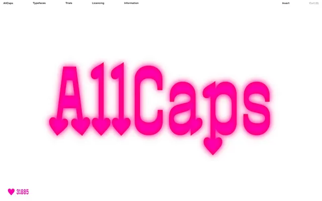
Preview image. Unlock full-res
Typographic Playground, Neon Pop
Color palette
Red outline accent for tags, dividers, and focused UI edges. Do not promote it to the primary CTA color
Pink wash for highlight backgrounds, decorative bands, and soft emphasis behind content
Page backgrounds, input backgrounds
Neutral form states, badge text, and quiet UI feedback where color should stay understated. Do not promote it to the primary CTA color
Typography
- Weights
- 400, 475
- Sizes
- 12px, 16px
- Line height
- 1.15, 1.22
- Letter spacing
- -0.01em at 12px, -0.013em at 16px
- Fallback
- Montserrat
Primary typeface for all UI text, headings, and body content. Its custom nature and varying letter-spacing contribute to the unique typographic voice.
- Weights
- 400
- Sizes
- 32px, 432px
- Line height
- 0.75, 1.15
- Letter spacing
- normal
- Fallback
- Pacifico
Decorative display font for large, brand-specific statements, creating a playful, emphatic effect.
Spacing & shape
Components
Transparent background, Ink Black text, no borders or padding directly on the element itself, giving a 'ghost' appearance. Radius of 0px.
Transparent background, no border, no shadow, and 0px padding. Text is Ink Black from MG ALLCAPS, showcasing different weights and styles. Vertical gap between items is 14px. No specific radius.
Small, functional tags with Neon Violet background and Canvas White text, featuring a 3.33333px border radius. Padding of 2px top/bottom and 7px left/right.
Small button with Neon Violet background (#e508ff), Canvas White text (#ffffff). No distinct padding/radius specified on the button itself, often appears directly adjacent to text.
Canvas White background, Ink Black text. Borders are present but often subtle or contextually defined. Top and bottom padding of 4px. Radius is 0px.
Guidelines
- Always use Ink Black (#000000) for all text and UI outlines unless explicitly specified as an accent.
- Utilize Canvas White (#ffffff) as the dominant background color for all pages and components to maintain a stark, high-contrast look.
- Apply Action Fuchsia (#ff003c) sparingly for decorative elements or specific highlight borders to draw attention.
- Employ Neon Violet (#e508ff) for background accents on small components like tags, ensuring high contrast with Canvas White text.
- Keep all component borders and radii at 0px by default, except for specific tags which use 3.33333px.
- Maintain a compact density with an element gap of 7px and section gap of 29px.
- Leverage the MG ALLCAPS font for all primary text content, using its variable weight and letter-spacing for typographic expression.
- Avoid using multiple colors for text or borders; maintain the strict Ink Black and Canvas White contrast.
- Do not introduce shadows or complex elevation; the system is characteristically flat.
- Do not use generic system fonts; MG ALLCAPS and Bandit Luv are essential for brand identity.
- Refrain from adding decorative gradients or elaborate backgrounds; stick to solid colors.
- Do not introduce inconsistent padding on buttons or cards; maintain 0px padding and 0px radius for most interactive elements.
- Avoid breaking line height relationships, particularly with MG ALLCAPS, to preserve the intended typographic density.
About this system
ShowHide
AllCaps is a stark, high-contrast system where typography takes center stage, often acting as the primary visual element. It uses pure white canvases and deep black text, punctuated by bold, almost neon, fuchsia and an unexpected violet. This creates an energetic and unconventional aesthetic focused on typographic expression rather than complex layouts or decorative elements. Surfaces are flat, and interactions are minimal, emphasizing direct visual communication.
Reminiscent of Future Fonts, OHNO Type Co., Pangram Pangram Foundry, Grilli Type.
# AllCaps — Style Reference
> Typographic Playground, Neon Pop

**Theme:** light

**Site:** https://www.allcapstype.com

AllCaps is a stark, high-contrast system where typography takes center stage, often acting as the primary visual element. It uses pure white canvases and deep black text, punctuated by bold, almost neon, fuchsia and an unexpected violet. This creates an energetic and unconventional aesthetic focused on typographic expression rather than complex layouts or decorative elements. Surfaces are flat, and interactions are minimal, emphasizing direct visual communication.

## Tokens — Colors

| Name | Value | Token | Role |
|------|------|------|------|
| Action Fuchsia | `#ff003c` | `--color-action-fuchsia` | Red outline accent for tags, dividers, and focused UI edges. Do not promote it to the primary CTA color |
| Neon Violet | `#e508ff` | `--color-neon-violet` | Pink wash for highlight backgrounds, decorative bands, and soft emphasis behind content |
| Canvas White | `#ffffff` | `--color-canvas-white` | Page backgrounds, input backgrounds |
| Ink Black | `#000000` | `--color-ink-black` | Neutral form states, badge text, and quiet UI feedback where color should stay understated. Do not promote it to the primary CTA color |

## Tokens — Typography

### MG ALLCAPS
- **Substitute:** Montserrat
- **Weights:** 400, 475
- **Sizes:** 12px, 16px
- **Line height:** 1.15, 1.22
- **Letter spacing:** -0.01em at 12px, -0.013em at 16px
- **Role:** Primary typeface for all UI text, headings, and body content. Its custom nature and varying letter-spacing contribute to the unique typographic voice.

### Bandit Luv
- **Substitute:** Pacifico
- **Weights:** 400
- **Sizes:** 32px, 432px
- **Line height:** 0.75, 1.15
- **Letter spacing:** normal
- **Role:** Decorative display font for large, brand-specific statements, creating a playful, emphatic effect.

## Tokens — Spacing

- **Section gap:** 29px
- **Card padding:** 0px
- **Element gap:** 7px

## Tokens — Radius

- **Default:** 0px
- **special:** 16px
- **tags:** 3.33333px

## Components

### Ghost Button
*Interactive elements for navigation and secondary actions.*

Transparent background, Ink Black text, no borders or padding directly on the element itself, giving a 'ghost' appearance. Radius of 0px.

### Font Specimen Card
*Display individual typeface styles.*

Transparent background, no border, no shadow, and 0px padding. Text is Ink Black from MG ALLCAPS, showcasing different weights and styles. Vertical gap between items is 14px. No specific radius.

### Style Tag
*Indicate available styles or status.*

Small, functional tags with Neon Violet background and Canvas White text, featuring a 3.33333px border radius. Padding of 2px top/bottom and 7px left/right.

### Purchase Callout Badge
*Small, immediately visible purchase link within a product listing.*

Small button with Neon Violet background (#e508ff), Canvas White text (#ffffff). No distinct padding/radius specified on the button itself, often appears directly adjacent to text.

### Minimal Input Field
*User input for forms.*

Canvas White background, Ink Black text. Borders are present but often subtle or contextually defined. Top and bottom padding of 4px. Radius is 0px.

## Guidelines

### Do

- Always use Ink Black (#000000) for all text and UI outlines unless explicitly specified as an accent.
- Utilize Canvas White (#ffffff) as the dominant background color for all pages and components to maintain a stark, high-contrast look.
- Apply Action Fuchsia (#ff003c) sparingly for decorative elements or specific highlight borders to draw attention.
- Employ Neon Violet (#e508ff) for background accents on small components like tags, ensuring high contrast with Canvas White text.
- Keep all component borders and radii at 0px by default, except for specific tags which use 3.33333px.
- Maintain a compact density with an element gap of 7px and section gap of 29px.
- Leverage the MG ALLCAPS font for all primary text content, using its variable weight and letter-spacing for typographic expression.

### Don't

- Avoid using multiple colors for text or borders; maintain the strict Ink Black and Canvas White contrast.
- Do not introduce shadows or complex elevation; the system is characteristically flat.
- Do not use generic system fonts; MG ALLCAPS and Bandit Luv are essential for brand identity.
- Refrain from adding decorative gradients or elaborate backgrounds; stick to solid colors.
- Do not introduce inconsistent padding on buttons or cards; maintain 0px padding and 0px radius for most interactive elements.
- Avoid breaking line height relationships, particularly with MG ALLCAPS, to preserve the intended typographic density.

## Agent Prompt Guide

Quick Color Reference:
text: #000000
background: #ffffff
border: #000000
accent: #ff003c
primary action: no distinct CTA color

Example Component Prompts:
1. Create a header navigation item: 'Typefaces' text in MG ALLCAPS, weight 400, size 16px, line height 1.22, letter-spacing -0.013em, color #000000. No background, no border, 0px radius.
2. Design a simple text input: Canvas White background (#ffffff), Ink Black text (#000000), 4px padding-top and padding-bottom, 0px border-radius, 1px solid Ink Black border.
3. Create a 'Buy' tag: Neon Violet background (#e508ff), Canvas White text (#ffffff), 3.33333px border-radius, 2px vertical padding, 7px horizontal padding. Text in MG ALLCAPS, weight 400, size 12px.
4. Design a large brand title: 'A11Caps' in Bandit Luv, weight 400, size 432px, line height 0.75, color #ff003c. Place on a Canvas White (#ffffff) background.
More like this









Keep what you find
A free account saves references to boards and can send you a weekly email of picks based on what you save.
To see every result, go Pro.