Preview image. Unlock full-res
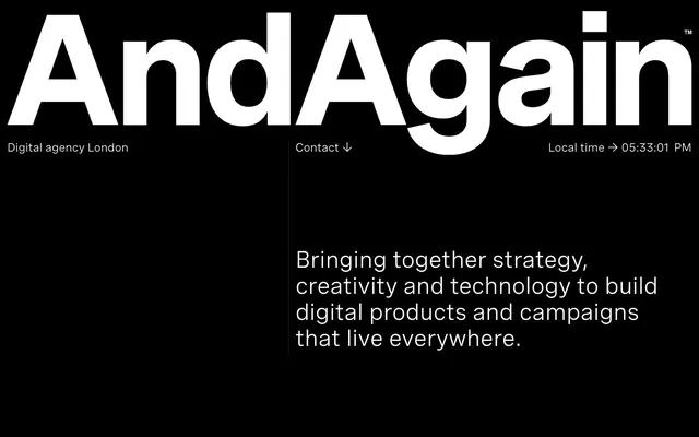
High-contrast digital canvas – a monochrome composition where every element stands out with graphic precision.
Color palette
Primary page background, text color in specific contexts (like inverted hero sections) — foundational for high contrast.
Primary text color, link text, button text, icon fills — creates sharp contrast against Absolute Black.
Secondary text, descriptive body copy, contextual information — provides a softer alternative to Pure White.
Typography
- Weights
- 400
- Sizes
- 24px, 48px
- Line height
- 1.13, 1.31
- Letter spacing
- normal
- Fallback
- Inter
All textual content, from headings and body copy to links and buttons. The single weight and specific sizes contribute to a strong, unified typographic voice that avoids visual complexity.
Spacing & shape
Components
Rendered in Pure White (#ffffff) using Spezia 400. No underline by default; interactivity implied by cursor change.
Displayed in Pure White (#ffffff) or Charcoal Gray (#747474) with Spezia 400, typically at 24px with 1.13 line height or similar.
Set in Pure White (#ffffff) with Spezia 400 at 48px with 1.31 line height, occupying significant visual space.
Defined by a 0px border-radius, 0px padding, Pure White (#ffffff) text and border. Background is transparent (rgba(0,0,0,0)). The 'Contact ↓' button is an example.
Rendered in Charcoal Gray (#747474) using Spezia 400, often at a smaller implied size, providing context without visual dominance.
Guidelines
- Prioritize a strict monochrome palette of Absolute Black (#000000) and Pure White (#ffffff) for primary elements, with Charcoal Gray (#747474) as a secondary accent.
- Utilize Spezia 400 as the sole typeface across all elements, maintaining a unified visual language.
- Employ generous vertical spacing, defaulting to a section gap of 188px, to create clear hierarchy and visual breathing room.
- Maintain a sharp, unrounded aesthetic by setting all component radii to 0px.
- Ensure all interactive elements, including ghost buttons and links, are rendered in Pure White (#ffffff) on Absolute Black (#000000) backgrounds.
- Use 24px and 48px from the typographic scale with their respective line heights (1.13 and 1.31) for consistent text sizing.
- Avoid the introduction of any chromatic colors; maintain the strictly achromatic theme.
- Do not deviate from the Spezia font family or its specified weight of 400 for any text.
- Refrain from using any rounded corners or soft shapes across the interface.
- Do not use subtle variations in gray for backgrounds; stick to the absolute contrast of #000000 and #ffffff.
- Avoid adding box shadows or elevation effects, as the design relies on flat, high-contrast layers for depth.
- Do not implement traditional button styles with solid backgrounds; favor ghost buttons or simple text links.
About this system
ShowHide
This design system presents as a stark, high-contrast monochrome environment, prioritizing sharp visual clarity and directness. The absolute black page background against crisp white typography defines its strong, almost severe, aesthetic. Information density is managed through precise typographic hierarchy and generous spacing, allowing the bold visual statements to breathe. The overall impression is one of confident, minimalist authority.
The layout is characterized by a full-bleed, edge-to-edge dark background, predominantly Absolute Black. The page content is largely left-aligned, with a clear global header that maintains a minimal text-based navigation. Sections within the page are separated by significant vertical spacing, like the 188px section gap, creating distinct content blocks. The primary content arrangement uses a top-down information hierarchy, with large headlines followed by descriptive text. Product or project showcases often feature large, centrally-presented framed visuals accompanied by minimal text, creating a strong focal point. The page does not appear to utilize a fixed maximum width for its content, allowing elements to occupy the full browser width, but sections are carefully composed to avoid horizontal sprawl.
This site features a dual approach to imagery. The initial hero section is purely typographic, relying on the stark contrast of large white text on black. Subsequent sections, particularly product showcases, use highly stylized 3D renders or product shots that feel integrated into a digital experience or interface. These visuals are typically contained within rectangular frames, sometimes with a slight 'device screen' aesthetic and a subtle outer glow or border effect, as seen in the Adidas example. The imagery serves to demonstrate technical capability and creative output, rather than provide decorative atmosphere, with a focus on product or experience showcase. Icons, when present, are mono-color and minimalistic, aligning with the overall sharp, unadorned aesthetic.
Reminiscent of Akin, Build in Amsterdam, Dogstudio, Hello Monday.
# AndAgain — Style Reference
> High-contrast digital canvas – a monochrome composition where every element stands out with graphic precision.

**Theme:** dark

**Site:** https://andagain.uk

This design system presents as a stark, high-contrast monochrome environment, prioritizing sharp visual clarity and directness. The absolute black page background against crisp white typography defines its strong, almost severe, aesthetic. Information density is managed through precise typographic hierarchy and generous spacing, allowing the bold visual statements to breathe. The overall impression is one of confident, minimalist authority.

## Tokens — Colors

| Name | Value | Token | Role |
|------|------|------|------|
| Absolute Black | `#000000` | `--color-absolute-black` | Primary page background, text color in specific contexts (like inverted hero sections) — foundational for high contrast. |
| Pure White | `#ffffff` | `--color-pure-white` | Primary text color, link text, button text, icon fills — creates sharp contrast against Absolute Black. |
| Charcoal Gray | `#747474` | `--color-charcoal-gray` | Secondary text, descriptive body copy, contextual information — provides a softer alternative to Pure White. |

## Tokens — Typography

### Spezia
- **Substitute:** Inter
- **Weights:** 400
- **Sizes:** 24px, 48px
- **Line height:** 1.13, 1.31
- **Letter spacing:** normal
- **Role:** All textual content, from headings and body copy to links and buttons. The single weight and specific sizes contribute to a strong, unified typographic voice that avoids visual complexity.

## Tokens — Type Scale

| Role | Size | Line height | Letter spacing |
|------|------|------|------|
| body | 24px | 1.13 | — |
| display | 48px | 1.31 | — |

## Tokens — Spacing

- **Section gap:** 188px
- **Element gap:** 28px

## Tokens — Radius

- **all:** 0px

## Layout

The layout is characterized by a full-bleed, edge-to-edge dark background, predominantly Absolute Black. The page content is largely left-aligned, with a clear global header that maintains a minimal text-based navigation. Sections within the page are separated by significant vertical spacing, like the 188px section gap, creating distinct content blocks. The primary content arrangement uses a top-down information hierarchy, with large headlines followed by descriptive text. Product or project showcases often feature large, centrally-presented framed visuals accompanied by minimal text, creating a strong focal point. The page does not appear to utilize a fixed maximum width for its content, allowing elements to occupy the full browser width, but sections are carefully composed to avoid horizontal sprawl.

## Imagery

This site features a dual approach to imagery. The initial hero section is purely typographic, relying on the stark contrast of large white text on black. Subsequent sections, particularly product showcases, use highly stylized 3D renders or product shots that feel integrated into a digital experience or interface. These visuals are typically contained within rectangular frames, sometimes with a slight 'device screen' aesthetic and a subtle outer glow or border effect, as seen in the Adidas example. The imagery serves to demonstrate technical capability and creative output, rather than provide decorative atmosphere, with a focus on product or experience showcase. Icons, when present, are mono-color and minimalistic, aligning with the overall sharp, unadorned aesthetic.

## Components

### Site Header Bar

### Agency Tagline Block

### Project Showcase Card

### Text Link
*Interactive navigation and calls to action.*

Rendered in Pure White (#ffffff) using Spezia 400. No underline by default; interactivity implied by cursor change.

### Body Text
*Standard informational content.*

Displayed in Pure White (#ffffff) or Charcoal Gray (#747474) with Spezia 400, typically at 24px with 1.13 line height or similar.

### Headline Text
*Primary page titles and section headers.*

Set in Pure White (#ffffff) with Spezia 400 at 48px with 1.31 line height, occupying significant visual space.

### Ghost Button
*Outlined, minimal interactive elements.*

Defined by a 0px border-radius, 0px padding, Pure White (#ffffff) text and border. Background is transparent (rgba(0,0,0,0)). The 'Contact ↓' button is an example.

### Metadata Text
*Contextual, smaller information like location or time.*

Rendered in Charcoal Gray (#747474) using Spezia 400, often at a smaller implied size, providing context without visual dominance.

## Guidelines

### Do

- Prioritize a strict monochrome palette of Absolute Black (#000000) and Pure White (#ffffff) for primary elements, with Charcoal Gray (#747474) as a secondary accent.
- Utilize Spezia 400 as the sole typeface across all elements, maintaining a unified visual language.
- Employ generous vertical spacing, defaulting to a section gap of 188px, to create clear hierarchy and visual breathing room.
- Maintain a sharp, unrounded aesthetic by setting all component radii to 0px.
- Ensure all interactive elements, including ghost buttons and links, are rendered in Pure White (#ffffff) on Absolute Black (#000000) backgrounds.
- Use 24px and 48px from the typographic scale with their respective line heights (1.13 and 1.31) for consistent text sizing.

### Don't

- Avoid the introduction of any chromatic colors; maintain the strictly achromatic theme.
- Do not deviate from the Spezia font family or its specified weight of 400 for any text.
- Refrain from using any rounded corners or soft shapes across the interface.
- Do not use subtle variations in gray for backgrounds; stick to the absolute contrast of #000000 and #ffffff.
- Avoid adding box shadows or elevation effects, as the design relies on flat, high-contrast layers for depth.
- Do not implement traditional button styles with solid backgrounds; favor ghost buttons or simple text links.

## Agent Prompt Guide

- Generate a ghost button for 'Contact ↓': Text in Pure White (#ffffff), Spezia 400. Transparent background (rgba(0,0,0,0)). 0px border-radius. No padding for visual space.
More like this









Keep what you find
A free account saves references to boards and can send you a weekly email of picks based on what you save.
To see every result, go Pro.