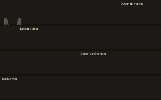
Preview image. Unlock full-res
Sepia-toned literary journal
Color palette
Primary text color across all elements (headings, body, links, buttons) and interactive states, providing consistent legibility against Inkwell.
Accent for section backgrounds, creating visual distinction and warmth on specific content blocks.
Page background, primary dark accent for borders and lines, creating a deep, resonant base.
Secondary text for subtle detail and supporting information, also used for border accents.
Typography
- Weights
- 400
- Sizes
- 15px, 16px, 26px, 30px, 58px, 115px, 225px, 317px
- Line height
- 0.95, 1, 1.2, 1.5
- Letter spacing
- normal
- Fallback
- Inter
Primary typeface for all content, from subtle body text (15-16px) to monumental display headings (317px). The consistent weight 400 across all sizes maintains a grounded, approachable feel, while the generous display sizes are treated as graphic elements.
Spacing & shape
Components
Text in Parchment Cream (#eee9cc) on Inkwell background. Hover state or active state indicated by a subtle line under the text with a 40px radius. No specific padding detected, relies on typographic spacing.
Background #eee9cc with text in Parchment Cream (#eee9cc), effectively rendering the text invisible unless the background changes color. Used for specific, subtle interactive states on menu items with a 50% border radius creating small, circular indicators.
Transparent background with no border radius or box shadow, integrating seamlessly into the page background. Text in Parchment Cream (#eee9cc). Padding is dynamic, but typically features 12px vertical padding.
Transparent background, text in Parchment Cream (#eee9cc), with no border radius, blending with content flow rather than standing out as a distinct button.
A thin line at 1px height, rendered in Parchment Cream (#eee9cc) or Antique Ivory (#cecab1), providing a subtle structural break without harshness.
Guidelines
- Do use Inkwell (#1e1915) as the primary background for most sections to maintain a deep, rich canvas.
- Do apply Parchment Cream (#eee9cc) for all primary text elements, including headings, body copy, and interactive text, for maximum legibility and brand consistency.
- Do leverage PP Neue Montreal weight 400 exclusively across all type sizes to maintain a consistent tone.
- Do treat headlines at 115px and above as graphic elements, paying attention to their visual form and unkerned character.
- Do apply 0px border radius to most UI elements and cards, relying on subtle line dividers for structure.
- Do use Burnt Umber (#674825) sparingly as a warm background accent for specific, distinct content blocks.
- Don't introduce additional font weights or families; PP Neue Montreal 400 is the only typeface.
- Don't use pronounced box shadows or elevation; the design relies on color and line for depth.
- Don't use full-color images or illustrations; opt for monochromatic visuals that match the sepia-toned aesthetic.
- Don't use vibrant or contrasting accent colors; stick to the Parchment Cream, Antique Ivory, and Burnt Umber palette.
- Don't override the default letter spacing; typography is designed to appear natural and unkerned.
- Don't use standard button styles; interactive elements are subtly indicated with text color changes, underlines, or minimal circular active states, not framed buttons.
About this system
ShowHide
This design system evokes a sense of refined, vintage elegance, akin to a printed book or an aged manuscript. The dominant dark, almost sepia, background paired with the warm, creamy text creates a soft, legible contrast that feels intimate and sophisticated. Large, unkerned typography becomes a primary visual element, treated as a graphic form rather than just text, emphasizing the 'artisan' nature of the brand. Minimalist lines and a near-absence of modern UI elements contribute to a timeless aesthetic where content is paramount.
The layout is primarily full-bleed dark with content centered or left-aligned within implicit columns, lacking a strong max-width constraint for main sections. The hero section features a monumental, graphically treated headline (317px, 225px) that dominates the screen. Navigation is a fixed top bar. Content is presented in vertical sections separated by subtle horizontal lines, often with a two-column implied grid for text-heavy content or listings. There is a consistent vertical rhythm driven by 'sectionGap' at 60px, creating ample breathing room, occasionally broken by dense table-like structures. The overall impression is spacious and text-dominant.
The site uses minimal imagery, primarily relying on typography as a visual element. When images are present (not directly observed in provided assets, but inferred by contextual clues from 'Artisan graphiste'), they are likely treated with a desaturated or monochrome filter to blend with the sepia-toned aesthetic, keeping focus on the UI and text. Icons, if present (e.g., in navigation), appear as simple, monochrome outlines, maintaining the understated elegance of the design.
Reminiscent of AIGA Journal, Certain niche art portfolios, Independent literary press websites, Early 2000s minimalist web design revival.
# Maëlan Le Meur — Style Reference
> Sepia-toned literary journal

**Theme:** dark

**Site:** https://maelanlemeur.com

This design system evokes a sense of refined, vintage elegance, akin to a printed book or an aged manuscript. The dominant dark, almost sepia, background paired with the warm, creamy text creates a soft, legible contrast that feels intimate and sophisticated. Large, unkerned typography becomes a primary visual element, treated as a graphic form rather than just text, emphasizing the 'artisan' nature of the brand. Minimalist lines and a near-absence of modern UI elements contribute to a timeless aesthetic where content is paramount.

## Tokens — Colors

| Name | Value | Token | Role |
|------|------|------|------|
| Parchment Cream | `#eee9cc` | `--color-parchment-cream` | Primary text color across all elements (headings, body, links, buttons) and interactive states, providing consistent legibility against Inkwell. |
| Burnt Umber | `#674825` | `--color-burnt-umber` | Accent for section backgrounds, creating visual distinction and warmth on specific content blocks. |
| Inkwell | `#1e1915` | `--color-inkwell` | Page background, primary dark accent for borders and lines, creating a deep, resonant base. |
| Antique Ivory | `#cecab1` | `--color-antique-ivory` | Secondary text for subtle detail and supporting information, also used for border accents. |

## Tokens — Typography

### PP Neue Montreal
- **Substitute:** Inter
- **Weights:** 400
- **Sizes:** 15px, 16px, 26px, 30px, 58px, 115px, 225px, 317px
- **Line height:** 0.95, 1, 1.2, 1.5
- **Letter spacing:** normal
- **Role:** Primary typeface for all content, from subtle body text (15-16px) to monumental display headings (317px). The consistent weight 400 across all sizes maintains a grounded, approachable feel, while the generous display sizes are treated as graphic elements.

## Tokens — Type Scale

| Role | Size | Line height | Letter spacing |
|------|------|------|------|
| caption | 15px | 1.5 | — |
| subheading | 26px | 1.2 | — |
| heading | 30px | 1.2 | — |
| heading-lg | 58px | 0.95 | — |
| display | 115px | 0.95 | — |
| display-lg | 225px | 0.95 | — |
| display-xl | 317px | 0.95 | — |

## Tokens — Spacing

- **Section gap:** 60px
- **Card padding:** 0px
- **Element gap:** 10-20px

## Tokens — Radius

- **Default:** 0px
- **links:** 40px

## Layout

The layout is primarily full-bleed dark with content centered or left-aligned within implicit columns, lacking a strong max-width constraint for main sections. The hero section features a monumental, graphically treated headline (317px, 225px) that dominates the screen. Navigation is a fixed top bar. Content is presented in vertical sections separated by subtle horizontal lines, often with a two-column implied grid for text-heavy content or listings. There is a consistent vertical rhythm driven by 'sectionGap' at 60px, creating ample breathing room, occasionally broken by dense table-like structures. The overall impression is spacious and text-dominant.

## Imagery

The site uses minimal imagery, primarily relying on typography as a visual element. When images are present (not directly observed in provided assets, but inferred by contextual clues from 'Artisan graphiste'), they are likely treated with a desaturated or monochrome filter to blend with the sepia-toned aesthetic, keeping focus on the UI and text. Icons, if present (e.g., in navigation), appear as simple, monochrome outlines, maintaining the understated elegance of the design.

## Components

### Services Category List

### Réalisations Project Table

### Hero Statement Block

### Navigation Link
*Interactive element (e.g. 'V', 'o', 'u', 's' in nav)*

Text in Parchment Cream (#eee9cc) on Inkwell background. Hover state or active state indicated by a subtle line under the text with a 40px radius. No specific padding detected, relies on typographic spacing.

### Menu Item Highlight Button
*Highlighting a currently selected menu item.*

Background #eee9cc with text in Parchment Cream (#eee9cc), effectively rendering the text invisible unless the background changes color. Used for specific, subtle interactive states on menu items with a 50% border radius creating small, circular indicators.

### Content Card/Grid Item
*Structural container for content listings (e.g., 'Quentin Hocdé', 'LCDC' entries).*

Transparent background with no border radius or box shadow, integrating seamlessly into the page background. Text in Parchment Cream (#eee9cc). Padding is dynamic, but typically features 12px vertical padding.

### Badge/Tag Default
*Descriptive labels.*

Transparent background, text in Parchment Cream (#eee9cc), with no border radius, blending with content flow rather than standing out as a distinct button.

### Horizontal Divider Line
*Visual separation of content sections.*

A thin line at 1px height, rendered in Parchment Cream (#eee9cc) or Antique Ivory (#cecab1), providing a subtle structural break without harshness.

## Guidelines

### Do

- Do use Inkwell (#1e1915) as the primary background for most sections to maintain a deep, rich canvas.
- Do apply Parchment Cream (#eee9cc) for all primary text elements, including headings, body copy, and interactive text, for maximum legibility and brand consistency.
- Do leverage PP Neue Montreal weight 400 exclusively across all type sizes to maintain a consistent tone.
- Do treat headlines at 115px and above as graphic elements, paying attention to their visual form and unkerned character.
- Do apply 0px border radius to most UI elements and cards, relying on subtle line dividers for structure.
- Do use Burnt Umber (#674825) sparingly as a warm background accent for specific, distinct content blocks.

### Don't

- Don't introduce additional font weights or families; PP Neue Montreal 400 is the only typeface.
- Don't use pronounced box shadows or elevation; the design relies on color and line for depth.
- Don't use full-color images or illustrations; opt for monochromatic visuals that match the sepia-toned aesthetic.
- Don't use vibrant or contrasting accent colors; stick to the Parchment Cream, Antique Ivory, and Burnt Umber palette.
- Don't override the default letter spacing; typography is designed to appear natural and unkerned.
- Don't use standard button styles; interactive elements are subtly indicated with text color changes, underlines, or minimal circular active states, not framed buttons.

## Agent Prompt Guide

### Quick Color Reference
- Text: #eee9cc
- Background: #1e1915
- Section Accent Background: #674825
- Line/Border: #cecab1

### Example Component Prompts
1. Create a Hero Section: Background #1e1915. Centered headline 'Je construis des images' in PP Neue Montreal, weight 400, size 317px, line-height 0.95, color #eee9cc. Below it, a subtle dividing line 1px thick, color #cecab1, spanning 60% width.
2. Design a Navigation Bar: Fixed at top. Background #1e1915. Links 'Maëlan', 'Vous', 'Réalisations', 'Écrivez-moi' in PP Neue Montreal, weight 400, size 15px, line-height 1.5, color #eee9cc. Space links with 10px `elementGap` horizontally.
3. Implement a Project Listing Section: Background #674825. Heading 'Réalisations' centered, PP Neue Montreal, weight 400, size 115px, line-height 0.95, color #eee9cc. Below, a table-like list: Project Name like 'Quentin Hocdé' (PP Neue Montreal, 16px, weight 400, #eee9cc) on left, Description like 'Développeur créatif' (PP Neue Montreal, 16px, weight 400, #eee9cc) in center, Date '2023' (PP Neue Montreal, 16px, weight 400, #eee9cc) on right. Each row separated by a 1px line in #cecab1.
More like this








Keep what you find
A free account saves references to boards and can send you a weekly email of picks based on what you save.
To see every result, go Pro.