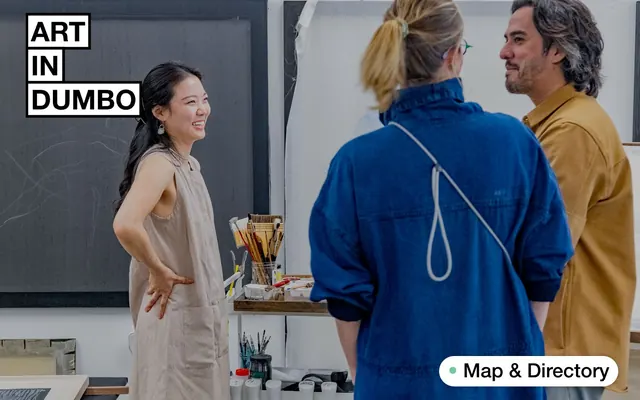
Preview image. Unlock full-res
Gallery Guidebook
Color palette
Green action color for filled buttons, selected navigation states, and focused conversion moments
Orange outline accent for tags, dividers, and focused UI edges.
Primary text, borders, iconography
Page backgrounds, card surfaces, ghost button fills
Subtle section backgrounds, alternate large surface base
Input field backgrounds, subtle hover states, tertiary surfaces
Muted text, faint borders, secondary headings
Medium-contrast borders, control outlines, and structural separators. Do not promote it to the primary CTA color
Subtle shadow color for elevation
Typography
- Weights
- 500
- Sizes
- 10px, 11px, 16px, 19px, 22px, 27px, 28px, 30px, 34px, 37px, 44px, 63px, 68px
- Line height
- 1, 1.05, 1.08, 1.09, 1.1, 1.15, 1.2, 1.27, 1.4, 1.5, 1.8
- Letter spacing
- normal
- Fallback
- Arial, Helvetica, sans-serif
Primary typeface for all content elements, headings, body text, and UI controls. Its single medium weight (500) contributes to the direct, no-nonsense tone, avoiding common typographic hierarchies that rely on extreme weight differences.
- Weights
- 400, 500
- Sizes
- 10px, 11px
- Line height
- 1.2, 1.4
- Letter spacing
- normal
- Fallback
- system-ui, sans-serif
Used for smaller utility text such as button labels or secondary information where a slightly less formal feel is acceptable.
Spacing & shape
Elevation
Components
Background: transparent, Text: Inkwell (#000000), Border: none, Radius: 0px, Padding: 0px.
Background: Canvas White (#ffffff), Text: Inkwell (#000000), Border: none, Radius: 0px, Padding: 0px.
Background: Canvas White (#ffffff), Text: Inkwell (#000000), Border: none, Radius: 50% (circular), Padding: 0px.
Background: Beacon Green (#71cc98), Text: Inkwell (#000000), Border: none, Radius: 2px, Padding: 0px. Used for 'Map & Directory'.
Background: transparent, Radius: 0px, No box shadow, Padding: 47px top, 20px right, 20px bottom, 20px left.
Background: Beacon Green (#71cc98), Radius: 50px, No box shadow, Padding: 0px.
Background: Gallery Orange (#ff7f41), Radius: 50px, No box shadow, Padding: 0px.
Background: Whisper Gray (#f1f2f2), Text: Inkwell (#000000), Border: Inkwell (#000000), Radius: 2px, Padding: 14.5px vertical, 29px left, 0px right. No placeholder style detected.
Guidelines
- Always use the Helvetica N typeface at weight 500 for all primary content, headlines, and UI elements to maintain a consistent editorial voice.
- Utilize Canvas White (#ffffff) as the default background for most content and Inkwell (#000000) for all primary text to ensure high contrast and readability.
- Apply Gallery Orange (#ff7f41) sparingly as a functional highlight for critical information or states like 'Closing Soon'.
- Employ Beacon Green (#71cc98) specifically for primary action buttons, such as 'Map & Directory', to guide user interaction.
- Maintain sharp, 0px border radii for general content cards and layout blocks to reinforce the graphic, editorial aesthetic.
- Use a minimum element spacing of 20px and a section gap of 144px to create a comfortable, uncluttered reading experience.
- Prefer text-only or ghost button styles over filled buttons, unless explicitly using Beacon Green for a primary call to action.
- Avoid using multiple font weights within a single typographic element; Helvetica N 500 is sufficient for most hierarchical needs.
- Do not introduce additional saturated colors beyond Gallery Orange (#ff7f41) and Beacon Green (#71cc98) without specific functional justification.
- Never add significant box shadows or decorative gradients to interface elements, as the design prioritizes flat surfaces.
- Resist rounding corners on cards or major content blocks, reserving the 50px radius exclusively for specific accent cards and pill-shaped utilities.
- Do not use generic gray buttons or actions where a clear Beacon Green (#71cc98) action is needed; primary actions should stand out.
- Avoid dense or cluttered layouts; maintain ample whitespace and comfortable element spacing like 20px to ensure content breathability.
- Do not use subtle or low-contrast text colors for essential information; Inkwell (#000000) and Canvas White (#ffffff) are fundamental to readability.
About this system
ShowHide
Art In DUMBO employs a high-contrast, text-dominant aesthetic that prioritizes content display with minimal visual adornment. Typography is bold and direct, setting a clear, editorial tone. A singular, vivid orange serves as a powerful accent color, appearing primarily in functional contexts, while an accompanying soft green provides a secondary, grounding chromatic element. The design favors sharp edges and flat surfaces, maintaining a clear separation between content blocks.
The page primarily uses a max-width contained layout, with content centered. The hero section often features a full-bleed photographic background with the brand name as a prominent overlay. Section rhythm is driven by distinct content blocks, with some alternating background colors (Canvas White #ffffff and Fog #e5e3df) to delineate sections. Content is often presented in a clear, single-column stack, but also utilizes list-like structures and two-column layouts for event or exhibition details. Navigation is a simple top bar, with a prominent 'Map & Directory' button fixed to the bottom right of the viewport.
The site uses a mix of high-quality, candid photography featuring people in art-related settings, like studios or galleries. Images are treated naturally, with realistic lighting and color, serving to establish a welcoming atmosphere rather than as product showcases. Iconic typography ('ART IN DUMBO') is boxed in white against some imagery, functioning as a brand overlay. There is limited use of simple, descriptive icons, which appear as filled monochromatic shapes (Inkwell #000000) or outlined elements.
Reminiscent of AIGA (American Institute of Graphic Arts), The Shed, Artsy, MOMA (Museum of Modern Art).
# Art In DUMBO — Style Reference
> Gallery Guidebook

**Theme:** light

**Site:** https://artindumbo.com

Art In DUMBO employs a high-contrast, text-dominant aesthetic that prioritizes content display with minimal visual adornment. Typography is bold and direct, setting a clear, editorial tone. A singular, vivid orange serves as a powerful accent color, appearing primarily in functional contexts, while an accompanying soft green provides a secondary, grounding chromatic element. The design favors sharp edges and flat surfaces, maintaining a clear separation between content blocks.

## Tokens — Colors

| Name | Value | Token | Role |
|------|------|------|------|
| Beacon Green | `#71cc98` | `--color-beacon-green` | Green action color for filled buttons, selected navigation states, and focused conversion moments |
| Gallery Orange | `#ff7f41` | `--color-gallery-orange` | Orange outline accent for tags, dividers, and focused UI edges. |
| Inkwell | `#000000` | `--color-inkwell` | Primary text, borders, iconography |
| Canvas White | `#ffffff` | `--color-canvas-white` | Page backgrounds, card surfaces, ghost button fills |
| Fog | `#e5e3df` | `--color-fog` | Subtle section backgrounds, alternate large surface base |
| Whisper Gray | `#f1f2f2` | `--color-whisper-gray` | Input field backgrounds, subtle hover states, tertiary surfaces |
| Driftwood | `#bdbdbd` | `--color-driftwood` | Muted text, faint borders, secondary headings |
| Charcoal Accent | `#828282` | `--color-charcoal-accent` | Medium-contrast borders, control outlines, and structural separators. Do not promote it to the primary CTA color |
| Shadow Tint | `#b3b3b3` | `--color-shadow-tint` | Subtle shadow color for elevation |

## Tokens — Typography

### Helvetica N
- **Substitute:** Arial, Helvetica, sans-serif
- **Weights:** 500
- **Sizes:** 10px, 11px, 16px, 19px, 22px, 27px, 28px, 30px, 34px, 37px, 44px, 63px, 68px
- **Line height:** 1, 1.05, 1.08, 1.09, 1.1, 1.15, 1.2, 1.27, 1.4, 1.5, 1.8
- **Letter spacing:** normal
- **Role:** Primary typeface for all content elements, headings, body text, and UI controls. Its single medium weight (500) contributes to the direct, no-nonsense tone, avoiding common typographic hierarchies that rely on extreme weight differences.

### Roboto
- **Substitute:** system-ui, sans-serif
- **Weights:** 400, 500
- **Sizes:** 10px, 11px
- **Line height:** 1.2, 1.4
- **Letter spacing:** normal
- **Role:** Used for smaller utility text such as button labels or secondary information where a slightly less formal feel is acceptable.

## Tokens — Type Scale

| Role | Size | Line height | Letter spacing |
|------|------|------|------|
| caption | 10px | 1.4 | — |
| body | 16px | 1.2 | — |
| subheading | 19px | 1.2 | — |
| heading-sm | 22px | 1.15 | — |
| heading | 27px | 1.09 | — |
| heading-lg | 30px | 1.08 | — |
| display | 68px | 1 | — |

## Tokens — Spacing

- **Section gap:** 144px
- **Card padding:** 20px
- **Element gap:** 20px

## Tokens — Radius

- **Default:** 2px
- **Buttons:** 2px
- **Inputs:** 2px
- **pill:** 50px

## Tokens — Elevation

- **Button:** `rgba(0, 0, 0, 0.25) 0px 0px 10px 0px`
- **Button (subtle):** `rgba(0, 0, 0, 0.3) 0px 1px 4px -1px`

## Layout

The page primarily uses a max-width contained layout, with content centered. The hero section often features a full-bleed photographic background with the brand name as a prominent overlay. Section rhythm is driven by distinct content blocks, with some alternating background colors (Canvas White #ffffff and Fog #e5e3df) to delineate sections. Content is often presented in a clear, single-column stack, but also utilizes list-like structures and two-column layouts for event or exhibition details. Navigation is a simple top bar, with a prominent 'Map & Directory' button fixed to the bottom right of the viewport.

## Imagery

The site uses a mix of high-quality, candid photography featuring people in art-related settings, like studios or galleries. Images are treated naturally, with realistic lighting and color, serving to establish a welcoming atmosphere rather than as product showcases. Iconic typography ('ART IN DUMBO') is boxed in white against some imagery, functioning as a brand overlay. There is limited use of simple, descriptive icons, which appear as filled monochromatic shapes (Inkwell #000000) or outlined elements.

## Components

### Ghost Text Button
*Interactive text links and navigation items that visually blend into the background.*

Background: transparent, Text: Inkwell (#000000), Border: none, Radius: 0px, Padding: 0px.

### Clear Text Button
*Interactive elements on Canvas White backgrounds that maintain a text-only appearance.*

Background: Canvas White (#ffffff), Text: Inkwell (#000000), Border: none, Radius: 0px, Padding: 0px.

### Circular Utility Button
*Small, functional buttons often used for icons or minimal controls.*

Background: Canvas White (#ffffff), Text: Inkwell (#000000), Border: none, Radius: 50% (circular), Padding: 0px.

### Beacon Green Button
*Primary action button, visually prominent and signaling an important interaction.*

Background: Beacon Green (#71cc98), Text: Inkwell (#000000), Border: none, Radius: 2px, Padding: 0px. Used for 'Map & Directory'.

### Content Card
*Container for event listings or feature sections, visually defined by content rather than a strong border/shadow.*

Background: transparent, Radius: 0px, No box shadow, Padding: 47px top, 20px right, 20px bottom, 20px left.

### Accent Card - Beacon Green
*Highlights specific content blocks with a distinct background color.*

Background: Beacon Green (#71cc98), Radius: 50px, No box shadow, Padding: 0px.

### Accent Card - Gallery Orange
*Highlights specific content blocks with a distinct background color.*

Background: Gallery Orange (#ff7f41), Radius: 50px, No box shadow, Padding: 0px.

### Email Input
*Standard input field for user text entry.*

Background: Whisper Gray (#f1f2f2), Text: Inkwell (#000000), Border: Inkwell (#000000), Radius: 2px, Padding: 14.5px vertical, 29px left, 0px right. No placeholder style detected.

## Guidelines

### Do

- Always use the Helvetica N typeface at weight 500 for all primary content, headlines, and UI elements to maintain a consistent editorial voice.
- Utilize Canvas White (#ffffff) as the default background for most content and Inkwell (#000000) for all primary text to ensure high contrast and readability.
- Apply Gallery Orange (#ff7f41) sparingly as a functional highlight for critical information or states like 'Closing Soon'.
- Employ Beacon Green (#71cc98) specifically for primary action buttons, such as 'Map & Directory', to guide user interaction.
- Maintain sharp, 0px border radii for general content cards and layout blocks to reinforce the graphic, editorial aesthetic.
- Use a minimum element spacing of 20px and a section gap of 144px to create a comfortable, uncluttered reading experience.
- Prefer text-only or ghost button styles over filled buttons, unless explicitly using Beacon Green for a primary call to action.

### Don't

- Avoid using multiple font weights within a single typographic element; Helvetica N 500 is sufficient for most hierarchical needs.
- Do not introduce additional saturated colors beyond Gallery Orange (#ff7f41) and Beacon Green (#71cc98) without specific functional justification.
- Never add significant box shadows or decorative gradients to interface elements, as the design prioritizes flat surfaces.
- Resist rounding corners on cards or major content blocks, reserving the 50px radius exclusively for specific accent cards and pill-shaped utilities.
- Do not use generic gray buttons or actions where a clear Beacon Green (#71cc98) action is needed; primary actions should stand out.
- Avoid dense or cluttered layouts; maintain ample whitespace and comfortable element spacing like 20px to ensure content breathability.
- Do not use subtle or low-contrast text colors for essential information; Inkwell (#000000) and Canvas White (#ffffff) are fundamental to readability.

## Agent Prompt Guide

Quick Color Reference:
text: #000000
background: #ffffff
border: #000000
accent: #ff7f41
primary action: #71cc98 (filled action)

Example Component Prompts:
1. Create a header: transparent background, with 'ART IN DUMBO' as a Boxed Brand Logo at Helvetica N 500, 27px, #000000 on #ffffff. Navigation links are Ghost Text Buttons, Helvetica N 500, 16px, #000000.
2. Create a newsletter signup section: Fog (#e5e3df) background. Headline at Helvetica N 500, 44px, #000000. Email Input field with Whisper Gray (#f1f2f2) background, Inkwell (#000000) text, #000000 border, 2px radius, 14.5px vertical padding. The 'Subscribe' button is a Clear Text Button, Roboto 400, 16px, #000000.
3. Create an event listing card: Canvas White (#ffffff) background. Event title at Helvetica N 500, 22px, #000000. Date and time text at Helvetica N 500, 19px, #000000. 'Closing Soon' text is Gallery Orange (#ff7f41), Helvetica N 500, 16px. Card has 0px radius, no shadow, with 20px padding (left, right, bottom) and 47px top padding.
More like this






Keep what you find
A free account saves references to boards and can send you a weekly email of picks based on what you save.
To see every result, go Pro.