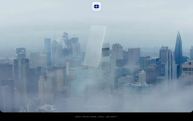
Preview image. Unlock full-res
Midnight Velvet Vault – rich, dark surfaces punctuated by a single, deep gem-toned light.
Color palette
Primary buttons, interactive state indicators, active links — the single point of visual interest against the dark canvas.
Background for hero sections, blending atmospheric photographic elements.
Page backgrounds, section backgrounds, deep surface elements.
Tertiary backgrounds, slightly elevated surfaces.
Minimal background shifts, almost imperceptible texture.
Minimal background shifts, almost imperceptible texture.
Primary text color, button text, high-contrast foreground elements against dark backgrounds.
Subtle highlights, specific text elements for highest contrast.
Border colors for interactive elements, secondary text.
Placeholder text, minor labels, low-emphasis information.
Subtle background depth for certain sections, adding visual richness.
Typography
- Weights
- 400, 700
- Sizes
- 16px, 23px, 24px, 28px
- Line height
- 1.17, 1.3, 1.4
- Letter spacing
- -0.008em at 23-28px, 0.008em at 16px
- Fallback
- Inter, sans-serif
Headlines and emphasis text; the letter-spacing is precisely tuned for specific sizes to give a refined feel, with subtle tightening for larger displays and a relaxed feel for smaller functional text.
- Weights
- 400
- Sizes
- 17px
- Line height
- 1.24
- Letter spacing
- normal
- Fallback
- Inter, sans-serif
Primary body text, standard button labels, general informational text. Its clean, readable form complements the headline variant.
- Weights
- 400
- Sizes
- 12px, 15px
- Line height
- 1.4, 1.67
- Letter spacing
- normal
- Fallback
- IBM Plex Mono, monospace
Small functional text, legal disclaimers, metadata. The monospace quality adds a subtle technical or editorial aesthetic without overwhelming the design.
- Weights
- 400
- Sizes
- 10px
- Line height
- 1.5
- Letter spacing
- normal
- Fallback
- IBM Plex Mono, monospace
Smallest print text, often used for footers or copyright notices, maintaining the monospace character at minimal sizes.
Spacing & shape
Components
Rounded, vibrant 'Atlas Violet' button. Text: Bright Silver, Sequel Sans Book 17px. Background: #001391. Border: 1px solid #f8f8f8. Radius: 128px. Padding: 0px top/bottom, 32px left/right.
Ghost button for engaging with features. Text: Pure White 80% opacity, Sequel Sans Book 17px. Background: transparent. Border: 1px solid rgba(255, 255, 255, 0.8). Radius: 24px. Padding: 8px top/bottom, 16px left/right.
Dark button with bright text. Text: Bright Silver, Sequel Sans Book 17px. Background: #1e1e1e. Border: 1px solid #f8f8f8. Radius: 18px. Padding: 0px top/bottom, 24px right, 32px left.
Essentially a styled link. Text: Bright Silver, Sequel Sans Book 17px. Background: transparent. Border: 1px solid #f8f8f8. Radius: 16px. Padding: 0px.
Small, functional links in the footer. Text: Mid-Grey, ApercuMono Pro Regular 10px. No explicit background or border, maintains natural link behavior.
Large text presented over the hero image. Text: Bright Silver, Sequel Sans Headline Book 28px weight 400, line-height 1.17, letter-spacing -0.22px. Typically centered on screen.
Standard body text for descriptions and detail. Text: Bright Silver, Sequel Sans Book 17px weight 400, line-height 1.24.
Guidelines
- Use Midnight Ink (#000000) for all main page backgrounds to maintain the deep, luxurious theme.
- Apply Atlas Violet (#001391) exclusively for primary calls to action and active interactive states.
- Ensure all body text uses Sequel Sans Book at 17px, weight 400, and line-height 1.24 for consistent readability.
- Implement letter-spacing adjustments for Sequel Sans Headline Book: -0.008em for 23px and 28px, 0.008em for 16px.
- Utilize 128px radius for primary pill buttons to create a soft, distinctive silhouette.
- Maintain a clear distinction between button types using background colors: #001391 for primary, #1e1e1 for secondary, and transparent for ghost buttons.
- Employ Bright Silver (#f8f8f8) as the predominant text color for all main content against dark backgrounds.
- Do not introduce new chromatic colors; restrict brand accents solely to Atlas Violet (#001391).
- Avoid using any radii less than 4px; the smallest defined radius for non-interactive elements is 4px.
- Do not use generic system fonts; always map to the provided custom typefaces or their specified substitutes.
- Refrain from using hard, sharp shadows; the design relies on subtle background color shifts and photography for depth.
- Do not deviate from the specified letter-spacing for headlines; it is a critical component of the typographic identity.
- Avoid using #808080 for primary body text; reserve it for low-emphasis or secondary information.
- Do not use highly saturated primary colors for UI elements other than the designated Atlas Violet CTA.
About this system
ShowHide
Atlas Card is a statement in understated luxury, built on a near-black canvas that allows its singular, deep violet accent to resonate with subtle authority. The design emanates a curated exclusivity through its scarce use of high-contrast elements, relying instead on a precise monochromatic scale and bespoke typography with unique letter-spacing to convey richness. Form is dictated by function, with oversized rounded buttons providing a soft, approachable counterpoint to the otherwise sharp, clean lines of the underlying layout.
The site uses a full-bleed page model, with content centered within implicit max-width boundaries that create spacious margins. The hero section is a full-viewport, atmospheric photographic background with a centered, minimalist text overlay. Following sections feature a consistent vertical rhythm and often present text-dominant content, frequently centered in a single column block for dramatic effect. There are no apparent grid layouts for cards or complex content arrangements; instead, content is presented sequentially with generous vertical spacing, emphasizing a focused reading experience. Navigation is minimal, likely a top bar and a footer with simple textual links.
The visual language for imagery is characterized by atmospheric, often misty or fog-enshrouded cityscapes and interior shots, typically with a cool, desaturated color palette that blends seamlessly into the dark UI background. Photography is large-scale, often full-bleed in hero sections, serving as decorative atmosphere rather than direct informational content. Product photography, such as of the card, is rendered as a clean, illuminated object against a muted, almost abstract backdrop, emphasizing its premium feel. Icons are monochrome, simple, and functional, typically rendered in Bright Silver against dark surfaces.
Reminiscent of Amex Centurion (Black Card Experience), Capital One Venture X (Premium Card), Acme Card, N26 (early dark mode).
# Atlas Card — Style Reference
> Midnight Velvet Vault – rich, dark surfaces punctuated by a single, deep gem-toned light.

**Theme:** dark

**Site:** https://atlascard.com

Atlas Card is a statement in understated luxury, built on a near-black canvas that allows its singular, deep violet accent to resonate with subtle authority. The design emanates a curated exclusivity through its scarce use of high-contrast elements, relying instead on a precise monochromatic scale and bespoke typography with unique letter-spacing to convey richness. Form is dictated by function, with oversized rounded buttons providing a soft, approachable counterpoint to the otherwise sharp, clean lines of the underlying layout.

## Tokens — Colors

| Name | Value | Token | Role |
|------|------|------|------|
| Atlas Violet | `#001391` | `--color-atlas-violet` | Primary buttons, interactive state indicators, active links — the single point of visual interest against the dark canvas. |
| Mist Gradient | `#9B97B8` | `--color-mist-gradient` | Background for hero sections, blending atmospheric photographic elements. |
| Midnight Ink | `#000000` | `--color-midnight-ink` | Page backgrounds, section backgrounds, deep surface elements. |
| Charcoal Grey | `#272727` | `--color-charcoal-grey` | Tertiary backgrounds, slightly elevated surfaces. |
| Dark Slate | `#333333` | `--color-dark-slate` | Minimal background shifts, almost imperceptible texture. |
| Deep Graphite | `#3d3d3d` | `--color-deep-graphite` | Minimal background shifts, almost imperceptible texture. |
| Bright Silver | `#f8f8f8` | `--color-bright-silver` | Primary text color, button text, high-contrast foreground elements against dark backgrounds. |
| Pure White | `#ffffff` | `--color-pure-white` | Subtle highlights, specific text elements for highest contrast. |
| Cadet Grey | `#cccccc` | `--color-cadet-grey` | Border colors for interactive elements, secondary text. |
| Mid-Grey | `#808080` | `--color-mid-grey` | Placeholder text, minor labels, low-emphasis information. |
| Dark Gradient | `#000000` | `--color-dark-gradient` | Subtle background depth for certain sections, adding visual richness. |

## Tokens — Typography

### Sequel Sans Headline Book
- **Substitute:** Inter, sans-serif
- **Weights:** 400, 700
- **Sizes:** 16px, 23px, 24px, 28px
- **Line height:** 1.17, 1.3, 1.4
- **Letter spacing:** -0.008em at 23-28px, 0.008em at 16px
- **Role:** Headlines and emphasis text; the letter-spacing is precisely tuned for specific sizes to give a refined feel, with subtle tightening for larger displays and a relaxed feel for smaller functional text.

### Sequel Sans Book
- **Substitute:** Inter, sans-serif
- **Weights:** 400
- **Sizes:** 17px
- **Line height:** 1.24
- **Letter spacing:** normal
- **Role:** Primary body text, standard button labels, general informational text. Its clean, readable form complements the headline variant.

### ApercuMono Pro Medium
- **Substitute:** IBM Plex Mono, monospace
- **Weights:** 400
- **Sizes:** 12px, 15px
- **Line height:** 1.4, 1.67
- **Letter spacing:** normal
- **Role:** Small functional text, legal disclaimers, metadata. The monospace quality adds a subtle technical or editorial aesthetic without overwhelming the design.

### ApercuMono Pro Regular
- **Substitute:** IBM Plex Mono, monospace
- **Weights:** 400
- **Sizes:** 10px
- **Line height:** 1.5
- **Letter spacing:** normal
- **Role:** Smallest print text, often used for footers or copyright notices, maintaining the monospace character at minimal sizes.

## Tokens — Type Scale

| Role | Size | Line height | Letter spacing |
|------|------|------|------|
| caption | 10px | 1.5 | — |
| body | 15px | 1.67 | — |
| body-lg | 17px | 1.24 | — |
| subheading | 23px | 1.3 | -0.18px |
| heading-lg | 28px | 1.17 | -0.22px |

## Tokens — Spacing

- **Section gap:** 48-64px
- **Card padding:** 16px
- **Element gap:** 8-32px

## Tokens — Radius

- **Default:** 4px
- **Inputs:** 8px
- **buttons-outline:** 24px
- **buttons-pill:** 128px
- **buttons-square:** 18px

## Layout

The site uses a full-bleed page model, with content centered within implicit max-width boundaries that create spacious margins. The hero section is a full-viewport, atmospheric photographic background with a centered, minimalist text overlay. Following sections feature a consistent vertical rhythm and often present text-dominant content, frequently centered in a single column block for dramatic effect. There are no apparent grid layouts for cards or complex content arrangements; instead, content is presented sequentially with generous vertical spacing, emphasizing a focused reading experience. Navigation is minimal, likely a top bar and a footer with simple textual links.

## Imagery

The visual language for imagery is characterized by atmospheric, often misty or fog-enshrouded cityscapes and interior shots, typically with a cool, desaturated color palette that blends seamlessly into the dark UI background. Photography is large-scale, often full-bleed in hero sections, serving as decorative atmosphere rather than direct informational content. Product photography, such as of the card, is rendered as a clean, illuminated object against a muted, almost abstract backdrop, emphasizing its premium feel. Icons are monochrome, simple, and functional, typically rendered in Bright Silver against dark surfaces.

## Components

### Request Invite CTA Block

### Ticker Marquee Banner

### Button Group Showcase

### Primary Action Pill Button
*Call to action*

Rounded, vibrant 'Atlas Violet' button. Text: Bright Silver, Sequel Sans Book 17px. Background: #001391. Border: 1px solid #f8f8f8. Radius: 128px. Padding: 0px top/bottom, 32px left/right.

### Ghost Feature Button
*Secondary action in content*

Ghost button for engaging with features. Text: Pure White 80% opacity, Sequel Sans Book 17px. Background: transparent. Border: 1px solid rgba(255, 255, 255, 0.8). Radius: 24px. Padding: 8px top/bottom, 16px left/right.

### Dark Square Button
*Secondary navigation or minor actions*

Dark button with bright text. Text: Bright Silver, Sequel Sans Book 17px. Background: #1e1e1e. Border: 1px solid #f8f8f8. Radius: 18px. Padding: 0px top/bottom, 24px right, 32px left.

### Text Link Button
*Inline textual actions*

Essentially a styled link. Text: Bright Silver, Sequel Sans Book 17px. Background: transparent. Border: 1px solid #f8f8f8. Radius: 16px. Padding: 0px.

### Footer Link
*Navigation in the footer*

Small, functional links in the footer. Text: Mid-Grey, ApercuMono Pro Regular 10px. No explicit background or border, maintains natural link behavior.

### Hero Text Overlay
*Dominant initial messaging*

Large text presented over the hero image. Text: Bright Silver, Sequel Sans Headline Book 28px weight 400, line-height 1.17, letter-spacing -0.22px. Typically centered on screen.

### Body Paragraph
*Main content narrative*

Standard body text for descriptions and detail. Text: Bright Silver, Sequel Sans Book 17px weight 400, line-height 1.24.

## Guidelines

### Do

- Use Midnight Ink (#000000) for all main page backgrounds to maintain the deep, luxurious theme.
- Apply Atlas Violet (#001391) exclusively for primary calls to action and active interactive states.
- Ensure all body text uses Sequel Sans Book at 17px, weight 400, and line-height 1.24 for consistent readability.
- Implement letter-spacing adjustments for Sequel Sans Headline Book: -0.008em for 23px and 28px, 0.008em for 16px.
- Utilize 128px radius for primary pill buttons to create a soft, distinctive silhouette.
- Maintain a clear distinction between button types using background colors: #001391 for primary, #1e1e1 for secondary, and transparent for ghost buttons.
- Employ Bright Silver (#f8f8f8) as the predominant text color for all main content against dark backgrounds.

### Don't

- Do not introduce new chromatic colors; restrict brand accents solely to Atlas Violet (#001391).
- Avoid using any radii less than 4px; the smallest defined radius for non-interactive elements is 4px.
- Do not use generic system fonts; always map to the provided custom typefaces or their specified substitutes.
- Refrain from using hard, sharp shadows; the design relies on subtle background color shifts and photography for depth.
- Do not deviate from the specified letter-spacing for headlines; it is a critical component of the typographic identity.
- Avoid using #808080 for primary body text; reserve it for low-emphasis or secondary information.
- Do not use highly saturated primary colors for UI elements other than the designated Atlas Violet CTA.

## Agent Prompt Guide

### Quick Color Reference
- Text: #f8f8f8
- Background: #000000
- CTA: #001391
- Secondary Button Background: #1e1e1e
- Border: #f8f8f8 (or 80% opacity variant)

### 3-5 Example Component Prompts
1. Create a `Primary Action Pill Button`: text 'Request Invite' using Sequel Sans Book 17px weight 400, color #f8f8f8. Background #001391, border 1px solid #f8f8f8, border-radius 128px, padding 0px 32px.
2. Design a `Ghost Feature Button`: text 'Learn More' with Sequel Sans Book 17px weight 400, color rgba(255,255,255,0.8). Background transparent, border 1px solid rgba(255,255,255,0.8), border-radius 24px, padding 8px 16px.
3. Generate a `Dark Square Button`: text 'Sign In' using Sequel Sans Book 17px weight 400, color #f8f8f8. Background #1e1e1, border 1px solid #f8f8f8, border-radius 18px, padding 0px 24px 0px 32px.
4. Produce a `Hero Text Overlay`: a centered, multiline headline using Sequel Sans Headline Book 28px weight 400, line-height 1.17, letter-spacing -0.22px, color #f8f8f8 against a background that includes linear-gradient(in oklab, rgb(55, 60, 89) 0%, rgb(156, 151, 184) 100%).
5. Create a `Body Paragraph`: text 'With Atlas, you can finally get tables...' using Sequel Sans Book 17px weight 400, line-height 1.24, color #f8f8f8, aligned left on a #000000 background.
More like this









Keep what you find
A free account saves references to boards and can send you a weekly email of picks based on what you save.
To see every result, go Pro.