
Preview image. Unlock full-res
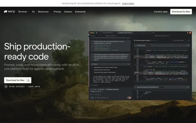
Midnight Command Center. Deeply desaturated dark surfaces provide a stage for precise, luminous information, like a control panel in low light.
Color palette
Accent color for interactive elements like links, highlights, and status indicators. Its moderate saturation provides a subtle yet distinct point of visual interest against the dark neutrals.
Illustrations, icon fills, occasional text like legal disclaimers. Its absolute nature anchors contrasting elements.
Primary page background, card surfaces, footer background — forms the foundational dark canvas.
Secondary background color for sections, providing a subtle differentiation from the main Console Dark without adding visual noise.
Secondary body text, subtle labels, placeholder text. Quietly present without demanding attention.
Primary text color for headings and body content, providing maximum legibility against dark backgrounds. Also used for navigation items and prominent links.
Text on interactive elements, highlighted text. Used sparingly to denote a higher level of importance or activeness.
Text in darker contexts, specific button backgrounds, subtle borders. A robust dark grey for structural elements.
Tertiary text, less prominent headlines, button borders. Lighter than Ghost Gray for slightly more emphasis.
Similar to Storm Gray, used for less prominent headings and textual elements, contributing to the overall desaturated aesthetic.
Used for very light text elements on darker backgrounds; offers a softer contrast than Luminous White or Polar White.
Specific navigation and section backgrounds, providing a slightly warmer dark tone.
Text on very light backgrounds, subtle shadows, reinforces the deep dark theme.
Occasional background element, notably in what appears to be a brand logo area, offering a stark light contrast.
Minor text elements, specifically within navigation, for very low prominence. Its slight blue undertone is barely perceptible.
Feedback or status indicators; its vivid hue ensures immediate recognition for positive states on dark backgrounds.
Typography
- Weights
- 400
- Sizes
- 16px
- Line height
- 1, 1.2
- Letter spacing
- -0.48, -0.32, -0.24, -0.14, -0.13, -0.12, 0.12, 0.24, 1.2, 2.4
- Fallback
- Inter
Primary typeface for all headings and most body text. The tight line heights and varying letter spacing, especially negative values at larger sizes, create a dense, technical feel appropriate for a dev tool. The range of weights provides a strong hierarchy without introducing additional families.
- Weights
- 400, 500
- Sizes
- 14px, 16px
- Line height
- 1, 1.2, 1.3, 1.38
- Letter spacing
- -0.17, -0.14
- Fallback
- system-ui
Secondary sans-serif for supplemental information, fine print, and some body text where a slightly more open feel is desired compared to Matter.
- Weights
- 400
- Sizes
- 16px
- Line height
- 1
- Fallback
- SF Mono, Fira Code
Monospaced font used for code snippets, technical commands, and precise data representation, reinforcing the developer tool identity.
Spacing & shape
Components
Background: rgba(255, 255, 255, 0.1) (10% white overlay for subtle lift). Text: Agent Violet (#CBB0F7). Border: None. Border Radius: 33.17px (pill shape). Padding: 5px vertical, 10px horizontal. Employs a ghosted, almost ethereal look despite being a CTA, leveraging the brand accent.
Background: rgba(255, 255, 255, 0.04) (4% white overlay). Text: Agent Violet (#CBB0F7). Border: None. Border Radius: 4px. Padding: 8px vertical, 12px horizontal. A more subdued version of the primary, hinting at interactiveness without strong visual dominance.
Background: #353534 (Deep Gray). Text: Storm Gray (#B4B4B2) or Polar White (#FFFFFF). Border: None. Border Radius: 4px. Padding: 8px vertical, 12px horizontal. A solid, functional button for less critical interactions, blending into the dark theme.
Background: #353534 (Deep Gray). Text: Ghost Gray (#AFACAC or #AFB0AC). Border: None. Border Radius: 50px (full pill). Padding: 10px all around. A highly rounded element for subtle visual cues or category selection, using a desaturated palette.
Background: Console Dark (#121212) or Surface Dark (#1E1E1D). Border: None. Border Radius: 7px (softly rounded). Padding: Not explicitly defined, but visuals suggest moderate internal spacing. Contains the visual elements within the dark theme.
Guidelines
- Use Console Dark (#121212) for primary backgrounds and Surface Dark (#1E1E1D) for secondary sections to create a sense of layered depth.
- Employ Luminous White (#FAF9F6) and Polar White (#FFFFFF) as primary text colors on all dark backgrounds for maximum readability.
- Apply Matter font with negative letter spacing for display headlines (e.g., Matter 56px with -0.04em, -0.48px) to achieve a precise, high-tech aesthetic.
- Utilize Agent Violet (#CBB0F7) exclusively for interactive elements and brand accents like links and primary buttons.
- Ensure buttons maintain varying radius profiles: 33.17px for primary actions, 4px for secondary, and 50px for pill-shaped status elements.
- Maintain a compact spacing density, utilizing 8px for element gaps and multiples of 5-14px for internal padding within components.
- Avoid introducing additional saturated colors beyond Agent Violet (#CBB0F7) and Success Green (#2ECC71) to preserve the desaturated, focused environment.
- Do not use generic system fonts for prominent text; always prioritize Matter and Geist Mono for brand consistency.
- Resist using hard-edged rectangles for cards or buttons where a subtle radius (4px, 7px, or 33.17px) is intended, as it softens the technical aesthetic appropriately.
- Do not deviate from the tight line heights and letter spacing defined in the Matter font profiles; they are critical for the system's precise feel.
- Avoid large, open white spaces; the design emphasizes compact information blocks within dark, structured sections.
- Do not use box-shadows or significant elevation; depth is created through subtle background shifts rather than visual lifts.
About this system
ShowHide
This design system conjures a high-tech command center feel, where dark surfaces meet crisp, focused information. The primary visual choice is the deeply desaturated dark background (#121212) contrasted with luminous white text (#FAFAFA), creating a sense of precision and low-light operations. Subtle uses of a muted violet (#CBB0F7) and an infrequent vivid green (#2ECC71) serve as functional indicators, akin to status lights on a console, reinforcing the industrial yet refined atmosphere. The almost exclusive use of the Matter font family, with its defined structure and variable weights, maintains a consistent technical aesthetic.
Reminiscent of GitHub, Linear, Vercel, Figma.
# Warp — Style Reference
> Midnight Command Center. Deeply desaturated dark surfaces provide a stage for precise, luminous information, like a control panel in low light.

**Theme:** dark

**Site:** https://warp.dev

This design system conjures a high-tech command center feel, where dark surfaces meet crisp, focused information. The primary visual choice is the deeply desaturated dark background (#121212) contrasted with luminous white text (#FAFAFA), creating a sense of precision and low-light operations. Subtle uses of a muted violet (#CBB0F7) and an infrequent vivid green (#2ECC71) serve as functional indicators, akin to status lights on a console, reinforcing the industrial yet refined atmosphere. The almost exclusive use of the Matter font family, with its defined structure and variable weights, maintains a consistent technical aesthetic.

## Tokens — Colors

| Name | Value | Token | Role |
|------|------|------|------|
| Agent Violet | `#CBB0F7` | `--color-agent-violet` | Accent color for interactive elements like links, highlights, and status indicators. Its moderate saturation provides a subtle yet distinct point of visual interest against the dark neutrals. |
| Deep Space | `#000000` | `--color-deep-space` | Illustrations, icon fills, occasional text like legal disclaimers. Its absolute nature anchors contrasting elements. |
| Console Dark | `#121212` | `--color-console-dark` | Primary page background, card surfaces, footer background — forms the foundational dark canvas. |
| Surface Dark | `#1E1E1D` | `--color-surface-dark` | Secondary background color for sections, providing a subtle differentiation from the main Console Dark without adding visual noise. |
| Ghost Gray | `#868684` | `--color-ghost-gray` | Secondary body text, subtle labels, placeholder text. Quietly present without demanding attention. |
| Luminous White | `#FAF9F6` | `--color-luminous-white` | Primary text color for headings and body content, providing maximum legibility against dark backgrounds. Also used for navigation items and prominent links. |
| Polar White | `#FFFFFF` | `--color-polar-white` | Text on interactive elements, highlighted text. Used sparingly to denote a higher level of importance or activeness. |
| Deep Gray | `#333333` | `--color-deep-gray` | Text in darker contexts, specific button backgrounds, subtle borders. A robust dark grey for structural elements. |
| Storm Gray | `#B4B4B2` | `--color-storm-gray` | Tertiary text, less prominent headlines, button borders. Lighter than Ghost Gray for slightly more emphasis. |
| Ash Gray | `#A0A0A0` | `--color-ash-gray` | Similar to Storm Gray, used for less prominent headings and textual elements, contributing to the overall desaturated aesthetic. |
| Light Driftwood | `#E3E2E0` | `--color-light-driftwood` | Used for very light text elements on darker backgrounds; offers a softer contrast than Luminous White or Polar White. |
| Twilight Gray | `#40403F` | `--color-twilight-gray` | Specific navigation and section backgrounds, providing a slightly warmer dark tone. |
| Eclipse Black | `#080808` | `--color-eclipse-black` | Text on very light backgrounds, subtle shadows, reinforces the deep dark theme. |
| Crystal Silver | `#EBEBEB` | `--color-crystal-silver` | Occasional background element, notably in what appears to be a brand logo area, offering a stark light contrast. |
| Battleship Gray | `#666469` | `--color-battleship-gray` | Minor text elements, specifically within navigation, for very low prominence. Its slight blue undertone is barely perceptible. |
| Success Green | `#2ECC71` | `--color-success-green` | Feedback or status indicators; its vivid hue ensures immediate recognition for positive states on dark backgrounds. |

## Tokens — Typography

### Matter
- **Substitute:** Inter
- **Weights:** 400
- **Sizes:** 16px
- **Line height:** 1, 1.2
- **Letter spacing:** -0.48, -0.32, -0.24, -0.14, -0.13, -0.12, 0.12, 0.24, 1.2, 2.4
- **Role:** Primary typeface for all headings and most body text. The tight line heights and varying letter spacing, especially negative values at larger sizes, create a dense, technical feel appropriate for a dev tool. The range of weights provides a strong hierarchy without introducing additional families.

### Inter
- **Substitute:** system-ui
- **Weights:** 400, 500
- **Sizes:** 14px, 16px
- **Line height:** 1, 1.2, 1.3, 1.38
- **Letter spacing:** -0.17, -0.14
- **Role:** Secondary sans-serif for supplemental information, fine print, and some body text where a slightly more open feel is desired compared to Matter.

### Geist Mono
- **Substitute:** SF Mono, Fira Code
- **Weights:** 400
- **Sizes:** 16px
- **Line height:** 1
- **Role:** Monospaced font used for code snippets, technical commands, and precise data representation, reinforcing the developer tool identity.

## Tokens — Type Scale

Augmented Fourth (1.414) from 14px base.

| Role | Size | Line height | Letter spacing |
|------|------|------|------|
| caption | 10px | 1.4 | 0.12px |
| body | 14px | 1.38 | -0.17px |
| heading-sm | 24px | 1.25 | -0.24px |
| heading | 32px | 1.2 | -0.32px |
| heading-lg | 42px | 1.15 | -0.42px |
| display | 56px | 1 | -0.48px |

## Tokens — Spacing

- **Section gap:** 60px
- **Element gap:** 8px

## Tokens — Radius

- **Default:** 4px
- **Buttons:** 4px, 33.17px, 50px
- **components:** 7px, 20px

## Components

### Product Cards — Warp Terminal & Oz

### Testimonial Cards

### Announcement Banner + Button Group

### Primary Action Button
*Call to action for downloads or critical next steps.*

Background: rgba(255, 255, 255, 0.1) (10% white overlay for subtle lift). Text: Agent Violet (#CBB0F7). Border: None. Border Radius: 33.17px (pill shape). Padding: 5px vertical, 10px horizontal. Employs a ghosted, almost ethereal look despite being a CTA, leveraging the brand accent.

### Secondary Ghost Button
*Less prominent interactive actions.*

Background: rgba(255, 255, 255, 0.04) (4% white overlay). Text: Agent Violet (#CBB0F7). Border: None. Border Radius: 4px. Padding: 8px vertical, 12px horizontal. A more subdued version of the primary, hinting at interactiveness without strong visual dominance.

### Tertiary Dark Button
*Navigation items or filter buttons.*

Background: #353534 (Deep Gray). Text: Storm Gray (#B4B4B2) or Polar White (#FFFFFF). Border: None. Border Radius: 4px. Padding: 8px vertical, 12px horizontal. A solid, functional button for less critical interactions, blending into the dark theme.

### Pill Status Button
*Informational tags or minor selections.*

Background: #353534 (Deep Gray). Text: Ghost Gray (#AFACAC or #AFB0AC). Border: None. Border Radius: 50px (full pill). Padding: 10px all around. A highly rounded element for subtle visual cues or category selection, using a desaturated palette.

### Image Card Wrapper
*Containers for product screenshots or visual content.*

Background: Console Dark (#121212) or Surface Dark (#1E1E1D). Border: None. Border Radius: 7px (softly rounded). Padding: Not explicitly defined, but visuals suggest moderate internal spacing. Contains the visual elements within the dark theme.

## Guidelines

### Do

- Use Console Dark (#121212) for primary backgrounds and Surface Dark (#1E1E1D) for secondary sections to create a sense of layered depth.
- Employ Luminous White (#FAF9F6) and Polar White (#FFFFFF) as primary text colors on all dark backgrounds for maximum readability.
- Apply Matter font with negative letter spacing for display headlines (e.g., Matter 56px with -0.04em, -0.48px) to achieve a precise, high-tech aesthetic.
- Utilize Agent Violet (#CBB0F7) exclusively for interactive elements and brand accents like links and primary buttons.
- Ensure buttons maintain varying radius profiles: 33.17px for primary actions, 4px for secondary, and 50px for pill-shaped status elements.
- Maintain a compact spacing density, utilizing 8px for element gaps and multiples of 5-14px for internal padding within components.

### Don't

- Avoid introducing additional saturated colors beyond Agent Violet (#CBB0F7) and Success Green (#2ECC71) to preserve the desaturated, focused environment.
- Do not use generic system fonts for prominent text; always prioritize Matter and Geist Mono for brand consistency.
- Resist using hard-edged rectangles for cards or buttons where a subtle radius (4px, 7px, or 33.17px) is intended, as it softens the technical aesthetic appropriately.
- Do not deviate from the tight line heights and letter spacing defined in the Matter font profiles; they are critical for the system's precise feel.
- Avoid large, open white spaces; the design emphasizes compact information blocks within dark, structured sections.
- Do not use box-shadows or significant elevation; depth is created through subtle background shifts rather than visual lifts.

## Agent Prompt Guide

### Quick Color Reference
- Text: #FAF9F6 (Luminous White)
- Background: #121212 (Console Dark)
- CTA: #CBB0F7 (Agent Violet)
- Button Background: rgba(255, 255, 255, 0.1)
- Border (subtle): #333333 (Deep Gray)

### 3-5 Example Component Prompts
1. Create a hero section with a Console Dark (#121212) background. Centered headline 'Warp is the agentic development environment' using Matter 56px weight 400, #FAF9F6, letter-spacing -0.48px. Below it, a 'Download for Mac' button: background rgba(255, 255, 255, 0.1), text #CBB0F7, 33.17px border radius, 5px vertical, 10px horizontal padding.
2. Design a feature card for the 'Oz' product: Surface Dark (#1E1E1D) background, 7px border radius. Title 'Oz' in Matter 24px weight 600, #FAF9F6. Description 'The orchestration platform for cloud agents' in Matter 16px weight 400, #B4B4B2. Include a 'Learn More' link in #CBB0F7 with Matter 12px weight 400.
3. Implement a partner logo grid section: Background Surface Dark (#1E1E1D). Use a 5-column grid. Logos should be monochrome, rendered in Light Driftwood (#E3E2E0) against the dark background. Each logo item should have 10px padding and 4px border radius, with Deep Gray (#333333) for hover state background.
4. Create a testimonial card: Console Dark (#121212) background, 7px border radius, with 10px padding. Quote text in Matter 18px weight 400, #FAF9F6. Author name 'Kyvu Gabriel' in Matter 16px weight 600, #CBB0F7. Author title 'Field CTO' in Matter 14px weight 400, #868684.
More like this




Keep what you find
A free account saves references to boards and can send you a weekly email of picks based on what you save.
To see every result, go Pro.