Preview image. Unlock full-res
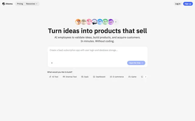
Clean blueprint with friendly edges and a vibrant blue accent.
Color palette
Primary call-to-action buttons, interactive elements, and key branding moments – a vibrant, clear blue signifying action and brand identity.
Interactive states and links, a slightly darker blue creating subtle visual feedback.
Decorative accents in illustrations or small visual indicators, part of a secondary vibrant palette.
Decorative accents in illustrations or small visual indicators, part of a secondary vibrant palette.
Decorative accents in illustrations or small visual indicators, part of a secondary vibrant palette.
Decorative accents in illustrations or small visual indicators, part of a secondary vibrant palette.
Backgrounds for specific sections or illustrative elements, invoking a sense of calm and openness.
Decorative backgrounds, adding a soft, almost ethereal visual texture.
Dynamic visual elements, providing a modern, energetic feel.
Primary background for the application and most components.
Primary text color for headlines and important information, providing strong contrast against light backgrounds.
Borders for cards and subtle dividers, creating visual separation without heavy lines.
Background for secondary containers and specific components like some card variations, offering a slight visual break from pure white.
Secondary text color for body copy and less emphasized elements, providing good readability while supporting visual hierarchy.
Icons and tertiary text, providing clear visibility for supporting visual elements.
Typography
- Weights
- 400, 500, 600
- Sizes
- 12px, 14px, 16px, 18px, 20px, 24px, 32px, 48px
- Line height
- 1, 1.17, 1.22, 1.25, 1.33, 1.4, 1.44, 1.49, 1.5, 1.57, 1.67
- Letter spacing
- normal
- Fallback
- system-ui, sans-serif
The primary typeface for all UI elements, body text, and most headings. Its utilitarian yet clear nature offers excellent readability across all sizes, reinforcing the tool's efficient character.
- Weights
- 600
- Sizes
- 48px
- Line height
- 1.17
- Letter spacing
- normal
- Fallback
- Georgia, serif
Used sparingly for prominent display headings, its serif character provides a touch of distinction and gravitas, contrasting with the dominant sans-serif for emphasis.
Spacing & shape
Elevation
Components
Buttons for primary actions. Background: Atoms Blue (#4267ff). Text: Page Canvas (#ffffff). Radius: 999px. Padding: 0px 12px.
Buttons for secondary actions. Background: transparent. Text: Deep Graphite (rgba(13, 13, 13, 0.95)). Border: 1px solid rgba(13, 13, 13, 0.55). Radius: 40px. Padding: 6px 16px.
Navigation items styled as buttons in the header. Background: transparent. Text: Deep Graphite (rgba(13, 13, 13, 0.95)). No border. Radius: 0px. Padding: 32px 0px. Emphasized by top and bottom padding, no horizontal.
Filter buttons to categorize content. Background: Page Canvas (#ffffff). Text: Deep Graphite (rgba(13, 13, 13, 0.95)). Border: Ghost Gray (rgb(229, 231, 235)). Radius: 9999px. Padding: 0px 12px.
Cards with depth for prominent content. Background: Page Canvas (#ffffff). Radius: 24px. Shadow: rgba(13, 13, 13, 0.08) 0px 8px 24px -4px, rgba(13, 13, 13, 0.04) 0px 4px 4px 0px. Padding: 24px.
Transparent cards for template previews. Background: transparent. Radius: 16px. No shadow. No padding.
Cards with a subtle background for features. Background: Subtle Ash (#f6f6f6). Radius: 32px. No shadow. Padding: 20px 24px.
Standard text input field. Background: transparent. Text: Deep Graphite (rgba(13, 13, 13, 0.95)). Border bottom: 1px solid rgba(13, 13, 13, 0.95). No border radius. No padding.
Text input field showing placeholder text. Background: transparent. Text: Medium Gray (rgba(13, 13, 13, 0.55)). Border bottom: 1px solid rgba(13, 13, 13, 0.55). No border radius. No padding.
Guidelines
- Use IBM Plex Sans for all text elements unless a specific distinction for display headings is required, reserving IBM Plex Serif for `display` role.
- Apply Atoms Blue (#4267ff) exclusively for primary CTAs and key interactive elements, maintaining its impact.
- Ensure all buttons and badges utilize a 9999px border radius for a consistent, soft-edged interaction point.
- Maintain a clear visual hierarchy by using Deep Graphite (#0d0d0d) for primary headings and important text, and Medium Gray (#767676) for secondary information.
- Use the specific card shadow (rgba(13, 13, 13, 0.08) 0px 8px 24px -4px, rgba(13, 13, 13, 0.04) 0px 4px 4px 0px) to give elements subtle elevation and visual distinction.
- Do not introduce new typefaces; rely on IBM Plex Sans and IBM Plex Serif for all typographic needs.
- Avoid using saturated colors as background for large content areas; reserve them for accents and specific gradients.
- Do not vary the border radius on interactive buttons; always use 9999px for consistent affordance.
- Refrain from adding heavy borders or strong dropshadows to elements other than the defined card variant; maintain a light and airy feel.
- Do not deviate from the established spacing scale (multiples of 4px and 8px) to maintain a harmonious layout density.
About this system
ShowHide
This design system feels like a friendly, efficient digital workshop. It skillfully blends utility with approachable charm through its use of a clean, high-contrast palette predominantly featuring white and deep black text. The signature playful elements include the 'Atoms Blue' primary accent, soft rounded corners on interactive elements and cards, and a subtle card elevation that adds visual depth without distracting. This balance creates an experience that is both professional and inviting, hinting at complex technology made simple.
The site employs a max-width contained layout, with content typically centered within a clear canvas. The hero section features a centered headline and subtext, with a prominent input field and a row of playful character illustrations above. Subsequent sections often alternate between large visual elements (like product screenshots) and centered explanatory text. There is a strong use of card grids (e.g., 3-column) for showcasing templates and testimonials, adding structure and scannability. Vertical spacing between sections is generous and consistent, creating a breathable visual rhythm. Navigation is a sticky top bar, providing persistent access to key links and calls to action.
The visual language focuses on friendly, almost emoji-like character illustrations for thematic elements, hinting at AI personalities. For product showcases, clean, contained screenshots of UI are employed. The overall style is playful and inviting, using a palette of varied, bright, solid colors for these illustrations, often arranged in rows or clusters. There is a sense of abstraction mixed with clear product representation, avoiding lifestyle photography. Icons are generally filled and monochromatic, consistent with the Deep Graphite text color.
Reminiscent of Vercel, Linear, Notion, Supabase.
# Atoms — Style Reference
> Clean blueprint with friendly edges and a vibrant blue accent.

**Theme:** light

**Site:** https://atoms.dev

This design system feels like a friendly, efficient digital workshop. It skillfully blends utility with approachable charm through its use of a clean, high-contrast palette predominantly featuring white and deep black text. The signature playful elements include the 'Atoms Blue' primary accent, soft rounded corners on interactive elements and cards, and a subtle card elevation that adds visual depth without distracting. This balance creates an experience that is both professional and inviting, hinting at complex technology made simple.

## Tokens — Colors

| Name | Value | Token | Role |
|------|------|------|------|
| Atoms Blue | `#4267ff` | `--color-atoms-blue` | Primary call-to-action buttons, interactive elements, and key branding moments – a vibrant, clear blue signifying action and brand identity. |
| Action Blue | `#425ce1` | `--color-action-blue` | Interactive states and links, a slightly darker blue creating subtle visual feedback. |
| Palette Purple | `#b88ade` | `--color-palette-purple` | Decorative accents in illustrations or small visual indicators, part of a secondary vibrant palette. |
| Palette Red | `#ff7fa7` | `--color-palette-red` | Decorative accents in illustrations or small visual indicators, part of a secondary vibrant palette. |
| Palette Orange | `#ffba6c` | `--color-palette-orange` | Decorative accents in illustrations or small visual indicators, part of a secondary vibrant palette. |
| Palette Green | `#2dbb5c` | `--color-palette-green` | Decorative accents in illustrations or small visual indicators, part of a secondary vibrant palette. |
| Sky Gradient | `#427fa5` | `--color-sky-gradient` | Backgrounds for specific sections or illustrative elements, invoking a sense of calm and openness. |
| Dreamscape Gradient | `#d2b9ff` | `--color-dreamscape-gradient` | Decorative backgrounds, adding a soft, almost ethereal visual texture. |
| Horizon Gradient | `#5f7bf4` | `--color-horizon-gradient` | Dynamic visual elements, providing a modern, energetic feel. |
| Page Canvas | `#ffffff` | `--color-page-canvas` | Primary background for the application and most components. |
| Deep Graphite | `#0d0d0d` | `--color-deep-graphite` | Primary text color for headlines and important information, providing strong contrast against light backgrounds. |
| Ghost Gray | `#e5e7eb` | `--color-ghost-gray` | Borders for cards and subtle dividers, creating visual separation without heavy lines. |
| Subtle Ash | `#f6f6f6` | `--color-subtle-ash` | Background for secondary containers and specific components like some card variations, offering a slight visual break from pure white. |
| Medium Gray | `#767676` | `--color-medium-gray` | Secondary text color for body copy and less emphasized elements, providing good readability while supporting visual hierarchy. |
| Dark Gray | `#3c3c3c` | `--color-dark-gray` | Icons and tertiary text, providing clear visibility for supporting visual elements. |

## Tokens — Typography

### IBM Plex Sans
- **Substitute:** system-ui, sans-serif
- **Weights:** 400, 500, 600
- **Sizes:** 12px, 14px, 16px, 18px, 20px, 24px, 32px, 48px
- **Line height:** 1, 1.17, 1.22, 1.25, 1.33, 1.4, 1.44, 1.49, 1.5, 1.57, 1.67
- **Letter spacing:** normal
- **Role:** The primary typeface for all UI elements, body text, and most headings. Its utilitarian yet clear nature offers excellent readability across all sizes, reinforcing the tool's efficient character.

### IBM Plex Serif
- **Substitute:** Georgia, serif
- **Weights:** 600
- **Sizes:** 48px
- **Line height:** 1.17
- **Letter spacing:** normal
- **Role:** Used sparingly for prominent display headings, its serif character provides a touch of distinction and gravitas, contrasting with the dominant sans-serif for emphasis.

## Tokens — Type Scale

Major Third (1.25) from 16px base.

| Role | Size | Line height | Letter spacing |
|------|------|------|------|
| caption | 12px | 1.5 | — |
| body-sm | 14px | 1.44 | — |
| body | 16px | 1.5 | — |
| subheading | 18px | 1.5 | — |
| heading | 24px | 1.33 | — |
| heading-lg | 32px | 1.25 | — |
| display | 48px | 1.17 | — |

## Tokens — Spacing

- **Section gap:** 48px
- **Card padding:** 24px
- **Element gap:** 8px

## Tokens — Radius

- **Buttons:** 9999px
- **Cards:** 24px
- **badges:** 9999px
- **input:** 0px

## Tokens — Elevation

- **Elevated Content Card:** `rgba(13, 13, 13, 0.08) 0px 8px 24px -4px, rgba(13, 13, 13, 0.04) 0px 4px 4px 0px`
- **Subtle Hover / Interaction Element:** `rgba(13, 13, 13, 0.04) 0px 1px 4px 0px`

## Layout

The site employs a max-width contained layout, with content typically centered within a clear canvas. The hero section features a centered headline and subtext, with a prominent input field and a row of playful character illustrations above. Subsequent sections often alternate between large visual elements (like product screenshots) and centered explanatory text. There is a strong use of card grids (e.g., 3-column) for showcasing templates and testimonials, adding structure and scannability. Vertical spacing between sections is generous and consistent, creating a breathable visual rhythm. Navigation is a sticky top bar, providing persistent access to key links and calls to action.

## Imagery

The visual language focuses on friendly, almost emoji-like character illustrations for thematic elements, hinting at AI personalities. For product showcases, clean, contained screenshots of UI are employed. The overall style is playful and inviting, using a palette of varied, bright, solid colors for these illustrations, often arranged in rows or clusters. There is a sense of abstraction mixed with clear product representation, avoiding lifestyle photography. Icons are generally filled and monochromatic, consistent with the Deep Graphite text color.

## Components

### Build Type Selector — Prompt Input with Category Tags

### Template Gallery with Tab Filter

### Testimonial Cards Grid

### Primary Filled Button
*Call to action*

Buttons for primary actions. Background: Atoms Blue (#4267ff). Text: Page Canvas (#ffffff). Radius: 999px. Padding: 0px 12px.

### Secondary Ghost Button
*Secondary action or navigation*

Buttons for secondary actions. Background: transparent. Text: Deep Graphite (rgba(13, 13, 13, 0.95)). Border: 1px solid rgba(13, 13, 13, 0.55). Radius: 40px. Padding: 6px 16px.

### Navigation Link Button
*Top navigation*

Navigation items styled as buttons in the header. Background: transparent. Text: Deep Graphite (rgba(13, 13, 13, 0.95)). No border. Radius: 0px. Padding: 32px 0px. Emphasized by top and bottom padding, no horizontal.

### Filter Tag Button
*Content filtering*

Filter buttons to categorize content. Background: Page Canvas (#ffffff). Text: Deep Graphite (rgba(13, 13, 13, 0.95)). Border: Ghost Gray (rgb(229, 231, 235)). Radius: 9999px. Padding: 0px 12px.

### Elevated Content Card
*Showcasing key content or testimonials*

Cards with depth for prominent content. Background: Page Canvas (#ffffff). Radius: 24px. Shadow: rgba(13, 13, 13, 0.08) 0px 8px 24px -4px, rgba(13, 13, 13, 0.04) 0px 4px 4px 0px. Padding: 24px.

### Template Preview Card
*Displaying template screenshots*

Transparent cards for template previews. Background: transparent. Radius: 16px. No shadow. No padding.

### Feature Highlight Card
*Highlighting specific features or user-generated content*

Cards with a subtle background for features. Background: Subtle Ash (#f6f6f6). Radius: 32px. No shadow. Padding: 20px 24px.

### Text Input (Default)
*User text input*

Standard text input field. Background: transparent. Text: Deep Graphite (rgba(13, 13, 13, 0.95)). Border bottom: 1px solid rgba(13, 13, 13, 0.95). No border radius. No padding.

### Text Input (Placeholder)
*User text input with placeholder*

Text input field showing placeholder text. Background: transparent. Text: Medium Gray (rgba(13, 13, 13, 0.55)). Border bottom: 1px solid rgba(13, 13, 13, 0.55). No border radius. No padding.

## Guidelines

### Do

- Use IBM Plex Sans for all text elements unless a specific distinction for display headings is required, reserving IBM Plex Serif for `display` role.
- Apply Atoms Blue (#4267ff) exclusively for primary CTAs and key interactive elements, maintaining its impact.
- Ensure all buttons and badges utilize a 9999px border radius for a consistent, soft-edged interaction point.
- Maintain a clear visual hierarchy by using Deep Graphite (#0d0d0d) for primary headings and important text, and Medium Gray (#767676) for secondary information.
- Use the specific card shadow (rgba(13, 13, 13, 0.08) 0px 8px 24px -4px, rgba(13, 13, 13, 0.04) 0px 4px 4px 0px) to give elements subtle elevation and visual distinction.

### Don't

- Do not introduce new typefaces; rely on IBM Plex Sans and IBM Plex Serif for all typographic needs.
- Avoid using saturated colors as background for large content areas; reserve them for accents and specific gradients.
- Do not vary the border radius on interactive buttons; always use 9999px for consistent affordance.
- Refrain from adding heavy borders or strong dropshadows to elements other than the defined card variant; maintain a light and airy feel.
- Do not deviate from the established spacing scale (multiples of 4px and 8px) to maintain a harmonious layout density.

## Agent Prompt Guide

### Quick Color Reference
- Text: #0d0d0d
- Background: #ffffff
- CTA: #4267ff
- Border: #e5e7eb
- Accent: #b88ade

### 3-5 Example Component Prompts
1. Create a hero section with a centered 'display' role headline, 'body' role subtext, and a Text Input (Placeholder) followed by a Primary Filled Button. Use default vertical spacing of 48px between components. Headline color: #0d0d0d. Subtext color: #767676. Input placeholder color: rgba(13, 13, 13, 0.55). Button background: #4267ff, text: #ffffff.
2. Design an 'Elevated Content Card' with 'heading' role title and 'body-sm' role text. Card background: #ffffff, padding: 24px, radius: 24px, shadow: rgba(13, 13, 13, 0.08) 0px 8px 24px -4px, rgba(13, 13, 13, 0.04) 0px 4px 4px 0px. Title color: #0d0d0d. Body color: #767676.
3. Build a navigation bar with a 'Navigation Link Button' for 'Pricing' and 'Resources', and a 'Primary Filled Button' for 'Sign up'. Link buttons: transparent background, rgba(13, 13, 13, 0.95) text, 0px border radius, 32px 0px padding. Sign up button: #4267ff background, #ffffff text, 999px border radius, 0px 12px padding.
More like this









Keep what you find
A free account saves references to boards and can send you a weekly email of picks based on what you save.
To see every result, go Pro.