Preview image. Unlock full-res
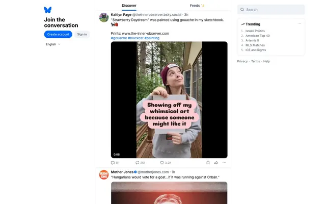
Crisp white canvas, quiet blue accent. The layout feels like a well-organized corkboard of fleeting thoughts and visual snippets, neatly pinned and easily digestible.
Color palette
Interactive elements, primary call-to-action buttons, active states, links — signaling interactive affordances with a burst of color on an otherwise monochrome canvas
Page backgrounds, dialogs, primary surfaces
Body text, primary headings, essential UI elements for maximum legibility
Subtle borders, dividers, inactive states, subtle backgrounds for content separation without harsh lines
Secondary background surfaces, subtle elevation differences, card backgrounds
Background for secondary buttons, search bars, and interactive components that require a soft, non-intrusive fill
Secondary text, metadata, tooltips — providing hierarchical differentiation from primary text
Default iconography, less emphasized UI elements — receding into the background without disappearing
Subtle icons, inactive states on interactive elements
Typography
- Weights
- 400, 500, 600, 700
- Sizes
- 11px, 12px, 13px, 15px, 16px, 24px
- Line height
- 1, 1.13, 1.2, 1.25, 1.3, 1.33
- Fallback
- Inter
The primary and only typeface, covering all text elements from small captions to large headlines. Its high legibility and variable nature allow for precise visual hierarchy and density control within a minimalist interface.
Spacing & shape
Components
Ghost Button style with `Sky Blue` (#006aff) background on hover/active, `Ebony Text` (#000000) for text. Fully rounded `999px` corners, `8px` vertical and `14px` horizontal padding. Example: 'Create account'.
Ghost Button style, `Ghost Button Background` (#eff2f6) background on hover/active, `Ebony Text` (#000000) for text. Fully rounded `999px` corners, `8px` vertical and `14px` horizontal padding. Example: 'Sign in'.
Transparent background, `Ebony Text` (#000000) for icon color. Small `4px` padding around the icon. Fully rounded `999px` corners, often used for like/comment actions. Example: numbers next to action icons ('111', '251').
Transparent background, `Ebony Text` (#000000) for text. No border, `0px` radius. No padding, allowing text to be close to the icon. Example: '111'.
Transparent background, `Ebony Text` (#000000) placeholder. No border, `0px` radius. `11px` vertical and `4px` horizontal padding. Unobtrusive design integrates seamlessly into the header.
White background, distinct from `Cloud Cover` secondary backgrounds. Rounded `12px` corners. No explicit border, relies on surrounding negative space. Internal padding varies, often `10px` for left/right content.
White background, `12px` rounded corners. No border. Contains lists of items with `Ebony Text` and `Sky Blue` links.
Circular `999px` radius, contains user imagery. Often appears with a `1px` margin or tight spacing to surrounding text.
`Sky Blue` (#006aff) text with no underline, appearing as interactive labels. This color highlights its function as a clickable element within body copy, directing users to related content.
Guidelines
- Prioritize `Ebony Text` (#000000) on `Canvas White` (#ffffff) or `Cloud Cover` (#f9fafb) for all primary text content to ensure maximum readability.
- Use `Sky Blue` (#006aff) exclusively for interactive elements like links, buttons, and active states to provide clear affordances and maintain brand identity.
- Apply `999px` border-radius to all primary and secondary buttons, as well as avatar images, to create a consistent soft, approachable aesthetic.
- Maintain a clear visual hierarchy using `Slate Text` (#405168) or `Steel Icon` (#667b99) for secondary information, metadata, and non-actionable icons.
- Utilize `Horizon Gray` (#dce2ea) for subtle dividers and borders to separate content sections without introducing heavy visual elements, supporting the light aesthetic.
- Employ the `InterVariable` typeface consistently across all text elements, leveraging its weights (400, 500, 600, 700) to establish type hierarchy and emphasis.
- Do not introduce additional vibrant colors; rely solely on `Sky Blue` (#006aff) as the primary accent color.
- Avoid hard-edged rectangular containers for interactive elements; favour the `999px` pill shape for buttons and avatars.
- Do not use shadows for elevation or depth; rely on background color changes (e.g., `Canvas White` on `Cloud Cover`) and explicit borders (`Horizon Gray`) for differentiation.
- Avoid excessive padding around embedded interactive elements like reply/like counts; use a minimal `4px` element gap for a compact interface.
- Do not use custom fonts other than `InterVariable`; this maintains the consistent, modern typographic voice.
- Never use dark backgrounds for main content areas; maintain the light theme with `Canvas White` (#ffffff) as the dominant background color.
About this system
ShowHide
Bluesky Social presents as a polished, no-nonsense social platform with a quiet confidence. The dominant achromatic palette of crisp whites and deep blacks, accented by a singular, bright blue, conveys focus on content rather than interface flourish. Consistent tight spacing and subtle border treatments maintain a sense of order while allowing user-generated content to take center stage.
Imagery predominantly consists of user-generated content: photography and digital art, which are displayed as unmasked, raw-edged squares or rectangles within post cards. There's no consistent 'brand' photography or illustration style imposed on user content. Icons are outline-style, `Steel Icon` (#667b99) by default, and `Ebony Text` (#000000) or `Sky Blue` (#006aff) for active states. These icons are functional, minimal, and visually consistent, serving purely interface purposes rather than decorative ones. The overall impression is image-heavy due to user posts, but the platform's own UI is image-minimal.
Reminiscent of X (formerly Twitter), Mastodon, Threads.
# Bluesky Social — Style Reference
> Crisp white canvas, quiet blue accent. The layout feels like a well-organized corkboard of fleeting thoughts and visual snippets, neatly pinned and easily digestible.

**Theme:** light

**Site:** https://bsky.app

Bluesky Social presents as a polished, no-nonsense social platform with a quiet confidence. The dominant achromatic palette of crisp whites and deep blacks, accented by a singular, bright blue, conveys focus on content rather than interface flourish. Consistent tight spacing and subtle border treatments maintain a sense of order while allowing user-generated content to take center stage.

## Tokens — Colors

| Name | Value | Token | Role |
|------|------|------|------|
| Sky Blue | `#006aff` | `--color-sky-blue` | Interactive elements, primary call-to-action buttons, active states, links — signaling interactive affordances with a burst of color on an otherwise monochrome canvas |
| Canvas White | `#ffffff` | `--color-canvas-white` | Page backgrounds, dialogs, primary surfaces |
| Ebony Text | `#000000` | `--color-ebony-text` | Body text, primary headings, essential UI elements for maximum legibility |
| Horizon Gray | `#dce2ea` | `--color-horizon-gray` | Subtle borders, dividers, inactive states, subtle backgrounds for content separation without harsh lines |
| Cloud Cover | `#f9fafb` | `--color-cloud-cover` | Secondary background surfaces, subtle elevation differences, card backgrounds |
| Ghost Button Background | `#eff2f6` | `--color-ghost-button-background` | Background for secondary buttons, search bars, and interactive components that require a soft, non-intrusive fill |
| Slate Text | `#405168` | `--color-slate-text` | Secondary text, metadata, tooltips — providing hierarchical differentiation from primary text |
| Steel Icon | `#667b99` | `--color-steel-icon` | Default iconography, less emphasized UI elements — receding into the background without disappearing |
| Icon Gray | `#8798b0` | `--color-icon-gray` | Subtle icons, inactive states on interactive elements |

## Tokens — Typography

### InterVariable
- **Substitute:** Inter
- **Weights:** 400, 500, 600, 700
- **Sizes:** 11px, 12px, 13px, 15px, 16px, 24px
- **Line height:** 1, 1.13, 1.2, 1.25, 1.3, 1.33
- **Role:** The primary and only typeface, covering all text elements from small captions to large headlines. Its high legibility and variable nature allow for precise visual hierarchy and density control within a minimalist interface.

## Tokens — Type Scale

| Role | Size | Line height | Letter spacing |
|------|------|------|------|
| caption | 11px | 1.25 | — |
| body-sm | 12px | 1.25 | — |
| body | 13px | 1.25 | — |
| body-lg | 15px | 1.25 | — |
| heading-sm | 16px | 1.25 | — |
| heading | 24px | 1.25 | — |

## Tokens — Spacing

- **Section gap:** 24px
- **Element gap:** 4px

## Tokens — Radius

- **Buttons:** 999px
- **Inputs:** 0px
- **Cards:** 12px
- **avatars:** 999px

## Imagery

Imagery predominantly consists of user-generated content: photography and digital art, which are displayed as unmasked, raw-edged squares or rectangles within post cards. There's no consistent 'brand' photography or illustration style imposed on user content. Icons are outline-style, `Steel Icon` (#667b99) by default, and `Ebony Text` (#000000) or `Sky Blue` (#006aff) for active states. These icons are functional, minimal, and visually consistent, serving purely interface purposes rather than decorative ones. The overall impression is image-heavy due to user posts, but the platform's own UI is image-minimal.

## Components

### Post Card

### Trending Sidebar Card

### Auth Panel with Tab Bar

### Primary Navigation Button
*Primary Call to Action*

Ghost Button style with `Sky Blue` (#006aff) background on hover/active, `Ebony Text` (#000000) for text. Fully rounded `999px` corners, `8px` vertical and `14px` horizontal padding. Example: 'Create account'.

### Secondary Navigation Button
*Secondary Action*

Ghost Button style, `Ghost Button Background` (#eff2f6) background on hover/active, `Ebony Text` (#000000) for text. Fully rounded `999px` corners, `8px` vertical and `14px` horizontal padding. Example: 'Sign in'.

### Interactive Icon Button
*Icon-only interaction*

Transparent background, `Ebony Text` (#000000) for icon color. Small `4px` padding around the icon. Fully rounded `999px` corners, often used for like/comment actions. Example: numbers next to action icons ('111', '251').

### Reply/Like Count Button
*Text and Icon interaction*

Transparent background, `Ebony Text` (#000000) for text. No border, `0px` radius. No padding, allowing text to be close to the icon. Example: '111'.

### Search Input
*Site-wide search*

Transparent background, `Ebony Text` (#000000) placeholder. No border, `0px` radius. `11px` vertical and `4px` horizontal padding. Unobtrusive design integrates seamlessly into the header.

### Post Card
*Individual content unit*

White background, distinct from `Cloud Cover` secondary backgrounds. Rounded `12px` corners. No explicit border, relies on surrounding negative space. Internal padding varies, often `10px` for left/right content.

### Trending Card
*Sidebar information display*

White background, `12px` rounded corners. No border. Contains lists of items with `Ebony Text` and `Sky Blue` links.

### Avatar Display
*User identification*

Circular `999px` radius, contains user imagery. Often appears with a `1px` margin or tight spacing to surrounding text.

### Hash Tag Link
*Categorization and navigation*

`Sky Blue` (#006aff) text with no underline, appearing as interactive labels. This color highlights its function as a clickable element within body copy, directing users to related content.

## Guidelines

### Do

- Prioritize `Ebony Text` (#000000) on `Canvas White` (#ffffff) or `Cloud Cover` (#f9fafb) for all primary text content to ensure maximum readability.
- Use `Sky Blue` (#006aff) exclusively for interactive elements like links, buttons, and active states to provide clear affordances and maintain brand identity.
- Apply `999px` border-radius to all primary and secondary buttons, as well as avatar images, to create a consistent soft, approachable aesthetic.
- Maintain a clear visual hierarchy using `Slate Text` (#405168) or `Steel Icon` (#667b99) for secondary information, metadata, and non-actionable icons.
- Utilize `Horizon Gray` (#dce2ea) for subtle dividers and borders to separate content sections without introducing heavy visual elements, supporting the light aesthetic.
- Employ the `InterVariable` typeface consistently across all text elements, leveraging its weights (400, 500, 600, 700) to establish type hierarchy and emphasis.

### Don't

- Do not introduce additional vibrant colors; rely solely on `Sky Blue` (#006aff) as the primary accent color.
- Avoid hard-edged rectangular containers for interactive elements; favour the `999px` pill shape for buttons and avatars.
- Do not use shadows for elevation or depth; rely on background color changes (e.g., `Canvas White` on `Cloud Cover`) and explicit borders (`Horizon Gray`) for differentiation.
- Avoid excessive padding around embedded interactive elements like reply/like counts; use a minimal `4px` element gap for a compact interface.
- Do not use custom fonts other than `InterVariable`; this maintains the consistent, modern typographic voice.
- Never use dark backgrounds for main content areas; maintain the light theme with `Canvas White` (#ffffff) as the dominant background color.

## Agent Prompt Guide

### Quick Color Reference
- Text: #000000 (Ebony Text)
- Background: #ffffff (Canvas White)
- CTA: #006aff (Sky Blue)
- Border: #dce2ea (Horizon Gray)
- Secondary Background: #f9fafb (Cloud Cover)

### 3-5 Example Component Prompts
1. Create a `Primary Navigation Button` labeled 'Create account': background `Sky Blue` (#006aff), text `Ebony Text` (#000000), `999px` radius, `8px 14px` padding, font `InterVariable` weight 400 size 15px.
2. Design a `Post Card`: `Canvas White` (#ffffff) background, `12px` radius. Inside, use `Ebony Text` (#000000) for usernames at `InterVariable` weight 600 size 15px, and `Slate Text` (#405168) for timestamps at `InterVariable` weight 400 size 13px. Include an `Interactive Icon Button` for 'like' with `Steel Icon` (#667b99) color and `4px` padding.
3. Implement a `Trending Card` section: background `Canvas White` (#ffffff), `12px` radius. Headline 'Trending' in `Ebony Text` (#000000) `InterVariable` weight 700 size 16px. List items with `Sky Blue` (#006aff) links using `InterVariable` weight 400 size 13px, separated by `3px` row gaps.
4. Construct a `Search Input` field: transparent background, `Ebony Text` (#000000) placeholder, `0px` border-radius, `11px` vertical and `4px` horizontal padding.
More like this





Keep what you find
A free account saves references to boards and can send you a weekly email of picks based on what you save.
To see every result, go Pro.