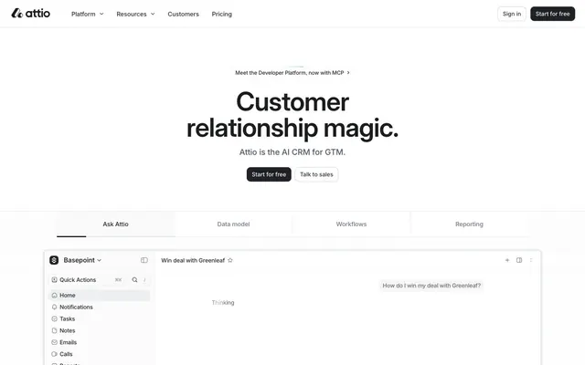
Preview image. Unlock full-res
Precision Digital Toolkit. A design system built on a foundation of high-contrast monochrome, where soft serif headlines provide a human touch to a clinical, tool-like interface.
Color palette
Decorative gradients for background accents
Links, active state indicators — a rare injection of color for interactivity
Focus rings and glows on interactive elements
Primary page background, text on dark surfaces
Subtle background panels, button pressed state
Light borders, dividers
Default borders, inactive UI elements
Placeholder text, disabled text
Secondary body text, supporting labels
Tertiary body text, icons
Icons, subtle interactive elements
Primary text, headlines, primary button background
Footer background
Status indicators, success notifications
Error messages, destructive action indicators
Warning notifications, status indicators
Typography
- Weights
- 400, 500
- Sizes
- 28px, 40px
- Line height
- 1.1, 1.23
- Fallback
- Newsreader, Lora
Used exclusively for large, emotive headlines (28px+) to add a soft, human, and editorial quality that contrasts with the functional UI. The signature `ss03` stylistic set is critical.
- Weights
- 500, 600
- Sizes
- 12px, 20px, 32px, 40px, 56px, 64px
- Line height
- 1, 1.07, 1.1, 1.17, 1.19, 1.3
- Fallback
- Inter
An optically-sized sans-serif for display text (32px+) where clarity and precision are paramount. Its tighter letter-spacing is key to its compact, authoritative appearance.
- Weights
- 400, 500, 600, 700
- Sizes
- 10px, 11px, 12px, 13px, 14px, 15px, 16px, 18px, 20px, 32px
- Line height
- 1, 1.17, 1.19, 1.2, 1.23, 1.25, 1.3, 1.33, 1.38, 1.4, 1.42, 1.43, 1.45, 1.47, 1.5, 1.57, 2.2
- Letter spacing
- -0.0200em, -0.0150em, -0.0130em, -0.0120em, -0.0110em, -0.0100em, -0.0050em
- Fallback
- system-ui, -apple-system, BlinkMacSystemFont, 'Segoe UI', Roboto, 'Helvetica Neue', Arial, sans-serif
The workhorse font for all UI elements: body copy, navigation, buttons, and labels. Its neutrality and legibility at all sizes make it the foundation of the user interface. The `ss03` stylistic set is always applied.
Spacing & shape
Elevation
Components
Background: Ink (#1c1d1f). Text: White (#ffffff). Font: 14px Inter weight 500. Padding: 8px 12px. Border: 1px solid #1c1d1f. Radius: 10px.
Background: White (#ffffff). Text: Ink (#1c1d1f). Font: 14px Inter weight 500. Padding: 8px 12px. Border: 1px solid Slate (#d3d8df). Radius: 10px.
Background: transparent. Text: Metal (#6f7988). Font: 14px Inter weight 500. Padding: 6px 10px. Radius: 10px. Hover state has an Ash (#f3f4f6) background.
Background: transparent. Text: Metal (#6f7988). Font: 15px Inter weight 500. Padding: 8px 16px. Radius: 0px. Active state has Ink (#1c1d1f) text and a 2px bottom border of Ink (#1c1d1f).
Background: White (#ffffff). Padding: 16px. Border: 1px solid Stone (#e4e7ec). Radius: 8px. Shadow: `rgba(28, 40, 64, 0.1) 0px 2px 3px -2px, rgba(28, 40, 64, 0.04) 0px 4px 6px -2px`.
Background: White (#ffffff). Text: Ink (#1c1d1f). Font: 14px Inter. Placeholder text: Lead (#b5bdc9). Border: 1px solid Slate (#d3d8df). Radius: 7px. Focus state shows a blue glow using Focus Blue (#94b9ff).
Grayscale logo fill using Carbon (#505967) or Metal (#6f7988). No background or border.
Background: Abyss (#000000). Organized into columns. Column titles use White (#ffffff) text at 14px, weight 500. Links use Overcast (#8f99a8) text at 14px, weight 400, changing to White on hover.
Guidelines
- Always set display and hero headlines in Tiempos Text.
- Use Inter with the `ss03` font feature setting for all UI copy.
- Apply negative letter-spacing to all text 18px and larger, following the type scale.
- Construct primary CTAs from Ink (#1c1d1f) backgrounds with White (#ffffff) text.
- Maintain a consistent 10px radius on all major buttons.
- Use borders (1px Slate #d3d8df) as the primary method for separating UI elements.
- Reserve color (Action Blue #407ff2) for interactive states like links and focus rings.
- Don't use Tiempos Text for body copy or any text smaller than 28px.
- Don't use color in headlines or primary buttons.
- Don't use fill-based colors unless for semantic status indicators.
- Don't apply shadows to buttons, inputs, or simple cards.
- Don't use radii other than 10px for buttons or 8px for cards.
- Don't forget to include the `ss03` font feature when setting type.
- Don't introduce new saturated colors; the palette is intentionally monochrome.
About this system
ShowHide
The design feels like a meticulously organized, high-end instrument. It operates on a starkly minimalist, black-and-white axis, where near-black (#1c1d1f) on pure white is the default state for text and primary actions. The most distinctive choice is the typographic duality: large, inviting headlines are set in the soft serif Tiempos Text, while the entire user interface, from buttons to body copy, uses the neutral sans-serif Inter. This creates a rhythm between approachable storytelling and functional precision. Color is used with extreme restraint, appearing as subtle accents for interactive states or status indicators, ensuring the user's focus remains on content and functionality. A consistent 10px radius on buttons provides a soft counterpoint to the otherwise sharp, grid-aligned UI frames.
The layout is built on a centered, max-width (1440px) model, creating generous white space on the peripheries. Hero sections are minimal, typically a large, centered headline stack. Page content follows a predictable rhythm of stacked, centered sections or simple two-column layouts. A key structural element is the large, embedded product UI demonstration, which acts as the visual centerpiece. Navigation is contained within a simple, sticky top bar.
Imagery is functional and abstract, avoiding lifestyle photography. The primary visuals are clean product UI screenshots contained within minimalist browser or app frames. Secondary visuals consist of abstract data visualizations, like the grid of grayscale profile pictures, which serve as atmospheric graphics rather than literal content. All imagery is rendered with sharp edges and presented in a clean, isolated manner.
Reminiscent of Linear, Notion, Vercel, Pitch.
# Attio — Style Reference
> Precision Digital Toolkit. A design system built on a foundation of high-contrast monochrome, where soft serif headlines provide a human touch to a clinical, tool-like interface.

**Theme:** light

**Site:** https://attio.com

The design feels like a meticulously organized, high-end instrument. It operates on a starkly minimalist, black-and-white axis, where near-black (#1c1d1f) on pure white is the default state for text and primary actions. The most distinctive choice is the typographic duality: large, inviting headlines are set in the soft serif Tiempos Text, while the entire user interface, from buttons to body copy, uses the neutral sans-serif Inter. This creates a rhythm between approachable storytelling and functional precision. Color is used with extreme restraint, appearing as subtle accents for interactive states or status indicators, ensuring the user's focus remains on content and functionality. A consistent 10px radius on buttons provides a soft counterpoint to the otherwise sharp, grid-aligned UI frames.

## Tokens — Colors

| Name | Value | Token | Role |
|------|------|------|------|
| Magic Aura | `#70a1f0` | `--color-magic-aura` | Decorative gradients for background accents |
| Action Blue | `#407ff2` | `--color-action-blue` | Links, active state indicators — a rare injection of color for interactivity |
| Focus Blue | `#94b9ff` | `--color-focus-blue` | Focus rings and glows on interactive elements |
| White | `#ffffff` | `--color-white` | Primary page background, text on dark surfaces |
| Ash | `#f3f4f6` | `--color-ash` | Subtle background panels, button pressed state |
| Stone | `#e4e7ec` | `--color-stone` | Light borders, dividers |
| Slate | `#d3d8df` | `--color-slate` | Default borders, inactive UI elements |
| Lead | `#b5bdc9` | `--color-lead` | Placeholder text, disabled text |
| Overcast | `#8f99a8` | `--color-overcast` | Secondary body text, supporting labels |
| Metal | `#6f7988` | `--color-metal` | Tertiary body text, icons |
| Carbon | `#505967` | `--color-carbon` | Icons, subtle interactive elements |
| Ink | `#1c1d1f` | `--color-ink` | Primary text, headlines, primary button background |
| Abyss | `#000000` | `--color-abyss` | Footer background |
| Success Green | `#075a39` | `--color-success-green` | Status indicators, success notifications |
| Danger Red | `#772322` | `--color-danger-red` | Error messages, destructive action indicators |
| Warning Yellow | `#705500` | `--color-warning-yellow` | Warning notifications, status indicators |

## Tokens — Typography

### Tiempos Text
- **Substitute:** Newsreader, Lora
- **Weights:** 400, 500
- **Sizes:** 28px, 40px
- **Line height:** 1.1, 1.23
- **Role:** Used exclusively for large, emotive headlines (28px+) to add a soft, human, and editorial quality that contrasts with the functional UI. The signature `ss03` stylistic set is critical.

### Inter Display
- **Substitute:** Inter
- **Weights:** 500, 600
- **Sizes:** 12px, 20px, 32px, 40px, 56px, 64px
- **Line height:** 1, 1.07, 1.1, 1.17, 1.19, 1.3
- **Role:** An optically-sized sans-serif for display text (32px+) where clarity and precision are paramount. Its tighter letter-spacing is key to its compact, authoritative appearance.

### Inter
- **Substitute:** system-ui, -apple-system, BlinkMacSystemFont, 'Segoe UI', Roboto, 'Helvetica Neue', Arial, sans-serif
- **Weights:** 400, 500, 600, 700
- **Sizes:** 10px, 11px, 12px, 13px, 14px, 15px, 16px, 18px, 20px, 32px
- **Line height:** 1, 1.17, 1.19, 1.2, 1.23, 1.25, 1.3, 1.33, 1.38, 1.4, 1.42, 1.43, 1.45, 1.47, 1.5, 1.57, 2.2
- **Letter spacing:** -0.0200em, -0.0150em, -0.0130em, -0.0120em, -0.0110em, -0.0100em, -0.0050em
- **Role:** The workhorse font for all UI elements: body copy, navigation, buttons, and labels. Its neutrality and legibility at all sizes make it the foundation of the user interface. The `ss03` stylistic set is always applied.

## Tokens — Type Scale

Major Third (1.25) from 16px base.

| Role | Size | Line height | Letter spacing |
|------|------|------|------|
| caption | 12px | 1.5 | -0.14px |
| body-sm | 14px | 1.43 | -0.14px |
| body | 16px | 1.5 | -0.24px |
| subheading | 20px | 1.3 | -0.4px |
| heading-sm | 28px | 1.23 | -0.42px |
| heading | 40px | 1.1 | -0.6px |
| heading-lg | 56px | 1.1 | -1.12px |
| display | 64px | 1.07 | -1.28px |

## Tokens — Spacing

- **Max width:** 1440px
- **Section gap:** 96px
- **Card padding:** 16px
- **Element gap:** 8px

## Tokens — Radius

- **Buttons:** 10px
- **Inputs:** 7px
- **Cards:** 8px
- **tabs:** 0px
- **tags:** 4px

## Tokens — Elevation

- **UI Frame Card:** `rgba(28, 40, 64, 0.1) 0px 2px 3px -2px, rgba(28, 40, 64, 0.04) 0px 4px 6px -2px`
- **Input Focus:** `0 0 0 3px color-mix(in srgb, #94b9ff 40%, transparent)`

## Layout

The layout is built on a centered, max-width (1440px) model, creating generous white space on the peripheries. Hero sections are minimal, typically a large, centered headline stack. Page content follows a predictable rhythm of stacked, centered sections or simple two-column layouts. A key structural element is the large, embedded product UI demonstration, which acts as the visual centerpiece. Navigation is contained within a simple, sticky top bar.

## Imagery

Imagery is functional and abstract, avoiding lifestyle photography. The primary visuals are clean product UI screenshots contained within minimalist browser or app frames. Secondary visuals consist of abstract data visualizations, like the grid of grayscale profile pictures, which serve as atmospheric graphics rather than literal content. All imagery is rendered with sharp edges and presented in a clean, isolated manner.

## Components

### CTA Button Group

### Feature Tab Bar

### AI Ask Input Card

### Primary CTA Button
*The main call-to-action.*

Background: Ink (#1c1d1f). Text: White (#ffffff). Font: 14px Inter weight 500. Padding: 8px 12px. Border: 1px solid #1c1d1f. Radius: 10px.

### Secondary CTA Button
*Secondary call-to-action, or an alternative to the primary.*

Background: White (#ffffff). Text: Ink (#1c1d1f). Font: 14px Inter weight 500. Padding: 8px 12px. Border: 1px solid Slate (#d3d8df). Radius: 10px.

### Header Navigation Button
*Used for navigation links in the main header.*

Background: transparent. Text: Metal (#6f7988). Font: 14px Inter weight 500. Padding: 6px 10px. Radius: 10px. Hover state has an Ash (#f3f4f6) background.

### Feature Tab Button
*Used in a tab group to switch between content views.*

Background: transparent. Text: Metal (#6f7988). Font: 15px Inter weight 500. Padding: 8px 16px. Radius: 0px. Active state has Ink (#1c1d1f) text and a 2px bottom border of Ink (#1c1d1f).

### UI Frame Card
*Container for complex UI modules, like the main app demo.*

Background: White (#ffffff). Padding: 16px. Border: 1px solid Stone (#e4e7ec). Radius: 8px. Shadow: `rgba(28, 40, 64, 0.1) 0px 2px 3px -2px, rgba(28, 40, 64, 0.04) 0px 4px 6px -2px`.

### Text Input
*Standard text input field.*

Background: White (#ffffff). Text: Ink (#1c1d1f). Font: 14px Inter. Placeholder text: Lead (#b5bdc9). Border: 1px solid Slate (#d3d8df). Radius: 7px. Focus state shows a blue glow using Focus Blue (#94b9ff).

### Logo Cloud Item
*Displays a partner or customer logo.*

Grayscale logo fill using Carbon (#505967) or Metal (#6f7988). No background or border.

### Page Footer
*The closing section of the page with site-wide links.*

Background: Abyss (#000000). Organized into columns. Column titles use White (#ffffff) text at 14px, weight 500. Links use Overcast (#8f99a8) text at 14px, weight 400, changing to White on hover.

## Guidelines

### Do

- Always set display and hero headlines in Tiempos Text.
- Use Inter with the `ss03` font feature setting for all UI copy.
- Apply negative letter-spacing to all text 18px and larger, following the type scale.
- Construct primary CTAs from Ink (#1c1d1f) backgrounds with White (#ffffff) text.
- Maintain a consistent 10px radius on all major buttons.
- Use borders (1px Slate #d3d8df) as the primary method for separating UI elements.
- Reserve color (Action Blue #407ff2) for interactive states like links and focus rings.

### Don't

- Don't use Tiempos Text for body copy or any text smaller than 28px.
- Don't use color in headlines or primary buttons.
- Don't use fill-based colors unless for semantic status indicators.
- Don't apply shadows to buttons, inputs, or simple cards.
- Don't use radii other than 10px for buttons or 8px for cards.
- Don't forget to include the `ss03` font feature when setting type.
- Don't introduce new saturated colors; the palette is intentionally monochrome.

## Agent Prompt Guide

### Quick Color Reference
- **Primary Text:** `#1c1d1f` (Ink)
- **Secondary Text:** `#8f99a8` (Overcast)
- **Page Background:** `#ffffff` (White)
- **Primary CTA:** bg `#1c1d1f` (Ink), text `#ffffff` (White)
- **Border:** `#d3d8df` (Slate)
- **Interactive Accent:** `#407ff2` (Action Blue)

### Example Component Prompts
1.  **Hero Section:** Create a hero with a white background. Main headline: 'Customer relationship magic.', font Tiempos Text, size 64px, weight 500, color Ink (#1c1d1f), line-height 1.07, letter-spacing -1.28px. Sub-headline below: 'Attio is the AI CRM for GTM.', font Inter, size 20px, weight 500, color Metal (#6f7988), letter-spacing -0.4px. Centered layout.

2.  **Primary CTA Button:** Create a button with the text 'Start for free'. Background color Ink (#1c1d1f), text color White (#ffffff). Font is 14px Inter at weight 500. Padding is 8px top/bottom and 12px left/right. Border-radius is 10px.

3.  **UI Frame Card:** Create a card with a White (#ffffff) background, 16px padding on all sides, an 8px border-radius, and a 1px solid border of color Stone (#e4e7ec). Apply the shadow style: `rgba(28, 40, 64, 0.1) 0px 2px 3px -2px, rgba(28, 40, 64, 0.04) 0px 4px 6px -2px`.
More like this









Keep what you find
A free account saves references to boards and can send you a weekly email of picks based on what you save.
To see every result, go Pro.