Preview image. Unlock full-res
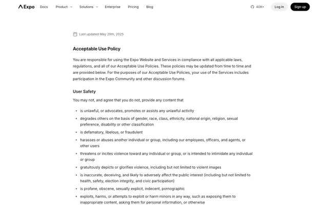
A precise technical blueprint on a minimalist canvas. Focus is achieved through stark neutrals and a single, deliberate accent.
Color palette
Primary Call-to-Action buttons, active navigation indicators, crucial interactive elements — the sole vibrant highlight signalling user interaction.
Used for specific background elements in navigation; a slightly darker, more subdued version of Expo Blue.
Subtle stroke and fill for decorative elements or less prominent interactive states, offering a muted chromatic tone.
Primary text, headers, non-interactive elements, dark icons — providing strong contrast against the light backgrounds.
Page backgrounds, card surfaces, primary button text — serving as the foundational background for all content.
Secondary text, disabled states, subtle navigation items, secondary icon strokes — for hierarchical distinction without stark contrast.
Subtle background shifts, hover states for navigation — offering a soft differentiation from pure white surfaces.
Subtle borders, dividers, form field outlines — for content separation without visual dominance.
Tertiary text, less prominent icons, and borders where a slightly darker neutral is needed.
Typography
- Weights
- 400, 500, 600, 700
- Sizes
- 12px, 14px, 16px, 18px, 20px
- Line height
- 1, 1.4, 1.6, 1.63, 1.75
- Letter spacing
- -0.012
- Fallback
- Inter
The primary typeface for all text content including body, links, buttons, navigation, and headings. Its clean sans-serif nature supports the functional aesthetic. Varied weights provide hierarchy within a consistent visual language.
Spacing & shape
Components
backgroundColor: rgba(0,0,0,0), color: #1c2024, borderTopColor: #1c2024, borderRadius: 0px, paddingTop/Right/Bottom/Left: 0px. This effectively renders as plain text with no visual decoration, relying on position for grouping.
backgroundColor: rgba(0,0,0,0), color: #1c2024, borderTopColor: rgba(0,0,0,0), borderRadius: 36px, paddingRight: 8px, paddingLeft: 16px. Visually distinct from standard text links but without a strong background fill.
backgroundColor: #0090ff (Expo Blue), color: #ffffff (Ghost White), borderTopColor: #0090ff, borderRadius: 36px, paddingRight/Left: 16px. A vivid blue pill-shaped button, standing out against the neutral palette.
backgroundColor: rgba(0,0,0,0), color: #60646c (Cool Gray), borderTopColor: #60646c, borderRadius: 0px, paddingTop/Right/Bottom/Left: 0px. Uses a muted gray text color, signaling a subordinate role compared to Midnight Ink text.
Font family: Inter, weight: 600, color: #1c2024 (Midnight Ink). Sizes are derived from type scale matching h1/h2 roles for strong content hierarchy.
Font family: Inter, weight: 400, size: 16px, lineHeight: 1.6, color: #1c2024 (Midnight Ink). Provides clear readability for detailed information.
Font family: Inter, weight: 400, size: 16px, lineHeight: 1.6, color: #1c2024 (Midnight Ink), with a consistent 4px left indent per bullet. Uses small, simple bullet points.
Guidelines
- Use Inter font family exclusively for all text elements to maintain typographic consistency.
- Apply #0090ff (Expo Blue) only to primary interactive elements and active states to preserve its signalling value.
- Employ borderRadius: 36px for all primary buttons and pill-shaped elements to establish a consistent soft touch.
- Prioritize the neutral palette of #1c2024, #ffffff, #60646c, #f0f0f3 for structure and content to maintain visual clarity.
- Utilize 4px as the base unit for all spacing, scaling up in multiples (e.g., 8px, 16px, 20px, 24px) for harmonious spatial relationships.
- Use text links that are #1c2024 (Midnight Ink) with 0px border radius and 0px padding, making them visually subtle until interaction.
- Do not introduce new typefaces; rely solely on Inter for all text.
- Avoid using highly saturated, non-blue chromatic colors for primary UI elements; maintain the achromatic base with specific blue accents.
- Do not use box-shadows for elevation; rely on background color changes or borders for differentiation between surface levels.
- Do not deviate from the established padding and radius values for buttons and interactive components; uniformity is key.
- Avoid applying a background color to generic text links; they should appear as plain text until hovered or active.
- Do not use strong, contrasting borders on elements that are meant to be visually soft or secondary; use subtle neutrals like #d9d9e0 instead.
About this system
ShowHide
Expo's design system feels like a precise technical blueprint on a minimalist canvas. It leverages a stark achromatic palette as its foundation, creating an atmosphere of clarity and focused utility. The singular bold blue (#0090ff) is reserved strictly for interactive elements like primary buttons and specific navigation items, acting as an indicator light in an otherwise subdued interface. Subtle rounded corners, particularly the exaggerated 36px radius on primary buttons, soften the otherwise sharp, text-heavy presentation, introducing an element of approachability to a highly technical subject.
The site's visual language is almost entirely UI-driven, with minimal decorative graphics. When present, images are limited to small, functional icons. These icons are typically outlined or filled in #1c2024 (Midnight Ink) or #60646c (Cool Gray), maintaining a functional, monochrome aesthetic. There is no photography or complex illustration, reinforcing the technical and content-focused nature of the brand. Imagery plays a supporting, explanatory role, never decorative or atmospheric, ensuring content takes center stage.
Reminiscent of Vercel, Stripe, Next.js Documentation, Tailwind CSS Docs.
# Expo — Style Reference
> A precise technical blueprint on a minimalist canvas. Focus is achieved through stark neutrals and a single, deliberate accent.

**Theme:** light

**Site:** https://expo.dev

Expo's design system feels like a precise technical blueprint on a minimalist canvas. It leverages a stark achromatic palette as its foundation, creating an atmosphere of clarity and focused utility. The singular bold blue (#0090ff) is reserved strictly for interactive elements like primary buttons and specific navigation items, acting as an indicator light in an otherwise subdued interface. Subtle rounded corners, particularly the exaggerated 36px radius on primary buttons, soften the otherwise sharp, text-heavy presentation, introducing an element of approachability to a highly technical subject.

## Tokens — Colors

| Name | Value | Token | Role |
|------|------|------|------|
| Expo Blue | `#0090ff` | `--color-expo-blue` | Primary Call-to-Action buttons, active navigation indicators, crucial interactive elements — the sole vibrant highlight signalling user interaction. |
| Deep Sea Blue | `#0072de` | `--color-deep-sea-blue` | Used for specific background elements in navigation; a slightly darker, more subdued version of Expo Blue. |
| Ocean Tint | `#405d96` | `--color-ocean-tint` | Subtle stroke and fill for decorative elements or less prominent interactive states, offering a muted chromatic tone. |
| Midnight Ink | `#1c2024` | `--color-midnight-ink` | Primary text, headers, non-interactive elements, dark icons — providing strong contrast against the light backgrounds. |
| Ghost White | `#ffffff` | `--color-ghost-white` | Page backgrounds, card surfaces, primary button text — serving as the foundational background for all content. |
| Cool Gray | `#60646c` | `--color-cool-gray` | Secondary text, disabled states, subtle navigation items, secondary icon strokes — for hierarchical distinction without stark contrast. |
| Whisper Gray | `#f0f0f3` | `--color-whisper-gray` | Subtle background shifts, hover states for navigation — offering a soft differentiation from pure white surfaces. |
| Parchment Gray | `#d9d9e0` | `--color-parchment-gray` | Subtle borders, dividers, form field outlines — for content separation without visual dominance. |
| Steel Gray | `#80838d` | `--color-steel-gray` | Tertiary text, less prominent icons, and borders where a slightly darker neutral is needed. |

## Tokens — Typography

### Inter
- **Substitute:** Inter
- **Weights:** 400, 500, 600, 700
- **Sizes:** 12px, 14px, 16px, 18px, 20px
- **Line height:** 1, 1.4, 1.6, 1.63, 1.75
- **Letter spacing:** -0.012
- **Role:** The primary typeface for all text content including body, links, buttons, navigation, and headings. Its clean sans-serif nature supports the functional aesthetic. Varied weights provide hierarchy within a consistent visual language.

## Tokens — Type Scale

Minor Third (1.2) from 16px base.

| Role | Size | Line height | Letter spacing |
|------|------|------|------|
| caption | 12px | 1.6 | -0.48px |
| body | 16px | 1.6 | -0.64px |
| subheading | 18px | 1.6 | -0.72px |
| heading | 20px | 1.6 | -0.8px |

## Tokens — Spacing

- **Section gap:** 40px
- **Card padding:** 16px
- **Element gap:** 8px

## Tokens — Radius

- **Buttons:** 36px
- **Cards:** 0px
- **navigationItems:** 24px
- **tags:** 9999px

## Imagery

The site's visual language is almost entirely UI-driven, with minimal decorative graphics. When present, images are limited to small, functional icons. These icons are typically outlined or filled in #1c2024 (Midnight Ink) or #60646c (Cool Gray), maintaining a functional, monochrome aesthetic. There is no photography or complex illustration, reinforcing the technical and content-focused nature of the brand. Imagery plays a supporting, explanatory role, never decorative or atmospheric, ensuring content takes center stage.

## Components

### Button Group

### Policy Section Card

### Policy Section with Badge Tags

### Primary Navigation Button (Text)
*Primary navigation links and actions within the header.*

backgroundColor: rgba(0,0,0,0), color: #1c2024, borderTopColor: #1c2024, borderRadius: 0px, paddingTop/Right/Bottom/Left: 0px. This effectively renders as plain text with no visual decoration, relying on position for grouping.

### Pill Navigation Item
*Contextual navigation or subtle interactive elements.*

backgroundColor: rgba(0,0,0,0), color: #1c2024, borderTopColor: rgba(0,0,0,0), borderRadius: 36px, paddingRight: 8px, paddingLeft: 16px. Visually distinct from standard text links but without a strong background fill.

### Primary Action Button (Filled)
*Primary Call-to-Action for high-importance user actions.*

backgroundColor: #0090ff (Expo Blue), color: #ffffff (Ghost White), borderTopColor: #0090ff, borderRadius: 36px, paddingRight/Left: 16px. A vivid blue pill-shaped button, standing out against the neutral palette.

### Secondary Navigation Button (Small)
*Less prominent navigation links and contextual actions.*

backgroundColor: rgba(0,0,0,0), color: #60646c (Cool Gray), borderTopColor: #60646c, borderRadius: 0px, paddingTop/Right/Bottom/Left: 0px. Uses a muted gray text color, signaling a subordinate role compared to Midnight Ink text.

### Headline
*Primary section titles.*

Font family: Inter, weight: 600, color: #1c2024 (Midnight Ink). Sizes are derived from type scale matching h1/h2 roles for strong content hierarchy.

### Body Text
*Standard content and paragraph text.*

Font family: Inter, weight: 400, size: 16px, lineHeight: 1.6, color: #1c2024 (Midnight Ink). Provides clear readability for detailed information.

### Bullet List Item
*Detailed factual listings, like policies or features.*

Font family: Inter, weight: 400, size: 16px, lineHeight: 1.6, color: #1c2024 (Midnight Ink), with a consistent 4px left indent per bullet. Uses small, simple bullet points.

## Guidelines

### Do

- Use Inter font family exclusively for all text elements to maintain typographic consistency.
- Apply #0090ff (Expo Blue) only to primary interactive elements and active states to preserve its signalling value.
- Employ borderRadius: 36px for all primary buttons and pill-shaped elements to establish a consistent soft touch.
- Prioritize the neutral palette of #1c2024, #ffffff, #60646c, #f0f0f3 for structure and content to maintain visual clarity.
- Utilize 4px as the base unit for all spacing, scaling up in multiples (e.g., 8px, 16px, 20px, 24px) for harmonious spatial relationships.
- Use text links that are #1c2024 (Midnight Ink) with 0px border radius and 0px padding, making them visually subtle until interaction.

### Don't

- Do not introduce new typefaces; rely solely on Inter for all text.
- Avoid using highly saturated, non-blue chromatic colors for primary UI elements; maintain the achromatic base with specific blue accents.
- Do not use box-shadows for elevation; rely on background color changes or borders for differentiation between surface levels.
- Do not deviate from the established padding and radius values for buttons and interactive components; uniformity is key.
- Avoid applying a background color to generic text links; they should appear as plain text until hovered or active.
- Do not use strong, contrasting borders on elements that are meant to be visually soft or secondary; use subtle neutrals like #d9d9e0 instead.

## Agent Prompt Guide

### Quick Color Reference
- **Text Primary:** #1c2024 (Midnight Ink)
- **Background:** #ffffff (Ghost White)
- **CTA Primary:** #0090ff (Expo Blue)
- **Secondary Text:** #60646c (Cool Gray)
- **Border/Divider:** #d9d9e0 (Parchment Gray)

### Example Component Prompts
1. **Create a primary navigation bar (sticky top):** Background #ffffff. Brand logo left. Nav links: Inter font, weight 400, size 16px, #1c2024, 0px padding. A 'Log in' button: Inter font, weight 500, size 16px, #1c2024, background rgba(0,0,0,0), border 0px, 36px radius, padding 0px. A 'Sign Up' button: Inter font, weight 500, size 16px, #ffffff, background #0090ff, 36px radius, padding 0px, right/left padding 16px. Height 60px.
2. **Generate a policy document section:** Heading 'Acceptable Use Policy' - Inter font, weight 600, size 20px, #1c2024. Body text - Inter font, weight 400, size 16px, lineHeight 1.6, #1c2024. Sub-heading 'User Safety' - Inter font, weight 600, size 18px, #1c2024. Bulleted list items: Inter font, weight 400, size 16px, lineHeight 1.6, #1c2024, indention 4px, small default bullets.
3. **Design a basic text link:** Text 'Docs' - Inter font, weight 400, size 16px, #1c2024, text-decoration none for normal link state.
4. **Create a pill-shaped tag or link:** Text 'Solutions' - Inter font, weight 400, size 16px, #1c2024, background rgba(0,0,0,0), border 0px, 36px radius, right padding 8px, left padding 16px.
More like this






Keep what you find
A free account saves references to boards and can send you a weekly email of picks based on what you save.
To see every result, go Pro.