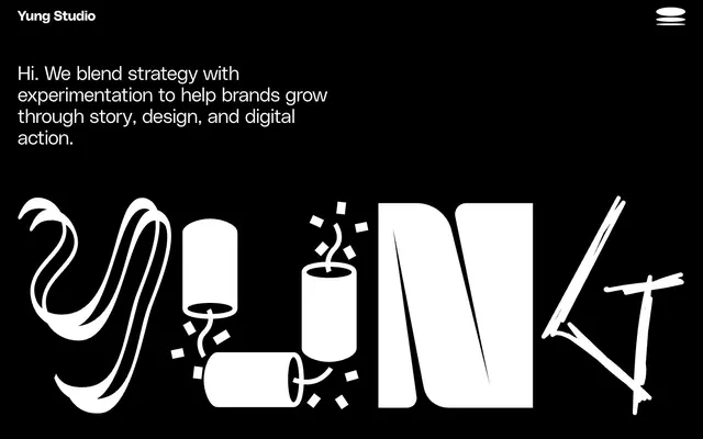
Preview image. Unlock full-res
Monochromatic Command Center. Pure black canvas where sharp white elements punctuate with precision and ample negative space.
Color palette
Subtle background accents, specific contextual highlights; provides the only chromatic color for visual differentiation.
Page backgrounds, card backgrounds, text on white buttons – the foundational darkness.
Primary text, button backgrounds, interactive elements – the dominant light element creating high contrast.
Typography
- Weights
- 400
- Sizes
- 16px, 20px, 30px, 40px
- Line height
- 1, 1.1, 1.35
- Letter spacing
- -0.0100em
- Fallback
- Inter
Body text, smaller headings, supporting information, links, and various content elements. Its uniform weight contributes to a calm, readable tone across varied text sizes.
- Weights
- 400
- Sizes
- 60px, 160px
- Line height
- 0.9, 1.1
- Letter spacing
- -0.0200em
- Fallback
- Inter
Display headings and prominent interactive elements like buttons. The extremely tight letter-spacing at large sizes creates a dense, impactful visual block rather than sprawling text, like a bold declaration.
- Weights
- 400
- Sizes
- 28px
- Line height
- 1.01
- Letter spacing
- -0.0100em
- Fallback
- Inter
Specialized links and secondary headings. This family variation offers a bulkier form factor for specific emphasis at a mid-range size.
Spacing & shape
Components
White background (`#ffffff`), black text (`#000000`). Fully rounded with `9999px` border-radius. Generous padding: `31.968px` top, `22.032px` bottom, `49.968px` sides. Uses PolySans-Neutral font, weight 400, for clear call to action.
Transparent background (`rgba(0, 0, 0, 0)`) with `0px` border-radius. No box-shadow or padding, integrating seamlessly into the negative space. Used for showcasing work items or article previews.
Uses PolySans-Slim for general links, or PolySans-Bulky at 28px for prominent links. Text color is `Ghost White` (`#ffffff`) against `Midnight Void` (`#000000`), no underline by default.
Uses PolySans-Slim at a 20px size, weight 400, `Ghost White` (`#ffffff`), positioned top-left on the `Midnight Void` (`#000000`) background.
Guidelines
- Maintain a strict achromatic palette, using only `Midnight Void` (#000000) for backgrounds and `Ghost White` (#ffffff) for primary foreground elements.
- Apply `9999px` border-radius to all interactive element buttons for a consistent pill shape.
- Utilize PolySans-Neutral with -0.0200em letter-spacing for all significant headings to create a dense, impactful typographic appearance.
- Implement `--obe` (#c692ff) sparingly as the sole chromatic accent, allowing it to highlight specific backgrounds or subtle contextual elements.
- Ensure generous `50px` horizontal padding for content sections and `20-24px` vertical spacing between elements to preserve ample negative space.
- Employ PolySans-Slim as the default font for all body copy and most secondary text at weight 400, ensuring clear readability across sizes.
- Avoid introducing any additional saturated colors beyond the designated `--ube` (#c692ff) to prevent diluting the distinct monochrome aesthetic.
- Do not use box-shadows or drop shadows; depth is implied solely through stark contrast and generous negative space.
- Refrain from deviating from the specified PolySans typefaces; custom fonts are a core identifier, and system defaults would undermine the brand.
- Do not add borders or background colors to content cards; they should appear as seamless blocks of text on the `Midnight Void` background.
- Avoid using radii other than `0px` for content containers and `9999px` for buttons, to maintain precision and the signature rounded forms.
- Do not clutter content sections; maintain the spacious `50px` horizontal padding and ample vertical element gaps to preserve legibility and impact.
About this system
ShowHide
This design system presents a stark, high-contrast aesthetic, mimicking a digital command console. Its core identity is built on pure black and white, creating immediate visual impact. The generous negative space and tight letter-spacing in headlines maintain an air of intentional precision, while the signature 9999px pill-shaped buttons introduce a single, playful soft edge.
This site features a clean visual language predominantly based on illustration and graphic elements, with minimal and direct application. The hero section displays large, custom, playful illustrations in pure white on a black background, with a hand-drawn, almost explosive quality, acting as a direct visual representation of the 'Yung' brand. The overall impression is that imagery serves a decorative, brand-identity building purpose rather than explanatory content, with a high visual density only in a dedicated hero area, transitioning to text-dominant content. Icons are minimal, represented by the white hamburger menu, suggesting a clean, outlined style. No photography is visible, reinforcing a graphic-first approach.
Reminiscent of Akin Gump, Baidu Ventures, Huge Inc., Figma (dark mode).
# Yung Studio — Style Reference
> Monochromatic Command Center. Pure black canvas where sharp white elements punctuate with precision and ample negative space.

**Theme:** dark

**Site:** https://yung.studio

This design system presents a stark, high-contrast aesthetic, mimicking a digital command console. Its core identity is built on pure black and white, creating immediate visual impact. The generous negative space and tight letter-spacing in headlines maintain an air of intentional precision, while the signature 9999px pill-shaped buttons introduce a single, playful soft edge.

## Tokens — Colors

| Name | Value | Token | Role |
|------|------|------|------|
| Accent Violet | `#c692ff` | `--color-accent-violet` | Subtle background accents, specific contextual highlights; provides the only chromatic color for visual differentiation. |
| Midnight Void | `#000000` | `--color-midnight-void` | Page backgrounds, card backgrounds, text on white buttons – the foundational darkness. |
| Ghost White | `#ffffff` | `--color-ghost-white` | Primary text, button backgrounds, interactive elements – the dominant light element creating high contrast. |

## Tokens — Typography

### PolySans-Slim
- **Substitute:** Inter
- **Weights:** 400
- **Sizes:** 16px, 20px, 30px, 40px
- **Line height:** 1, 1.1, 1.35
- **Letter spacing:** -0.0100em
- **Role:** Body text, smaller headings, supporting information, links, and various content elements. Its uniform weight contributes to a calm, readable tone across varied text sizes.

### PolySans-Neutral
- **Substitute:** Inter
- **Weights:** 400
- **Sizes:** 60px, 160px
- **Line height:** 0.9, 1.1
- **Letter spacing:** -0.0200em
- **Role:** Display headings and prominent interactive elements like buttons. The extremely tight letter-spacing at large sizes creates a dense, impactful visual block rather than sprawling text, like a bold declaration.

### PolySans-Bulky
- **Substitute:** Inter
- **Weights:** 400
- **Sizes:** 28px
- **Line height:** 1.01
- **Letter spacing:** -0.0100em
- **Role:** Specialized links and secondary headings. This family variation offers a bulkier form factor for specific emphasis at a mid-range size.

## Tokens — Type Scale

Perfect Fifth (1.5) from 16px base.

| Role | Size | Line height | Letter spacing |
|------|------|------|------|
| body | 16px | 1.35 | — |
| body-lg | 20px | 1.1 | — |
| subheading | 28px | 1.01 | -0.28px |
| heading | 30px | 1.1 | -0.3px |
| heading-lg | 40px | 1 | -0.4px |
| display | 60px | 0.9 | -1.2px |
| display-xl | 160px | 0.9 | -3.2px |

## Tokens — Spacing

- **Section gap:** 60-124px
- **Card padding:** 0px
- **Element gap:** 20-24px

## Tokens — Radius

- **Default:** 10px
- **Buttons:** 9999px
- **Cards:** 0px

## Imagery

This site features a clean visual language predominantly based on illustration and graphic elements, with minimal and direct application. The hero section displays large, custom, playful illustrations in pure white on a black background, with a hand-drawn, almost explosive quality, acting as a direct visual representation of the 'Yung' brand. The overall impression is that imagery serves a decorative, brand-identity building purpose rather than explanatory content, with a high visual density only in a dedicated hero area, transitioning to text-dominant content. Icons are minimal, represented by the white hamburger menu, suggesting a clean, outlined style. No photography is visible, reinforcing a graphic-first approach.

## Components

### Primary Action Button Group

### Stat / Metric Block

### Service / Feature Cards

### Primary Action Button
*Interactive element*

White background (`#ffffff`), black text (`#000000`). Fully rounded with `9999px` border-radius. Generous padding: `31.968px` top, `22.032px` bottom, `49.968px` sides. Uses PolySans-Neutral font, weight 400, for clear call to action.

### Naked Content Card
*Content container*

Transparent background (`rgba(0, 0, 0, 0)`) with `0px` border-radius. No box-shadow or padding, integrating seamlessly into the negative space. Used for showcasing work items or article previews.

### Text Link
*Navigation/Internal link*

Uses PolySans-Slim for general links, or PolySans-Bulky at 28px for prominent links. Text color is `Ghost White` (`#ffffff`) against `Midnight Void` (`#000000`), no underline by default.

### Header Logo
*Brand identity*

Uses PolySans-Slim at a 20px size, weight 400, `Ghost White` (`#ffffff`), positioned top-left on the `Midnight Void` (`#000000`) background.

## Guidelines

### Do

- Maintain a strict achromatic palette, using only `Midnight Void` (#000000) for backgrounds and `Ghost White` (#ffffff) for primary foreground elements.
- Apply `9999px` border-radius to all interactive element buttons for a consistent pill shape.
- Utilize PolySans-Neutral with -0.0200em letter-spacing for all significant headings to create a dense, impactful typographic appearance.
- Implement `--obe` (#c692ff) sparingly as the sole chromatic accent, allowing it to highlight specific backgrounds or subtle contextual elements.
- Ensure generous `50px` horizontal padding for content sections and `20-24px` vertical spacing between elements to preserve ample negative space.
- Employ PolySans-Slim as the default font for all body copy and most secondary text at weight 400, ensuring clear readability across sizes.

### Don't

- Avoid introducing any additional saturated colors beyond the designated `--ube` (#c692ff) to prevent diluting the distinct monochrome aesthetic.
- Do not use box-shadows or drop shadows; depth is implied solely through stark contrast and generous negative space.
- Refrain from deviating from the specified PolySans typefaces; custom fonts are a core identifier, and system defaults would undermine the brand.
- Do not add borders or background colors to content cards; they should appear as seamless blocks of text on the `Midnight Void` background.
- Avoid using radii other than `0px` for content containers and `9999px` for buttons, to maintain precision and the signature rounded forms.
- Do not clutter content sections; maintain the spacious `50px` horizontal padding and ample vertical element gaps to preserve legibility and impact.

## Agent Prompt Guide

### Quick Color Reference
- Text: `#ffffff`
- Background: `#000000`
- Button Background: `#ffffff`
- Button Text: `#000000`
- Accent: `#c692ff`

### 3-5 Example Component Prompts
1. **Create a Primary Action Button:** Text 'Get Started', background `Ghost White` (`#ffffff`), text `Midnight Void` (`#000000`), `9999px` border-radius. Padding: `31.968px` top, `22.032px` bottom, `49.968px` left and right. Font: PolySans-Neutral, weight 400, size 16px, `1.1` lineHeight, `-0.0200em` letter-spacing.
2. **Design a Hero Section:** Full-bleed `Midnight Void` (`#000000`) background. Headline 'We Define Tomorrow' in PolySans-Neutral, size 160px, weight 400, `0.9` lineHeight, `-0.0200em` letter-spacing, color `Ghost White` (`#ffffff`). Add a sub-headline 'Strategy to Action' in PolySans-Slim, size 40px, weight 400, `1.0` lineHeight, `-0.0100em` letter-spacing, color `Ghost White` (`#ffffff`). A `20px` `marginBottom` should separate headline from sub-headline.
3. **Implement a Content Block:** Background `Midnight Void` (`#000000`). Title 'Featured Work' in PolySans-Slim, size 30px, weight 400, `1.1` lineHeight, `-0.0100em` letter-spacing, color `Ghost White` (`#ffffff`). Body text 'Our latest projects blend design thinking with bold execution.' in PolySans-Slim, size 20px, weight 400, `1.1` lineHeight, `-0.0100em` letter-spacing, `Ghost White` color. Use `50px` horizontal padding for the block and `24px` `marginBottom` between title and body.
4. **Create a Text Link:** Text 'Learn More', font PolySans-Bulky, size 28px, weight 400, `1.01` lineHeight, `-0.0100em` letter-spacing, color `Ghost White` (`#ffffff`). No underline, no background, and no padding.
More like this








Keep what you find
A free account saves references to boards and can send you a weekly email of picks based on what you save.
To see every result, go Pro.