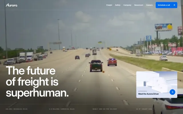
Preview image. Unlock full-res
Industrial precision on frosted glass
Color palette
Primary text, prominent headings, borders on cards and other structural elements, ghost button text
Primary action backgrounds, interactive states, navigational accents, link color, decorative icons — signaling active functions and brand identity
Starting point for a gradient highlight, paired with Aurora Blue for dynamic visual accents
Neutral form states, badge text, and quiet UI feedback where color should stay understated. Do not promote it to the primary CTA color
Secondary card backgrounds, subtle background washes for differentiation, inactive button fills
Subtle borders, dividers, and background elements, often for footers
Secondary body text, muted links, less prominent headings—providing visual relief from primary text
Tertiary text for detailed information or less emphasized links
Muted helper text, less prominent headlines, often seen in a light-on-white context
Secondary text for strong contrast on light backgrounds, used for button text and icons
Typography
- Weights
- 400, 500, 600
- Sizes
- 12px, 14px, 16px, 20px, 24px, 36px, 44px, 52px, 64px, 90px
- Line height
- 0.9, 0.95, 0.96, 0.97, 1, 1.1, 1.2, 1.3, 1.4, 1.5
- Letter spacing
- -0.0400em, -0.0380em, -0.0300em
- Fallback
- system-ui
Primary typeface for all text content, from body to display headings. Its clean, sans-serif design supports technical content, while varied weights and precise letter spacing lend a confident yet readable tone.
- Weights
- 400
- Sizes
- 13px
- Line height
- 1.2
Arial — detected in extracted data but not described by AI
Spacing & shape
Components
Fills with Aurora Blue (#006aed), uses Canvas White (#ffffff) text, and has an 8px border-radius. Padding is 14px vertical, 16px horizontal.
Transparent background with Midnight Ink (#001733) text and border. No explicit padding or border-radius, acting as a styled link.
Fills with Distant Gray (#f3f4f8) and uses Aurora Blue (#006aed) text. Feature a 50% border-radius for a pill shape. 0px padding.
Transparent background, 0px border-radius, and no box shadow. No padding by default.
Fills with Distant Gray (#f3f4f8) with an 8px border-radius and no box shadow. No padding by default.
Fills with Canvas White (#ffffff), uses Midnight Ink (#001733) text, and has a 4px border-radius. Padding is 9px vertical, 12px horizontal.
Guidelines
- Prioritize Midnight Ink (#001733) for all primary text content for strong contrast and readability.
- Use Aurora Blue (#006aed) exclusively for primary interactive elements and key brand highlights to ensure visual consistency.
- Apply 8px border-radius to all buttons, cards, and interactive elements to maintain a consistent subtle softening.
- Employ the Inter font family with judicious letter spacing adjustments (-0.03em to -0.04em for larger text) to enhance typographic precision.
- Ensure sufficient vertical rhythm by utilizing section gaps primarily at 24px and element gaps at 4px.
- Leverage Distant Gray (#f3f4f8) for secondary background surfaces to provide hierarchy without harsh contrast.
- Always use Canvas White (#ffffff) as the main page and card background for a clean, expansive feel.
- Avoid using multiple accent colors; confine brand emphasis to Aurora Blue (#006aed).
- Do not introduce sharp corners; maintain the consistent 8px or 4px border-radius to preserve the system's friendly yet precise aesthetic.
- Refrain from heavy shadows or complex gradients unless explicitly defined in the system; surfaces should generally remain flat.
- Do not deviate from the Inter font family unless specifically for code snippets; extraneous typefaces dilute brand identity.
- Avoid visual clutter by limiting decorative elements and focusing on functional UI decisions.
- Do not use generic gray values; use the defined neutral scale (Ash Mist, Slate Text, Steel Text, Subtle Gray) for consistent tone.
- Do not use unstyled links; all interactive text should either adopt Aurora Blue (#006aed) or be part of a defined component interaction.
About this system
ShowHide
Aurora presents a high-tech, industrial aesthetic, blending a mostly achromatic canvas with stark blues for critical actions and highlight elements. The design prioritizes clear information hierarchy through distinct text color variations and generous spacing. Components are generally flat and functional, with subtle rounded corners indicating interactive elements or content containers, suggesting precision and reliability.
The page uses a maximum width of 1200px, centered on the screen, creating a contained and structured feel. Hero sections feature full-bleed background videos or imagery with large, centered or left-aligned headlines. Section rhythm is characterized by consistent vertical spacing, often with seamless transitions rather than overt visual dividers. Content is frequently arranged in horizontal splits (text-left/image-right or vice-versa) or stacked vertical blocks. Card grids, particularly 3-column layouts, are used for features or news sections. The layout promotes a comfortable density, allowing breathing room between elements while maintaining clear information hierarchy, supporting a top bar navigation that can become sticky.
The visual language predominantly features high-quality product photography (trucks, Aurora Driver components) or real-world driving footage as background elements. Photography is often full-bleed or tightly cropped, emphasizing the product itself with minimal lifestyle context. Illustrations are rare, but icons, when present, are typically filled and monochromatic with a default stroke weight. Imagery serves an explanatory and product-showcasing role, integrated into hero sections or alongside textual content to illustrate capabilities. There's a balance between imagery and text, with text-dominant sections punctuated by relevant visuals.
Reminiscent of Waymo, Cruise, NVIDIA, Palo Alto Networks.
# Aurora — Style Reference
> Industrial precision on frosted glass

**Theme:** light

**Site:** https://aurora.tech

Aurora presents a high-tech, industrial aesthetic, blending a mostly achromatic canvas with stark blues for critical actions and highlight elements. The design prioritizes clear information hierarchy through distinct text color variations and generous spacing. Components are generally flat and functional, with subtle rounded corners indicating interactive elements or content containers, suggesting precision and reliability.

## Tokens — Colors

| Name | Value | Token | Role |
|------|------|------|------|
| Midnight Ink | `#001733` | `--color-midnight-ink` | Primary text, prominent headings, borders on cards and other structural elements, ghost button text |
| Aurora Blue | `#006aed` | `--color-aurora-blue` | Primary action backgrounds, interactive states, navigational accents, link color, decorative icons — signaling active functions and brand identity |
| Vivid Aqua | `#18dcdc` | `--color-vivid-aqua` | Starting point for a gradient highlight, paired with Aurora Blue for dynamic visual accents |
| Canvas White | `#ffffff` | `--color-canvas-white` | Neutral form states, badge text, and quiet UI feedback where color should stay understated. Do not promote it to the primary CTA color |
| Distant Gray | `#f3f4f8` | `--color-distant-gray` | Secondary card backgrounds, subtle background washes for differentiation, inactive button fills |
| Ash Mist | `#e6e9f0` | `--color-ash-mist` | Subtle borders, dividers, and background elements, often for footers |
| Slate Text | `#68748d` | `--color-slate-text` | Secondary body text, muted links, less prominent headings—providing visual relief from primary text |
| Steel Text | `#464e5d` | `--color-steel-text` | Tertiary text for detailed information or less emphasized links |
| Subtle Gray | `#d1d6e0` | `--color-subtle-gray` | Muted helper text, less prominent headlines, often seen in a light-on-white context |
| Deep Space | `#000000` | `--color-deep-space` | Secondary text for strong contrast on light backgrounds, used for button text and icons |

## Tokens — Typography

### Inter
- **Substitute:** system-ui
- **Weights:** 400, 500, 600
- **Sizes:** 12px, 14px, 16px, 20px, 24px, 36px, 44px, 52px, 64px, 90px
- **Line height:** 0.9, 0.95, 0.96, 0.97, 1, 1.1, 1.2, 1.3, 1.4, 1.5
- **Letter spacing:** -0.0400em, -0.0380em, -0.0300em
- **Role:** Primary typeface for all text content, from body to display headings. Its clean, sans-serif design supports technical content, while varied weights and precise letter spacing lend a confident yet readable tone.

### Arial
- **Weights:** 400
- **Sizes:** 13px
- **Line height:** 1.2
- **Role:** Arial — detected in extracted data but not described by AI

## Tokens — Type Scale

Perfect Fourth (1.333) from 16px base.

| Role | Size | Line height | Letter spacing |
|------|------|------|------|
| caption | 12px | 1.5 | — |
| body-sm | 14px | 1.4 | — |
| body | 16px | 1.3 | — |
| subheading | 20px | 1.2 | — |
| heading-sm | 24px | 1.2 | — |
| heading | 36px | 1.1 | -0.48px |
| heading-lg | 44px | 1.1 | -0.528px |
| display | 90px | 0.9 | -3.6px |

## Tokens — Spacing

- **Max width:** 1200px
- **Section gap:** 24px
- **Card padding:** 16px
- **Element gap:** 4px

## Tokens — Radius

- **Buttons:** 8px
- **Cards:** 8px
- **badges:** 4px
- **links:** 8px

## Layout

The page uses a maximum width of 1200px, centered on the screen, creating a contained and structured feel. Hero sections feature full-bleed background videos or imagery with large, centered or left-aligned headlines. Section rhythm is characterized by consistent vertical spacing, often with seamless transitions rather than overt visual dividers. Content is frequently arranged in horizontal splits (text-left/image-right or vice-versa) or stacked vertical blocks. Card grids, particularly 3-column layouts, are used for features or news sections. The layout promotes a comfortable density, allowing breathing room between elements while maintaining clear information hierarchy, supporting a top bar navigation that can become sticky.

## Imagery

The visual language predominantly features high-quality product photography (trucks, Aurora Driver components) or real-world driving footage as background elements. Photography is often full-bleed or tightly cropped, emphasizing the product itself with minimal lifestyle context. Illustrations are rare, but icons, when present, are typically filled and monochromatic with a default stroke weight. Imagery serves an explanatory and product-showcasing role, integrated into hero sections or alongside textual content to illustrate capabilities. There's a balance between imagery and text, with text-dominant sections punctuated by relevant visuals.

## Components

### Primary Call to Action Button
*Filled button indicating primary actions.*

Fills with Aurora Blue (#006aed), uses Canvas White (#ffffff) text, and has an 8px border-radius. Padding is 14px vertical, 16px horizontal.

### Ghost Navigation Button
*Navigation links or secondary actions presented without a fill.*

Transparent background with Midnight Ink (#001733) text and border. No explicit padding or border-radius, acting as a styled link.

### Pill Accent Button
*Decorative or small navigational buttons, often for page navigation within a component.*

Fills with Distant Gray (#f3f4f8) and uses Aurora Blue (#006aed) text. Feature a 50% border-radius for a pill shape. 0px padding.

### Content Card (Default)
*Containers for information without visual emphasis.*

Transparent background, 0px border-radius, and no box shadow. No padding by default.

### Content Card (Subtle Background)
*Containers for grouped information, providing a soft background separation.*

Fills with Distant Gray (#f3f4f8) with an 8px border-radius and no box shadow. No padding by default.

### Info Badge
*Small informational labels for status or categorization.*

Fills with Canvas White (#ffffff), uses Midnight Ink (#001733) text, and has a 4px border-radius. Padding is 9px vertical, 12px horizontal.

## Guidelines

### Do

- Prioritize Midnight Ink (#001733) for all primary text content for strong contrast and readability.
- Use Aurora Blue (#006aed) exclusively for primary interactive elements and key brand highlights to ensure visual consistency.
- Apply 8px border-radius to all buttons, cards, and interactive elements to maintain a consistent subtle softening.
- Employ the Inter font family with judicious letter spacing adjustments (-0.03em to -0.04em for larger text) to enhance typographic precision.
- Ensure sufficient vertical rhythm by utilizing section gaps primarily at 24px and element gaps at 4px.
- Leverage Distant Gray (#f3f4f8) for secondary background surfaces to provide hierarchy without harsh contrast.
- Always use Canvas White (#ffffff) as the main page and card background for a clean, expansive feel.

### Don't

- Avoid using multiple accent colors; confine brand emphasis to Aurora Blue (#006aed).
- Do not introduce sharp corners; maintain the consistent 8px or 4px border-radius to preserve the system's friendly yet precise aesthetic.
- Refrain from heavy shadows or complex gradients unless explicitly defined in the system; surfaces should generally remain flat.
- Do not deviate from the Inter font family unless specifically for code snippets; extraneous typefaces dilute brand identity.
- Avoid visual clutter by limiting decorative elements and focusing on functional UI decisions.
- Do not use generic gray values; use the defined neutral scale (Ash Mist, Slate Text, Steel Text, Subtle Gray) for consistent tone.
- Do not use unstyled links; all interactive text should either adopt Aurora Blue (#006aed) or be part of a defined component interaction.

## Agent Prompt Guide

Quick Color Reference:
text: #001733
background: #ffffff
border: #e6e9f0
accent: #006aed
primary action: #006aed (filled action)

Example Component Prompts:
1. Create a Primary Action Button: #006aed background, #ffffff text, 9999px radius, compact pill padding. Use this filled treatment for the main CTA.
2. Create a content card: Distant Gray (#f3f4f8) background, 8px border-radius, 16px padding. Inside, 'Introduction' in Inter 20px, weight 500, Midnight Ink text, followed by 2 body paragraphs in Inter 16px, weight 400, Slate Text (#68748d).
3. Create a navigation bar item for desktop: Ghost Navigation Button with text 'Company' in Inter 16px, weight 500, Midnight Ink (#001733) text.
More like this





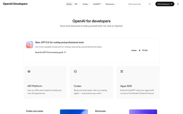




Keep what you find
A free account saves references to boards and can send you a weekly email of picks based on what you save.
To see every result, go Pro.