Preview image. Unlock full-res
Architectural blueprints on frosted glass. A digital space that feels both precise and slightly translucent, built on foundational whites and grays.
Color palette
Page background, primary surface for content containers.
Elevated card backgrounds, subtly distinct from the canvas.
Secondary card backgrounds, navigation items – offers a soft contrast.
Primary text for headings and body content, providing strong readability against light backgrounds.
Secondary text for descriptions and less prominent information.
Muted text, borders, and subtle decorative elements – provides a hint of structure.
Used for shadow effects with transparency, and for very dark text/icons.
Specific interactive component backgrounds.
Used as a background in some card variants, indicating an alternative surface.
Navigation links and some decorative elements, a near-black for emphasis.
Typography
- Weights
- 400, 500, 600
- Sizes
- 12px, 14px, 16px, 18px, 20px, 30px
- Line height
- 1, 1.3, 1.33, 1.38, 1.4, 1.43, 1.5, 1.63, 1.75
- Letter spacing
- -0.008, -0.01, -0.011, -0.011, -0.011, -0.02
- Fallback
- Inter
Primary brand typeface. Weight 600 is used for prominent headings, establishing a clear yet understated hierarchy. Weight 500 for subheadings and important text, maintaining a crisp presence. Weight 400 is the default for body text and navigation, ensuring high readability over extended passages. The precise, tighter letter-spacing especially at larger sizes contributes to the technical and modern feel.
Spacing & shape
Elevation
Components
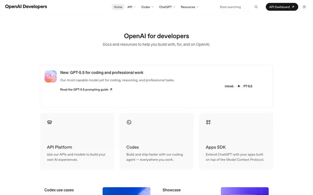
Text link with `Graphite Text` (#5d5d5d) at 16px, weight 400. On hover, text color changes to `Slate Text` (#282828). No explicit background or borders. Letter-spacing normal.
Filled button with `Shadow` (#000000) background and `Canvas White` (#ffffff) text. Features `9999px` border-radius and `8px` vertical, `16px` horizontal padding. Font `OpenAI Sans` 16px weight 500.
Container with `Canvas White` (#ffffff) background, `9999px` border-radius. Text input uses `Slate Text` (#282828) at 16px. Placeholder text `Start searching` in `Graphite Text` (#5d5d5d).
Card with `Canvas White` (#ffffff) background and `10px` border-radius. Features diffused shadow `rgba(0, 0, 0, 0.08) 0px 1px 2px -1px`. Contains headlines, body text, and links. Example: 'New: GPT-5.5' card.
Card with `Cloud Gray` (#f9f9f9) background and `8px` border-radius. Contains `Slate Text` (#282828) heading (e.g. 'API Platform') at 20px 500 weight, and `Graphite Text` (#5d5d5d) body text at 16px 400 weight. Padding is `32px` on all sides.
Card with `Whisper Gray` (#ededed) background and `8px` border-radius. Text styling and padding are identical to the 'Feature Card (Default)'. Used in varied layout contexts to subtly differentiate sections.
Text link with `Slate Text` (#282828) as the default color. Font `OpenAI Sans` 16px weight 400. Example: 'Read the GPT-5.5 prompting guide'. No explicit underline by default.
Guidelines
- Use `OpenAI Sans` weight 600 for all primary headings, and weight 500 for secondary headings to establish clear hierarchy.
- Employ `Canvas White` (#ffffff) as the default page background and `Cloud Gray` (#f9f9f9) for most card or elevated section backgrounds.
- Apply `8px` border-radius to all feature cards, images, and embedded media elements for visual consistency.
- For interactive buttons, utilize `9999px` (pill shape) border-radius with `Shadow` (#000000) for filled states.
- Maintain `16px` as the standard base font size for body text (`OpenAI Sans` weight 400) colored `Slate Text` (#282828).
- Integrate the `rgba(0, 0, 0, 0.08) 0px 1px 2px -1px` shadow for subtle elevation on key informational cards or interactive containers.
- Ensure `4px` horizontal and `8px` vertical spacing for most inline elements and small gaps within components.
- Avoid using highly saturated or vibrant colors; the system relies on a monochromatic base with subtle shifts in neutral tones.
- Do not introduce square corners on buttons or interactive elements; all buttons must maintain `9999px` radius.
- Refrain from using strong, dark borders around cards; rely on background color shifts and subtle shadows for visual separation.
- Do not use letter-spacing wider than normal; the tightly tracked `OpenAI Sans` is a key brand characteristic.
- Avoid large hero gradients or busy background images; keep backgrounds clean and functional.
- Do not deviate from the established `4px` spacing base unit for element and component spacing.
About this system
ShowHide
The OpenAI Developers site presents a professional and approachable aesthetic, grounded in a refined grayscale palette. Soft, diffused shadows on card elements subtly layer content, avoiding harsh contrasts. Typography employs a custom Sans typeface with precise letter-spacing, particularly noticeable on headlines, cultivating a sense of technical clarity. The design relies on careful text density and spacious layouts to maintain an open, readable environment, with interactive elements subtly highlighted through state changes rather than high-chroma accents.
The page uses a contained max-width layout (approximately 1200px) centered on a `Canvas White` background, providing ample whitespace. The hero section features a centered `OpenAI for developers` heading. Content is primarily arranged in single-column stacks for main text blocks, transitioning to multi-column card grids (e.g., three-column feature cards for 'API Platform', 'Codex', 'Apps SDK'). Sections maintain consistent vertical spacing, creating an organized rhythm. The sticky top navigation bar is minimal, featuring centered links and right-aligned action buttons.
The site predominantly uses abstract graphics and clean product-focused icons. Icons are outlined, monochrome, and have a consistent stroke weight, visually aligning with the UI's precision. When images are present (like the 'GPT-5.5' icon), they feature soft, gradient-like colors within a rounded container. Imagery serves an explanatory or indicative role, not decorative. The visual density is image-light, with UI and text taking precedence.
Reminiscent of Vercel, Stripe Developers, Linear.
# OpenAI Developers — Style Reference
> Architectural blueprints on frosted glass. A digital space that feels both precise and slightly translucent, built on foundational whites and grays.

**Theme:** light

**Site:** https://developers.openai.com

The OpenAI Developers site presents a professional and approachable aesthetic, grounded in a refined grayscale palette. Soft, diffused shadows on card elements subtly layer content, avoiding harsh contrasts. Typography employs a custom Sans typeface with precise letter-spacing, particularly noticeable on headlines, cultivating a sense of technical clarity. The design relies on careful text density and spacious layouts to maintain an open, readable environment, with interactive elements subtly highlighted through state changes rather than high-chroma accents.

## Tokens — Colors

| Name | Value | Token | Role |
|------|------|------|------|
| Canvas White | `#ffffff` | `--color-canvas-white` | Page background, primary surface for content containers. |
| Cloud Gray | `#f9f9f9` | `--color-cloud-gray` | Elevated card backgrounds, subtly distinct from the canvas. |
| Whisper Gray | `#ededed` | `--color-whisper-gray` | Secondary card backgrounds, navigation items – offers a soft contrast. |
| Slate Text | `#282828` | `--color-slate-text` | Primary text for headings and body content, providing strong readability against light backgrounds. |
| Graphite Text | `#5d5d5d` | `--color-graphite-text` | Secondary text for descriptions and less prominent information. |
| Subtle Gray | `#64748b` | `--color-subtle-gray` | Muted text, borders, and subtle decorative elements – provides a hint of structure. |
| Shadow | `#000000` | `--color-shadow` | Used for shadow effects with transparency, and for very dark text/icons. |
| Input Pale | `#f3f3f3` | `--color-input-pale` | Specific interactive component backgrounds. |
| Dark Overlay | `#181818` | `--color-dark-overlay` | Used as a background in some card variants, indicating an alternative surface. |
| Accent Black | `#0d0d0d` | `--color-accent-black` | Navigation links and some decorative elements, a near-black for emphasis. |

## Tokens — Typography

### OpenAI Sans
- **Substitute:** Inter
- **Weights:** 400, 500, 600
- **Sizes:** 12px, 14px, 16px, 18px, 20px, 30px
- **Line height:** 1, 1.3, 1.33, 1.38, 1.4, 1.43, 1.5, 1.63, 1.75
- **Letter spacing:** -0.008, -0.01, -0.011, -0.011, -0.011, -0.02
- **Role:** Primary brand typeface. Weight 600 is used for prominent headings, establishing a clear yet understated hierarchy. Weight 500 for subheadings and important text, maintaining a crisp presence. Weight 400 is the default for body text and navigation, ensuring high readability over extended passages. The precise, tighter letter-spacing especially at larger sizes contributes to the technical and modern feel.

## Tokens — Type Scale

Minor Third (1.2) from 16px base.

| Role | Size | Line height | Letter spacing |
|------|------|------|------|
| caption | 12px | 1.75 | — |
| body-sm | 14px | 1.43 | — |
| body | 16px | 1.5 | -0.176px |
| subheading | 18px | 1.38 | -0.198px |
| heading-sm | 20px | 1.33 | -0.22px |
| display | 30px | 1 | -0.6px |

## Tokens — Spacing

- **Max width:** 1200px
- **Section gap:** 64px
- **Card padding:** 20px
- **Element gap:** 4px

## Tokens — Radius

- **Default:** 8px
- **Buttons:** 9999px
- **Cards:** 8px
- **banners:** 10px
- **callouts:** 10px

## Tokens — Elevation

- **Info Callout Card:** `rgba(0, 0, 0, 0.08) 0px 1px 2px -1px`

## Layout

The page uses a contained max-width layout (approximately 1200px) centered on a `Canvas White` background, providing ample whitespace. The hero section features a centered `OpenAI for developers` heading. Content is primarily arranged in single-column stacks for main text blocks, transitioning to multi-column card grids (e.g., three-column feature cards for 'API Platform', 'Codex', 'Apps SDK'). Sections maintain consistent vertical spacing, creating an organized rhythm. The sticky top navigation bar is minimal, featuring centered links and right-aligned action buttons.

## Imagery

The site predominantly uses abstract graphics and clean product-focused icons. Icons are outlined, monochrome, and have a consistent stroke weight, visually aligning with the UI's precision. When images are present (like the 'GPT-5.5' icon), they feature soft, gradient-like colors within a rounded container. Imagery serves an explanatory or indicative role, not decorative. The visual density is image-light, with UI and text taking precedence.

## Components

### Primary Navigation Link
*Navigation item*

Text link with `Graphite Text` (#5d5d5d) at 16px, weight 400. On hover, text color changes to `Slate Text` (#282828). No explicit background or borders. Letter-spacing normal.

### API Dashboard Button
*Call to action button*

Filled button with `Shadow` (#000000) background and `Canvas White` (#ffffff) text. Features `9999px` border-radius and `8px` vertical, `16px` horizontal padding. Font `OpenAI Sans` 16px weight 500.

### Search Input Field
*Search interface element*

Container with `Canvas White` (#ffffff) background, `9999px` border-radius. Text input uses `Slate Text` (#282828) at 16px. Placeholder text `Start searching` in `Graphite Text` (#5d5d5d).

### Info Callout Card
*Informational alert/highlight*

Card with `Canvas White` (#ffffff) background and `10px` border-radius. Features diffused shadow `rgba(0, 0, 0, 0.08) 0px 1px 2px -1px`. Contains headlines, body text, and links. Example: 'New: GPT-5.5' card.

### Feature Card (Default)
*Interactive content display*

Card with `Cloud Gray` (#f9f9f9) background and `8px` border-radius. Contains `Slate Text` (#282828) heading (e.g. 'API Platform') at 20px 500 weight, and `Graphite Text` (#5d5d5d) body text at 16px 400 weight. Padding is `32px` on all sides.

### Feature Card (Alternative)
*Interactive content display*

Card with `Whisper Gray` (#ededed) background and `8px` border-radius. Text styling and padding are identical to the 'Feature Card (Default)'. Used in varied layout contexts to subtly differentiate sections.

### Text Link (Inline)
*Interactive text link*

Text link with `Slate Text` (#282828) as the default color. Font `OpenAI Sans` 16px weight 400. Example: 'Read the GPT-5.5 prompting guide'. No explicit underline by default.

## Guidelines

### Do

- Use `OpenAI Sans` weight 600 for all primary headings, and weight 500 for secondary headings to establish clear hierarchy.
- Employ `Canvas White` (#ffffff) as the default page background and `Cloud Gray` (#f9f9f9) for most card or elevated section backgrounds.
- Apply `8px` border-radius to all feature cards, images, and embedded media elements for visual consistency.
- For interactive buttons, utilize `9999px` (pill shape) border-radius with `Shadow` (#000000) for filled states.
- Maintain `16px` as the standard base font size for body text (`OpenAI Sans` weight 400) colored `Slate Text` (#282828).
- Integrate the `rgba(0, 0, 0, 0.08) 0px 1px 2px -1px` shadow for subtle elevation on key informational cards or interactive containers.
- Ensure `4px` horizontal and `8px` vertical spacing for most inline elements and small gaps within components.

### Don't

- Avoid using highly saturated or vibrant colors; the system relies on a monochromatic base with subtle shifts in neutral tones.
- Do not introduce square corners on buttons or interactive elements; all buttons must maintain `9999px` radius.
- Refrain from using strong, dark borders around cards; rely on background color shifts and subtle shadows for visual separation.
- Do not use letter-spacing wider than normal; the tightly tracked `OpenAI Sans` is a key brand characteristic.
- Avoid large hero gradients or busy background images; keep backgrounds clean and functional.
- Do not deviate from the established `4px` spacing base unit for element and component spacing.

## Agent Prompt Guide

### Quick Color Reference
- Text Primary: #282828
- Background Canvas: #ffffff
- CTA Background: #000000
- Border/Muted Text: #64748b
- Card Surface: #f9f9f9

### 3-5 Example Component Prompts
1. Create a `Primary Navigation Link` for 'Documentation': Text `Documentation` in `Graphite Text` (#5d5d5d), `OpenAI Sans` 16px weight 400. On hover, text color changes to `Slate Text` (#282828).
2. Generate an `API Dashboard Button`: Background `Shadow` (#000000), text `Canvas White` (#ffffff), `9999px` border-radius. Padding `8px` vertical, `16px` horizontal. Text `OpenAI Sans` 16px weight 500.
3. Design an `Info Callout Card` with the headline 'Important Update': Background `Canvas White` (#ffffff), `10px` border-radius, shadow `rgba(0, 0, 0, 0.08) 0px 1px 2px -1px`. Headline `Slate Text` (#282828), `OpenAI Sans` 20px weight 600, letter-spacing -0.22px.
4. Create a `Feature Card (Default)` for 'AI Models': Background `Cloud Gray` (#f9f9f9), `8px` border-radius, `32px` padding on all sides. Heading `AI Models` in `Slate Text` (#282828), `OpenAI Sans` 20px weight 500, letter-spacing -0.22px. Body text below in `Graphite Text` (#5d5d5d), `OpenAI Sans` 16px weight 400, line height 1.5.
More like this









Keep what you find
A free account saves references to boards and can send you a weekly email of picks based on what you save.
To see every result, go Pro.