Preview image. Unlock full-res
Midnight gradient glow
Color palette
Blue wash for highlight backgrounds, decorative bands, and soft emphasis behind content. Do not promote it to the primary CTA color
Decorative accents, illustration elements, subtle glowing borders
Green outline accent for tags, dividers, and focused UI edges. Do not promote it to the primary CTA color
Page backgrounds, card backgrounds, deep shadows, primary button fill, text
Elevated card backgrounds, secondary surface
Muted text, subtle borders, secondary text
Link text, subtle borders
Primary text, heading text, button text, active borders
Typography
- Weights
- 300, 400, 700, 900
- Sizes
- 11px, 13px, 14px, 15px, 17px, 18px, 24px, 53px, 56px
- Line height
- 1, 1.05, 1.1, 1.2, 1.43, 1.5, 1.82
- Letter spacing
- 0.2860em
- Fallback
- Helvetica Neue
Primary typeface for all interface elements including navigation, headings, body text, and buttons. Its wide range of weights, including light 300, contributes to the sophisticated yet compact feel.
- Weights
- 400
- Sizes
- 17px, 18px, 19px, 35px
- Line height
- 1.2, 1.5
- Letter spacing
- normal
- Fallback
- Sacramento
Decorative script font used for brand elements and occasional visual flair, offering a human touch against the structured primary typeface. Only seen as part of 'Lava' logo.
Spacing & shape
Elevation
Components
Filled with Midnight Aura, White Frost text, 200px border-radius. Padding 12px vertical, 40px horizontal.
Ash Slate background, 20px border-radius, with 37px padding on top, right, and left, and 44px on bottom. No shadow.
Transparent background, 20px border-radius, with a deep shadow: rgba(0, 0, 0, 0.5) 14px 14px 40px 0px or rgba(0, 0, 0, 0.6) 14px 14px 40px 0px.
Ash Slate background, 18px border-radius. No top/side padding, 56px bottom padding. No shadow.
White Frost text with occasional Neon Green border. Uses Neue Haas Unica font at 14px with 0.2860em letter spacing.
Guidelines
- Prioritize Midnight Aura (#000000) for all significant backgrounds and surface fills to maintain the dark theme.
- Use White Frost (#ffffff) exclusively for primary text and headings for maximum contrast against dark surfaces.
- Apply Spectrum Gradient (linear-gradient(45deg, #0072ff, #00d2e8 17%, #04fd8f 34%, #70fd6c 51%, #dae11 68%, #ff9346 85%, #ff62c6)) as a border for interactive elements and highlights to provide a signature brand cue.
- Maintain a 200px border-radius for all primary buttons to achieve a highly rounded, 'pill' shape.
- Utilize Neue Haas Unica with a 0.2860em letter spacing for most headings and substantial text blocks to enforce conciseness and character.
- Employ the 14px 14px 40px 0px shadow for cards that require significant visual elevation, with an opacity of 50-60%.
- Ensure generous padding on cards, specifically using 37px (top/right/left) and 44px (bottom) when content needs breathing room within the card.
- Avoid using bright, full-saturation colors for large background areas; reserve them for accents, highlights, and gradients.
- Do not deviate from the predominantly dark theme; avoid light backgrounds except as direct content within media.
- Do not use generic square or slightly rounded corners for buttons; all buttons must use the 200px 'pill' radius.
- Refrain from using shadows on every element; reserve them only for cards needing explicit elevation in a dark environment.
- Do not use letter-spacing: normal for headlines where tight tracking is preferred; consistently apply the 0.2860em value for Neue Haas Unica where specified.
- Avoid using decorative fonts like Galada for body text or functional interface elements; it is reserved for specific brand elements.
- Do not introduce new border-radius values; stick to the established system of 20px for cards, 15px for images, and 200px for buttons.
About this system
ShowHide
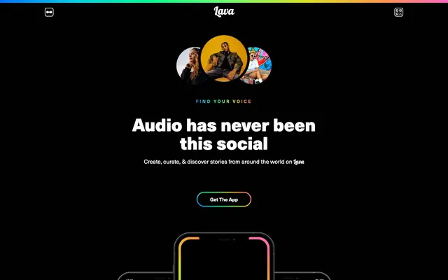
Lava's design system evokes a 'midnight command center behind frosted glass' aesthetic with its deeply saturated dark theme and vibrant, multi-hued gradients. Typography is bold and compact, contrasting against the dark surfaces, and often utilizes fine weights to convey a sophisticated tone. Components are sharp-edged yet rounded for a tactile feel, featuring prominent glow effects and a scarcity of true white, reserving it for core text elements.
The page primarily uses a full-bleed black background but contains content within a responsive, likely max-width centered layout rather than edge-to-edge. The hero section is full-bleed black with a centered headline and circular hero imagery. Sections have a consistent vertical rhythm, with clear spacing between content blocks. Content arrangement often features centered stacks for headlines and calls to action, followed by multi-column grids (like the 3-column card grid for features). Navigation is a sticky top bar, minimally present with white icons against the full-bleed gradient. The layout manages to feel both spacious and information-dense, using the dark canvas to make content pop.
The visual language for imagery is characterized by tightly cropped, often circular or pill-shaped, photographs of diverse individuals or vibrant abstract graphics, which are typically contained within cards or act as focal points. Photography is dynamic and often involves high-contrast subjects. Product screenshots are contained within device outlines, which themselves often feature glowing gradient borders. Icons are minimal, outlined, or filled, and primarily monochrome or utilize the brand's accent colors. Imagery serves both decorative atmosphere and explicit product showcase, with a relatively high density of visual content that balances text-dominant sections.
Reminiscent of Clubhouse, Spotify (Dark Mode), Discord, Netflix.
# Ayo — Style Reference
> Midnight gradient glow

**Theme:** dark

**Site:** https://www.joinlava.com

Lava's design system evokes a 'midnight command center behind frosted glass' aesthetic with its deeply saturated dark theme and vibrant, multi-hued gradients. Typography is bold and compact, contrasting against the dark surfaces, and often utilizes fine weights to convey a sophisticated tone. Components are sharp-edged yet rounded for a tactile feel, featuring prominent glow effects and a scarcity of true white, reserving it for core text elements.

## Tokens — Colors

| Name | Value | Token | Role |
|------|------|------|------|
| Spectrum Gradient | `#0072ff` | `--color-spectrum-gradient` | Blue wash for highlight backgrounds, decorative bands, and soft emphasis behind content. Do not promote it to the primary CTA color |
| Vivid Pink | `#491363` | `--color-vivid-pink` | Decorative accents, illustration elements, subtle glowing borders |
| Neon Green | `#04fd8f` | `--color-neon-green` | Green outline accent for tags, dividers, and focused UI edges. Do not promote it to the primary CTA color |
| Midnight Aura | `#000000` | `--color-midnight-aura` | Page backgrounds, card backgrounds, deep shadows, primary button fill, text |
| Ash Slate | `#1f2023` | `--color-ash-slate` | Elevated card backgrounds, secondary surface |
| Carbon Gray | `#333333` | `--color-carbon-gray` | Muted text, subtle borders, secondary text |
| Storm Gray | `#383b40` | `--color-storm-gray` | Link text, subtle borders |
| White Frost | `#ffffff` | `--color-white-frost` | Primary text, heading text, button text, active borders |

## Tokens — Typography

### Neue haas unica
- **Substitute:** Helvetica Neue
- **Weights:** 300, 400, 700, 900
- **Sizes:** 11px, 13px, 14px, 15px, 17px, 18px, 24px, 53px, 56px
- **Line height:** 1, 1.05, 1.1, 1.2, 1.43, 1.5, 1.82
- **Letter spacing:** 0.2860em
- **Role:** Primary typeface for all interface elements including navigation, headings, body text, and buttons. Its wide range of weights, including light 300, contributes to the sophisticated yet compact feel.

### Galada
- **Substitute:** Sacramento
- **Weights:** 400
- **Sizes:** 17px, 18px, 19px, 35px
- **Line height:** 1.2, 1.5
- **Letter spacing:** normal
- **Role:** Decorative script font used for brand elements and occasional visual flair, offering a human touch against the structured primary typeface. Only seen as part of 'Lava' logo.

## Tokens — Type Scale

| Role | Size | Line height | Letter spacing |
|------|------|------|------|
| caption | 11px | 1.43 | 0.286px |
| heading | 24px | 1.1 | 0.286px |
| heading-lg | 53px | 1.05 | 0.286px |
| display | 56px | 1 | 0.286px |

## Tokens — Spacing

- **Section gap:** 27px
- **Card padding:** 37px
- **Element gap:** 5px

## Tokens — Radius

- **Buttons:** 200px
- **Cards:** 20px
- **Images:** 15px
- **circularElements:** 100px

## Tokens — Elevation

- **Floating Card:** `rgba(0, 0, 0, 0.5) 14px 14px 40px 0px`
- **Floating Card (stronger):** `rgba(0, 0, 0, 0.6) 14px 14px 40px 0px`

## Layout

The page primarily uses a full-bleed black background but contains content within a responsive, likely max-width centered layout rather than edge-to-edge. The hero section is full-bleed black with a centered headline and circular hero imagery. Sections have a consistent vertical rhythm, with clear spacing between content blocks. Content arrangement often features centered stacks for headlines and calls to action, followed by multi-column grids (like the 3-column card grid for features). Navigation is a sticky top bar, minimally present with white icons against the full-bleed gradient. The layout manages to feel both spacious and information-dense, using the dark canvas to make content pop.

## Imagery

The visual language for imagery is characterized by tightly cropped, often circular or pill-shaped, photographs of diverse individuals or vibrant abstract graphics, which are typically contained within cards or act as focal points. Photography is dynamic and often involves high-contrast subjects. Product screenshots are contained within device outlines, which themselves often feature glowing gradient borders. Icons are minimal, outlined, or filled, and primarily monochrome or utilize the brand's accent colors. Imagery serves both decorative atmosphere and explicit product showcase, with a relatively high density of visual content that balances text-dominant sections.

## Components

### Primary Action Button
*Main call-to-action button for initiating key user flows.*

Filled with Midnight Aura, White Frost text, 200px border-radius. Padding 12px vertical, 40px horizontal.

### Standard Card
*Container for content sections, often featuring media.*

Ash Slate background, 20px border-radius, with 37px padding on top, right, and left, and 44px on bottom. No shadow.

### Floating Card Shadowed
*Container for content, elevated with a pronounced shadow.*

Transparent background, 20px border-radius, with a deep shadow: rgba(0, 0, 0, 0.5) 14px 14px 40px 0px or rgba(0, 0, 0, 0.6) 14px 14px 40px 0px.

### Compact Card
*Small content blocks, typically without explicit top/side padding.*

Ash Slate background, 18px border-radius. No top/side padding, 56px bottom padding. No shadow.

### Header Navigation Item
*Interactive elements within the main navigation bar.*

White Frost text with occasional Neon Green border. Uses Neue Haas Unica font at 14px with 0.2860em letter spacing.

## Guidelines

### Do

- Prioritize Midnight Aura (#000000) for all significant backgrounds and surface fills to maintain the dark theme.
- Use White Frost (#ffffff) exclusively for primary text and headings for maximum contrast against dark surfaces.
- Apply Spectrum Gradient (linear-gradient(45deg, #0072ff, #00d2e8 17%, #04fd8f 34%, #70fd6c 51%, #dae11 68%, #ff9346 85%, #ff62c6)) as a border for interactive elements and highlights to provide a signature brand cue.
- Maintain a 200px border-radius for all primary buttons to achieve a highly rounded, 'pill' shape.
- Utilize Neue Haas Unica with a 0.2860em letter spacing for most headings and substantial text blocks to enforce conciseness and character.
- Employ the 14px 14px 40px 0px shadow for cards that require significant visual elevation, with an opacity of 50-60%.
- Ensure generous padding on cards, specifically using 37px (top/right/left) and 44px (bottom) when content needs breathing room within the card.

### Don't

- Avoid using bright, full-saturation colors for large background areas; reserve them for accents, highlights, and gradients.
- Do not deviate from the predominantly dark theme; avoid light backgrounds except as direct content within media.
- Do not use generic square or slightly rounded corners for buttons; all buttons must use the 200px 'pill' radius.
- Refrain from using shadows on every element; reserve them only for cards needing explicit elevation in a dark environment.
- Do not use letter-spacing: normal for headlines where tight tracking is preferred; consistently apply the 0.2860em value for Neue Haas Unica where specified.
- Avoid using decorative fonts like Galada for body text or functional interface elements; it is reserved for specific brand elements.
- Do not introduce new border-radius values; stick to the established system of 20px for cards, 15px for images, and 200px for buttons.

## Agent Prompt Guide

Quick Color Reference:
text: #ffffff
background: #000000
border: #333333
accent: #491363
primary action: #000000 (filled action)

Example Component Prompts:
1. Create a Primary Action Button: #000000 background, #ffffff text, 9999px radius, compact pill padding. Use this filled treatment for the main CTA.
2. Create a Standard Card: Ash Slate background, 20px border-radius, 37px padding on top, right, and left, 44px on bottom. Headline in White Frost, Neue Haas Unica weight 700 at 24px.
3. Create a Floating Card: No background, 20px border-radius, box-shadow rgba(0, 0, 0, 0.5) 14px 14px 40px 0px. Internal text in White Frost, Neue Haas Unica weight 400 at 14px.
4. Compose a Header Navigation Item: Text 'Lava' in White Frost, Neue Haas Unica weight 400 at 14px, 0.2860em letter spacing. Include a Spectrum Gradient border when active.
More like this







Keep what you find
A free account saves references to boards and can send you a weekly email of picks based on what you save.
To see every result, go Pro.