Preview image. Unlock full-res
Midnight production studio
Color palette
Primary action buttons, interactive elements, brand accent
Subtle background for navigation highlights
Secondary accent for text and borders
Soft section background, alternate surface, and quiet card fill. Do not promote it to the primary CTA color
Primary background, card surfaces, dark text
Text on dark backgrounds, active states, button fills for secondary actions, light surface areas
Secondary light background sections, light text on dark accents
Hero background, prominent dark surfaces
Headings, strong text, dark navigation elements
Card shadows, muted text, inactive link borders
Subtle borders, secondary text in light areas
Helper text on light backgrounds, subtle icons
Tertiary text, subtle borders
Typography
- Weights
- 300, 400, 500, 600, 700, 800
- Sizes
- 8px, 9px, 10px, 11px, 12px, 14px, 16px, 18px, 24px, 30px, 40px, 50px, 56px, 80px
- Line height
- 0.71, 0.72, 0.73, 0.75, 0.9, 1, 1.04, 1.08, 1.14, 1.16, 1.17, 1.18, 1.21, 1.22, 1.25, 1.27, 1.29, 1.38, 1.43, 1.44, 1.5, 1.57, 1.71, 1.73, 1.8, 2, 2.14, 2.5
- Letter spacing
- -0.0060em
- Fallback
- system-ui
Primary typeface for all text content including headings, body, navigation, and buttons. Its wide range of weights and sizes supports a detailed typographic hierarchy, from small utilitarian text to large, impactful headlines.
- Weights
- 600
- Sizes
- 16px
- Line height
- 1.5
- Letter spacing
- normal
- Fallback
- Roboto
Used for specific heading applications, providing a slightly more structured feel than Inter when needed.
Spacing & shape
Elevation
Components
Filled with Electric Violet (#9671ff), White Canvas (#ffffff) text, 300px border radius, 17px vertical and 46px horizontal padding. This button stands out with its vivid color against dark backgrounds.
Transparent background, Muted Grey (#d2d2d2) text with a slight opacity (rgba(255,255,255,0.8)), 8px vertical and 10px horizontal padding, 0px border radius. This subtle button blends into the navigation.
Filled with White Canvas (#ffffff), Carbon Black (#111111) text, 300px border radius, 17px vertical and 46px horizontal padding. Offers a solid light-background interaction.
Obsidian (#1d1d1d) background, 8px border radius, no shadow. 34px vertical and 32px horizontal padding. Used for grouping related content on the primary dark canvas.
Semi-transparent background (rgba(255, 255, 255, 0.05)), 8px border-radius, no shadow. Padding of 26px top, 24px right, 34px bottom, 24px left. Creates a soft, almost frosted effect.
Obsidian (#1d1d1d) background, 4.32px border radius, with a subtle shadow (rgba(0, 0, 0, 0.25) 0px 4px 15px 0px). Padding 15px top, 7px horizontal, 11.5px bottom. This variant indicates slight visual hierarchy.
White Canvas (#ffffff) background, Obsidian (#1d1d1d) text, 100px border radius for a pill shape, 16px vertical and 24px horizontal padding. Provides clear, contrasting tags.
Guidelines
- Prioritize Electric Violet (#9671ff) for all primary calls to action to maintain interaction consistency.
- Use Obsidian (#1d1d1d) as the default background for most content sections and cards, creating a consistent dark-mode base.
- Apply White Canvas (#ffffff) for all main body text and crucial information on dark backgrounds, ensuring high legibility.
- Utilize Inter font family with its variable weights for all typographic elements, leveraging its versatility for hierarchy.
- Maintain a 300px border-radius on all primary buttons for a distinct, pill-like appearance.
- Incorporate 8px border-radius for card backgrounds and contained elements using Obsidian (#1d1d1d) or Subtle Feature Card styling.
- Implement -0.0060em letter spacing for Inter font wherever applied, creating a compact and modern text feel.
- Avoid using bright, highly saturated colors for large background areas; maintain a dominant dark, muted palette.
- Do not introduce new shadow styles beyond rgba(0, 0, 0, 0.25) 0px 4px 15px 0px, maintaining a consistent, subtle elevation effect.
- Refrain from using thin borders or outlines as primary button styles when a clear call to action is needed; prefer the filled Electric Violet (#9671ff) button.
- Avoid using White Canvas (#ffffff) as a primary background for entire sections, reserving it for text or contained components within darker canvases.
- Do not deviate from the established padding and radius values for specific components like buttons and cards to ensure visual consistency.
- Restrict the use of IBM Plex Sans to specified heading contexts; Inter is the primary typeface for general content.
- Do not overuse Soft Lavender or Tinted White; these are subtle accents, not primary interface colors.
About this system
ShowHide
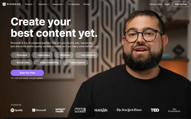
Riverside's aesthetic is a dark-mode canvas punctuated by vibrant purple actions and crisp, clean typography. The interface uses deep, near-black backgrounds as primary surfaces, softened by subtle elevation with faint shadows. Interactive components are intentionally weighty and prominent, contrasting with the overall muted background, while information is delivered with ample whitespace and clear typographic hierarchy.
The page uses a full-bleed layout for sections, with content mostly constrained to a centered maximum width (implied, not explicit in data but visible in screenshots). The hero section is full-bleed dark with a prominent, centered headline and a person in the foreground. Subsequent sections alternate between dark and light full-width background bands, featuring two-column layouts with text-left/image-right or centered feature stacks. Content blocks are comfortably spaced with ample vertical rhythm, creating a spacious but focused presentation. Navigation is a sticky top bar with a primary action button on the right.
Imagery primarily consists of tight product crops and professional photography of individuals speaking or presenting, often with a product UI overlay. Images are typically contained within cards with 4px or 8px rounded corners, sometimes with a subtle shadow. The overall treatment is realistic and product-focused, serving to showcase the platform's utility with minimal decorative elements. Icons are filled, monochrome, and typically in White Canvas (#ffffff) against dark backgrounds, providing clear functional indicators.
Reminiscent of Linear, Figma, Supabase, Vercel.
# Riverside — Style Reference
> Midnight production studio

**Theme:** dark

**Site:** https://riverside.fm

Riverside's aesthetic is a dark-mode canvas punctuated by vibrant purple actions and crisp, clean typography. The interface uses deep, near-black backgrounds as primary surfaces, softened by subtle elevation with faint shadows. Interactive components are intentionally weighty and prominent, contrasting with the overall muted background, while information is delivered with ample whitespace and clear typographic hierarchy.

## Tokens — Colors

| Name | Value | Token | Role |
|------|------|------|------|
| Electric Violet | `#9671ff` | `--color-electric-violet` | Primary action buttons, interactive elements, brand accent |
| Soft Lavender | `#f2eeff` | `--color-soft-lavender` | Subtle background for navigation highlights |
| Twilight Purple | `#ad98fa` | `--color-twilight-purple` | Secondary accent for text and borders |
| Tinted White | `#eae3ff` | `--color-tinted-white` | Soft section background, alternate surface, and quiet card fill. Do not promote it to the primary CTA color |
| Obsidian | `#1d1d1d` | `--color-obsidian` | Primary background, card surfaces, dark text |
| White Canvas | `#ffffff` | `--color-white-canvas` | Text on dark backgrounds, active states, button fills for secondary actions, light surface areas |
| Smokey White | `#f6f6f6` | `--color-smokey-white` | Secondary light background sections, light text on dark accents |
| Carbon Black | `#111111` | `--color-carbon-black` | Hero background, prominent dark surfaces |
| Deep Graphite | `#000000` | `--color-deep-graphite` | Headings, strong text, dark navigation elements |
| Silver Mist | `#bfbfbf` | `--color-silver-mist` | Card shadows, muted text, inactive link borders |
| Muted Grey | `#d2d2d2` | `--color-muted-grey` | Subtle borders, secondary text in light areas |
| Dark Shale | `#383838` | `--color-dark-shale` | Helper text on light backgrounds, subtle icons |
| Pale Ash | `#969696` | `--color-pale-ash` | Tertiary text, subtle borders |

## Tokens — Typography

### Inter
- **Substitute:** system-ui
- **Weights:** 300, 400, 500, 600, 700, 800
- **Sizes:** 8px, 9px, 10px, 11px, 12px, 14px, 16px, 18px, 24px, 30px, 40px, 50px, 56px, 80px
- **Line height:** 0.71, 0.72, 0.73, 0.75, 0.9, 1, 1.04, 1.08, 1.14, 1.16, 1.17, 1.18, 1.21, 1.22, 1.25, 1.27, 1.29, 1.38, 1.43, 1.44, 1.5, 1.57, 1.71, 1.73, 1.8, 2, 2.14, 2.5
- **Letter spacing:** -0.0060em
- **Role:** Primary typeface for all text content including headings, body, navigation, and buttons. Its wide range of weights and sizes supports a detailed typographic hierarchy, from small utilitarian text to large, impactful headlines.

### IBM Plex Sans
- **Substitute:** Roboto
- **Weights:** 600
- **Sizes:** 16px
- **Line height:** 1.5
- **Letter spacing:** normal
- **Role:** Used for specific heading applications, providing a slightly more structured feel than Inter when needed.

## Tokens — Type Scale

Augmented Fourth (1.414) from 14px base.

| Role | Size | Line height | Letter spacing |
|------|------|------|------|
| caption | 10px | 1.5 | -0.006em |
| body | 14px | 1.5 | -0.006em |
| subheading | 18px | 1.5 | -0.006em |
| heading | 24px | 1.25 | -0.006em |
| heading-lg | 40px | 1.18 | -0.006em |
| display | 56px | 1.21 | -0.006em |

## Tokens — Spacing

- **Section gap:** 43px
- **Card padding:** 12px
- **Element gap:** 10px

## Tokens — Radius

- **Default:** 8px
- **Buttons:** 300px
- **Cards:** 8px
- **Images:** 4px
- **badges:** 100px
- **hero:** 60px

## Tokens — Elevation

- **Elevated Content Card:** `rgba(0, 0, 0, 0.25) 0px 4px 15px 0px`

## Layout

The page uses a full-bleed layout for sections, with content mostly constrained to a centered maximum width (implied, not explicit in data but visible in screenshots). The hero section is full-bleed dark with a prominent, centered headline and a person in the foreground. Subsequent sections alternate between dark and light full-width background bands, featuring two-column layouts with text-left/image-right or centered feature stacks. Content blocks are comfortably spaced with ample vertical rhythm, creating a spacious but focused presentation. Navigation is a sticky top bar with a primary action button on the right.

## Imagery

Imagery primarily consists of tight product crops and professional photography of individuals speaking or presenting, often with a product UI overlay. Images are typically contained within cards with 4px or 8px rounded corners, sometimes with a subtle shadow. The overall treatment is realistic and product-focused, serving to showcase the platform's utility with minimal decorative elements. Icons are filled, monochrome, and typically in White Canvas (#ffffff) against dark backgrounds, providing clear functional indicators.

## Components

### Primary Call to Action Button
*Main interactive button*

Filled with Electric Violet (#9671ff), White Canvas (#ffffff) text, 300px border radius, 17px vertical and 46px horizontal padding. This button stands out with its vivid color against dark backgrounds.

### Ghost Navigation Button
*Navigation and secondary actions*

Transparent background, Muted Grey (#d2d2d2) text with a slight opacity (rgba(255,255,255,0.8)), 8px vertical and 10px horizontal padding, 0px border radius. This subtle button blends into the navigation.

### Light Secondary Button
*Alternate call to action on light backgrounds*

Filled with White Canvas (#ffffff), Carbon Black (#111111) text, 300px border radius, 17px vertical and 46px horizontal padding. Offers a solid light-background interaction.

### Dark Content Card
*Container for content sections*

Obsidian (#1d1d1d) background, 8px border radius, no shadow. 34px vertical and 32px horizontal padding. Used for grouping related content on the primary dark canvas.

### Subtle Feature Card
*Feature or showcase card*

Semi-transparent background (rgba(255, 255, 255, 0.05)), 8px border-radius, no shadow. Padding of 26px top, 24px right, 34px bottom, 24px left. Creates a soft, almost frosted effect.

### Elevated Content Card
*Emphasized content or testimonials*

Obsidian (#1d1d1d) background, 4.32px border radius, with a subtle shadow (rgba(0, 0, 0, 0.25) 0px 4px 15px 0px). Padding 15px top, 7px horizontal, 11.5px bottom. This variant indicates slight visual hierarchy.

### Light Badge
*Categorization or tags*

White Canvas (#ffffff) background, Obsidian (#1d1d1d) text, 100px border radius for a pill shape, 16px vertical and 24px horizontal padding. Provides clear, contrasting tags.

## Guidelines

### Do

- Prioritize Electric Violet (#9671ff) for all primary calls to action to maintain interaction consistency.
- Use Obsidian (#1d1d1d) as the default background for most content sections and cards, creating a consistent dark-mode base.
- Apply White Canvas (#ffffff) for all main body text and crucial information on dark backgrounds, ensuring high legibility.
- Utilize Inter font family with its variable weights for all typographic elements, leveraging its versatility for hierarchy.
- Maintain a 300px border-radius on all primary buttons for a distinct, pill-like appearance.
- Incorporate 8px border-radius for card backgrounds and contained elements using Obsidian (#1d1d1d) or Subtle Feature Card styling.
- Implement -0.0060em letter spacing for Inter font wherever applied, creating a compact and modern text feel.

### Don't

- Avoid using bright, highly saturated colors for large background areas; maintain a dominant dark, muted palette.
- Do not introduce new shadow styles beyond rgba(0, 0, 0, 0.25) 0px 4px 15px 0px, maintaining a consistent, subtle elevation effect.
- Refrain from using thin borders or outlines as primary button styles when a clear call to action is needed; prefer the filled Electric Violet (#9671ff) button.
- Avoid using White Canvas (#ffffff) as a primary background for entire sections, reserving it for text or contained components within darker canvases.
- Do not deviate from the established padding and radius values for specific components like buttons and cards to ensure visual consistency.
- Restrict the use of IBM Plex Sans to specified heading contexts; Inter is the primary typeface for general content.
- Do not overuse Soft Lavender or Tinted White; these are subtle accents, not primary interface colors.

## Agent Prompt Guide

Quick Color Reference:
- text: #ffffff (White Canvas)
- background: #1d1d1d (Obsidian)
- border: #d2d2d2 (Muted Grey)
- accent: #ad98fa (Twilight Purple)
- primary action: #9671ff (filled action)

Example Component Prompts:
- Create a Primary Action Button: #9671ff background, #111111 text, 9999px radius, compact pill padding. Use this filled treatment for the main CTA.
- Build a feature card: Obsidian (#1d1d1d) background, 8px radius. Heading at 24px Inter weight 600, #ffffff, letter-spacing -0.006em. Body text at 14px Inter weight 400, #ffffff, letter-spacing -0.006em. 34px vertical and 32px horizontal padding.
- Generate a navigation link: Ghost style, #d2d2d2 text, 0px radius, 8px 10px padding. On hover, text color should shift to Twilight Purple (#ad98fa).
- Construct an info badge: White Canvas (#ffffff) background, Obsidian (#1d1d1d) text, 100px radius, 16px 24px padding.
More like this







Keep what you find
A free account saves references to boards and can send you a weekly email of picks based on what you save.
To see every result, go Pro.