Preview image. Unlock full-res
Color palette
Page backgrounds, button backgrounds, primary surface for product display cards
Primary text, navigation links, borders, and input text – providing stark contrast on white surfaces
Dark borders and separators for elevated surfaces and inverted UI. Do not promote it to the primary CTA color
Typography
- Weights
- 400
- Sizes
- 14px
- Line height
- 1, 1.3
- Letter spacing
- normal
- Fallback
- Space Mono
Primary UI text, navigation, product titles, input fields, and all body text. Its monospaced nature lends an industrial, precise feel that complements the product design focus.
- Weights
- 400
- Sizes
- 12px
- Line height
- 1.13, 2.5
- Letter spacing
- normal
- Fallback
- Helvetica Neue
Fine print, footer text, and specific link states, providing a slightly smaller and subtly bolder option for secondary information.
- Weights
- 700
- Sizes
- 14px
- Line height
- 2.71
-apple-system — detected in extracted data but not described by AI
Spacing & shape
Components
backgroundColor: Canvas White (#ffffff), color: Muted Stone (#595959), border: 1px solid Muted Stone (#595959), borderRadius: 4px, padding: 0px.
backgroundColor: transparent (rgba(0, 0, 0, 0)), borderRadius: 0px, boxShadow: none, paddingRight: 4px, paddingLeft: 4px. Product titles use Ink Black text (HELVMONO, 400).
color: Ink Black (#000000), font: HELVMONO 400. Hover/active states are implied by a rounded highlight with 14.4px border-radius, though no distinct visual change is specified beyond this.
backgroundColor: transparent (rgba(0, 0, 0, 0)), color: Ink Black (#000000), border: none, borderRadius: 0px, padding: 0px.
Guidelines
- Prioritize Canvas White (#ffffff) for all large background and surface areas, creating a clean, almost exhibition-like feel.
- Use Ink Black (#000000) for all primary text, headings, and crucial interactive elements to ensure maximum contrast and legibility.
- Employ HELVMONO font at weight 400 for all UI text, reinforcing the precise, industrial aesthetic of the brand.
- Maintain a compact density, using 5px as the default elementGap and 4px for cardPadding to maximize product visibility.
- Utilize a 0px border-radius for all cards and product containers to maintain a sharp, photographic presentation.
- When borders are present, use 1px solid Ink Black (#000000) for a crisp, defined line.
- Apply Vivid Orange (#e73b1d) sparingly for decorative accents or secondary highlights, never for primary interactive elements.
- Avoid using multiple font families or excessive font weights; stick to HELVMONO 400 and helvetica-bold 400 for consistency.
- Do not introduce complex shadows or gradients; rely on flat surfaces, high contrast, and photographic content for visual interest.
- Refrain from using heavily saturated colors for backgrounds or large UI areas; the canvas should remain neutral.
- Do not deviate from the compact spacing values; avoid expansive padding or large element gaps that would reduce content density.
- Avoid decorative iconography; the visual system is focused on product display and simple typographic elements.
- Do not use heavily rounded corners on cards or major content blocks; maintain a sharp, almost technical edge (0px radius).
- Avoid custom button styles beyond ghost or outlined; do not introduce filled buttons with accent colors as primary actions.
About this system
ShowHide
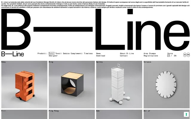
B—Line's visual system evokes a gallery of industrial design: a pristine white canvas showcases product photography and minimal UI elements. Black typography provides high contrast and a grounding presence. The density is compact, making efficient use of space to present a catalog of items with subtle interactive cues and minimal ornamentation. The entire aesthetic is about the product being the star, supported by an understated display system.
The page primarily uses a max-width contained layout section, though the header elements touch the viewport edges. The hero section is minimal, with a large brand mark and a compact horizontal navigation. The main content area features a distinct grid pattern for product display, with 4 columns of cards repeated vertically. Each product card is a visual square with the product name below it. Sections flow seamlessly without distinct visual dividers, maintaining consistent vertical spacing. The overall impression is a dense, responsive grid layout that prioritizes product visibility.
The visual language is dominated by high-quality product photography. Products are presented as isolated objects against a neutral gray background, often with subtle lighting that highlights their form and texture. There are no lifestyle shots or human elements, focusing entirely on the design of the objects themselves. Imagery is the primary content, with UI elements acting as a frame around these product showcased items. Icons are minimal, likely single-color outlines or filled monochromes for navigation.
Reminiscent of Fritz Hansen, Herman Miller, Objets Nomades (Louis Vuitton), Artek.
# B—Line — Style Reference
> Gallery Grid Aesthetics

**Theme:** light

**Site:** https://www.b-line.it

B—Line's visual system evokes a gallery of industrial design: a pristine white canvas showcases product photography and minimal UI elements. Black typography provides high contrast and a grounding presence. The density is compact, making efficient use of space to present a catalog of items with subtle interactive cues and minimal ornamentation. The entire aesthetic is about the product being the star, supported by an understated display system.

## Tokens — Colors

| Name | Value | Token | Role |
|------|------|------|------|
| Canvas White | `#ffffff` | `--color-canvas-white` | Page backgrounds, button backgrounds, primary surface for product display cards |
| Ink Black | `#000000` | `--color-ink-black` | Primary text, navigation links, borders, and input text – providing stark contrast on white surfaces |
| Muted Stone | `#595959` | `--color-muted-stone` | Dark borders and separators for elevated surfaces and inverted UI. Do not promote it to the primary CTA color |

## Tokens — Typography

### HELVMONO
- **Substitute:** Space Mono
- **Weights:** 400
- **Sizes:** 14px
- **Line height:** 1, 1.3
- **Letter spacing:** normal
- **Role:** Primary UI text, navigation, product titles, input fields, and all body text. Its monospaced nature lends an industrial, precise feel that complements the product design focus.

### helvetica-bold
- **Substitute:** Helvetica Neue
- **Weights:** 400
- **Sizes:** 12px
- **Line height:** 1.13, 2.5
- **Letter spacing:** normal
- **Role:** Fine print, footer text, and specific link states, providing a slightly smaller and subtly bolder option for secondary information.

### -apple-system
- **Weights:** 700
- **Sizes:** 14px
- **Line height:** 2.71
- **Role:** -apple-system — detected in extracted data but not described by AI

## Tokens — Type Scale

| Role | Size | Line height | Letter spacing |
|------|------|------|------|
| body-lg | 14px | 1 | — |

## Tokens — Spacing

- **Section gap:** 40px
- **Card padding:** 4px
- **Element gap:** 5px

## Tokens — Radius

- **Buttons:** 4px
- **Inputs:** 0px
- **Cards:** 0px
- **links:** 14.4px

## Layout

The page primarily uses a max-width contained layout section, though the header elements touch the viewport edges. The hero section is minimal, with a large brand mark and a compact horizontal navigation. The main content area features a distinct grid pattern for product display, with 4 columns of cards repeated vertically. Each product card is a visual square with the product name below it. Sections flow seamlessly without distinct visual dividers, maintaining consistent vertical spacing. The overall impression is a dense, responsive grid layout that prioritizes product visibility.

## Imagery

The visual language is dominated by high-quality product photography. Products are presented as isolated objects against a neutral gray background, often with subtle lighting that highlights their form and texture. There are no lifestyle shots or human elements, focusing entirely on the design of the objects themselves. Imagery is the primary content, with UI elements acting as a frame around these product showcased items. Icons are minimal, likely single-color outlines or filled monochromes for navigation.

## Components

### Primary Ghost Button
*Action button with minimal styling.*

backgroundColor: Canvas White (#ffffff), color: Muted Stone (#595959), border: 1px solid Muted Stone (#595959), borderRadius: 4px, padding: 0px.

### Product Display Card
*Container for product imagery and titles in a grid layout.*

backgroundColor: transparent (rgba(0, 0, 0, 0)), borderRadius: 0px, boxShadow: none, paddingRight: 4px, paddingLeft: 4px. Product titles use Ink Black text (HELVMONO, 400).

### Navigation Link
*Interactive text links in header and footer.*

color: Ink Black (#000000), font: HELVMONO 400. Hover/active states are implied by a rounded highlight with 14.4px border-radius, though no distinct visual change is specified beyond this.

### Text Input (minimal)
*Basic text input field.*

backgroundColor: transparent (rgba(0, 0, 0, 0)), color: Ink Black (#000000), border: none, borderRadius: 0px, padding: 0px.

## Guidelines

### Do

- Prioritize Canvas White (#ffffff) for all large background and surface areas, creating a clean, almost exhibition-like feel.
- Use Ink Black (#000000) for all primary text, headings, and crucial interactive elements to ensure maximum contrast and legibility.
- Employ HELVMONO font at weight 400 for all UI text, reinforcing the precise, industrial aesthetic of the brand.
- Maintain a compact density, using 5px as the default elementGap and 4px for cardPadding to maximize product visibility.
- Utilize a 0px border-radius for all cards and product containers to maintain a sharp, photographic presentation.
- When borders are present, use 1px solid Ink Black (#000000) for a crisp, defined line.
- Apply Vivid Orange (#e73b1d) sparingly for decorative accents or secondary highlights, never for primary interactive elements.

### Don't

- Avoid using multiple font families or excessive font weights; stick to HELVMONO 400 and helvetica-bold 400 for consistency.
- Do not introduce complex shadows or gradients; rely on flat surfaces, high contrast, and photographic content for visual interest.
- Refrain from using heavily saturated colors for backgrounds or large UI areas; the canvas should remain neutral.
- Do not deviate from the compact spacing values; avoid expansive padding or large element gaps that would reduce content density.
- Avoid decorative iconography; the visual system is focused on product display and simple typographic elements.
- Do not use heavily rounded corners on cards or major content blocks; maintain a sharp, almost technical edge (0px radius).
- Avoid custom button styles beyond ghost or outlined; do not introduce filled buttons with accent colors as primary actions.

## Agent Prompt Guide

Quick Color Reference:
text: #000000
background: #ffffff
border: #000000
accent: #e73b1d
primary action: no distinct CTA color

Example Component Prompts:
1. Create a header with navigation: Background Canvas White (#ffffff). Top-left logo text 'B—Line' Ink Black (#000000), HELVMONO 400. Navigation links 'Tutti', 'Tavoli', 'Sedute' in Ink Black (#000000), HELVMONO 400, with 7px marginRight between them. Right-aligned 'IT / EN' links, also Ink Black HELVMONO 400.
2. Design a product grid section: Main background Canvas White (#ffffff). Display products in a 4-column grid, each product card using 0px border-radius, transparent background. Below each product image, display the product name in Ink Black (#000000), HELVMONO 400, with 8px marginBottom. Cards have 4px padding on left/right.
3. Create a minimal ghost button: Background Canvas White (#ffffff), text Muted Stone (#595959), border 1px solid Muted Stone (#595959), 4px border-radius, 0px padding. This functions as a secondary action.
More like this









Keep what you find
A free account saves references to boards and can send you a weekly email of picks based on what you save.
To see every result, go Pro.