Preview image. Unlock full-res
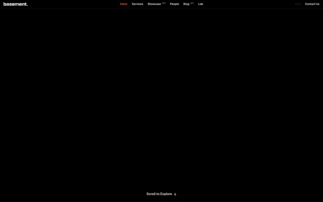
Void print shop at 3am — massive compressed type bleeding off a pitch-black canvas, one ember of orange light on the nav, everything else white or ghost-gray.
Color palette
Active nav state only — appears on a single interactive element as a hot indicator, never used for buttons or CTAs; its rarity is the feature
Page background, button fill, SVG fills — absolute black, not near-black
Primary text, nav labels, button text, body copy
Border color across nav, cards, buttons, logo grid dividers — the structural skeleton visible against black
Secondary text, subheadings, de-emphasized body copy, SVG fills
Tertiary text, muted labels, icon fills
Card/tile border color — used on logo grid cells to define structure without brightness
Input backgrounds, input borders — the only surface that differs from absolute black
SVG illustration fills, decorative icon tones
Typography
- Weights
- 400, 500, 600
- Sizes
- 12px, 13px, 15px, 16px, 20px, 24px, 38px, 76px, 87px
- Line height
- 0.89, 0.9
- Letter spacing
- -0.04em at 76-87px, -0.03em at 38px, -0.02em at 20-24px
- Fallback
- Inter, Helvetica Neue
Single font family across all type — nav, body, display, headings, labels. The 87px weight-600 headline at 0.89 line-height is the system's signature: text taller than its own cap-height spacing, letters colliding at scale. -0.04em letter-spacing at display sizes crushes the tracking until characters nearly touch. 'ss01' feature flag activates alternate glyph forms distinct to Geist. Using one face for everything from 12px captions to 87px display creates a monolithic typographic voice — zero genre-mixing.
Spacing & shape
Components
Transparent background, #ffffff text at 13px Geist weight 500, no padding, no border, no radius. Active state: color switches to #ff4d00 — the only place this accent appears in the entire system.
#000000 background, #ffffff text at 13px Geist weight 500, 0px border-radius, 4px padding all sides, border: 1px solid #e5e7eb. Sharp-cornered box against the black nav bar — distinguishable only by the border rectangle.
Transparent background, #ffffff text at 15px Geist weight 400, accompanied by a down-arrow glyph. No button chrome. Sits at the bottom center of the full-black hero viewport.
Transparent background, 1px solid #454545 border, 0px radius, 0px explicit padding (content centered within equal-width grid cell). White SVG logo fills. Grid layout 8-wide, dense tessellation — no gaps between cells, borders collapse against adjacent tiles.
#757575 text at 13px Geist weight 400, no decoration. Appears above content blocks as a muted classifier — lighter than body text, heavier than captions.
#ffffff text at 87px Geist weight 600, line-height 0.89, letter-spacing -0.04em, font-feature-settings 'ss01'. Full-width block, text wraps to fill viewport width. The dominant visual element of the page — no decoration, no underline, no gradient — pure compressed type mass.
#c4c4c4 text at 15px Geist weight 400, line-height 1.5. Set in a constrained column (~300-350px width) beneath the display headline. The gray-down from white creates visual subordination without a size change.
#1a1a1a background, #1a1a1a border (flush — border blends with background), #ffffff text at 15px Geist weight 400, 0px border-radius, 4px horizontal padding, 0px vertical padding. The input surface is the only non-black background in the system.
Small superscript or inline badge in #757575 at 12px Geist weight 400. No background, no border, no radius. Purely typographic count indicator.
'basement.' in #ffffff Geist weight 600 at ~16px. The period is part of the brand mark. No icon, no logomark — logotype only.
Guidelines
- Use #000000 as the only page background — never substitute near-blacks like #0a0a0a or #111111; the absolute void is intentional.
- Apply 0px border-radius to every element — buttons, cards, inputs, badges, all components. Any rounded corner breaks the system.
- Reserve #ff4d00 exclusively for the active nav state. Never use it on buttons, CTAs, icons, or decorative elements.
- Set display type (38px+) with font-feature-settings: 'ss01' and letter-spacing at minimum -0.02em, scaling to -0.04em at 76-87px.
- Use 1px solid #454545 borders on grid tiles and 1px solid #e5e7eb on interactive elements (buttons, nav items) — these two border shades create a two-tier hierarchy.
- Maintain Geist as the single typeface across all sizes from 12px caption to 87px display — no secondary or decorative fonts.
- Use #c4c4c4 for body copy under headlines rather than full white, creating luminosity hierarchy through brightness rather than size alone.
- Never add box-shadows, drop-shadows, or glows — the design has zero elevation; depth is created by type scale and color, not shadow.
- Never use rounded corners — not 2px, not 4px. The 0px radius is non-negotiable across every component.
- Never introduce a secondary typeface — not for decorative headlines, not for code blocks, not for quotes.
- Never place #ff4d00 on backgrounds, fills, or decorative shapes — it exists only as a 1-element text color signal.
- Never use white (#ffffff) for body-level descriptive text — use #c4c4c4 or #757575 to preserve the display headline as the luminance peak.
- Never add gradients to backgrounds or text — the system is flat, matte, and binary in its color application.
- Never apply padding greater than 16px to inline or small components — the spacing system is compact (4px base unit) and dense grid arrangements should not breathe excessively.
About this system
ShowHide
Pure void aesthetic — the page opens as a black rectangle with a single orange nav item and a whispered 'Scroll to Explore', then erupts into massive display type at 87px. The #000000 canvas is absolute, not 'dark gray' — no surface gradients, no depth layers, no decorative noise. Geist at 87px weight 600 with -0.04em letter-spacing is the visual anchor: compressed, wide, mechanical. The single accent, #ff4d00 ember orange, appears only on the active nav item — never on CTAs, never on buttons — making it feel like an indicator light, not a brand color. Grid-bordered client logo tiles in #454545 create a dense, file-cabinet inventory feel against pure black.
Full-bleed #000000 canvas with no max-width constraint on the hero. Navigation is a fixed top bar with wordmark left, links centered, contact CTA right. First viewport is entirely black with only nav visible plus 'Scroll to Explore' bottom-center — a theatrical reveal before content appears. Below the fold: full-width display headline spanning the viewport, then a constrained-width (~350px) body paragraph column left-aligned. Client logo section uses an 8-column equal-width grid with collapsed 1px borders (#454545) — cells share borders, no gaps, creating a dense mesh. Section rhythm is generous between major sections (128px gap) but internally compact. No alternating light/dark bands — entire page maintains the void background throughout.
Client logos are white SVG monochrome renderings on transparent backgrounds, set into a rigid bordered grid — no breathing room, no hover state photographs. No photography, no illustration, no 3D. The visual language is purely typographic and iconographic. Logo tiles function as inventory catalog entries rather than showcase moments. The page is text-dominant to an extreme degree: the hero is 100% type against black, zero imagery. Icon style where present is minimal outlined/filled mono-white SVGs at small sizes. The design deliberately resists atmospheric imagery — the void IS the art direction.
Reminiscent of Linear, Vercel, Rauno / Personal studios, MSCHF, Resend.
# basement.studio — Style Reference
> Void print shop at 3am — massive compressed type bleeding off a pitch-black canvas, one ember of orange light on the nav, everything else white or ghost-gray.

**Theme:** dark

**Site:** https://basement.studio

Pure void aesthetic — the page opens as a black rectangle with a single orange nav item and a whispered 'Scroll to Explore', then erupts into massive display type at 87px. The #000000 canvas is absolute, not 'dark gray' — no surface gradients, no depth layers, no decorative noise. Geist at 87px weight 600 with -0.04em letter-spacing is the visual anchor: compressed, wide, mechanical. The single accent, #ff4d00 ember orange, appears only on the active nav item — never on CTAs, never on buttons — making it feel like an indicator light, not a brand color. Grid-bordered client logo tiles in #454545 create a dense, file-cabinet inventory feel against pure black.

## Tokens — Colors

| Name | Value | Token | Role |
|------|------|------|------|
| Ember Signal | `#ff4d00` | `--color-ember-signal` | Active nav state only — appears on a single interactive element as a hot indicator, never used for buttons or CTAs; its rarity is the feature |
| Void | `#000000` | `--color-void` | Page background, button fill, SVG fills — absolute black, not near-black |
| Chalk | `#ffffff` | `--color-chalk` | Primary text, nav labels, button text, body copy |
| Fog | `#e5e7eb` | `--color-fog` | Border color across nav, cards, buttons, logo grid dividers — the structural skeleton visible against black |
| Ash | `#c4c4c4` | `--color-ash` | Secondary text, subheadings, de-emphasized body copy, SVG fills |
| Graphite | `#757575` | `--color-graphite` | Tertiary text, muted labels, icon fills |
| Carbon | `#454545` | `--color-carbon` | Card/tile border color — used on logo grid cells to define structure without brightness |
| Cinder | `#1a1a1a` | `--color-cinder` | Input backgrounds, input borders — the only surface that differs from absolute black |
| Smudge | `#666666` | `--color-smudge` | SVG illustration fills, decorative icon tones |

## Tokens — Typography

### Geist
- **Substitute:** Inter, Helvetica Neue
- **Weights:** 400, 500, 600
- **Sizes:** 12px, 13px, 15px, 16px, 20px, 24px, 38px, 76px, 87px
- **Line height:** 0.89, 0.9
- **Letter spacing:** -0.04em at 76-87px, -0.03em at 38px, -0.02em at 20-24px
- **Role:** Single font family across all type — nav, body, display, headings, labels. The 87px weight-600 headline at 0.89 line-height is the system's signature: text taller than its own cap-height spacing, letters colliding at scale. -0.04em letter-spacing at display sizes crushes the tracking until characters nearly touch. 'ss01' feature flag activates alternate glyph forms distinct to Geist. Using one face for everything from 12px captions to 87px display creates a monolithic typographic voice — zero genre-mixing.

## Tokens — Type Scale

Golden Ratio (1.618) from 12px base.

| Role | Size | Line height | Letter spacing |
|------|------|------|------|
| caption | 12px | 1.5 | — |
| heading-sm | 20px | 1.23 | -0.4px |
| heading | 24px | 1.07 | -0.48px |
| heading-lg | 38px | 1 | -1.14px |
| display | 87px | 0.89 | -3.48px |

## Tokens — Spacing

- **Max width:** 1280px
- **Section gap:** 128px
- **Card padding:** 16px
- **Element gap:** 8px

## Tokens — Radius

- **Buttons:** 0px
- **Inputs:** 0px
- **Cards:** 0px
- **badges:** 0px
- **global:** 0px — zero radius everywhere, no exceptions

## Layout

Full-bleed #000000 canvas with no max-width constraint on the hero. Navigation is a fixed top bar with wordmark left, links centered, contact CTA right. First viewport is entirely black with only nav visible plus 'Scroll to Explore' bottom-center — a theatrical reveal before content appears. Below the fold: full-width display headline spanning the viewport, then a constrained-width (~350px) body paragraph column left-aligned. Client logo section uses an 8-column equal-width grid with collapsed 1px borders (#454545) — cells share borders, no gaps, creating a dense mesh. Section rhythm is generous between major sections (128px gap) but internally compact. No alternating light/dark bands — entire page maintains the void background throughout.

## Imagery

Client logos are white SVG monochrome renderings on transparent backgrounds, set into a rigid bordered grid — no breathing room, no hover state photographs. No photography, no illustration, no 3D. The visual language is purely typographic and iconographic. Logo tiles function as inventory catalog entries rather than showcase moments. The page is text-dominant to an extreme degree: the hero is 100% type against black, zero imagery. Icon style where present is minimal outlined/filled mono-white SVGs at small sizes. The design deliberately resists atmospheric imagery — the void IS the art direction.

## Components

### Client Logo Grid

### Display Headline with Body Copy

### Nav Bar Strip

### Ghost Navigation Link
*Primary nav items*

Transparent background, #ffffff text at 13px Geist weight 500, no padding, no border, no radius. Active state: color switches to #ff4d00 — the only place this accent appears in the entire system.

### Contact Us Button
*Primary CTA in nav*

#000000 background, #ffffff text at 13px Geist weight 500, 0px border-radius, 4px padding all sides, border: 1px solid #e5e7eb. Sharp-cornered box against the black nav bar — distinguishable only by the border rectangle.

### Scroll to Explore Label
*Scroll prompt / ambient CTA*

Transparent background, #ffffff text at 15px Geist weight 400, accompanied by a down-arrow glyph. No button chrome. Sits at the bottom center of the full-black hero viewport.

### Client Logo Tile
*Social proof grid cell*

Transparent background, 1px solid #454545 border, 0px radius, 0px explicit padding (content centered within equal-width grid cell). White SVG logo fills. Grid layout 8-wide, dense tessellation — no gaps between cells, borders collapse against adjacent tiles.

### Section Label
*Small contextual headers (e.g. 'Trusted by Visionaries')*

#757575 text at 13px Geist weight 400, no decoration. Appears above content blocks as a muted classifier — lighter than body text, heavier than captions.

### Display Headline
*Hero primary heading*

#ffffff text at 87px Geist weight 600, line-height 0.89, letter-spacing -0.04em, font-feature-settings 'ss01'. Full-width block, text wraps to fill viewport width. The dominant visual element of the page — no decoration, no underline, no gradient — pure compressed type mass.

### Body Paragraph
*Descriptive sub-headline body copy*

#c4c4c4 text at 15px Geist weight 400, line-height 1.5. Set in a constrained column (~300-350px width) beneath the display headline. The gray-down from white creates visual subordination without a size change.

### Text Input
*Form input fields*

#1a1a1a background, #1a1a1a border (flush — border blends with background), #ffffff text at 15px Geist weight 400, 0px border-radius, 4px horizontal padding, 0px vertical padding. The input surface is the only non-black background in the system.

### Nav Badge / Count
*Numeric label on nav items (e.g. showcase item count)*

Small superscript or inline badge in #757575 at 12px Geist weight 400. No background, no border, no radius. Purely typographic count indicator.

### Wordmark
*Brand logo in nav*

'basement.' in #ffffff Geist weight 600 at ~16px. The period is part of the brand mark. No icon, no logomark — logotype only.

## Guidelines

### Do

- Use #000000 as the only page background — never substitute near-blacks like #0a0a0a or #111111; the absolute void is intentional.
- Apply 0px border-radius to every element — buttons, cards, inputs, badges, all components. Any rounded corner breaks the system.
- Reserve #ff4d00 exclusively for the active nav state. Never use it on buttons, CTAs, icons, or decorative elements.
- Set display type (38px+) with font-feature-settings: 'ss01' and letter-spacing at minimum -0.02em, scaling to -0.04em at 76-87px.
- Use 1px solid #454545 borders on grid tiles and 1px solid #e5e7eb on interactive elements (buttons, nav items) — these two border shades create a two-tier hierarchy.
- Maintain Geist as the single typeface across all sizes from 12px caption to 87px display — no secondary or decorative fonts.
- Use #c4c4c4 for body copy under headlines rather than full white, creating luminosity hierarchy through brightness rather than size alone.

### Don't

- Never add box-shadows, drop-shadows, or glows — the design has zero elevation; depth is created by type scale and color, not shadow.
- Never use rounded corners — not 2px, not 4px. The 0px radius is non-negotiable across every component.
- Never introduce a secondary typeface — not for decorative headlines, not for code blocks, not for quotes.
- Never place #ff4d00 on backgrounds, fills, or decorative shapes — it exists only as a 1-element text color signal.
- Never use white (#ffffff) for body-level descriptive text — use #c4c4c4 or #757575 to preserve the display headline as the luminance peak.
- Never add gradients to backgrounds or text — the system is flat, matte, and binary in its color application.
- Never apply padding greater than 16px to inline or small components — the spacing system is compact (4px base unit) and dense grid arrangements should not breathe excessively.

## Agent Prompt Guide

**Quick Color Reference**
- Text (primary): #ffffff
- Text (secondary): #c4c4c4
- Text (tertiary/muted): #757575
- Background: #000000
- Borders (structural): #454545
- Borders (interactive): #e5e7eb
- Active accent: #ff4d00 (nav only)
- Input surface: #1a1a1a

**Example Component Prompts**

1. Hero Section: Full-viewport #000000 background. Headline at 87px Geist weight 600, #ffffff, line-height 0.89, letter-spacing -3.5px, font-feature-settings 'ss01'. Sub-body paragraph at 15px Geist weight 400, #c4c4c4, line-height 1.5, max-width 350px, positioned below headline. 'Scroll to Explore' label at 15px #ffffff centered bottom of viewport.

2. Navigation Bar: #000000 background, full-width. Wordmark 'basement.' in #ffffff Geist weight 600 16px left-aligned. Nav links at 13px Geist weight 500 #ffffff centered, active item in #ff4d00. 'Contact Us' button right-aligned: #000000 fill, 1px solid #e5e7eb border, 0px radius, 4px padding, #ffffff text 13px weight 500.

3. Client Logo Grid: 8-column grid, cells sharing 1px solid #454545 collapsed borders, 0px radius, #000000 background. Each cell contains white SVG logo centered. No gaps — borders collapse. Grid spans full content width.

4. Text Input Field: #1a1a1a background and border-color, 0px border-radius, 4px horizontal padding, 0px vertical padding, #ffffff text at 15px Geist weight 400. The input surface is the only non-void background in the system.

5. Section Label + Content Block: Section label at 13px Geist weight 400 #757575, above heading. Heading at 38px Geist weight 600 #ffffff letter-spacing -1.14px line-height 1.0. 128px margin-top between major sections.
More like this








Keep what you find
A free account saves references to boards and can send you a weekly email of picks based on what you save.
To see every result, go Pro.