Preview image. Unlock full-res
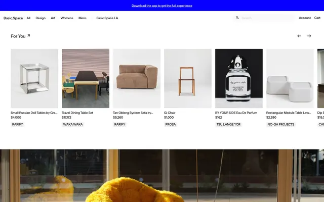
Gallery Grid Monochrome.
Color palette
Supporting palette color for small decorative accents when the core palette needs contrast. Do not promote it to the primary CTA color
Page backgrounds, subtle card outlines, dividing lines — serves as the primary visual separation
Primary headings, body text, and icon fills on light surfaces. Do not promote it to the primary CTA color
Background for specific content sections, creating subtle elevation shifts
Neutral form states, badge text, and quiet UI feedback where color should stay understated. Do not promote it to the primary CTA color
Secondary surface background, slightly off-white to provide minimal distinction
Placeholder text in inputs and muted secondary text for less prominent information
Typography
- Weights
- 400, 500, 600
- Sizes
- 14px, 16px, 18px, 20px, 38px, 39px, 40px
- Line height
- 1.12, 1.13, 1.2, 1.22, 1.38, 1.43, 1.71
- Letter spacing
- -0.0220em at 38-40px, -0.0100em at 14-20px
- Fallback
- Arial
The primary typeface for all text content, from headings to body copy and interactive labels. Its consistent use across weights and sizes establishes a cohesive, authoritative voice.
Spacing & shape
Components
Background: transparent (rgba(0, 0, 0, 0)), Text: Inkwell (#000000), Border: 1px thin Canvas Fog (#ebebeb), Radius: 9999px, Padding: 8px on all sides.
Background: transparent (rgba(0, 0, 0, 0)), Text: Pure White (#ffffff), Border: 1px thin Canvas Fog (#ebebeb), Radius: 0px, Padding: 0px.
Background: transparent (rgba(0, 0, 0, 0)), Border: none, Radius: 0px, Padding: 0px.
Background: transparent (rgba(0, 0, 0, 0)), Border: none, Radius: 2px, Padding: 0px.
Background: Subtle Ash (#f7f7f7), Text: Inkwell (#000000), Border: 1px thin Canvas Fog (#ebebeb) on all sides, Radius: 16px, Padding: 0px top/bottom, 40px left, 80px right.
Background: Pure White (#ffffff), Placeholder: Placeholder Gray (#b5b5b5), Border: 1px thin Canvas Fog (#ebebeb) on all sides, Radius: 0px, Padding: 0px.
Guidelines
- Prioritize Inkwell (#000000) for all main text and Canvas Fog (#ebebeb) for backgrounds and subtle borders, establishing the core monochrome palette.
- Use 9999px border radius for all buttons and small interactive elements to create a pill-like, contained appearance.
- Apply 2px border radius to product cards and images to provide a consistent, slight softening of edges.
- Maintain high visual contrast for text by almost exclusively using Inkwell (#000000) on light backgrounds like Pure White (#ffffff), Subtle Ash (#f7f7f7), or Canvas Fog (#ebebeb).
- Employ the FTBasicSpace font consistently across all typographic elements, leveraging its different weights (400, 500, 600) to create hierarchy.
- Utilize 4px as the foundational unit for inner element spacing and padding to ensure compact visual density.
- Reserve Electric Blue (#007aff) for functional accents such as app download banners or interactive highlights, avoiding decorative overuse.
- Do not introduce highly saturated colors for primary UI elements; adhere strictly to the achromatic palette with minimal Electric Blue accents.
- Avoid heavy shadows or gradients; rely on clean borders and subtle background shifts to define UI layers.
- Do not deviate from the specified border radii; maintain 9999px for buttons, 2px for cards, and 16px for inputs.
- Refrain from using varied typefaces or decorative font styles; FTBasicSpace covers all typographic needs.
- Do not use large, wide spacing for elements or sections; the system favors a compact, information-dense layout.
- Avoid complex, multi-layered components; keep interactive elements simple with clear, minimal styling.
- Do not use more than 1px border thickness; the system relies on hairline definitions for structure.
About this system
ShowHide
Basic.Space presents a stark, almost utilitarian aesthetic, building on a foundation of pure achromatic neutrals. The design is characterized by crisp lines, minimal ornamentation, and a compact, information-dense display of products. Typography is consistently dark and primary, creating a strong contrast against the light canvas, while interactive elements are subtly defined by thin borders and precise spacing rather than bold color accents.
The page adheres to a mostly full-bleed layout with content sections but employs a maximum width constraint implicitly for readability within those sections, centered horizontally. The hero section is a full-bleed visual banner, potentially with superimposed text. Section rhythm is primarily driven by color shifts between Canvas Fog, Subtle Ash, and Surface Frost backgrounds, creating distinct visual blocks often separated by thin horizontal lines. Content is frequently arranged in multi-column grids for product listings and alternating text-left/image-right compositions for feature sections. Overall density is compact, prioritizing product visibility in tight grids. Navigation is a sticky top bar with minimal links and a central search input.
The site uses a mix of high-quality product photography and artistic lifestyle shots focused on objects, not people. Photography is typically clean, high-key, and often isolated from context, emphasizing the product itself. Illustrations are stylized and abstract, used sparingly as visual highlights without explicit outlining. Icons are filled and monochromatic (Inkwell or Placeholder Gray), maintaining the minimal aesthetic. Imagery serves primarily as a product showcase and decorative atmosphere, with a high density of images relative to text in product grids.
Reminiscent of SSENSE, GOAT, Kith, Grailed.
# Basic.Space — Style Reference
> Gallery Grid Monochrome.

**Theme:** light

**Site:** https://basic.space

Basic.Space presents a stark, almost utilitarian aesthetic, building on a foundation of pure achromatic neutrals. The design is characterized by crisp lines, minimal ornamentation, and a compact, information-dense display of products. Typography is consistently dark and primary, creating a strong contrast against the light canvas, while interactive elements are subtly defined by thin borders and precise spacing rather than bold color accents.

## Tokens — Colors

| Name | Value | Token | Role |
|------|------|------|------|
| Electric Blue | `#007aff` | `--color-electric-blue` | Supporting palette color for small decorative accents when the core palette needs contrast. Do not promote it to the primary CTA color |
| Canvas Fog | `#ebebeb` | `--color-canvas-fog` | Page backgrounds, subtle card outlines, dividing lines — serves as the primary visual separation |
| Inkwell | `#000000` | `--color-inkwell` | Primary headings, body text, and icon fills on light surfaces. Do not promote it to the primary CTA color |
| Surface Frost | `#cecccc` | `--color-surface-frost` | Background for specific content sections, creating subtle elevation shifts |
| Pure White | `#ffffff` | `--color-pure-white` | Neutral form states, badge text, and quiet UI feedback where color should stay understated. Do not promote it to the primary CTA color |
| Subtle Ash | `#f7f7f7` | `--color-subtle-ash` | Secondary surface background, slightly off-white to provide minimal distinction |
| Placeholder Gray | `#b5b5b5` | `--color-placeholder-gray` | Placeholder text in inputs and muted secondary text for less prominent information |

## Tokens — Typography

### FTBasicSpace
- **Substitute:** Arial
- **Weights:** 400, 500, 600
- **Sizes:** 14px, 16px, 18px, 20px, 38px, 39px, 40px
- **Line height:** 1.12, 1.13, 1.2, 1.22, 1.38, 1.43, 1.71
- **Letter spacing:** -0.0220em at 38-40px, -0.0100em at 14-20px
- **Role:** The primary typeface for all text content, from headings to body copy and interactive labels. Its consistent use across weights and sizes establishes a cohesive, authoritative voice.

## Tokens — Type Scale

Perfect Fourth (1.333) from 16px base.

| Role | Size | Line height | Letter spacing |
|------|------|------|------|
| caption | 14px | 1.71 | -0.14px |
| body | 16px | 1.43 | -0.16px |
| subheading | 18px | 1.22 | -0.18px |
| heading | 20px | 1.2 | -0.2px |
| display | 40px | 1.12 | -0.88px |

## Tokens — Spacing

- **Section gap:** 48px
- **Card padding:** 0px
- **Element gap:** 4px

## Tokens — Radius

- **Buttons:** 9999px
- **Inputs:** 16px
- **Cards:** 2px

## Layout

The page adheres to a mostly full-bleed layout with content sections but employs a maximum width constraint implicitly for readability within those sections, centered horizontally. The hero section is a full-bleed visual banner, potentially with superimposed text. Section rhythm is primarily driven by color shifts between Canvas Fog, Subtle Ash, and Surface Frost backgrounds, creating distinct visual blocks often separated by thin horizontal lines. Content is frequently arranged in multi-column grids for product listings and alternating text-left/image-right compositions for feature sections. Overall density is compact, prioritizing product visibility in tight grids. Navigation is a sticky top bar with minimal links and a central search input.

## Imagery

The site uses a mix of high-quality product photography and artistic lifestyle shots focused on objects, not people. Photography is typically clean, high-key, and often isolated from context, emphasizing the product itself. Illustrations are stylized and abstract, used sparingly as visual highlights without explicit outlining. Icons are filled and monochromatic (Inkwell or Placeholder Gray), maintaining the minimal aesthetic. Imagery serves primarily as a product showcase and decorative atmosphere, with a high density of images relative to text in product grids.

## Components

### Outlined Pill Button
*Secondary action button, often used for navigation or filtering.*

Background: transparent (rgba(0, 0, 0, 0)), Text: Inkwell (#000000), Border: 1px thin Canvas Fog (#ebebeb), Radius: 9999px, Padding: 8px on all sides.

### Ghost Link Button
*Minimal interactive text link or navigation item.*

Background: transparent (rgba(0, 0, 0, 0)), Text: Pure White (#ffffff), Border: 1px thin Canvas Fog (#ebebeb), Radius: 0px, Padding: 0px.

### Product Card (Minimal)
*Default display for product listings with no visible border or shadow.*

Background: transparent (rgba(0, 0, 0, 0)), Border: none, Radius: 0px, Padding: 0px.

### Product Card (Hover)
*Product display with a subtle radius, likely for interactive states.*

Background: transparent (rgba(0, 0, 0, 0)), Border: none, Radius: 2px, Padding: 0px.

### Search Input (Filled)
*Primary search input field.*

Background: Subtle Ash (#f7f7f7), Text: Inkwell (#000000), Border: 1px thin Canvas Fog (#ebebeb) on all sides, Radius: 16px, Padding: 0px top/bottom, 40px left, 80px right.

### Text Input (Underlined)
*Minimal input field, typically for forms.*

Background: Pure White (#ffffff), Placeholder: Placeholder Gray (#b5b5b5), Border: 1px thin Canvas Fog (#ebebeb) on all sides, Radius: 0px, Padding: 0px.

## Guidelines

### Do

- Prioritize Inkwell (#000000) for all main text and Canvas Fog (#ebebeb) for backgrounds and subtle borders, establishing the core monochrome palette.
- Use 9999px border radius for all buttons and small interactive elements to create a pill-like, contained appearance.
- Apply 2px border radius to product cards and images to provide a consistent, slight softening of edges.
- Maintain high visual contrast for text by almost exclusively using Inkwell (#000000) on light backgrounds like Pure White (#ffffff), Subtle Ash (#f7f7f7), or Canvas Fog (#ebebeb).
- Employ the FTBasicSpace font consistently across all typographic elements, leveraging its different weights (400, 500, 600) to create hierarchy.
- Utilize 4px as the foundational unit for inner element spacing and padding to ensure compact visual density.
- Reserve Electric Blue (#007aff) for functional accents such as app download banners or interactive highlights, avoiding decorative overuse.

### Don't

- Do not introduce highly saturated colors for primary UI elements; adhere strictly to the achromatic palette with minimal Electric Blue accents.
- Avoid heavy shadows or gradients; rely on clean borders and subtle background shifts to define UI layers.
- Do not deviate from the specified border radii; maintain 9999px for buttons, 2px for cards, and 16px for inputs.
- Refrain from using varied typefaces or decorative font styles; FTBasicSpace covers all typographic needs.
- Do not use large, wide spacing for elements or sections; the system favors a compact, information-dense layout.
- Avoid complex, multi-layered components; keep interactive elements simple with clear, minimal styling.
- Do not use more than 1px border thickness; the system relies on hairline definitions for structure.

## Agent Prompt Guide

Quick Color Reference:
text: #000000
background: #ebebeb
border: #ebebeb
accent: #007aff
primary action: no distinct CTA color

Example Component Prompts:
1. Create a header navigation link: 'All' with text Inkwell (#000000), using FTBasicSpace, weight 400, size 16px, lineHeight 1.43, letterSpacing -0.16px.
2. Design a product card: Background transparent, no border, Inkwell (#000000) for product name 'Small Russian Doll Tables', 16px FTBasicSpace weight 400; Muted text Placeholder Gray (#b5b5b5) for 'Rarify' at 14px FTBasicSpace weight 400, no radius.
3. Implement a search input: Background Subtle Ash (#f7f7f7), radius 16px, placeholder Placeholder Gray (#b5b5b5) 16px FTBasicSpace weight 400, border 1px Canvas Fog (#ebebeb), padding 0px top/bottom, 40px left, 80px right.
4. Compose a main heading: 'For You' using Inkwell (#000000), FTBasicSpace, weight 600, size 40px, lineHeight 1.12, letterSpacing -0.88px.
More like this









Keep what you find
A free account saves references to boards and can send you a weekly email of picks based on what you save.
To see every result, go Pro.