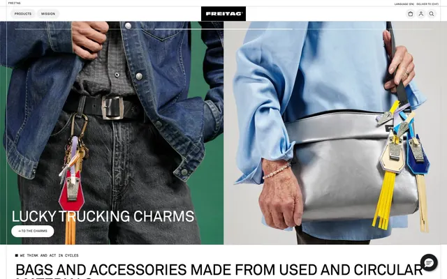
Preview image. Unlock full-res
Recycled canvas gallery
Color palette
Decorative and functional accent, not a brand primary. Commonly used in carousel mechanisms
Primary text, borders, icons, navigation elements, high-contrast accents
Interface background, subtle card borders, secondary text in specific contexts
Component backgrounds, selected button fills, content surfaces, high-contrast text
Fine borders, subtle box shadows
Secondary button backgrounds, navigation hover states, subtle surface fills
Muted text, less prominent content
Darker accent background, single button fill
Subtle shadow base
Typography
- Weights
- 400
- Sizes
- 11px, 16px
- Line height
- 1.15, 1.5
- Letter spacing
- 0.020em
- Fallback
- system-ui
General body text and interface elements, ensuring readability across the system.
- Weights
- 400
- Sizes
- 8px, 10px, 11px, 16px, 24px, 32px, 48px
- Line height
- 0.74, 0.97, 1.1, 1.15, 1.28, 1.5
- Letter spacing
- -0.010em, -0.005em, 0.020em, 0.040em, 0.050em
- Fallback
- Inter
Headings and key callouts, providing a distinct, slightly condensed feel for emphasis.
- Weights
- 400
- Sizes
- 10px
- Line height
- 0.74
- Letter spacing
- 0.050em
- Fallback
- Roboto Condensed
Specific button labels and small, utility text, characterized by its compact, uppercase look.
- Weights
- 400
- Sizes
- 10px
- Line height
- 1
Arial — detected in extracted data but not described by AI
- Weights
- 400
- Sizes
- 16px
- Line height
- 1.2
sans-serif — detected in extracted data but not described by AI
Spacing & shape
Elevation
Components
Filled with Canvas White (#ffffff), Ink (#000000) text, 1px Ink (#000000) border, and an extreme 9999px border-radius for a pill shape. Padding is 0px vertical, 22px horizontal.
Filled with Light Gray (#f1f1f1), Ink (#000000) text, 1px Ink (#000000) border, and an extreme 9999px border-radius. No explicit padding detected, relies on text element spacing.
Transparent background, Ink (#000000) text and 1px border. No border-radius, appears as a square or line-enclosed text. No explicit padding detected.
Filled with Canvas White (#ffffff), Ink (#000000) text, 1px Ink (#000000) border, and 4px border-radius. No explicit padding detected.
Transparent background, no specific border-radius, no box shadow. Relies on content for visual definition. No inherent padding, content defines spacing.
Circular button with a 2px 2px 10px 0px rgba(0, 0, 0, 0.12) shadow. Features Ink (#1a1b1e) background.
Guidelines
- Use Silver Foam (#cacaca) as the primary page background color for all main content areas.
- Apply Ink (#000000) for all primary body text, headings, and interactive elements to maintain high contrast with light backgrounds.
- Ensure all buttons utilize a 9999px border-radius to achieve a consistent pill shape for interactive elements.
- Maintain high stroke contrast (1px Ink #000000 or Graphite Outline #404040) for borders on all primary UI elements and interactive components.
- Implement AkkStdRg for all headings at appropriate scale sizes and FRg for small, functional text like button labels, ensuring distinct typographic roles.
- Structure page content within a 1200px pageMaxWidth, centered, to provide a structured, gallery-like presentation.
- Utilize a 22px margin or padding around sections and a 12px margin for elements to define clear content separation.
- Avoid chromatic colors for primary UI elements like backgrounds or main text; reserve them for product imagery and accents.
- Do not introduce new border-radii values; strictly adhere to 0px, 4px, 12px, 16px, or 9999px as defined.
- Never use soft, low-contrast shadows; only apply the defined 2px 2px 10px 0px rgba(0, 0, 0, 0.12) shadow to specific elevated actions.
- Do not deviate from the specified font families and their respective letter-spacing values to preserve the brand's typographic tone.
- Avoid full-bleed layouts; always respect the 1200px content constraint to maintain visual discipline.
- Do not use generic system fonts for branding or impactful headlines; AkkStdRg and FRg are crucial for brand identity.
About this system
ShowHide
Freitag's design system uses a utilitarian, recycled canvas aesthetic: dominant light gray surfaces, stark black typography, and highly functional component treatments. The visual style emphasizes content clarity and product-focused imagery, punctuated by vibrant, raw material colors within the product compositions themselves. The layout maintains a controlled maximum width, creating a structured, gallery-like experience for showcasing unique items.
The site employs a contained layout with a maximum content width of approximately 1200px, creating defined visual columns. The hero section often uses a split-screen approach with engaging product photography and bold, off-grid typography. Sections maintain a consistent vertical rhythm with sectionGap of 64px, alternating between product displays, descriptive text blocks, and card grids. Product display sections leverage a grid of items, typically a 3-column layout. The overall density is comfortable, providing sufficient white space around elements, avoiding an overly dense or claustrophobic feel. Navigation is a sticky top bar with minimal branding, focused links, and utility icons.
This site features product-focused photography and lifestyle imagery, often presented as split-screen hero banners. Photography is usually full-bleed within its container, showcasing products in context or as focused, clean shots. Treatment is raw and authentic, reflecting the 'upcycled' nature of the products, with no excessive retouching or stylized filters. Icons are minimalist, outlined, and monochromatic (Ink #000000). The role of imagery is both decorative and explanatory, providing context for the products and an atmosphere of rugged utility, while keeping a dominant focus on the unique visuals of each item.
Reminiscent of Patagonia, Aesop, Recycle Nation storefronts, Bellroy, Out of the Woods.
# Freitag — Style Reference
> Recycled canvas gallery

**Theme:** light

**Site:** https://freitag.ch/en_ID

Freitag's design system uses a utilitarian, recycled canvas aesthetic: dominant light gray surfaces, stark black typography, and highly functional component treatments. The visual style emphasizes content clarity and product-focused imagery, punctuated by vibrant, raw material colors within the product compositions themselves. The layout maintains a controlled maximum width, creating a structured, gallery-like experience for showcasing unique items.

## Tokens — Colors

| Name | Value | Token | Role |
|------|------|------|------|
| Swiper Blue | `#007aff` | `--color-swiper-blue` | Decorative and functional accent, not a brand primary. Commonly used in carousel mechanisms |
| Ink | `#000000` | `--color-ink` | Primary text, borders, icons, navigation elements, high-contrast accents |
| Silver Foam | `#cacaca` | `--color-silver-foam` | Interface background, subtle card borders, secondary text in specific contexts |
| Canvas White | `#ffffff` | `--color-canvas-white` | Component backgrounds, selected button fills, content surfaces, high-contrast text |
| Graphite Outline | `#404040` | `--color-graphite-outline` | Fine borders, subtle box shadows |
| Light Gray | `#f1f1f1` | `--color-light-gray` | Secondary button backgrounds, navigation hover states, subtle surface fills |
| Muted Ash | `#616161` | `--color-muted-ash` | Muted text, less prominent content |
| Iron Oxide | `#1a1b1e` | `--color-iron-oxide` | Darker accent background, single button fill |
| Shadow Tint | `#969696` | `--color-shadow-tint` | Subtle shadow base |

## Tokens — Typography

### ui-sans-serif
- **Substitute:** system-ui
- **Weights:** 400
- **Sizes:** 11px, 16px
- **Line height:** 1.15, 1.5
- **Letter spacing:** 0.020em
- **Role:** General body text and interface elements, ensuring readability across the system.

### AkkStdRg
- **Substitute:** Inter
- **Weights:** 400
- **Sizes:** 8px, 10px, 11px, 16px, 24px, 32px, 48px
- **Line height:** 0.74, 0.97, 1.1, 1.15, 1.28, 1.5
- **Letter spacing:** -0.010em, -0.005em, 0.020em, 0.040em, 0.050em
- **Role:** Headings and key callouts, providing a distinct, slightly condensed feel for emphasis.

### FRg
- **Substitute:** Roboto Condensed
- **Weights:** 400
- **Sizes:** 10px
- **Line height:** 0.74
- **Letter spacing:** 0.050em
- **Role:** Specific button labels and small, utility text, characterized by its compact, uppercase look.

### Arial
- **Weights:** 400
- **Sizes:** 10px
- **Line height:** 1
- **Role:** Arial — detected in extracted data but not described by AI

### sans-serif
- **Weights:** 400
- **Sizes:** 16px
- **Line height:** 1.2
- **Role:** sans-serif — detected in extracted data but not described by AI

## Tokens — Type Scale

Augmented Fourth (1.414) from 24px base.

| Role | Size | Line height | Letter spacing |
|------|------|------|------|
| heading | 24px | 1.28 | -0.01em |
| heading-lg | 32px | 1.28 | -0.005em |
| display | 48px | 1.28 | -0.01em |

## Tokens — Spacing

- **Max width:** 1200px
- **Section gap:** 64px
- **Card padding:** 24px
- **Element gap:** 12px

## Tokens — Radius

- **Buttons:** 9999px
- **Cards:** 0px
- **Images:** 12px
- **navigation:** 16px

## Tokens — Elevation

- **Floating Action Button:** `rgba(0, 0, 0, 0.12) 2px 2px 10px 0px`
- **Header Bottom Border:** `rgb(64, 64, 64) 0px -1px 0px 0px`

## Layout

The site employs a contained layout with a maximum content width of approximately 1200px, creating defined visual columns. The hero section often uses a split-screen approach with engaging product photography and bold, off-grid typography. Sections maintain a consistent vertical rhythm with sectionGap of 64px, alternating between product displays, descriptive text blocks, and card grids. Product display sections leverage a grid of items, typically a 3-column layout. The overall density is comfortable, providing sufficient white space around elements, avoiding an overly dense or claustrophobic feel. Navigation is a sticky top bar with minimal branding, focused links, and utility icons.

## Imagery

This site features product-focused photography and lifestyle imagery, often presented as split-screen hero banners. Photography is usually full-bleed within its container, showcasing products in context or as focused, clean shots. Treatment is raw and authentic, reflecting the 'upcycled' nature of the products, with no excessive retouching or stylized filters. Icons are minimalist, outlined, and monochromatic (Ink #000000). The role of imagery is both decorative and explanatory, providing context for the products and an atmosphere of rugged utility, while keeping a dominant focus on the unique visuals of each item.

## Components

### Pill Button - Canvas Fill
*Primary action button*

Filled with Canvas White (#ffffff), Ink (#000000) text, 1px Ink (#000000) border, and an extreme 9999px border-radius for a pill shape. Padding is 0px vertical, 22px horizontal.

### Pill Button - Light Gray Fill
*Secondary action button*

Filled with Light Gray (#f1f1f1), Ink (#000000) text, 1px Ink (#000000) border, and an extreme 9999px border-radius. No explicit padding detected, relies on text element spacing.

### Ghost Button
*Subtle action button*

Transparent background, Ink (#000000) text and 1px border. No border-radius, appears as a square or line-enclosed text. No explicit padding detected.

### Square Button
*Action button in contained spaces*

Filled with Canvas White (#ffffff), Ink (#000000) text, 1px Ink (#000000) border, and 4px border-radius. No explicit padding detected.

### Product Display Card
*Showcasing individual products or categories*

Transparent background, no specific border-radius, no box shadow. Relies on content for visual definition. No inherent padding, content defines spacing.

### Floating Action Button
*Persistent, elevated action*

Circular button with a 2px 2px 10px 0px rgba(0, 0, 0, 0.12) shadow. Features Ink (#1a1b1e) background.

## Guidelines

### Do

- Use Silver Foam (#cacaca) as the primary page background color for all main content areas.
- Apply Ink (#000000) for all primary body text, headings, and interactive elements to maintain high contrast with light backgrounds.
- Ensure all buttons utilize a 9999px border-radius to achieve a consistent pill shape for interactive elements.
- Maintain high stroke contrast (1px Ink #000000 or Graphite Outline #404040) for borders on all primary UI elements and interactive components.
- Implement AkkStdRg for all headings at appropriate scale sizes and FRg for small, functional text like button labels, ensuring distinct typographic roles.
- Structure page content within a 1200px pageMaxWidth, centered, to provide a structured, gallery-like presentation.
- Utilize a 22px margin or padding around sections and a 12px margin for elements to define clear content separation.

### Don't

- Avoid chromatic colors for primary UI elements like backgrounds or main text; reserve them for product imagery and accents.
- Do not introduce new border-radii values; strictly adhere to 0px, 4px, 12px, 16px, or 9999px as defined.
- Never use soft, low-contrast shadows; only apply the defined 2px 2px 10px 0px rgba(0, 0, 0, 0.12) shadow to specific elevated actions.
- Do not deviate from the specified font families and their respective letter-spacing values to preserve the brand's typographic tone.
- Avoid full-bleed layouts; always respect the 1200px content constraint to maintain visual discipline.
- Do not use generic system fonts for branding or impactful headlines; AkkStdRg and FRg are crucial for brand identity.

## Agent Prompt Guide

Quick Color Reference:
text: #000000
background: #cacaca
border: #000000
accent: #007aff
primary action: no distinct CTA color

Example Component Prompts:
1. Create a primary navigation item: `FREITAG` text in AkkStdRg weight 400 at 16px, Ink (#000000) color, 12px horizontal padding. On hover, background becomes Light Gray (#f1f1f1).
2. Create a 'Pill Button - Canvas Fill' for action. Text uses FRg font at 10px, Ink (#000000) color. Background is Canvas White (#ffffff), border is 1px solid Ink (#000000), and border-radius is 9999px. Padding measures 0px vertical and 22px horizontal.
3. Design a product showcase card: no background color, no border, no shadow. Product image has 12px border-radius. Headline text is Ink (#000000) in AkkStdRg weight 400 at 24px. Sub-label text is Ink (#000000) in AkkStdRg weight 400 at 16px.
4. Implement a footer link: Ink (#000000) text (ui-sans-serif, 11px, 1.15 lineHeight, 0.02em letterSpacing). Apply Silver Foam (#cacaca) background for the section. The link should have a 1px Ink (#000000) bottom border on hover.
More like this









Keep what you find
A free account saves references to boards and can send you a weekly email of picks based on what you save.
To see every result, go Pro.