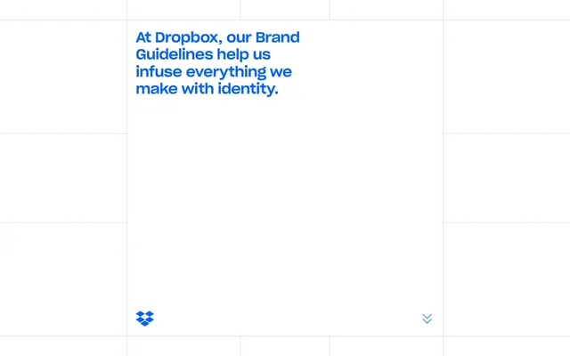
Preview image. Unlock full-res
Shifting color block canvas
Color palette
Brand accent color, used for primary interactive elements, links, icons, and outlines on ghost buttons. Conveys action and brand identity
Softer accent blue, used for background fills and borders, often combined with Ocean Blue for depth
Vibrant accent color for differentiating navigation sections and large background blocks
Deep, warm accent color for navigation elements and thematic content blocks
Muted, cool accent color for navigational elements and content differentiation
Warm, earthy accent color for navigation categories and distinct content area backgrounds
Rich, purple-pink accent for distinguishing navigation, active states, and content sections
Light, subtle blue used for navigation borders and backgrounds, providing a soft contrast
Deep, intense red-brown for navigation elements and specific content highlighting
Muted, dark green for navigation accents and thematic content blocks
Bright, vivid yellow for dynamic background blocks and highlights
Vivid deep pink for background blocks, indicating a distinct content zone
Bright, vivid cyan-blue for background blocks, adding visual pop
Vivid orange for background blocks and prominent color accents
Moderate violet for background blocks, contributing to the varied color palette
Page backgrounds, main content surfaces, base of interactive elements
Primary content text, headings, and significant labels. Offers high contrast on white
Secondary text, muted labels, and borders where a softer contrast is desired
Typography
- Weights
- 400, 500
- Sizes
- 12px, 14px
- Line height
- 1.43, 1.57, 1.67
- Letter spacing
- normal
- Fallback
- Inter
Body text, links, navigation labels, and UI controls. Its clear, sans-serif design maintains legibility across various small to medium text elements.
- Weights
- 500, 700
- Sizes
- 30px, 34px, 36px
- Line height
- 0.8, 1.2
- Letter spacing
- -0.0200em
- Fallback
- Inter
Headings and prominent navigation titles. This variable font's tight tracking creates a contemporary, condensed appearance, making titles assertive without being bulky. Its high visual weight provides strong hierarchy against the colorful backgrounds.
Spacing & shape
Components
Text in Ocean Blue (#0061fe), with a 2px Ocean Blue (#0061fe) border. Background is Canvas White (#ffffff). Radius is 0px, indicating sharp corners. Used for primary calls to action like 'Brand Partner Toolkit'.
Guidelines
- Prioritize vibrant, saturated color blocks, drawing from the accent color palette to define distinct sections.
- Utilize Atlasgrotesk Web (or Inter) for all body copy and UI elements with a default of weight 400 and Canvas White (#ffffff) text on dark backgrounds, or Primary Text (#1e1919) on light.
- Apply Dbsharpgroteskvariable Vf (or Inter) at weights 500 or 700 for all headlines, maintaining the tight letter-spacing of -0.0200em.
- Employ Ocean Blue (#0061fe) as the primary indicator for interactive elements, including links and outlined buttons.
- Use a base radius of 0px for all buttons and interactive elements, favoring sharp, angular shapes over rounded corners.
- Implement the detected spacing tokens (e.g., 23px padding for content blocks, 16px element gaps) for consistent rhythm.
- When creating interactive elements, use distinct color accents (#0061fe, #5f9dff) as borders or text colors to indicate interactivity, avoiding solid fills for primary actions.
- Avoid using drop shadows or complex elevation effects; the design relies on color and sharp edges for visual hierarchy.
- Do not introduce gradients unless they are simple color-to-color transitions that mimic the color-block aesthetic.
- Do not use highly rounded corners (e.g., >8px) for buttons or primary components, as the system favors sharp, defined shapes.
- Refrain from using generic gray scales for backgrounds; instead, use the vibrant accent colors to define distinct content areas.
- Do not deviate from the specified font families or their respective letter-spacing values, as these are critical to brand identity.
- Avoid overly dense layouts; maintain a comfortable density with ample padding and element gaps, consistent with the base unit of 4px.
- Do not use dark backgrounds for significant body text; ensure high contrast with light background colors like Canvas White (#ffffff).
About this system
ShowHide
Dropbox's brand guidelines site employs a playful, almost kaleidoscopic visual system built on a vibrant and highly chromatic color palette. The layout uses a grid-based approach with large, color-blocked sections that shift dynamically, giving a sense of movement and modularity. Typography is clean and modern, providing clear information against the lively backgrounds. The design prioritizes distinctive branding through color and flexible, responsive layout rather than heavy shadows or complex gradients.
The page structure is dominated by a flexible, full-bleed grid layout where content sections are defined by large, shifting color blocks. There is no fixed pageMaxWidth, allowing sections to extend to the full viewport width. The hero section often features a centered headline or impactful text over a background color block. Content is arranged across these dynamic blocks, often centered within them when text-heavy. Navigation appears to be a sticky top bar or an aside that floats, adapting to the grid. Section rhythm is driven by the alternating and sometimes overlapping nature of the color blocks, creating a dynamic, non-linear flow. Density is kept comfortable, with significant white space (or colored space) around content blocks.
This design system uses a minimal, largely UI-focused imagery approach. The primary visual elements are the color blocks themselves, forming a dynamic grid system. Icons, like the Dropbox logo, are crisp, filled, and monochromatic (using Ocean Blue or Canvas White), serving as functional brand markers. Photography, illustrations, or product screenshots are not a dominant feature of this system; the visual language is created through color, typography, and clean arrangement of interface elements. Imagery, if present, is expected to be simple, abstract, or purely functional within the color-block context.
# Brand — Style Reference
> Shifting color block canvas

**Theme:** light

**Site:** https://brand.dropbox.com

Dropbox's brand guidelines site employs a playful, almost kaleidoscopic visual system built on a vibrant and highly chromatic color palette. The layout uses a grid-based approach with large, color-blocked sections that shift dynamically, giving a sense of movement and modularity. Typography is clean and modern, providing clear information against the lively backgrounds. The design prioritizes distinctive branding through color and flexible, responsive layout rather than heavy shadows or complex gradients.

## Tokens — Colors

| Name | Value | Token | Role |
|------|------|------|------|
| Ocean Blue | `#0061fe` | `--color-ocean-blue` | Brand accent color, used for primary interactive elements, links, icons, and outlines on ghost buttons. Conveys action and brand identity |
| Sky Blue | `#5f9dff` | `--color-sky-blue` | Softer accent blue, used for background fills and borders, often combined with Ocean Blue for depth |
| Coral Red | `#ffafa5` | `--color-coral-red` | Vibrant accent color for differentiating navigation sections and large background blocks |
| Spice Orange | `#6d2e09` | `--color-spice-orange` | Deep, warm accent color for navigation elements and thematic content blocks |
| Teal Ink | `#055463` | `--color-teal-ink` | Muted, cool accent color for navigational elements and content differentiation |
| Goldenrod | `#684505` | `--color-goldenrod` | Warm, earthy accent color for navigation categories and distinct content area backgrounds |
| Indigo Magenta | `#682760` | `--color-indigo-magenta` | Rich, purple-pink accent for distinguishing navigation, active states, and content sections |
| Powder Blue | `#b4c8e1` | `--color-powder-blue` | Light, subtle blue used for navigation borders and backgrounds, providing a soft contrast |
| Crimson Mocha | `#4e0119` | `--color-crimson-mocha` | Deep, intense red-brown for navigation elements and specific content highlighting |
| Forest Green | `#175641` | `--color-forest-green` | Muted, dark green for navigation accents and thematic content blocks |
| Canary Yellow | `#fad24b` | `--color-canary-yellow` | Bright, vivid yellow for dynamic background blocks and highlights |
| Deep Plum | `#892055` | `--color-deep-plum` | Vivid deep pink for background blocks, indicating a distinct content zone |
| Aqua Glow | `#3dd3ee` | `--color-aqua-glow` | Bright, vivid cyan-blue for background blocks, adding visual pop |
| Papaya Orange | `#ff8c19` | `--color-papaya-orange` | Vivid orange for background blocks and prominent color accents |
| Misty Violet | `#c8aff0` | `--color-misty-violet` | Moderate violet for background blocks, contributing to the varied color palette |
| Canvas White | `#ffffff` | `--color-canvas-white` | Page backgrounds, main content surfaces, base of interactive elements |
| Primary Text | `#1e1919` | `--color-primary-text` | Primary content text, headings, and significant labels. Offers high contrast on white |
| Subtle Text | `#736c64` | `--color-subtle-text` | Secondary text, muted labels, and borders where a softer contrast is desired |

## Tokens — Typography

### Atlasgrotesk Web
- **Substitute:** Inter
- **Weights:** 400, 500
- **Sizes:** 12px, 14px
- **Line height:** 1.43, 1.57, 1.67
- **Letter spacing:** normal
- **Role:** Body text, links, navigation labels, and UI controls. Its clear, sans-serif design maintains legibility across various small to medium text elements.

### Dbsharpgroteskvariable Vf
- **Substitute:** Inter
- **Weights:** 500, 700
- **Sizes:** 30px, 34px, 36px
- **Line height:** 0.8, 1.2
- **Letter spacing:** -0.0200em
- **Role:** Headings and prominent navigation titles. This variable font's tight tracking creates a contemporary, condensed appearance, making titles assertive without being bulky. Its high visual weight provides strong hierarchy against the colorful backgrounds.

## Tokens — Type Scale

Perfect Fourth (1.333) from 14px base.

| Role | Size | Line height | Letter spacing |
|------|------|------|------|
| caption | 12px | 1.57 | — |
| body | 14px | 1.67 | — |
| subheading | 30px | 0.8 | -0.6px |
| heading | 34px | 1.2 | -0.68px |
| heading-lg | 36px | 1.2 | -0.72px |

## Tokens — Spacing

- **Section gap:** 48px
- **Card padding:** 23px
- **Element gap:** 16px

## Tokens — Radius

- **Default:** 8px

## Layout

The page structure is dominated by a flexible, full-bleed grid layout where content sections are defined by large, shifting color blocks. There is no fixed pageMaxWidth, allowing sections to extend to the full viewport width. The hero section often features a centered headline or impactful text over a background color block. Content is arranged across these dynamic blocks, often centered within them when text-heavy. Navigation appears to be a sticky top bar or an aside that floats, adapting to the grid. Section rhythm is driven by the alternating and sometimes overlapping nature of the color blocks, creating a dynamic, non-linear flow. Density is kept comfortable, with significant white space (or colored space) around content blocks.

## Imagery

This design system uses a minimal, largely UI-focused imagery approach. The primary visual elements are the color blocks themselves, forming a dynamic grid system. Icons, like the Dropbox logo, are crisp, filled, and monochromatic (using Ocean Blue or Canvas White), serving as functional brand markers. Photography, illustrations, or product screenshots are not a dominant feature of this system; the visual language is created through color, typography, and clean arrangement of interface elements. Imagery, if present, is expected to be simple, abstract, or purely functional within the color-block context.

## Components

### Ghost Primary Button
*Outline button for primary actions*

Text in Ocean Blue (#0061fe), with a 2px Ocean Blue (#0061fe) border. Background is Canvas White (#ffffff). Radius is 0px, indicating sharp corners. Used for primary calls to action like 'Brand Partner Toolkit'.

## Guidelines

### Do

- Prioritize vibrant, saturated color blocks, drawing from the accent color palette to define distinct sections.
- Utilize Atlasgrotesk Web (or Inter) for all body copy and UI elements with a default of weight 400 and Canvas White (#ffffff) text on dark backgrounds, or Primary Text (#1e1919) on light.
- Apply Dbsharpgroteskvariable Vf (or Inter) at weights 500 or 700 for all headlines, maintaining the tight letter-spacing of -0.0200em.
- Employ Ocean Blue (#0061fe) as the primary indicator for interactive elements, including links and outlined buttons.
- Use a base radius of 0px for all buttons and interactive elements, favoring sharp, angular shapes over rounded corners.
- Implement the detected spacing tokens (e.g., 23px padding for content blocks, 16px element gaps) for consistent rhythm.
- When creating interactive elements, use distinct color accents (#0061fe, #5f9dff) as borders or text colors to indicate interactivity, avoiding solid fills for primary actions.

### Don't

- Avoid using drop shadows or complex elevation effects; the design relies on color and sharp edges for visual hierarchy.
- Do not introduce gradients unless they are simple color-to-color transitions that mimic the color-block aesthetic.
- Do not use highly rounded corners (e.g., >8px) for buttons or primary components, as the system favors sharp, defined shapes.
- Refrain from using generic gray scales for backgrounds; instead, use the vibrant accent colors to define distinct content areas.
- Do not deviate from the specified font families or their respective letter-spacing values, as these are critical to brand identity.
- Avoid overly dense layouts; maintain a comfortable density with ample padding and element gaps, consistent with the base unit of 4px.
- Do not use dark backgrounds for significant body text; ensure high contrast with light background colors like Canvas White (#ffffff).

## Agent Prompt Guide

primary action: #0061fe (outlined action border)
Create an Outlined Primary Action: Transparent background, #0061fe border and text, 9999px radius, compact pill padding. Use it for the main CTA instead of a filled button.
More like this









Keep what you find
A free account saves references to boards and can send you a weekly email of picks based on what you save.
To see every result, go Pro.