Preview image. Unlock full-res
digital drafting board
Color palette
Link backgrounds used as categorical markers, decorative fills in illustrations or brand elements
Link backgrounds used as categorical markers, decorative fills in illustrations or brand elements
Link backgrounds used as categorical markers, decorative fills in illustrations or brand elements
Link backgrounds used as categorical markers
Link backgrounds used as categorical markers
Link backgrounds used as categorical markers
Link backgrounds used as categorical markers
Link backgrounds used as categorical markers
Observed in link backgroundColor.
Link backgrounds used as categorical markers
Primary Call-to-Action button fills — a vibrant focus point against the neutral backdrop for interaction
Component accent borders and text, part of custom conic gradients
Component accent borders and text, part of custom conic gradients
Page backgrounds, elevated card surfaces, primary text on dark backgrounds
Primary text, icon fills, borders, main navigation text, secondary button backgrounds
Muted body text, secondary text, subtle borders
Background for subtle surface distinction, like some card states or section backgrounds
Typography
- Weights
- 320, 330, 340, 400, 450, 480, 520, 700
- Sizes
- 16px, 18px, 24px, 56px, 72px
- Line height
- 1, 1.1, 1.3, 1.35, 1.4, 1.45
- Letter spacing
- -0.007, -0.008, -0.009, -0.015, -0.02
- Fallback
- Inter
Primary typeface for all UI text, headings, and body content. Its custom design provides a distinct, clean aesthetic. The range of weights allows for a nuanced hierarchy, from light to bold.
- Weights
- 400
- Sizes
- 12px, 16px
- Line height
- 1, 1.3
- Letter spacing
- 0.05, 0.03
- Fallback
- JetBrains Mono
Monospaced typeface used for specific technical contexts or code snippets, maintaining legibility with generous letter-spacing. Its presence nods to developers and technical users.
Spacing & shape
Elevation
Components
backgroundColor=rgba(0, 0, 0, 0), color=rgb(0, 0, 0), border-radius=0px, padding=8px. Used for navigation and tertiary actions, blending seamlessly into the background.
backgroundColor=rgba(77, 73, 252, 1), color=rgb(255, 255, 255), borderRadius=50px, paddingTop=8px, paddingRight=18px, paddingBottom=10px, paddingLeft=18px. Distinctive rounded shape and solid fill make it stand out as the key interactive element.
backgroundColor=rgb(255, 255, 255), color=rgb(0, 0, 0), borderTopColor=rgb(0, 0, 0), borderRadius=50px, paddingTop=8px, paddingRight=18px, paddingBottom=10px, paddingLeft=18px. Offers an alternative call to action with a pill shape and bordered appearance.
backgroundColor=rgba(0, 0, 0, 0.08), color=rgb(0, 0, 0), borderRadius=50%, padding=0px. Used for subtle, icon-only interactions, typically with a light background tint on hover/active states.
backgroundColor=rgba(255, 255, 255, 0.16), color=rgb(255, 255, 255), borderRadius=50%, padding=0px. Icon-only interactions for dark contexts, appearing as a ghost element with a white tint.
backgroundColor=rgba(0, 0, 0, 0), borderRadius=0px, boxShadow=none, padding=0px. Used as a structural content block without explicit visual styling beyond its defined space.
backgroundColor=rgb(230, 230, 230), borderRadius=18px, boxShadow=rgba(0, 0, 0, 0.1) 0px 24px 70px 0px, padding=0px. Features a pronounced shadow and distinct background, designed to visually pop out from the page.
backgroundColor=rgb(255, 255, 255), borderRadius=16px, boxShadow=none, padding=16px. Clean white background and rounded corners without an explicit shadow, serving as a contained information block.
Guidelines
- Use 'Canvas White' (#ffffff) as the primary page background color for a clean, open feel.
- Apply 'Ink Black' (#000000) for all primary text elements to ensure high contrast and readability.
- Reserve 'Action Violet' (#4d49fc) exclusively for primary Call-to-Action button backgrounds to maintain its impact and clear interaction signal.
- Utilize 'Figma Sans' with weight 700 for headings, and 'Figma Sans' weight 400 for body text to establish a clear typographic hierarchy.
- Employ a 'Primary Pill Button' (backgroundColor '#4d49fc', borderRadius '50px') for all main conversions.
- Maintain a comfortable rhythm across sections by using a 'sectionGap' of '24px'.
- Apply a 'cardPadding' of '16px' within content cards to provide adequate breathing room around their content.
- Do not use 'Action Violet' (#4d49fc) for decorative elements or non-interactive text to avoid diluting its primary action significance.
- Avoid applying strong shadows to elements other than designated 'Elevated Marketing Card' components to preserve visual flatness and focus.
- Do not use letter spacing variations on body text; keep 'figmaSans' body text at its default (normal) tracking for optimal readability.
- Do not introduce sharp corners on buttons; enforce a '50px' borderRadius for 'Primary Pill Button' or '8px' for smaller 'small Buttons'.
- Refrain from using heavily saturated brand colors (e.g., 'Link Blue', 'Link Green') as primary text or background colors; their role is for accents and categorizing links.
- Do not deviate from the established 'comfortable' spacing density; consistently apply a base unit of '4px' to maintain visual rhythm.
- Avoid using the 'figmaMono' font for extensive body passages; its use is specific for technical code-like content, not general reading.
About this system
ShowHide
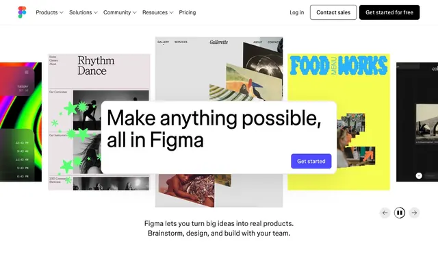
Figma's design language evokes a sophisticated workspace feel, balancing clean utility with creative vibrancy. Dominant neutral tones provide a calm canvas, allowing strategic pops of vivid color to highlight interactive elements and brand identity. This interplay creates both clarity and engagement, reflecting a tool built for focused work yet enabling imaginative output. Rounded 'pill' buttons and soft shadows on cards suggest approachability within an otherwise crisp, almost systematic aesthetic.
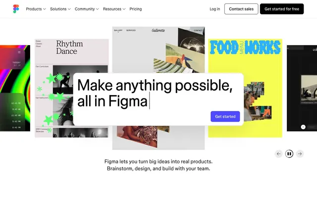
The page primarily employs a max-width contained layout for content, centered to create a focused reading experience. The hero section often breaks this containment, presenting full-bleed, dynamic visuals with a prominent, centralized headline overlay. Sections alternate between simple text blocks and more complex arrangements featuring image-left/text-right or vise-versa. Card grids are used for showcasing multiple examples or products, typically in a responsive column layout. There's a consistent vertical rhythm with 'sectionGap' at '24px', suggesting a comfortable density rather than information-heavy blocks, allowing visuals to breathe. A sticky top navigation bar with clear calls to action reinforces persistent brand presence.
The visual language blends product screenshots showcasing complex UI with dynamic, colorful abstract graphics. Product screenshots are typically contained within cards, sometimes overlapping or presented on a slight angle, giving a sense of dynamic motion without being distracting. The abstract graphics utilize vivid, often gradient-infused colors that serve a decorative, atmospheric role, breaking up the otherwise clean UI. Icons are simple, outlined, and monochromatic, used sparingly to support navigation and feature identification. Imagery is used to convey both the 'what' (product UI) and the 'feel' (creative energy).
Reminiscent of Canva, Webflow, Notion, Linear.
# Figma — Style Reference
> digital drafting board

**Theme:** light

**Site:** https://www.figma.com

Figma's design language evokes a sophisticated workspace feel, balancing clean utility with creative vibrancy. Dominant neutral tones provide a calm canvas, allowing strategic pops of vivid color to highlight interactive elements and brand identity. This interplay creates both clarity and engagement, reflecting a tool built for focused work yet enabling imaginative output. Rounded 'pill' buttons and soft shadows on cards suggest approachability within an otherwise crisp, almost systematic aesthetic.

## Tokens — Colors

| Name | Value | Token | Role |
|------|------|------|------|
| Link Blue | `#00b6ff` | `--color-link-blue` | Link backgrounds used as categorical markers, decorative fills in illustrations or brand elements |
| Link Green | `#24cb71` | `--color-link-green` | Link backgrounds used as categorical markers, decorative fills in illustrations or brand elements |
| Link Orange | `#ff7237` | `--color-link-orange` | Link backgrounds used as categorical markers, decorative fills in illustrations or brand elements |
| Figma Green | `#e4ff97` | `--color-figma-green` | Link backgrounds used as categorical markers |
| Figma Violet | `#c4baff` | `--color-figma-violet` | Link backgrounds used as categorical markers |
| Figma Ash | `#95b9ac` | `--color-figma-ash` | Link backgrounds used as categorical markers |
| Figma Pink | `#cb9fd2` | `--color-figma-pink` | Link backgrounds used as categorical markers |
| Figma Blush | `#ffc9c1` | `--color-figma-blush` | Link backgrounds used as categorical markers |
| Error Red | `#721c1c` | `--color-error-red` | Observed in link backgroundColor. |
| Figma Teal | `#c7f8fb` | `--color-figma-teal` | Link backgrounds used as categorical markers |
| Action Violet | `#4d49fc` | `--color-action-violet` | Primary Call-to-Action button fills — a vibrant focus point against the neutral backdrop for interaction |
| Gradient Teal Bright | `#33dfdf` | `--color-gradient-teal-bright` | Component accent borders and text, part of custom conic gradients |
| Gradient Amber | `#b98e01` | `--color-gradient-amber` | Component accent borders and text, part of custom conic gradients |
| Canvas White | `#ffffff` | `--color-canvas-white` | Page backgrounds, elevated card surfaces, primary text on dark backgrounds |
| Ink Black | `#000000` | `--color-ink-black` | Primary text, icon fills, borders, main navigation text, secondary button backgrounds |
| Figma Gray | `#595959` | `--color-figma-gray` | Muted body text, secondary text, subtle borders |
| Surface Off-White | `#e2e2e2` | `--color-surface-off-white` | Background for subtle surface distinction, like some card states or section backgrounds |

## Tokens — Typography

### figmaSans
- **Substitute:** Inter
- **Weights:** 320, 330, 340, 400, 450, 480, 520, 700
- **Sizes:** 16px, 18px, 24px, 56px, 72px
- **Line height:** 1, 1.1, 1.3, 1.35, 1.4, 1.45
- **Letter spacing:** -0.007, -0.008, -0.009, -0.015, -0.02
- **Role:** Primary typeface for all UI text, headings, and body content. Its custom design provides a distinct, clean aesthetic. The range of weights allows for a nuanced hierarchy, from light to bold.

### figmaMono
- **Substitute:** JetBrains Mono
- **Weights:** 400
- **Sizes:** 12px, 16px
- **Line height:** 1, 1.3
- **Letter spacing:** 0.05, 0.03
- **Role:** Monospaced typeface used for specific technical contexts or code snippets, maintaining legibility with generous letter-spacing. Its presence nods to developers and technical users.

## Tokens — Type Scale

Augmented Fourth (1.414) from 18px base.

| Role | Size | Line height | Letter spacing |
|------|------|------|------|
| caption | 12px | 1.3 | 0.6px |
| body-sm | 16px | 1.45 | -0.112px |
| body | 18px | 1.4 | -0.144px |
| heading | 24px | 1.35 | -0.216px |
| heading-lg | 56px | 1.1 | -0.84px |
| display | 72px | 1 | -1.44px |

## Tokens — Spacing

- **Section gap:** 24px
- **Card padding:** 16px
- **Element gap:** 16px

## Tokens — Radius

- **Buttons:** 50px
- **Cards:** 16px
- **links:** 2px
- **smallButtons:** 8px

## Tokens — Elevation

- **Elevated Marketing Card:** `rgba(0, 0, 0, 0.1) 0px 24px 70px 0px`

## Layout

The page primarily employs a max-width contained layout for content, centered to create a focused reading experience. The hero section often breaks this containment, presenting full-bleed, dynamic visuals with a prominent, centralized headline overlay. Sections alternate between simple text blocks and more complex arrangements featuring image-left/text-right or vise-versa. Card grids are used for showcasing multiple examples or products, typically in a responsive column layout. There's a consistent vertical rhythm with 'sectionGap' at '24px', suggesting a comfortable density rather than information-heavy blocks, allowing visuals to breathe. A sticky top navigation bar with clear calls to action reinforces persistent brand presence.

## Imagery

The visual language blends product screenshots showcasing complex UI with dynamic, colorful abstract graphics. Product screenshots are typically contained within cards, sometimes overlapping or presented on a slight angle, giving a sense of dynamic motion without being distracting. The abstract graphics utilize vivid, often gradient-infused colors that serve a decorative, atmospheric role, breaking up the otherwise clean UI. Icons are simple, outlined, and monochromatic, used sparingly to support navigation and feature identification. Imagery is used to convey both the 'what' (product UI) and the 'feel' (creative energy).

## Components

### Ghost Text Button
*navigation link, secondary action*

backgroundColor=rgba(0, 0, 0, 0), color=rgb(0, 0, 0), border-radius=0px, padding=8px. Used for navigation and tertiary actions, blending seamlessly into the background.

### Primary Pill Button
*primary action*

backgroundColor=rgba(77, 73, 252, 1), color=rgb(255, 255, 255), borderRadius=50px, paddingTop=8px, paddingRight=18px, paddingBottom=10px, paddingLeft=18px. Distinctive rounded shape and solid fill make it stand out as the key interactive element.

### Secondary Pill Button (Outlined)
*secondary action*

backgroundColor=rgb(255, 255, 255), color=rgb(0, 0, 0), borderTopColor=rgb(0, 0, 0), borderRadius=50px, paddingTop=8px, paddingRight=18px, paddingBottom=10px, paddingLeft=18px. Offers an alternative call to action with a pill shape and bordered appearance.

### Circular Icon Button (Transparent BG)
*icon button, subtle interaction*

backgroundColor=rgba(0, 0, 0, 0.08), color=rgb(0, 0, 0), borderRadius=50%, padding=0px. Used for subtle, icon-only interactions, typically with a light background tint on hover/active states.

### Circular Icon Button (Ghost White)
*icon button, subtle interaction on dark BG*

backgroundColor=rgba(255, 255, 255, 0.16), color=rgb(255, 255, 255), borderRadius=50%, padding=0px. Icon-only interactions for dark contexts, appearing as a ghost element with a white tint.

### Base Card
*content container*

backgroundColor=rgba(0, 0, 0, 0), borderRadius=0px, boxShadow=none, padding=0px. Used as a structural content block without explicit visual styling beyond its defined space.

### Elevated Marketing Card
*marketing spotlight, showcase*

backgroundColor=rgb(230, 230, 230), borderRadius=18px, boxShadow=rgba(0, 0, 0, 0.1) 0px 24px 70px 0px, padding=0px. Features a pronounced shadow and distinct background, designed to visually pop out from the page.

### Standard Content Card
*information display, nested content*

backgroundColor=rgb(255, 255, 255), borderRadius=16px, boxShadow=none, padding=16px. Clean white background and rounded corners without an explicit shadow, serving as a contained information block.

## Guidelines

### Do

- Use 'Canvas White' (#ffffff) as the primary page background color for a clean, open feel.
- Apply 'Ink Black' (#000000) for all primary text elements to ensure high contrast and readability.
- Reserve 'Action Violet' (#4d49fc) exclusively for primary Call-to-Action button backgrounds to maintain its impact and clear interaction signal.
- Utilize 'Figma Sans' with weight 700 for headings, and 'Figma Sans' weight 400 for body text to establish a clear typographic hierarchy.
- Employ a 'Primary Pill Button' (backgroundColor '#4d49fc', borderRadius '50px') for all main conversions.
- Maintain a comfortable rhythm across sections by using a 'sectionGap' of '24px'.
- Apply a 'cardPadding' of '16px' within content cards to provide adequate breathing room around their content.

### Don't

- Do not use 'Action Violet' (#4d49fc) for decorative elements or non-interactive text to avoid diluting its primary action significance.
- Avoid applying strong shadows to elements other than designated 'Elevated Marketing Card' components to preserve visual flatness and focus.
- Do not use letter spacing variations on body text; keep 'figmaSans' body text at its default (normal) tracking for optimal readability.
- Do not introduce sharp corners on buttons; enforce a '50px' borderRadius for 'Primary Pill Button' or '8px' for smaller 'small Buttons'.
- Refrain from using heavily saturated brand colors (e.g., 'Link Blue', 'Link Green') as primary text or background colors; their role is for accents and categorizing links.
- Do not deviate from the established 'comfortable' spacing density; consistently apply a base unit of '4px' to maintain visual rhythm.
- Avoid using the 'figmaMono' font for extensive body passages; its use is specific for technical code-like content, not general reading.

## Agent Prompt Guide

Quick Color Reference:
- text: #000000
- background: #ffffff
- border: #000000
- accent: #4d49fc
- primary action: #4d49fc (filled action)

Example Component Prompts:
- Create a Primary Action Button: #4d49fc background, #ffffff text, 9999px radius, compact pill padding. Use this filled treatment for the main CTA.
- Design a content card: 'Standard Content Card' with 'Canvas White' background, '16px' border-radius, and '16px' padding. Inside, use 'Ink Black' for titles (24px 'figmaSans' weight 520) and 'Figma Gray' for body text (16px 'figmaSans' weight 400).
- Create a Primary Action Button: #4d49fc background, #ffffff text, 9999px radius, compact pill padding. Use this filled treatment for the main CTA.
- Render an 'Elevated Marketing Card': 'Surface Off-White' background, '18px' border-radius, with the specified shadow (rgba(0, 0, 0, 0.1) 0px 24px 70px 0px).
More like this









Keep what you find
A free account saves references to boards and can send you a weekly email of picks based on what you save.
To see every result, go Pro.