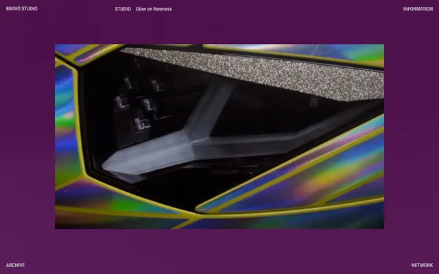
Preview image. Unlock full-res
Color palette
Page background – creates a dark, theatrical stage for content, especially media
Primary text for navigation and informational elements, subtle borders
High-contrast informational text, subtle borders, often used for header text against dark content sections
Typography
- Weights
- 400
- Sizes
- 16px, 17px
- Line height
- 1.06, 1.2
- Fallback
- IBM Plex Sans Condensed
Used for all text, from navigation to body copy, maintaining a consistent, refined voice with its condensed form.
Spacing & shape
Components
Text: Pure White (#ffffff), weight 400. Hover/active state is the only visual feedback.
Guidelines
- Use Plum Canvas (#4D004B) as the dominant background color for all page sections.
- Utilize GTAmerica Condensed, weight 400, for all text content to maintain a consistent brand voice.
- Set text color to Pure White (#ffffff) for primary navigation and prominent information, and Ghostly Slate (#dedede) for secondary or less prominent text, ensuring high contrast against the dark background.
- Maintain a minimal border radius of 0px for all elements, emphasizing sharp, angular forms.
- Implement a generous vertical spacing of 48px between main content blocks to create a composed layout.
- Avoid using highly saturated accent colors that would disrupt the monochrome aesthetic.
- Do not introduce rounded corners; all UI elements should maintain sharp, 0px radii.
- Refrain from using shadows or other elevation cues; the design relies on flat, layered surfaces and color contrast.
- Do not break the GTAmerica Condensed font family with other display fonts or excessive weight variations.
- Avoid dense, paragraph-heavy text blocks; keep text concise and functional to align with the annotated feel.
About this system
ShowHide
BRAVÒ STUDIO employs a dark, almost monochrome aesthetic, creating a sense of understated drama. The primary visual element is often a central piece of media, framed by vast swaths of a deep, rich plum background. Typography is compact and precise, appearing as subtle, highly contrasted annotations or navigation elements rather than dominant content blocks. The system prioritizes stark legibility against a dark canvas, with minimal decorative elements, allowing the core content to take precedence.
The page primarily uses a full-bleed structure, with content sections occupying the full viewport width. The hero pattern seems to be a centered image or media block set against the Plum Canvas background. Vertical sections maintain consistent spacing, with text elements often appearing in a fixed position at the header and footer, acting as navigational anchors for the central, dynamic content area. The overall density is spacious, ensuring strong focus on individual content pieces.
The site heavily features photography, specifically close-cropped, high-detail shots, often with iridescent or metallic surfaces (as seen in the car headlight). These images are treated as the central content, full-bleed within their section, and appear without rounded corners or masks, presenting raw and impactful visuals. Their role is primarily showcase and atmospheric, with sparse text surrounding them, allowing the visual to dominate and tell the story.
Reminiscent of A24 FILMS, Acne Studios, The Row.
# BRAVÒ STUDIO — Style Reference
> Deep Plum Proscenium

**Theme:** dark

**Site:** https://brv.studio

BRAVÒ STUDIO employs a dark, almost monochrome aesthetic, creating a sense of understated drama. The primary visual element is often a central piece of media, framed by vast swaths of a deep, rich plum background. Typography is compact and precise, appearing as subtle, highly contrasted annotations or navigation elements rather than dominant content blocks. The system prioritizes stark legibility against a dark canvas, with minimal decorative elements, allowing the core content to take precedence.

## Tokens — Colors

| Name | Value | Token | Role |
|------|------|------|------|
| Plum Canvas | `#4D004B` | `--color-plum-canvas` | Page background – creates a dark, theatrical stage for content, especially media |
| Ghostly Slate | `#dedede` | `--color-ghostly-slate` | Primary text for navigation and informational elements, subtle borders |
| Pure White | `#ffffff` | `--color-pure-white` | High-contrast informational text, subtle borders, often used for header text against dark content sections |

## Tokens — Typography

### GTAmerica Condensed
- **Substitute:** IBM Plex Sans Condensed
- **Weights:** 400
- **Sizes:** 16px, 17px
- **Line height:** 1.06, 1.2
- **Role:** Used for all text, from navigation to body copy, maintaining a consistent, refined voice with its condensed form.

## Tokens — Spacing

- **Section gap:** 48px
- **Card padding:** 24px
- **Element gap:** 12px

## Tokens — Radius

- **none:** 0px

## Layout

The page primarily uses a full-bleed structure, with content sections occupying the full viewport width. The hero pattern seems to be a centered image or media block set against the Plum Canvas background. Vertical sections maintain consistent spacing, with text elements often appearing in a fixed position at the header and footer, acting as navigational anchors for the central, dynamic content area. The overall density is spacious, ensuring strong focus on individual content pieces.

## Imagery

The site heavily features photography, specifically close-cropped, high-detail shots, often with iridescent or metallic surfaces (as seen in the car headlight). These images are treated as the central content, full-bleed within their section, and appear without rounded corners or masks, presenting raw and impactful visuals. Their role is primarily showcase and atmospheric, with sparse text surrounding them, allowing the visual to dominate and tell the story.

## Components

### Header Navigation Link
*Top and bottom navigation items*

Text: Pure White (#ffffff), weight 400. Hover/active state is the only visual feedback.

## Guidelines

### Do

- Use Plum Canvas (#4D004B) as the dominant background color for all page sections.
- Utilize GTAmerica Condensed, weight 400, for all text content to maintain a consistent brand voice.
- Set text color to Pure White (#ffffff) for primary navigation and prominent information, and Ghostly Slate (#dedede) for secondary or less prominent text, ensuring high contrast against the dark background.
- Maintain a minimal border radius of 0px for all elements, emphasizing sharp, angular forms.
- Implement a generous vertical spacing of 48px between main content blocks to create a composed layout.

### Don't

- Avoid using highly saturated accent colors that would disrupt the monochrome aesthetic.
- Do not introduce rounded corners; all UI elements should maintain sharp, 0px radii.
- Refrain from using shadows or other elevation cues; the design relies on flat, layered surfaces and color contrast.
- Do not break the GTAmerica Condensed font family with other display fonts or excessive weight variations.
- Avoid dense, paragraph-heavy text blocks; keep text concise and functional to align with the annotated feel.

## Agent Prompt Guide

Quick Color Reference:
text: #dedede
background: #4D004B
border: #dedede
accent: no distinct accent color
primary action: no distinct CTA color

Example Component Prompts:
Create a navigation item: GTAmerica Condensed, weight 400, 16px, line height 1.06, color Pure White (#ffffff).
Create a page heading: GTAmerica Condensed, weight 400, 17px, line height 1.20, color Ghostly Slate (#dedede).
Create a standard information text block: GTAmerica Condensed, weight 400, 16px, line height 1.20, color Ghostly Slate (#dedede).
Create a full-width header: background Plum Canvas (#4D004B). Left text 'BRAVÒ STUDIO', right text 'INFORMATION' both GTAmerica Condensed, weight 400, 16px, line height 1.06, color Pure White (#ffffff).
More like this






Keep what you find
A free account saves references to boards and can send you a weekly email of picks based on what you save.
To see every result, go Pro.