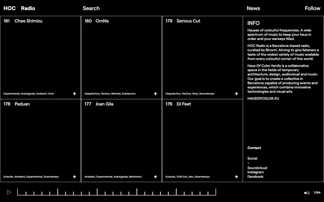
Preview image. Unlock full-res
Color palette
Page backgrounds, surface fills, component backdrops — provides a deep, immersive canvas
Neutral form states, badge text, and quiet UI feedback where color should stay understated. Do not promote it to the primary CTA color
Typography
- Weights
- 400, 500, 700
- Sizes
- 12px, 16px, 20px, 24px
- Line height
- 0.8, 1.2, 1.4, 1.5
- Fallback
- Inter
The primary typeface for all textual content, from headings to body and functional elements. Its clear, geometric forms contribute to the system's precise and modern feel.
Spacing & shape
Components
Transparent background, Lunar White text, and minimal 1px padding. No border unless hovered or focused.
Jet black background, defined by 1px solid Lunar White borders on the right and bottom. Text in Lunar White. Internal padding for text: 8px bottom and 16px left/right.
Transparent background, Lunar White text, 1px solid Lunar White border with 4px radius. Left padding 80px for icon placement, right padding 16px.
Transparent background, Lunar White text, no border. Appears as a line of text, not a distinct framed element. Uses 12px Roobert.
Lunar White text, 20px Roobert with 1.2 line height. Functionally a Ghost Button, but with distinct header typography and a 5px top, 10px right/left padding and a 1px bottom border.
Jet black background with a 1px solid Lunar White border on the left. All text is Lunar White. Uses 16px Roobert for body copy.
Guidelines
- Maintain a strict achromatic palette: Lunar White (#ffffff) for all foreground elements and Midnight Eclipse (#000000) for all backgrounds.
- Use 1px Lunar White borders as primary visual separators for information and grid elements.
- Apply the Roobert typeface consistently across all text elements, leveraging its provided weights for hierarchy.
- Structure content primarily through a symmetrical grid with clearly defined 1px Lunar White divisional lines.
- Utilize 8px vertical spacing between closely related text elements and 16px for larger component gaps.
- Keep border-radius at 0px for most elements, reserving 4px solely for specific input fields to subtly differentiate them.
- Introduce any saturated colors unless specifically for semantic states (e.g., success, error) which are not currently defined.
- Use shadows or any form of elevation (unless for focus states) — surfaces are flat and defined solely by borders and typography.
- Break the grid structure with irregular spacing or misaligned elements; precision is key to this system's aesthetic.
- Apply varied line spacing that deviates from the Roobert font's predefined lineHeight values for consistency.
- Use decorative imagery or complex illustrations; the system is text and line-art dominant.
- Increase component padding beyond 8px for internal content, aiming for a contained and dense information display.
About this system
ShowHide
HOC Radio employs a high-contrast dark mode aesthetic, presenting a stark, functional interface ideal for a digital radio platform. The design prioritizes clear information hierarchy through a grid-based layout and precise typographic contrasts. The entire system uses achromatic colors, with pure white text and borders against a jet black background, creating an atmosphere of focus and quiet intensity. Visual elements are minimal, relying on strong lines and text to convey information and structure.
The page model is full-bleed, extending edge-to-edge for its dark canvas. The hero presents a minimal header with navigation links. The primary content area is a rigid, symmetrical grid composed of equally sized content blocks. Each block is delineated by fine 1px Lunar White lines, forming a tight, uniform matrix. The information panel on the right acts as a persistent sidebar, also defined by a single vertical 1px line. Navigation is a top bar, with elements separated by vertical lines. The density is very high, characterized by compact information blocks and minimal breathing room between content sections.
The visual system is entirely devoid of photography or complex illustrations. It relies on minimalist line icons, simple geometric shapes, and text as its primary visual language. Icons are outlined in Lunar White, strictly functional rather than decorative, and appear in contexts like expand/collapse toggles and media playback controls. Visual density is high, with imagery occupying virtually no space, yielding a UI focused purely on content and interaction.
Reminiscent of SoundCloud, Are.na, Resident Advisor.
# HOC Radio — Style Reference
> High-contrast digital darkroom

**Theme:** dark

**Site:** https://hocradio.eu

HOC Radio employs a high-contrast dark mode aesthetic, presenting a stark, functional interface ideal for a digital radio platform. The design prioritizes clear information hierarchy through a grid-based layout and precise typographic contrasts. The entire system uses achromatic colors, with pure white text and borders against a jet black background, creating an atmosphere of focus and quiet intensity. Visual elements are minimal, relying on strong lines and text to convey information and structure.

## Tokens — Colors

| Name | Value | Token | Role |
|------|------|------|------|
| Midnight Eclipse | `#000000` | `--color-midnight-eclipse` | Page backgrounds, surface fills, component backdrops — provides a deep, immersive canvas |
| Lunar White | `#ffffff` | `--color-lunar-white` | Neutral form states, badge text, and quiet UI feedback where color should stay understated. Do not promote it to the primary CTA color |

## Tokens — Typography

### Roobert
- **Substitute:** Inter
- **Weights:** 400, 500, 700
- **Sizes:** 12px, 16px, 20px, 24px
- **Line height:** 0.8, 1.2, 1.4, 1.5
- **Role:** The primary typeface for all textual content, from headings to body and functional elements. Its clear, geometric forms contribute to the system's precise and modern feel.

## Tokens — Type Scale

Major Third (1.25) from 16px base.

| Role | Size | Line height | Letter spacing |
|------|------|------|------|
| badge | 12px | 1.5 | — |
| body | 16px | 1.5 | — |
| heading | 20px | 1.2 | — |
| display | 24px | 0.8 | — |

## Tokens — Spacing

- **Section gap:** 48px
- **Card padding:** 8px
- **Element gap:** 16px

## Tokens — Radius

- **Inputs:** 4px
- **none:** 0px

## Layout

The page model is full-bleed, extending edge-to-edge for its dark canvas. The hero presents a minimal header with navigation links. The primary content area is a rigid, symmetrical grid composed of equally sized content blocks. Each block is delineated by fine 1px Lunar White lines, forming a tight, uniform matrix. The information panel on the right acts as a persistent sidebar, also defined by a single vertical 1px line. Navigation is a top bar, with elements separated by vertical lines. The density is very high, characterized by compact information blocks and minimal breathing room between content sections.

## Imagery

The visual system is entirely devoid of photography or complex illustrations. It relies on minimalist line icons, simple geometric shapes, and text as its primary visual language. Icons are outlined in Lunar White, strictly functional rather than decorative, and appear in contexts like expand/collapse toggles and media playback controls. Visual density is high, with imagery occupying virtually no space, yielding a UI focused purely on content and interaction.

## Components

### Ghost Button
*Interactive elements, navigation links, and subtle calls to action.*

Transparent background, Lunar White text, and minimal 1px padding. No border unless hovered or focused.

### Item Card
*Displays individual content entries in a grid, like radio shows or artists.*

Jet black background, defined by 1px solid Lunar White borders on the right and bottom. Text in Lunar White. Internal padding for text: 8px bottom and 16px left/right.

### Text Input (Search)
*Search fields.*

Transparent background, Lunar White text, 1px solid Lunar White border with 4px radius. Left padding 80px for icon placement, right padding 16px.

### Content Tag
*Labels for content categories or keywords.*

Transparent background, Lunar White text, no border. Appears as a line of text, not a distinct framed element. Uses 12px Roobert.

### Header Navigation Item
*Top-level navigation.*

Lunar White text, 20px Roobert with 1.2 line height. Functionally a Ghost Button, but with distinct header typography and a 5px top, 10px right/left padding and a 1px bottom border.

### Info Panel
*Displays detailed information blocks.*

Jet black background with a 1px solid Lunar White border on the left. All text is Lunar White. Uses 16px Roobert for body copy.

## Guidelines

### Do

- Maintain a strict achromatic palette: Lunar White (#ffffff) for all foreground elements and Midnight Eclipse (#000000) for all backgrounds.
- Use 1px Lunar White borders as primary visual separators for information and grid elements.
- Apply the Roobert typeface consistently across all text elements, leveraging its provided weights for hierarchy.
- Structure content primarily through a symmetrical grid with clearly defined 1px Lunar White divisional lines.
- Utilize 8px vertical spacing between closely related text elements and 16px for larger component gaps.
- Keep border-radius at 0px for most elements, reserving 4px solely for specific input fields to subtly differentiate them.

### Don't

- Introduce any saturated colors unless specifically for semantic states (e.g., success, error) which are not currently defined.
- Use shadows or any form of elevation (unless for focus states) — surfaces are flat and defined solely by borders and typography.
- Break the grid structure with irregular spacing or misaligned elements; precision is key to this system's aesthetic.
- Apply varied line spacing that deviates from the Roobert font's predefined lineHeight values for consistency.
- Use decorative imagery or complex illustrations; the system is text and line-art dominant.
- Increase component padding beyond 8px for internal content, aiming for a contained and dense information display.

## Agent Prompt Guide

Quick Color Reference:
text: #ffffff
background: #000000
border: #ffffff
accent: no distinct accent color
primary action: no distinct CTA color

Example Component Prompts:
1. Create a Header Navigation Bar: Midnight Eclipse background, containing Ghost Buttons with Lunar White text 'HOC Radio', 'Search', 'News', 'Follow'. Each item uses 20px Roobert weight 400, lineHeight 1.2, has 5px top and 10px side padding, and is separated by a 1px Lunar White vertical border.
2. Design an Item Card: Midnight Eclipse background, defined by a 1px solid Lunar White right border and 1px solid Lunar White bottom border. Display '181' (Lunar White, 24px Roobert weight 400, lineHeight 0.8) and 'Chee Shimizu' (Lunar White, 20px Roobert weight 400, lineHeight 1.2). Below, add a Content Tag 'Experimental, Avantgarde, Ambient, Vinyl' (Lunar White, 12px Roobert weight 400, lineHeight 1.5) with a '+' icon button (Lunar White line icon) on the right.
3. Implement a Search Input Field: Transparent background with a 1px Lunar White border and 4px radius. Placeholder text 'Search' in Lunar White. Text input color is Lunar White, 16px Roobert weight 400. Left padding 80px, right padding 16px.
4. Create an Info Panel: Midnight Eclipse background, with a 1px solid Lunar White left border. Content within is body text (Lunar White, 16px Roobert weight 400, lineHeight 1.5) and a list of links (Lunar White, 16px Roobert weight 400, lineHeight 1.5), with a section title 'INFO' (Lunar White, 20px Roobert weight 400, lineHeight 1.2). Padding is 16px on all sides.
More like this




Keep what you find
A free account saves references to boards and can send you a weekly email of picks based on what you save.
To see every result, go Pro.