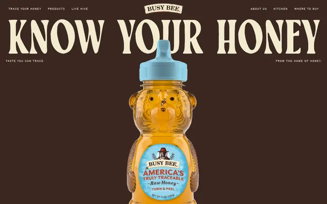
Preview image. Unlock full-res
Golden Harvest Comfort: a sun-drenched, natural warmth with a handmade touch.
Color palette
Primary typography, high-contrast text, filled buttons, structural borders
Decorative background accents, outlined button borders, navigation background for current page
Secondary background accents, navigation highlights
Green wash for highlight backgrounds, decorative bands, and soft emphasis behind content
Red outline accent for tags, dividers, and focused UI edges. Do not promote it to the primary CTA color
Page backgrounds, surface elements, muted text
High-contrast text, borders, decorative elements
Typography
- Weights
- 400
- Sizes
- 28px, 90px, 135px, 209px, 238px
- Line height
- 0.8, 0.82, 1
- Letter spacing
- -0.0100em
- Fallback
- Merriweather, Playfair Display
Display and primary headings – an unconventional serif with tight tracking, giving a handcrafted yet bold presence. Substitute: Merriweather, Playfair Display.
- Weights
- 400
- Sizes
- 12px, 14px, 16px, 20px
- Line height
- 1, 1.1, 1.5
- Letter spacing
- normal
Navigation, subheadings, and specific call-out text – a unique serif that complements the primary display font. Substitute: Georgia, Lora.
- Weights
- 400
- Sizes
- 16px
- Line height
- 1.2
- Letter spacing
- normal
- Fallback
- Georgia, Lora
System serif for general body text and product descriptions where long-form readability is key. Substitute: Georgia, Lora.
- Weights
- 400
- Sizes
- 16px
- Line height
- 1.61
- Letter spacing
- 0.0310em
- Fallback
- Roboto Mono, Space Mono
Specialized text, possibly for code or unique labels, with generous letter spacing.
- Weights
- 400
- Sizes
- 13px, 16px, 24px, 65px
- Line height
- 1
- Letter spacing
- normal
Specific branding elements and decorative text; appears to be a unique ornamental font. Substitute: none, use as image where possible.
- Weights
- 400
- Sizes
- 13px
- Line height
- 1.2
- Letter spacing
- normal
- Fallback
- Helvetica, Open Sans
Fallback sans-serif for button labels and small utilitarian text. Substitute: Helvetica, Open Sans.
Spacing & shape
Components
Background: Earth Brown (`#3b2722`), Text: Warm Cream (`#f2ebd0`), Border Radius: 500px, Padding: 24px all sides. Uses system sans-serif `Arial`.
Background: Transparent (`rgba(255, 255, 255, 0)`), Text: Earth Brown (`#3b2722`), Border: 1px Earth Brown, Border Radius: 1000px, Padding: 24px vertical, 40px horizontal. Uses system sans-serif `Arial`.
Background: Transparent (`rgba(0, 0, 0, 0)`), Text: Black Ink (`#000000`), Border: 1px Black Ink, Border Radius: 500px, Padding: 0px. Uses system sans-serif `Arial`.
Background: Transparent, Border Radius: 0px, No shadow. Padding: 0px.
Guidelines
- Use Earth Brown (`#3b2722`) for primary text and calls to action to maintain brand consistency.
- Apply 500px or 1000px border-radius to all interactive elements like buttons for a soft, friendly feel.
- Prioritize TayMakawao for large headlines using its tight letter-spacing for visual impact.
- Utilize Warm Cream (`#f2ebd0`) as the dominant background color for content sections.
- Employ consistent 24px vertical and 40px horizontal padding for main ghost buttons.
- Use Honeycomb Gold (`#ffca50`) and Sky Blue (`#6aacc2`) sparingly as accent colors for distinct elements or to indicate active states.
- Avoid sharp corners; all functional UI elements should have a significant border radius.
- Do not use generic system fonts for branding or primary headlines where TayMakawao or TayBirdie are intended.
- Do not overuse accent colors; most of the UI should remain in the neutral and Earth Brown palette.
- Avoid complex shadow systems; the design system appears to favor flat surfaces.
- Do not vary line heights excessively within body text; maintain a comfortable 1.2-1.5 ratio.
- Do not use transparent backgrounds for text-heavy sections; ensure sufficient contrast with solid background colors.
About this system
ShowHide
Busy Bee Honey's design system evokes a rustic, wholesome, and approachable brand character. It uses warm, earthy tones contrasting with a clean, light background and vibrant accent colors. Typography combines a classic serif for branding and headings with highly legible sans-serif for body text, creating a sense of heritage and trustworthiness. Components are soft and generous, prioritizing comfort over sharp precision, with rounded shapes and ample padding.
The page primarily uses a full-bleed layout, where background colors or large imagery stretch across the viewport width. The hero section features a large, centered headline over a dark, full-width background, with a prominent product image. Subsequent sections vary, often incorporating alternating full-width color bands (e.g., Warm Cream, Honeycomb Gold). Content within these bands tends to be centrally aligned or uses two-column text and image arrangements. Vertical spacing between sections is generous, establishing a comfortable, unhurried rhythm. Navigation is a top bar, with interactive elements subtly highlighted on hover.
The imagery features highly stylized product photography (honey bottles), often floating or placed centrally against a strong brand-colored background. Illustrations are minimal but present, such as bee icons, adding a whimsical touch without overpowering the product. Icons are either outlined or filled, with a moderate stroke weight, and monochrome. The overall density is low, allowing images to occupy significant visual space and act as focal points, primarily for product showcase and brand atmosphere rather than explanatory content.
Reminiscent of Burt's Bees, King Arthur Baking Company, Local Honey Co-ops.
# Busy Bee Honey — Style Reference
> Golden Harvest Comfort: a sun-drenched, natural warmth with a handmade touch.

**Theme:** light

**Site:** https://www.busybeehoney.com

Busy Bee Honey's design system evokes a rustic, wholesome, and approachable brand character. It uses warm, earthy tones contrasting with a clean, light background and vibrant accent colors. Typography combines a classic serif for branding and headings with highly legible sans-serif for body text, creating a sense of heritage and trustworthiness. Components are soft and generous, prioritizing comfort over sharp precision, with rounded shapes and ample padding.

## Tokens — Colors

| Name | Value | Token | Role |
|------|------|------|------|
| Earth Brown | `#3b2722` | `--color-earth-brown` | Primary typography, high-contrast text, filled buttons, structural borders |
| Honeycomb Gold | `#ffca50` | `--color-honeycomb-gold` | Decorative background accents, outlined button borders, navigation background for current page |
| Sky Blue | `#6aacc2` | `--color-sky-blue` | Secondary background accents, navigation highlights |
| Harvest Green | `#6fa162` | `--color-harvest-green` | Green wash for highlight backgrounds, decorative bands, and soft emphasis behind content |
| Cacao Red | `#a0342a` | `--color-cacao-red` | Red outline accent for tags, dividers, and focused UI edges. Do not promote it to the primary CTA color |
| Warm Cream | `#f2ebd0` | `--color-warm-cream` | Page backgrounds, surface elements, muted text |
| Black Ink | `#000000` | `--color-black-ink` | High-contrast text, borders, decorative elements |

## Tokens — Typography

### TayMakawao
- **Substitute:** Merriweather, Playfair Display
- **Weights:** 400
- **Sizes:** 28px, 90px, 135px, 209px, 238px
- **Line height:** 0.8, 0.82, 1
- **Letter spacing:** -0.0100em
- **Role:** Display and primary headings – an unconventional serif with tight tracking, giving a handcrafted yet bold presence. Substitute: Merriweather, Playfair Display.

### TayBirdie
- **Weights:** 400
- **Sizes:** 12px, 14px, 16px, 20px
- **Line height:** 1, 1.1, 1.5
- **Letter spacing:** normal
- **Role:** Navigation, subheadings, and specific call-out text – a unique serif that complements the primary display font. Substitute: Georgia, Lora.

### Times
- **Substitute:** Georgia, Lora
- **Weights:** 400
- **Sizes:** 16px
- **Line height:** 1.2
- **Letter spacing:** normal
- **Role:** System serif for general body text and product descriptions where long-form readability is key. Substitute: Georgia, Lora.

### AnonymousPro
- **Substitute:** Roboto Mono, Space Mono
- **Weights:** 400
- **Sizes:** 16px
- **Line height:** 1.61
- **Letter spacing:** 0.0310em
- **Role:** Specialized text, possibly for code or unique labels, with generous letter spacing.

### barkmanhoney
- **Weights:** 400
- **Sizes:** 13px, 16px, 24px, 65px
- **Line height:** 1
- **Letter spacing:** normal
- **Role:** Specific branding elements and decorative text; appears to be a unique ornamental font. Substitute: none, use as image where possible.

### Arial
- **Substitute:** Helvetica, Open Sans
- **Weights:** 400
- **Sizes:** 13px
- **Line height:** 1.2
- **Letter spacing:** normal
- **Role:** Fallback sans-serif for button labels and small utilitarian text. Substitute: Helvetica, Open Sans.

## Tokens — Type Scale

Golden Ratio (1.618) from 14px base.

| Role | Size | Line height | Letter spacing |
|------|------|------|------|
| caption | 12px | 1 | — |
| body | 14px | 1.1 | — |
| body-lg | 16px | 1.2 | — |
| subheading | 20px | 1.5 | — |
| heading | 28px | 1 | -0.448px |
| heading-lg | 90px | 0.82 | -14.4px |
| display | 238px | 0.8 | -38.08px |

## Tokens — Spacing

- **Section gap:** 32px
- **Card padding:** 24px
- **Element gap:** 8px

## Tokens — Radius

- **Buttons:** 500px
- **body:** 42.75px

## Layout

The page primarily uses a full-bleed layout, where background colors or large imagery stretch across the viewport width. The hero section features a large, centered headline over a dark, full-width background, with a prominent product image. Subsequent sections vary, often incorporating alternating full-width color bands (e.g., Warm Cream, Honeycomb Gold). Content within these bands tends to be centrally aligned or uses two-column text and image arrangements. Vertical spacing between sections is generous, establishing a comfortable, unhurried rhythm. Navigation is a top bar, with interactive elements subtly highlighted on hover.

## Imagery

The imagery features highly stylized product photography (honey bottles), often floating or placed centrally against a strong brand-colored background. Illustrations are minimal but present, such as bee icons, adding a whimsical touch without overpowering the product. Icons are either outlined or filled, with a moderate stroke weight, and monochrome. The overall density is low, allowing images to occupy significant visual space and act as focal points, primarily for product showcase and brand atmosphere rather than explanatory content.

## Components

### Primary Filled Button
*Main call-to-action button.*

Background: Earth Brown (`#3b2722`), Text: Warm Cream (`#f2ebd0`), Border Radius: 500px, Padding: 24px all sides. Uses system sans-serif `Arial`.

### Ghost Outlined Button (Earth Brown)
*Secondary action or subtle navigation.*

Background: Transparent (`rgba(255, 255, 255, 0)`), Text: Earth Brown (`#3b2722`), Border: 1px Earth Brown, Border Radius: 1000px, Padding: 24px vertical, 40px horizontal. Uses system sans-serif `Arial`.

### Ghost Outlined Button (Black)
*Neutral tertiary action.*

Background: Transparent (`rgba(0, 0, 0, 0)`), Text: Black Ink (`#000000`), Border: 1px Black Ink, Border Radius: 500px, Padding: 0px. Uses system sans-serif `Arial`.

### Basic Card
*Container for content where no elevation or strong visual separation is needed.*

Background: Transparent, Border Radius: 0px, No shadow. Padding: 0px.

## Guidelines

### Do

- Use Earth Brown (`#3b2722`) for primary text and calls to action to maintain brand consistency.
- Apply 500px or 1000px border-radius to all interactive elements like buttons for a soft, friendly feel.
- Prioritize TayMakawao for large headlines using its tight letter-spacing for visual impact.
- Utilize Warm Cream (`#f2ebd0`) as the dominant background color for content sections.
- Employ consistent 24px vertical and 40px horizontal padding for main ghost buttons.
- Use Honeycomb Gold (`#ffca50`) and Sky Blue (`#6aacc2`) sparingly as accent colors for distinct elements or to indicate active states.

### Don't

- Avoid sharp corners; all functional UI elements should have a significant border radius.
- Do not use generic system fonts for branding or primary headlines where TayMakawao or TayBirdie are intended.
- Do not overuse accent colors; most of the UI should remain in the neutral and Earth Brown palette.
- Avoid complex shadow systems; the design system appears to favor flat surfaces.
- Do not vary line heights excessively within body text; maintain a comfortable 1.2-1.5 ratio.
- Do not use transparent backgrounds for text-heavy sections; ensure sufficient contrast with solid background colors.

## Agent Prompt Guide

Quick Color Reference:
text: #3b2722
background: #f2ebd0
border: #3b2722
accent: #ffca50
primary action: #ffca50 (filled action)

Example Component Prompts:
1. Create a hero section: Earth Brown (`#3b2722`) background. Headline 'KNOW YOUR HONEY' in TayMakawao weight 400, 238px, #f2ebd0, letter-spacing -0.0100em. Subtitle 'TASTE YOU CAN TRACE.' in TayBirdie weight 400, 20px, #f2ebd0.
2. Create a Primary Action Button: #ffca50 background, #000000 text, 9999px radius, compact pill padding. Use this filled treatment for the main CTA.
3. Create a navigation link: Text 'Trace your honey' in TayBirdie weight 400, 16px, #3b2722. On hover, background Honeycomb Gold (`#ffca50`).
4. Build a content card: Warm Cream (`#f2ebd0`) background, no border-radius. Body text in Times weight 400, 16px, #3b2722.
More like this








Keep what you find
A free account saves references to boards and can send you a weekly email of picks based on what you save.
To see every result, go Pro.