Preview image. Unlock full-res
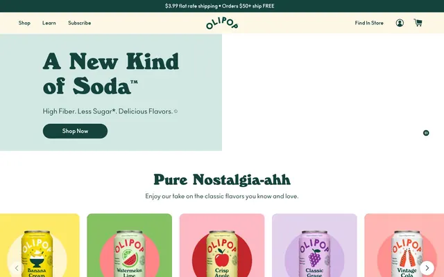
Whimsical soda shop on cream. Bold, rounded letterforms and a palette of comforting dark teal and creamy white, accented by juicy fruit colors, define its inviting, playful core.
Color palette
Primary brand color, text, navigation links, primary button backgrounds, icon fills — establishes the brand's core identity with a natural, sophisticated tone.
Promotional text, key headlines — a vivid, deep red communicating energy without aggression.
Product card background — a soft, pastel version of the brand red.
Product card background — a muted purple for product differentiation.
Product card background — a clear, moderate blue suggesting freshness.
Product card background — sunny, moderate yellow.
Product card background — vibrant green for a fresh, zesty feel.
Product card background — a soft, warm orange.
Highlight and active states for interactive elements, accent buttons — vibrant teal provides a playful pop.
Page backgrounds, card backgrounds, certain button text — provides a warm, inviting canvas for content.
Section background for product showcases, subtle secondary card backgrounds — acts as a light, cool divider.
Body text, secondary button text, links, detailed information — provides strong readability against light backgrounds.
Button backgrounds, form fields, page elements needing high contrast — universal achromatic base.
Typography
- Weights
- 700, 800, 900
- Sizes
- 20px, 32px, 48px, 52px, 72px, 80px
- Line height
- 1
- Fallback
- Georgia Pro
Display and marketing headlines – its heavy, rounded, and condensed letterforms, especially at 72px and 80px, create a retro soda-fountain aesthetic that is distinctive and memorable. It shouts 'nostalgia' without being kitsch.
- Weights
- 400, 600, 700
- Sizes
- 12px, 14px, 16px, 18px, 20px, 22px, 24px
- Line height
- 1, 1.2, 1.26, 1.4, 1.48, 1.5, 1.56, 1.6, 1.67, 1.8, 1.82, 1.88, 2.33
- Fallback
- Inter
Body copy, subheadings, navigation, and button text – this custom sans-serif provides excellent readability and a friendly, minimalist contrast to the display font. Its diverse weights support clear hierarchy.
- Weights
- 400
- Sizes
- 16px
- Line height
- 1.5
- Fallback
- Arial
Functional text for specific buttons and icons – used sparingly, it provides a stable, unobtrusive baseline for interface elements.
Spacing & shape
Components
Background: Deep Sea Teal (#14433d), Text: Creamy Canvas (#fdf7e7), Border: Creamy Canvas (#fdf7e7), Radius: 50px, Padding: 10px vertical, 32px horizontal. Large, inviting pill shape.
Background: Pure White (#ffffff), Text: Deep Sea Teal (#14433d), Border: None, Radius: 50px, Padding: 1px vertical, 12px horizontal. Pill shape for visual consistency.
Background: transparent, Text: Deep Sea Teal (#14433d), Border: Deep Sea Teal (#14433d) on top only, Radius: 0px, Padding: 0px. Text-only appearance.
Background: Pure White (#ffffff), Text: Ash Slate (#3a3a3a), Border: None, Radius: 100% (circular), Padding: 1px vertical, 6px horizontal. Small, distinct circular form for iconography.
Background: Transparent (adapts to section background), Border Radius: 16px, Box Shadow: None, Padding: 15px top, 0px horizontal/bottom. Designed to contain images and minimal text without heavy styling, relying on color accents from the section itself.
Background: #febac4 (Candy Apple Red), Border Radius: 16px, Box Shadow: None, Padding: 0px. Uses a solid accent background to differentiate product types.
Background: #e3d2ed (Lavender Bloom), Border Radius: 16px, Box Shadow: None, Padding: 0px. Uses a solid accent background to differentiate product types.
Background: #fdf4b5 (Mellow Yellow), Border Radius: 16px, Box Shadow: None, Padding: 0px. Uses a solid accent background to differentiate product types.
Background: Pure White (#ffffff), Text: Deep Sea Teal (#14433d), Border: Deep Sea Teal (#14433d), Radius: 49px, Padding: 10px vertical, 24px horizontal. Pill-shaped input with a prominent brand-colored border.
Guidelines
- Do use WindsorEF at weights 700-900 for all primary headings, particularly 72px and 80px, to establish the distinct brand voice.
- Do apply a 50px border-radius to all buttons and a 49px radius to input fields, ensuring a consistent soft, pill-shaped interaction aesthetic.
- Do use Deep Sea Teal (#14433d) for all primary interactive elements like buttons and active navigation links.
- Do ensure Creamy Canvas (#fdf7e7) or Cloud Burst Gray (#d3e8e3) serve as the primary background colors for sections, providing a light, inviting base.
- Do employ a diverse array of pastel and vivid accent colors (e.g., #febac4, #e3d2ed, #fdf4b5) for product cards to visually differentiate offerings.
- Do maintain a compact vertical rhythm, with section gaps typically between 40-80px and elemental gaps between 8-20px.
- Do use Ash Slate (#3a3a3a) for all primary body text to ensure strong readability against light backgrounds.
- Don't use overly sharp or angular graphic elements; everything should lean towards rounded and soft forms (min 16px radius for cards).
- Don't dilute the impact of Deep Sea Teal (#14433d) by using other saturated primary colors for main calls to action.
- Don't introduce additional display fonts; WindsorEF is exclusive for prominent headlines, and Ano for supporting text.
- Don't use strong box shadows for cards or general elevation; the design relies on color and slight border separation for depth.
- Don't use generic system UI fonts like Helvetica for prominent information; it's reserved for subtle functional text.
- Don't deviate from the established accent color palette for product categorization; stick to the provided range (e.g., #febac4, #e3d2ed, #fdf4b5, #4ac1e0).
About this system
ShowHide
This design system evokes a sense of playful nostalgia fused with modern health consciousness. Dominant dark teal (#14433d) and creamy off-white (#fdf7e7) establish a comforting, natural palette, punctuated by a diverse array of pastel and vivid fruit-inspired accent colors for product showcase. The custom 'WindsorEF' typeface with weighty, generous letterforms and tight line-height gives headings an almost hand-drawn, vintage soda shop feel, while the 'Ano' sans-serif provides crisp, legible body text. Rounded corners and liberal padding contribute to an approachable, soft aesthetic, countering the sharp contrast of the headline fonts.
The page primarily uses a max-width contained layout, centered on the screen, though the hero section spans full-width with text and a button contained within. The hero showcases a split background (cream and teal) with a prominent headline. Subsequent sections are typically full-width with a light background (Creamy Canvas #fdf7e7 or Cloud Burst Gray #d3e8e3), utilizing a multi-column card grid (5 columns) for product display. Content often follows a stacked, centered pattern for headlines and subtext, creating a clear visual hierarchy. Navigation is a sticky top bar, reinforced by a secondary 'Find In Store' link. Sections have distinct but not visually harsh vertical separation, primarily through color changes or content blocks. There's a playful balance between structured content and whimsical, off-center illustrative elements.
The visual language is product-centric, featuring tightly cropped product cans on solid, often pastel-colored backgrounds. Treatment is isolated and contained, with a consistent 16px border-radius on implied card containers. Photography is vibrant and well-lit, focusing solely on the product. Secondary visuals include playful, illustrative graphics (like the glass and jacket) that reinforce the retro, celebratory feel. Icons are monochrome, filled, and bold. The overall density is balanced, with imagery playing a key role in breaking up text and adding visual interest, creating an 'album cover' like feel for product presentation.
Reminiscent of Poppi, Chobani (packaging style), Happy Socks, Mailchimp (old branding).
# OLIPOP — Style Reference
> Whimsical soda shop on cream. Bold, rounded letterforms and a palette of comforting dark teal and creamy white, accented by juicy fruit colors, define its inviting, playful core.

**Theme:** light

**Site:** https://drinkolipop.com

This design system evokes a sense of playful nostalgia fused with modern health consciousness. Dominant dark teal (#14433d) and creamy off-white (#fdf7e7) establish a comforting, natural palette, punctuated by a diverse array of pastel and vivid fruit-inspired accent colors for product showcase. The custom 'WindsorEF' typeface with weighty, generous letterforms and tight line-height gives headings an almost hand-drawn, vintage soda shop feel, while the 'Ano' sans-serif provides crisp, legible body text. Rounded corners and liberal padding contribute to an approachable, soft aesthetic, countering the sharp contrast of the headline fonts.

## Tokens — Colors

| Name | Value | Token | Role |
|------|------|------|------|
| Deep Sea Teal | `#14433d` | `--color-deep-sea-teal` | Primary brand color, text, navigation links, primary button backgrounds, icon fills — establishes the brand's core identity with a natural, sophisticated tone. |
| Ruby Red | `#7e0022` | `--color-ruby-red` | Promotional text, key headlines — a vivid, deep red communicating energy without aggression. |
| Candy Apple Red | `#febac4` | `--color-candy-apple-red` | Product card background — a soft, pastel version of the brand red. |
| Lavender Bloom | `#e3d2ed` | `--color-lavender-bloom` | Product card background — a muted purple for product differentiation. |
| Tropical Sky | `#4ac1e0` | `--color-tropical-sky` | Product card background — a clear, moderate blue suggesting freshness. |
| Mellow Yellow | `#fdf4b5` | `--color-mellow-yellow` | Product card background — sunny, moderate yellow. |
| Lime Spritz | `#95d95d` | `--color-lime-spritz` | Product card background — vibrant green for a fresh, zesty feel. |
| Peach Fuzz | `#ffc3b3` | `--color-peach-fuzz` | Product card background — a soft, warm orange. |
| Aqua Pop | `#2ad2c9` | `--color-aqua-pop` | Highlight and active states for interactive elements, accent buttons — vibrant teal provides a playful pop. |
| Creamy Canvas | `#fdf7e7` | `--color-creamy-canvas` | Page backgrounds, card backgrounds, certain button text — provides a warm, inviting canvas for content. |
| Cloud Burst Gray | `#d3e8e3` | `--color-cloud-burst-gray` | Section background for product showcases, subtle secondary card backgrounds — acts as a light, cool divider. |
| Ash Slate | `#3a3a3a` | `--color-ash-slate` | Body text, secondary button text, links, detailed information — provides strong readability against light backgrounds. |
| Pure White | `#ffffff` | `--color-pure-white` | Button backgrounds, form fields, page elements needing high contrast — universal achromatic base. |

## Tokens — Typography

### WindsorEF
- **Substitute:** Georgia Pro
- **Weights:** 700, 800, 900
- **Sizes:** 20px, 32px, 48px, 52px, 72px, 80px
- **Line height:** 1
- **Role:** Display and marketing headlines – its heavy, rounded, and condensed letterforms, especially at 72px and 80px, create a retro soda-fountain aesthetic that is distinctive and memorable. It shouts 'nostalgia' without being kitsch.

### Ano
- **Substitute:** Inter
- **Weights:** 400, 600, 700
- **Sizes:** 12px, 14px, 16px, 18px, 20px, 22px, 24px
- **Line height:** 1, 1.2, 1.26, 1.4, 1.48, 1.5, 1.56, 1.6, 1.67, 1.8, 1.82, 1.88, 2.33
- **Role:** Body copy, subheadings, navigation, and button text – this custom sans-serif provides excellent readability and a friendly, minimalist contrast to the display font. Its diverse weights support clear hierarchy.

### Helvetica
- **Substitute:** Arial
- **Weights:** 400
- **Sizes:** 16px
- **Line height:** 1.5
- **Role:** Functional text for specific buttons and icons – used sparingly, it provides a stable, unobtrusive baseline for interface elements.

## Tokens — Type Scale

Major Third (1.25) from 16px base.

| Role | Size | Line height | Letter spacing |
|------|------|------|------|
| caption | 12px | 1.56 | — |
| body-sm | 14px | 1.5 | — |
| body | 16px | 1.5 | — |
| subheading | 18px | 1.48 | — |
| heading-sm | 20px | 1.2 | — |
| heading | 24px | 1.2 | — |
| heading-lg | 32px | 1 | — |
| display-sm | 48px | 1 | — |
| display | 72px | 1 | — |

## Tokens — Spacing

- **Section gap:** 40-80px
- **Card padding:** 15px
- **Element gap:** 8-20px

## Tokens — Radius

- **Buttons:** 50px
- **Inputs:** 49px
- **Cards:** 16px
- **circularElements:** 100px

## Layout

The page primarily uses a max-width contained layout, centered on the screen, though the hero section spans full-width with text and a button contained within. The hero showcases a split background (cream and teal) with a prominent headline. Subsequent sections are typically full-width with a light background (Creamy Canvas #fdf7e7 or Cloud Burst Gray #d3e8e3), utilizing a multi-column card grid (5 columns) for product display. Content often follows a stacked, centered pattern for headlines and subtext, creating a clear visual hierarchy. Navigation is a sticky top bar, reinforced by a secondary 'Find In Store' link. Sections have distinct but not visually harsh vertical separation, primarily through color changes or content blocks. There's a playful balance between structured content and whimsical, off-center illustrative elements.

## Imagery

The visual language is product-centric, featuring tightly cropped product cans on solid, often pastel-colored backgrounds. Treatment is isolated and contained, with a consistent 16px border-radius on implied card containers. Photography is vibrant and well-lit, focusing solely on the product. Secondary visuals include playful, illustrative graphics (like the glass and jacket) that reinforce the retro, celebratory feel. Icons are monochrome, filled, and bold. The overall density is balanced, with imagery playing a key role in breaking up text and adding visual interest, creating an 'album cover' like feel for product presentation.

## Components

### Product Flavor Cards Row

### Rewards Banner — Get Rewarded for Sipping

### Shipping Announcement Banner + Button Group

### Primary Action Button
*Primary calls to action in hero sections and prominent areas.*

Background: Deep Sea Teal (#14433d), Text: Creamy Canvas (#fdf7e7), Border: Creamy Canvas (#fdf7e7), Radius: 50px, Padding: 10px vertical, 32px horizontal. Large, inviting pill shape.

### Secondary Action Button
*Secondary CTAs, navigation items that feel like buttons.*

Background: Pure White (#ffffff), Text: Deep Sea Teal (#14433d), Border: None, Radius: 50px, Padding: 1px vertical, 12px horizontal. Pill shape for visual consistency.

### Text Link Button
*In-text actionable links that appear as buttons but lack distinct background.*

Background: transparent, Text: Deep Sea Teal (#14433d), Border: Deep Sea Teal (#14433d) on top only, Radius: 0px, Padding: 0px. Text-only appearance.

### Circular Icon Button
*Small interactive elements like quantity selectors or social sharing.*

Background: Pure White (#ffffff), Text: Ash Slate (#3a3a3a), Border: None, Radius: 100% (circular), Padding: 1px vertical, 6px horizontal. Small, distinct circular form for iconography.

### Product Display Card
*Showcasing individual product variants.*

Background: Transparent (adapts to section background), Border Radius: 16px, Box Shadow: None, Padding: 15px top, 0px horizontal/bottom. Designed to contain images and minimal text without heavy styling, relying on color accents from the section itself.

### Accent Product Card (Peach)
*Highlights specific product variants with an accent color background.*

Background: #febac4 (Candy Apple Red), Border Radius: 16px, Box Shadow: None, Padding: 0px. Uses a solid accent background to differentiate product types.

### Accent Product Card (Lavender)
*Highlights specific product variants with an accent color background.*

Background: #e3d2ed (Lavender Bloom), Border Radius: 16px, Box Shadow: None, Padding: 0px. Uses a solid accent background to differentiate product types.

### Accent Product Card (Buttercup)
*Highlights specific product variants with an accent color background.*

Background: #fdf4b5 (Mellow Yellow), Border Radius: 16px, Box Shadow: None, Padding: 0px. Uses a solid accent background to differentiate product types.

### Subscription Text Input
*Form fields for email subscription or search.*

Background: Pure White (#ffffff), Text: Deep Sea Teal (#14433d), Border: Deep Sea Teal (#14433d), Radius: 49px, Padding: 10px vertical, 24px horizontal. Pill-shaped input with a prominent brand-colored border.

## Guidelines

### Do

- Do use WindsorEF at weights 700-900 for all primary headings, particularly 72px and 80px, to establish the distinct brand voice.
- Do apply a 50px border-radius to all buttons and a 49px radius to input fields, ensuring a consistent soft, pill-shaped interaction aesthetic.
- Do use Deep Sea Teal (#14433d) for all primary interactive elements like buttons and active navigation links.
- Do ensure Creamy Canvas (#fdf7e7) or Cloud Burst Gray (#d3e8e3) serve as the primary background colors for sections, providing a light, inviting base.
- Do employ a diverse array of pastel and vivid accent colors (e.g., #febac4, #e3d2ed, #fdf4b5) for product cards to visually differentiate offerings.
- Do maintain a compact vertical rhythm, with section gaps typically between 40-80px and elemental gaps between 8-20px.
- Do use Ash Slate (#3a3a3a) for all primary body text to ensure strong readability against light backgrounds.

### Don't

- Don't use overly sharp or angular graphic elements; everything should lean towards rounded and soft forms (min 16px radius for cards).
- Don't dilute the impact of Deep Sea Teal (#14433d) by using other saturated primary colors for main calls to action.
- Don't introduce additional display fonts; WindsorEF is exclusive for prominent headlines, and Ano for supporting text.
- Don't use strong box shadows for cards or general elevation; the design relies on color and slight border separation for depth.
- Don't use generic system UI fonts like Helvetica for prominent information; it's reserved for subtle functional text.
- Don't deviate from the established accent color palette for product categorization; stick to the provided range (e.g., #febac4, #e3d2ed, #fdf4b5, #4ac1e0).

## Agent Prompt Guide

### Quick Color Reference
- Text: #3a3a3a (Ash Slate)
- Background: #fdf7e7 (Creamy Canvas)
- CTA Background: #2ad2c9 (Aqua Pop)
- CTA Text: #fdf7e7 (Creamy Canvas)
- Accent (Product Card): #febac4 (Candy Apple Red)

### 3-5 Example Component Prompts
1. Create a hero section with a split background: left half Creamy Canvas (#fdf7e7), right half Deep Sea Teal (#14433d). Place a headline 'A New Kind of Soda™' using WindsorEF 72px, weight 700, Deep Sea Teal (#14433d). Below it, add body text 'High Fiber. Less Sugar*. Delicious Flavors.' using Ano 18px, weight 400, Deep Sea Teal (#14433d). Include a Primary Action Button 'Shop Now'.
2. Generate a 'Product Display Card' for 'Banana Cream' with a Mellow Yellow (#fdf4b5) background. Use a 16px border-radius, no shadow, and place product image centered with 'Banana Cream' using Ano 16px weight 600, Ash Slate (#3a3a3a) below it. Ensure 15px top padding for the card.
3. Design a 'Subscription Text Input' field. Background Pure White (#ffffff), border Deep Sea Teal (#14433d), 49px border-radius. Placeholder text 'Enter your email' should be Ano 16px, weight 400, Deep Sea Teal (#14433d). Add a small text link button 'Sign Up Now'.
4. Create a header section. Background Creamy Canvas (#fdf7e7). Left aligned navigation links 'Shop', 'Learn', 'Subscribe' using Ano 16px, weight 400, Deep Sea Teal (#14433d) with 20px horizontal element gap. Right aligned 'Find In Store' link and icons, also inheriting Deep Sea Teal (#14433d) for text and icon fill.
More like this






Keep what you find
A free account saves references to boards and can send you a weekly email of picks based on what you save.
To see every result, go Pro.