Preview image. Unlock full-res
Warm minimal gallery
Color palette
Primary accent color for calls to action, active states, and brand highlights, creating a warm, inviting focus
Background for specific product feature cards, a muted, sophisticated red
Background for specific product feature cards, a soft, muted blue
Border and text color for specific cards, a vibrant, moderate green
Border and text color for specific cards, a vivid, warm orange
Border and text color for specific cards, a vivid, rich violet
Background for specific product feature cards, a moderate, earthy orange
Primary background for pages and main content areas, creating a soft, warm base
Background for elevated elements like cards and navigation bars, providing subtle contrast against the canvas
Dominant text color for headings, body text, and primary information, ensuring high contrast
Secondary text color for navigation items, less prominent headings, and supporting details, offering a slightly softer presence
Muted text for helper lines, metadata, and placeholder text, providing good readability without being dominant
Soft borders for dividing lines, input fields, and subtle structural elements
Very light borders and backgrounds for subtle separation, such as navigation item Hover states
Text color used within semantic badges or secondary alerts, a muddy gold providing contrast against lighter accents
Typography
- Weights
- 400, 500
- Sizes
- 12px, 14px, 16px, 19px, 21px, 22px, 25px, 71px, 82px, 140px
- Line height
- 0.93, 1, 1.2, 1.25, 1.3, 1.35, 1.4
- Letter spacing
- -0.0400em for display text, -0.0300em for large headings, -0.0200em for medium headings, -0.0020em for body text, 0.1000em for uppercase elements
- Fallback
- Inter
The primary typeface for all textual content, offering a refined geometric sans-serif aesthetic. Its precise letter-spacing maintains legibility at small sizes and gives a distinctive crispness to larger headlines. Weight 500 is used for emphasis in navigation and headings, while 400 covers body text.
- Weights
- 400
- Sizes
- 13px
- Line height
- 1.2
- Letter spacing
- normal
Fallback font, used sparingly for very small utility text where system font rendering is acceptable.
Spacing & shape
Elevation
Components
Filled with Action Gold (#f1ba35) background, Text Primary (#242424) for text. Border radius 8px. Text is ABCDiatype 400, 16px. Padding typically 0px top/bottom, 20px left/right, and 12px for subscribe buttons.
Transparent background (rgba(0,0,0,0)), Text Primary (#242424) for text, 1px Border Light (#d3d3d3) border. Border radius 0px. Padding 15px top/bottom, 24px left/right.
Transparent background, Text Secondary (#585a5a) for text. No visible border. Border radius 0px. Minimal padding around text.
Transparent background (rgba(0,0,0,0)), Text Primary (#faf9f7) for text, 1px Border Light (#727272) border. Border radius 8px. Padding 12px top/bottom, 20px left/right.
Transparent background, no border, no shadow, 0px border radius. Padding 0px.
Transparent background, no border, no shadow. Border radius 8px. Padding 0px.
Background Border Pale (#edecea), 8px border radius, no shadow. Intrinsic padding for aspect ratio (e.g., 550.797px top padding for aspect ratio).
Transparent background, Text Primary (#363636) for text. Border radius 0px. Padding 0px.
Background is usually Surface White (#ffffff) or Action Gold (#f1ba35). Text color is Info Text (#48250b). Border radius 4px. Padding 0px top/bottom, 8px left/right.
Background is black (#242424), 8px border radius, with a subtle shadow (rgba(0, 0, 0, 0.01) 0px 24px 10px 0px, etc.). Padding 64px top/bottom, 20px left/right.
Guidelines
- Use Canvas (#faf9f7) as the default page background to maintain consistent visual warmth.
- Apply ABCDiatype with specific letter-spacing: -0.0400em for display headings (71px+), -0.0300em for large headings, -0.0200em for medium headings, -0.0020em for body text, and 0.1000em for uppercase elements.
- Utilize Action Gold (#f1ba35) exclusively for primary calls to action, high-visibility icons, and brand highlights.
- Implement an 8px border-radius for all primary interactive elements and cards, with 4px for smaller badges and navigation items.
- Maintain a clear visual hierarchy with Text Primary (#242424) for prominent information and Text Secondary (#585a5a) or Text Muted (#727272) for supportive text.
- Separate sections with a vertical gap of 40px, and ensure a default element gap of 10px between inline items.
- Accentuate product feature cards using the specific muted and vivid accent colors (e.g., Card Accent Red #6c3c3c, Card Accent Green #458e71) as background or border/text colors.
- Avoid generic blue for links; instead use Text Primary (#242424) with a specific underline style, or Action Gold (#f1ba35) for explicit call-to-action links.
- Do not introduce new border radii beyond 8px, 4px, 1px or 16px (for specific card asymmetry), as this will break the consistent feel.
- Refrain from adding heavy drop shadows; implement only the subtle pre-defined shadow for elevated components like modals/popups.
- Do not use highly saturated colors for backgrounds or large sections; reserve them for small, intentional accents as defined in the accent palette.
- Avoid mixing ABCDiatype with other sans-serif fonts; Arial is strictly reserved as a fallback.
- Do not deviate from the defined letter-spacing values for ABCDiatype; these are crucial for the brand's typographic identity.
- Never use the default browser link color (#0000ee) in any context.
About this system
ShowHide
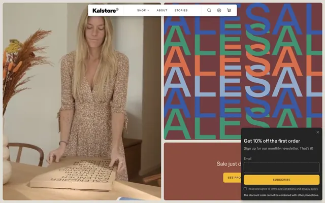
Kalstore® exudes a calm and focused aesthetic, built on a clean canvas of soft, near-white neutrals. Color is used sparingly but effectively, primarily through a vivid golden yellow for key actions and branding, and a palette of muted, earthy tones for a sophisticated accent. Typography is a key element, utilizing a custom geometric sans-serif with precise letter-spacing to convey a refined, authoritative, yet approachable tone. Components are lightweight with minimal borders and subtle radii, allowing content to take center stage.
The page primarily uses a contained layout within a soft, almost full-bleed Canvas background. The hero section often features a split layout or a full-width video, sometimes with large, repeating text patterns as a strong visual element. Content sections typically follow a consistent vertical rhythm with 40px section gaps, alternating between text-left/image-right and text-right/image-left patterns or centered stacks. Product listings often use a multi-column card grid. The navigation is a sticky top bar, minimal and icon-driven, with clear text links.
The site predominantly uses high-quality product photography, often featuring products in a lifestyle context, sometimes with models. Images are typically contained within their card boundaries, with generally rounded 8px corners (but also 0px for full-bleed examples). The photography style is warm and natural, emphasizing the product's practicality and aesthetic integration into everyday life. Icons are generally outlined, dark, and minimal, serving functional navigation or decorative elements without competing with the photography. Imagery serves both to showcase products and to establish a gentle, aspirational lifestyle.
Reminiscent of Stripe, Figma, Evernote, Monzo, Moleskine (ecommerce).
# Kalstore® — Style Reference
> Warm minimal gallery

**Theme:** light

**Site:** https://kal-store.com

Kalstore® exudes a calm and focused aesthetic, built on a clean canvas of soft, near-white neutrals. Color is used sparingly but effectively, primarily through a vivid golden yellow for key actions and branding, and a palette of muted, earthy tones for a sophisticated accent. Typography is a key element, utilizing a custom geometric sans-serif with precise letter-spacing to convey a refined, authoritative, yet approachable tone. Components are lightweight with minimal borders and subtle radii, allowing content to take center stage.

## Tokens — Colors

| Name | Value | Token | Role |
|------|------|------|------|
| Action Gold | `#f1ba35` | `--color-action-gold` | Primary accent color for calls to action, active states, and brand highlights, creating a warm, inviting focus |
| Card Accent Red | `#6c3c3c` | `--color-card-accent-red` | Background for specific product feature cards, a muted, sophisticated red |
| Card Accent Blue | `#90abc8` | `--color-card-accent-blue` | Background for specific product feature cards, a soft, muted blue |
| Card Accent Green | `#458e71` | `--color-card-accent-green` | Border and text color for specific cards, a vibrant, moderate green |
| Card Accent Orange | `#d26c46` | `--color-card-accent-orange` | Border and text color for specific cards, a vivid, warm orange |
| Card Accent Violet | `#3b59a3` | `--color-card-accent-violet` | Border and text color for specific cards, a vivid, rich violet |
| Card Background Orange | `#8a4d40` | `--color-card-background-orange` | Background for specific product feature cards, a moderate, earthy orange |
| Canvas | `#faf9f7` | `--color-canvas` | Primary background for pages and main content areas, creating a soft, warm base |
| Surface White | `#ffffff` | `--color-surface-white` | Background for elevated elements like cards and navigation bars, providing subtle contrast against the canvas |
| Text Primary | `#242424` | `--color-text-primary` | Dominant text color for headings, body text, and primary information, ensuring high contrast |
| Text Secondary | `#585a5a` | `--color-text-secondary` | Secondary text color for navigation items, less prominent headings, and supporting details, offering a slightly softer presence |
| Text Muted | `#727272` | `--color-text-muted` | Muted text for helper lines, metadata, and placeholder text, providing good readability without being dominant |
| Border Light | `#d3d3d3` | `--color-border-light` | Soft borders for dividing lines, input fields, and subtle structural elements |
| Border Pale | `#edecea` | `--color-border-pale` | Very light borders and backgrounds for subtle separation, such as navigation item Hover states |
| Info Text | `#30250b` | `--color-info-text` | Text color used within semantic badges or secondary alerts, a muddy gold providing contrast against lighter accents |

## Tokens — Typography

### ABCDiatype
- **Substitute:** Inter
- **Weights:** 400, 500
- **Sizes:** 12px, 14px, 16px, 19px, 21px, 22px, 25px, 71px, 82px, 140px
- **Line height:** 0.93, 1, 1.2, 1.25, 1.3, 1.35, 1.4
- **Letter spacing:** -0.0400em for display text, -0.0300em for large headings, -0.0200em for medium headings, -0.0020em for body text, 0.1000em for uppercase elements
- **Role:** The primary typeface for all textual content, offering a refined geometric sans-serif aesthetic. Its precise letter-spacing maintains legibility at small sizes and gives a distinctive crispness to larger headlines. Weight 500 is used for emphasis in navigation and headings, while 400 covers body text.

### Arial
- **Weights:** 400
- **Sizes:** 13px
- **Line height:** 1.2
- **Letter spacing:** normal
- **Role:** Fallback font, used sparingly for very small utility text where system font rendering is acceptable.

## Tokens — Type Scale

Perfect Fourth (1.333) from 16px base.

| Role | Size | Line height | Letter spacing |
|------|------|------|------|
| caption | 12px | 1.4 | — |
| body-sm | 14px | 1.35 | — |
| body | 16px | 1.3 | — |
| subheading | 19px | 1.25 | — |
| heading-sm | 21px | 1.25 | — |
| heading-lg | 25px | 1.2 | — |
| display-sm | 71px | 1 | -0.04em |
| display | 82px | 0.93 | -0.04em |
| display-lg | 140px | 0.93 | -0.04em |

## Tokens — Spacing

- **Section gap:** 40px
- **Card padding:** 12px
- **Element gap:** 10px

## Tokens — Radius

- **Default:** 8px
- **asymmetricCards:** 16px
- **badges:** 4px
- **bodyElements:** 1px

## Tokens — Elevation

- **Newsletter Popup Card:** `rgba(0, 0, 0, 0.01) 0px 24px 10px 0px, rgba(0, 0, 0, 0.05) 0px 13px 8px 0px, rgba(0, 0, 0, 0.09) 0px 6px 6px 0px, rgba(0, 0, 0, 0.1) 0px 1px 3px 0px`

## Layout

The page primarily uses a contained layout within a soft, almost full-bleed Canvas background. The hero section often features a split layout or a full-width video, sometimes with large, repeating text patterns as a strong visual element. Content sections typically follow a consistent vertical rhythm with 40px section gaps, alternating between text-left/image-right and text-right/image-left patterns or centered stacks. Product listings often use a multi-column card grid. The navigation is a sticky top bar, minimal and icon-driven, with clear text links.

## Imagery

The site predominantly uses high-quality product photography, often featuring products in a lifestyle context, sometimes with models. Images are typically contained within their card boundaries, with generally rounded 8px corners (but also 0px for full-bleed examples). The photography style is warm and natural, emphasizing the product's practicality and aesthetic integration into everyday life. Icons are generally outlined, dark, and minimal, serving functional navigation or decorative elements without competing with the photography. Imagery serves both to showcase products and to establish a gentle, aspirational lifestyle.

## Components

### Primary Action Button
*Main call to action button.*

Filled with Action Gold (#f1ba35) background, Text Primary (#242424) for text. Border radius 8px. Text is ABCDiatype 400, 16px. Padding typically 0px top/bottom, 20px left/right, and 12px for subscribe buttons.

### Ghost Button
*Secondary action or navigational link button.*

Transparent background (rgba(0,0,0,0)), Text Primary (#242424) for text, 1px Border Light (#d3d3d3) border. Border radius 0px. Padding 15px top/bottom, 24px left/right.

### Text Button
*Minimal link-style button for secondary actions or navigation within content.*

Transparent background, Text Secondary (#585a5a) for text. No visible border. Border radius 0px. Minimal padding around text.

### Newsletter Input Field (Dark)
*Input element for forms within dark-themed sections (newsletter popup).*

Transparent background (rgba(0,0,0,0)), Text Primary (#faf9f7) for text, 1px Border Light (#727272) border. Border radius 8px. Padding 12px top/bottom, 20px left/right.

### Product Card (Full Width)
*Card for displaying product images, often full bleeding.*

Transparent background, no border, no shadow, 0px border radius. Padding 0px.

### Product Card (Standard)
*Standard product display card with subtle containment.*

Transparent background, no border, no shadow. Border radius 8px. Padding 0px.

### Product Card (Placeholder)
*Placeholder card with an aspect ratio for images.*

Background Border Pale (#edecea), 8px border radius, no shadow. Intrinsic padding for aspect ratio (e.g., 550.797px top padding for aspect ratio).

### Badge (Neutral)
*Informational tag or label.*

Transparent background, Text Primary (#363636) for text. Border radius 0px. Padding 0px.

### Badge (Accent)
*Prominent informational tag, such as for 'Sold out' or discounts.*

Background is usually Surface White (#ffffff) or Action Gold (#f1ba35). Text color is Info Text (#48250b). Border radius 4px. Padding 0px top/bottom, 8px left/right.

### Newsletter Popup Card
*Modal or dialog card for newsletter sign-up.*

Background is black (#242424), 8px border radius, with a subtle shadow (rgba(0, 0, 0, 0.01) 0px 24px 10px 0px, etc.). Padding 64px top/bottom, 20px left/right.

## Guidelines

### Do

- Use Canvas (#faf9f7) as the default page background to maintain consistent visual warmth.
- Apply ABCDiatype with specific letter-spacing: -0.0400em for display headings (71px+), -0.0300em for large headings, -0.0200em for medium headings, -0.0020em for body text, and 0.1000em for uppercase elements.
- Utilize Action Gold (#f1ba35) exclusively for primary calls to action, high-visibility icons, and brand highlights.
- Implement an 8px border-radius for all primary interactive elements and cards, with 4px for smaller badges and navigation items.
- Maintain a clear visual hierarchy with Text Primary (#242424) for prominent information and Text Secondary (#585a5a) or Text Muted (#727272) for supportive text.
- Separate sections with a vertical gap of 40px, and ensure a default element gap of 10px between inline items.
- Accentuate product feature cards using the specific muted and vivid accent colors (e.g., Card Accent Red #6c3c3c, Card Accent Green #458e71) as background or border/text colors.

### Don't

- Avoid generic blue for links; instead use Text Primary (#242424) with a specific underline style, or Action Gold (#f1ba35) for explicit call-to-action links.
- Do not introduce new border radii beyond 8px, 4px, 1px or 16px (for specific card asymmetry), as this will break the consistent feel.
- Refrain from adding heavy drop shadows; implement only the subtle pre-defined shadow for elevated components like modals/popups.
- Do not use highly saturated colors for backgrounds or large sections; reserve them for small, intentional accents as defined in the accent palette.
- Avoid mixing ABCDiatype with other sans-serif fonts; Arial is strictly reserved as a fallback.
- Do not deviate from the defined letter-spacing values for ABCDiatype; these are crucial for the brand's typographic identity.
- Never use the default browser link color (#0000ee) in any context.

## Agent Prompt Guide

Quick Color Reference:
text: #242424
background: #faf9f7
border: #d3d3d3
accent: #f1ba35
primary action: #f1ba35 (filled action)

Example Component Prompts:
1. Create a large display heading: ABCDiatype weight 500, 82px, lineHeight 0.93, letter-spacing -0.0400em, color #242424. Content: 'Minimal Design. Lasting Function.'
2. Create a Primary Action Button: #f1ba35 background, #000000 text, 9999px radius, compact pill padding. Use this filled treatment for the main CTA.
3. Create a standard product card: Background #ffffff, border-radius 8px, padding 12px. Inside, include a product name: ABCDiatype weight 500, 19px, color #242424. Below, an item description: ABCDiatype weight 400, 16px, color #585a5a.
4. Create a ghost button for secondary navigation: Background transparent, border 1px solid #d3d3d3, text #242424, ABCDiatype weight 400, 16px, border-radius 0px, padding 15px 24px. Text: 'Shop All'
5. Design a newsletter input field for a dark section: Background transparent, border 1px solid #727272, text #faf9f7, ABCDiatype weight 400, 16px, border-radius 8px, padding 12px 20px. Placeholder text: 'Email'
More like this









Keep what you find
A free account saves references to boards and can send you a weekly email of picks based on what you save.
To see every result, go Pro.