Preview image. Unlock full-res
precision ledger on a clean slate
Color palette
Primary action buttons, prominent links, interactive highlights — establishes brand action
Accent text within headlines, active navigation indicators
Subtle background for UI elements, inactive states
Hero background gradient start, providing depth and a premium feel
Highlight cards, callout sections — a vibrant, attention-grabbing accent
Subtle background for complementary information panels
Icon backgrounds, very light decorative fills
Secondary accent for small highlights or decorative elements
Primary text, strong headings, dark backgrounds for contrast, outlines
Page backgrounds, card surfaces, button text against saturated colors
Subtle section backgrounds, alternative card background
Secondary text, icon fills, subtle borders
Muted text, subtle borders, inactive states
Card borders, subtle decorative accents
Decorative borders, subtle UI element outlining
Typography
- Weights
- 700
- Sizes
- 63px, 77px
- Line height
- 1
- Letter spacing
- -0.0400em at 77px, -0.0320em at 63px
- Fallback
- Inter
Hero headlines and significant display text leveraging a single bold weight for impact. The tight letter spacing creates a dense, modern block of text that feels commanding.
- Weights
- 300, 400, 500, 600, 700
- Sizes
- 11px, 12px, 13px, 14px, 15px, 16px, 17px, 18px, 20px, 22px, 31px
- Line height
- 0.86, 1, 1.1, 1.2, 1.29, 1.3, 1.4, 1.45, 1.5, 1.53, 1.6, 1.8, 2
- Letter spacing
- -0.0450em at 31px, -0.0200em at 20px, -0.0100em at 18px and 22px, normal at 11-17px
- Fallback
- system-ui
Body copy, subheadings, navigation, buttons, and all other UI text. A versatile sans-serif used across a broad range of sizes and weights to establish clear hierarchy and readability on a light canvas. Noticeable tight tracking on larger sizes to prevent sprawl.
Spacing & shape
Components
Filled button with Plum Royal (#4823ff) background, Polar White (#ffffff) text, and a highly rounded (100px) border-radius. Padding is 12px vertical, 25px horizontal. Uses Inter font.
Ghost button with transparent background, Midnight Ink (#18161a) text and a 1px Midnight Ink border. Rounded (100px) border-radius. Padding 20px vertical, 36px horizontal. Uses Inter font.
Transparent background, Stone Slate (#333333) text, and 0px border-radius. Minimal padding 5px vertical, 0px horizontal. Uses Inter font.
Polar White (#ffffff) background, 20px border-radius, no shadow. Internal padding 15px on all sides.
Lime Spritz (#e7ff6e) background, 20px border-radius, no shadow. Internal padding 30px on all sides.
Sky Whisper (#99cefe) background, 20px border-radius, no shadow. Internal padding 20px on all sides.
Soft Indigo (#7e78ff) background with a 10% opacity, 20px border-radius, no shadow. Padding 20px on all sides.
Guidelines
- Prioritize Midnight Ink (#18161a) for all primary text and main headings on light backgrounds.
- Use Plum Royal (#4823ff) exclusively for primary interactive elements, ensuring high contrast with Polar White (#ffffff) text.
- Employ Polar White (#ffffff) as the dominant background color for most sections, cards, and interactive elements for a crisp, legible foundation.
- Apply 20px border-radius to all major containers like cards and image masks, softening their visual presence.
- Ensure buttons maintain a 100px border-radius for a distinct pill-like shape, signalling interactiveness.
- Utilize Plus Jakarta Sans 700 with aggressive letter-spacing for large, impactful headlines to create a condensed, authoritative statement.
- Incorporate Lime Spritz (#e7ff6e) sparingly for intentional highlights or call-to-action cards, preventing overuse that could diminish its impact.
- Avoid using multiple chromatic colors for primary actions; Plum Royal (#4823ff) is the singular choice for this purpose.
- Do not introduce complex shadow patterns; maintain a flat or nearly flat aesthetic, with elevation hinted through color changes or subtle outlines.
- Refrain from widely varying border-radius values. Stick to the defined system (20px for cards, 100px for buttons) for visual consistency.
- Do not use dark backgrounds for large content blocks outside of specifically designed hero sections or dark UI panels, as the system relies on a light canvas.
- Avoid decorative images with overly complex compositions or busy backgrounds; prioritize product screenshots or clean illustrations.
- Do not use letter-spacing on small body text, reserving it for larger headings to maintain readability.
- Resist using a strong border on filled buttons; rely on background color for visual distinction of primary actions.
About this system
ShowHide
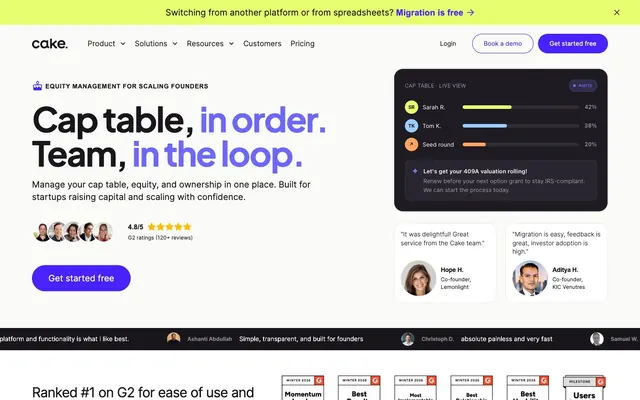
Cake Equity's visual system evokes a precise, supportive atmosphere with a foundation of stark neutrals and a vibrant, warm purple accent. Clean surfaces and intentional use of border radii define interactive elements and containers. Typography is confident and direct, emphasizing clear information hierarchy, while a bright lime green and soft blue punctuate feature areas.
The page primarily uses a max-width contained model, centered on the screen, creating a focused content area. The hero section follows a split layout, featuring a large headline and supporting text on the left, counterbalanced by a product UI preview on the right, which itself is often a dark-themed card on the light canvas. Section rhythm is marked by consistent vertical spacing, often with alternating light (#fafaf8, #ffffff) and accent-colored (#e7ff6e) backgrounds, creating clear visual breaks. Content arrangement frequently alternates between text-left/visual-right and visual-left/text-right patterns within two-column sections. Card grids are used for features and testimonials. Navigation is a simple top bar with clearly defined links and two distinct button types (ghost and primary filled CTA).
The site predominantly uses product screenshots and contained abstract graphics. Product screenshots are clean, showcasing UI in context with a focused, minimal framing. Illustrations leverage a flat, organic style, often outlined or with solid brand-colored fills, serving primarily as decorative atmosphere. Icons are filled, with a moderate stroke weight, typically monochrome. The density is image-heavy in feature sections, with graphics playing an explanatory role, showing actual product functionality. Images are contained within defined boundaries, rarely overlapping, and often benefit from the standard 20px border-radius.
Reminiscent of Rippling, Brex, Gusto, Carta.
# Cake Equity — Style Reference
> precision ledger on a clean slate

**Theme:** light

**Site:** https://www.cakeequity.com

Cake Equity's visual system evokes a precise, supportive atmosphere with a foundation of stark neutrals and a vibrant, warm purple accent. Clean surfaces and intentional use of border radii define interactive elements and containers. Typography is confident and direct, emphasizing clear information hierarchy, while a bright lime green and soft blue punctuate feature areas.

## Tokens — Colors

| Name | Value | Token | Role |
|------|------|------|------|
| Plum Royal | `#4823ff` | `--color-plum-royal` | Primary action buttons, prominent links, interactive highlights — establishes brand action |
| Vivid Violet | `#6d67fb` | `--color-vivid-violet` | Accent text within headlines, active navigation indicators |
| Soft Indigo | `#7e78ff` | `--color-soft-indigo` | Subtle background for UI elements, inactive states |
| Phantom Deep Violet | `#2b1599` | `--color-phantom-deep-violet` | Hero background gradient start, providing depth and a premium feel |
| Lime Spritz | `#e7ff6e` | `--color-lime-spritz` | Highlight cards, callout sections — a vibrant, attention-grabbing accent |
| Sky Whisper | `#99cefe` | `--color-sky-whisper` | Subtle background for complementary information panels |
| Pale Plum | `#dfddff` | `--color-pale-plum` | Icon backgrounds, very light decorative fills |
| Sunset Orange | `#ffa360` | `--color-sunset-orange` | Secondary accent for small highlights or decorative elements |
| Midnight Ink | `#18161a` | `--color-midnight-ink` | Primary text, strong headings, dark backgrounds for contrast, outlines |
| Polar White | `#ffffff` | `--color-polar-white` | Page backgrounds, card surfaces, button text against saturated colors |
| Cloud Gray | `#fafaf8` | `--color-cloud-gray` | Subtle section backgrounds, alternative card background |
| Stone Slate | `#333333` | `--color-stone-slate` | Secondary text, icon fills, subtle borders |
| Ash Mist | `#898b91` | `--color-ash-mist` | Muted text, subtle borders, inactive states |
| Lilac Gray | `#ede9ff` | `--color-lilac-gray` | Card borders, subtle decorative accents |
| Lavender Hue | `#d9d2ff` | `--color-lavender-hue` | Decorative borders, subtle UI element outlining |

## Tokens — Typography

### Plus Jakarta Sans
- **Substitute:** Inter
- **Weights:** 700
- **Sizes:** 63px, 77px
- **Line height:** 1
- **Letter spacing:** -0.0400em at 77px, -0.0320em at 63px
- **Role:** Hero headlines and significant display text leveraging a single bold weight for impact. The tight letter spacing creates a dense, modern block of text that feels commanding.

### Inter
- **Substitute:** system-ui
- **Weights:** 300, 400, 500, 600, 700
- **Sizes:** 11px, 12px, 13px, 14px, 15px, 16px, 17px, 18px, 20px, 22px, 31px
- **Line height:** 0.86, 1, 1.1, 1.2, 1.29, 1.3, 1.4, 1.45, 1.5, 1.53, 1.6, 1.8, 2
- **Letter spacing:** -0.0450em at 31px, -0.0200em at 20px, -0.0100em at 18px and 22px, normal at 11-17px
- **Role:** Body copy, subheadings, navigation, buttons, and all other UI text. A versatile sans-serif used across a broad range of sizes and weights to establish clear hierarchy and readability on a light canvas. Noticeable tight tracking on larger sizes to prevent sprawl.

## Tokens — Type Scale

Perfect Fourth (1.333) from 16px base.

| Role | Size | Line height | Letter spacing |
|------|------|------|------|
| caption | 11px | 1.5 | 0.05em |
| body-sm | 14px | 1.5 | 0.004em |
| body | 16px | 1.5 | -0.001em |
| body-lg | 18px | 1.5 | -0.01em |
| subheading | 22px | 1.4 | -0.01em |
| heading | 31px | 1.3 | -0.045em |
| heading-lg | 63px | 1 | -0.032em |
| display | 77px | 1 | -0.04em |

## Tokens — Spacing

- **Section gap:** 71px
- **Card padding:** 20px
- **Element gap:** 20px

## Tokens — Radius

- **General:** 16px
- **Buttons:** 100px
- **Cards:** 20px
- **icons:** 50px
- **links:** 12px
- **tags:** 999px

## Layout

The page primarily uses a max-width contained model, centered on the screen, creating a focused content area. The hero section follows a split layout, featuring a large headline and supporting text on the left, counterbalanced by a product UI preview on the right, which itself is often a dark-themed card on the light canvas. Section rhythm is marked by consistent vertical spacing, often with alternating light (#fafaf8, #ffffff) and accent-colored (#e7ff6e) backgrounds, creating clear visual breaks. Content arrangement frequently alternates between text-left/visual-right and visual-left/text-right patterns within two-column sections. Card grids are used for features and testimonials. Navigation is a simple top bar with clearly defined links and two distinct button types (ghost and primary filled CTA).

## Imagery

The site predominantly uses product screenshots and contained abstract graphics. Product screenshots are clean, showcasing UI in context with a focused, minimal framing. Illustrations leverage a flat, organic style, often outlined or with solid brand-colored fills, serving primarily as decorative atmosphere. Icons are filled, with a moderate stroke weight, typically monochrome. The density is image-heavy in feature sections, with graphics playing an explanatory role, showing actual product functionality. Images are contained within defined boundaries, rarely overlapping, and often benefit from the standard 20px border-radius.

## Components

### Primary Filled Button
*Call to action.*

Filled button with Plum Royal (#4823ff) background, Polar White (#ffffff) text, and a highly rounded (100px) border-radius. Padding is 12px vertical, 25px horizontal. Uses Inter font.

### Secondary Outlined Button
*Secondary call to action, ghost buttons.*

Ghost button with transparent background, Midnight Ink (#18161a) text and a 1px Midnight Ink border. Rounded (100px) border-radius. Padding 20px vertical, 36px horizontal. Uses Inter font.

### Navigation Link
*Primary navigation items.*

Transparent background, Stone Slate (#333333) text, and 0px border-radius. Minimal padding 5px vertical, 0px horizontal. Uses Inter font.

### Default Card
*General content container.*

Polar White (#ffffff) background, 20px border-radius, no shadow. Internal padding 15px on all sides.

### Highlight Card (Lime Spritz)
*Promotional or featured content container.*

Lime Spritz (#e7ff6e) background, 20px border-radius, no shadow. Internal padding 30px on all sides.

### Subtle Accent Card (Sky Whisper)
*Informational or complementary content card.*

Sky Whisper (#99cefe) background, 20px border-radius, no shadow. Internal padding 20px on all sides.

### Informational Pane (Soft Indigo)
*Embedded UI panels or data displays.*

Soft Indigo (#7e78ff) background with a 10% opacity, 20px border-radius, no shadow. Padding 20px on all sides.

## Guidelines

### Do

- Prioritize Midnight Ink (#18161a) for all primary text and main headings on light backgrounds.
- Use Plum Royal (#4823ff) exclusively for primary interactive elements, ensuring high contrast with Polar White (#ffffff) text.
- Employ Polar White (#ffffff) as the dominant background color for most sections, cards, and interactive elements for a crisp, legible foundation.
- Apply 20px border-radius to all major containers like cards and image masks, softening their visual presence.
- Ensure buttons maintain a 100px border-radius for a distinct pill-like shape, signalling interactiveness.
- Utilize Plus Jakarta Sans 700 with aggressive letter-spacing for large, impactful headlines to create a condensed, authoritative statement.
- Incorporate Lime Spritz (#e7ff6e) sparingly for intentional highlights or call-to-action cards, preventing overuse that could diminish its impact.

### Don't

- Avoid using multiple chromatic colors for primary actions; Plum Royal (#4823ff) is the singular choice for this purpose.
- Do not introduce complex shadow patterns; maintain a flat or nearly flat aesthetic, with elevation hinted through color changes or subtle outlines.
- Refrain from widely varying border-radius values. Stick to the defined system (20px for cards, 100px for buttons) for visual consistency.
- Do not use dark backgrounds for large content blocks outside of specifically designed hero sections or dark UI panels, as the system relies on a light canvas.
- Avoid decorative images with overly complex compositions or busy backgrounds; prioritize product screenshots or clean illustrations.
- Do not use letter-spacing on small body text, reserving it for larger headings to maintain readability.
- Resist using a strong border on filled buttons; rely on background color for visual distinction of primary actions.

## Agent Prompt Guide

### Quick Color Reference
- text: #18161a
- background: #ffffff
- border: #ede9ff
- accent: #e7ff6e
- primary action: #4823ff (filled action)

### 3-5 Example Component Prompts
- Create a Primary Action Button: #4823ff background, #ffffff text, 9999px radius, compact pill padding. Use this filled treatment for the main CTA.
- Design a feature card: Lime Spritz (#e7ff6e) background, 20px radius, 30px padding. Inside, 'Grow Faster' as a 22px Inter weight 600, #18161a. Body copy at 16px Inter weight 400, #333333, line-height 1.45.
More like this








Keep what you find
A free account saves references to boards and can send you a weekly email of picks based on what you save.
To see every result, go Pro.