Preview image. Unlock full-res
Architectural blueprint on white marble
Color palette
Primary action backgrounds, interactive states, and decorative icon accents. Serves as the primary brand accent color
Accent text in navigation or specific body text for emphasis, creates a vibrant highlight
Light background wash for emphasized content blocks or subtle visual breaks
Violet supporting accent for decorative details and low-frequency emphasis. Do not promote it to the primary CTA color
Green text accent for links, tags, and emphasized short phrases. Use as a supporting accent, not as a status color
Primary page backgrounds, elevated card surfaces, clean visual fields for product elements
Subtle background for UI sections, secondary card backgrounds, adds minimal depth to surfaces
Lightest button backgrounds, subtle input fields, and soft horizontal dividers
Hairline borders, subtle separators, and default input borders. Sets a clean boundary without harshness; Subtle linear background gradient for foundational sections, adding a soft, layered feel to the canvas
Primary body text, main headings, and active icon fills. Provides strong readability against light backgrounds
Secondary text, metadata, and muted button text. Creates visual separation from primary text
Muted text, helper labels, and inactive icon states. Offers a softer contrast
Dominant headings and critical information where maximum impact is required
Soft linear gradient used for hero sections, blending light blues and whites to create an open, airy feeling
Decorative radial gradient for background visual interests, creating a soft, almost ethereal effect
Typography
- Weights
- 300, 400, 500, 600, 700
- Sizes
- 8px, 9px, 10px, 11px, 12px, 13px, 14px, 15px, 16px, 18px, 24px
- Line height
- 1, 1.1, 1.2, 1.25, 1.33, 1.4, 1.43, 1.45, 1.5, 1.56, 1.6, 1.63, 1.67, 1.71, 1.75, 1.78, 1.8, 1.82, 1.85, 2
- Letter spacing
- -0.0030em, -0.0020em
- Fallback
- system-ui
Primary font for all UI elements: body text, navigation, buttons, and most headings. Its varied weights allow for clear hierarchy and a modern, compact feel.
- Weights
- 300, 400
- Sizes
- 40px, 46px
- Line height
- 1
- Letter spacing
- -0.0250em
- Fallback
- Georgia, serif
Signature font for large display headings. Its subtle serifs at light weights provide a unique, authoritative presence without being overly bold, creating an almost whispered impact.
- Weights
- 400
- Sizes
- 10px
- Line height
- 1.5, 1.8
- Letter spacing
- normal
- Fallback
- Menlo, monospace
Monospaced font for code snippets, data readouts, and technical details, ensuring precise character alignment.
Spacing & shape
Elevation
Components
Background: transparent. Text: Graphite (#505050). Border: Stone Grey (#e5e7eb) 1px. Radius: 9999px. Padding: 0px 14px 0px 8px.
Background: transparent. Text: Ash (#757575). Border: Stone Grey (#e5e7eb) 1px. Radius: 4px. Padding: 0px.
Background: Sequence Violet (#a565ff). Text: White (#ffffff). Radius: 4px. Padding: 0px.
Background: Ghost Gray (#efefef). Text: Graphite (#505050). Radius: 20px. Padding: 12px 16px.
Background: Cloud Gray (#f7f7f7). Border: 1px solid rgba(80, 80, 80, 0.1). Radius: 8px. No padding at root, content provides its own inner padding.
Background: Canvas White (#ffffff, 0.7 opacity). Box Shadow: rgba(117,117,117,0.1) 0px 0px 0px 1px, rgba(0,0,0,0.05) 0px 10px 15px -3px, rgba(0,0,0,0.05) 0px 4px 6px -4px. Radius: 16px 0px 0px 16px for visible corners. No padding at root.
Background: Canvas White (#ffffff). Text: Graphite (#505050). Border: Stone Grey (#e5e7eb) 1px. Radius: 0px. No padding at root.
Background: transparent. Text: Graphite (#505050). Border-bottom: Stone Grey (#e5e7eb) 1px. Radius: 0px. No padding at root.
Guidelines
- Use twkLausanne font family for all body text, navigation, and most headings, employing its various weights to establish visual hierarchy.
- Apply moderatSerif for signature large display headings between 40px and 46px at weights 300 or 400 with -0.0250em letter spacing.
- Reserve Sequence Violet (#a565ff) exclusively for primary calls to action, brand highlights, and decorative icon accents.
- Implement Canvas White (#ffffff) as the dominant background for all major sections and elevated cards to maintain an airy, expansive feel.
- Define UI element borders with Stone Grey (#e5e7eb) at 1px thickness for a delicate, crisp separation.
- Apply a 9999px border-radius to all buttons for a friendly, pill-shaped aesthetic.
- Employ Cloud Gray (#f7f7f7) for subtle background shifts to differentiate sections without heavy visual dividers.
- Avoid using multiple accent colors; keep Sequence Violet (#a565ff) as the singular chromatic highlight for interactive elements.
- Do not introduce strong, opaque background gradients on interface elements, instead opt for subtle, near-transparent washes or blurred effects.
- Do not use heavy, dark drop shadows; maintain a light elevation style with minimal offset and transparency, referencing the existing shadow tokens.
- Refrain from using excessively bold weights for body text; prioritize clarity and a compact information display with twkLausanne at weights 400 or below.
- Do not deviate from the established spacing scale; maintain a compact density, relying on 4px and 8px increments for element gaps and small paddings.
- Avoid sharp, angular corners on cards; use 8px or 16px radius to align with the slightly softer visual style.
- Do not introduce complex color patterns or highly saturated hues outside of the defined brand and accent colors.
About this system
ShowHide
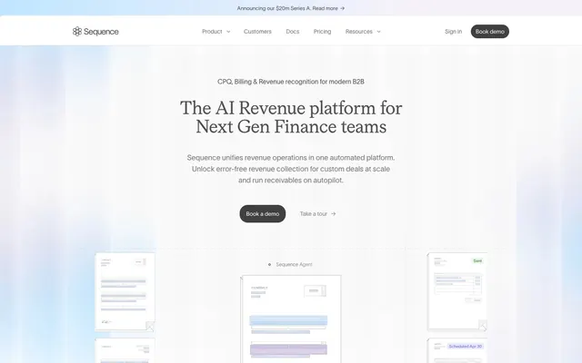
Sequence establishes a sunlit, architectural clarity with a predominant white canvas, delicate grays, and precise monochrome elements. Subtle background gradients add depth without overwhelming the product's clean functionality. Typography is compact and confident, grounding the interface with a technical yet approachable feel. The visual system emphasizes functional directness, using soft elevation and a single, vivid violet accent for key interactions and brand highlights.
The page maintains a centered max-width content area, often implicit, creating a contained and organized feel. The hero section features a centered headline over a subtle, full-bleed gradient background, establishing an open first impression. Section rhythm is predominantly defined by alternating white and subtly grayed backgrounds, often with soft linear gradients, creating a seamless flow without overt dividers. Content is arranged in alternating text-left/visual-right patterns or centered stacked blocks, providing clear visual progression. Grid usage includes multi-column feature lists with icons and descriptions, and card grids for solutions or partners. The overall density is spacious between sections, but content within blocks is compact. Navigation is a sticky top bar with a clear brand logo, primary links, and distinct 'Sign in' and 'Book demo' actions.
The site predominantly uses abstract, blueprint-like illustrations, often with a subtle glowing effect or faded outlines against a light background. These conceptual visuals provide context without being literal product screenshots. When product imagery is present, it's typically clean, outlined UI mockups or line-art illustrations of interfaces. Icons are monochromatic, mostly outlined with a consistent stroke weight, and occasionally filled with Sequence Violet (#a565ff) for emphasis. Imagery serves a decorative and atmospheric role, rather than purely informational, creating an intellectual and somewhat futuristic mood. Image density is moderate, carefully balanced with significant white space.
Reminiscent of Linear, Stripe, Vercel, Notion.
# Sequence — Style Reference
> Architectural blueprint on white marble

**Theme:** light

**Site:** https://www.sequencehq.com

Sequence establishes a sunlit, architectural clarity with a predominant white canvas, delicate grays, and precise monochrome elements. Subtle background gradients add depth without overwhelming the product's clean functionality. Typography is compact and confident, grounding the interface with a technical yet approachable feel. The visual system emphasizes functional directness, using soft elevation and a single, vivid violet accent for key interactions and brand highlights.

## Tokens — Colors

| Name | Value | Token | Role |
|------|------|------|------|
| Sequence Violet | `#a565ff` | `--color-sequence-violet` | Primary action backgrounds, interactive states, and decorative icon accents. Serves as the primary brand accent color |
| Deep Violet | `#5e5cff` | `--color-deep-violet` | Accent text in navigation or specific body text for emphasis, creates a vibrant highlight |
| Pale Violet Background | `#ebebff` | `--color-pale-violet-background` | Light background wash for emphasized content blocks or subtle visual breaks |
| Muted Violet Glow | `#e0c9ff` | `--color-muted-violet-glow` | Violet supporting accent for decorative details and low-frequency emphasis. Do not promote it to the primary CTA color |
| Accent Green | `#2e7317` | `--color-accent-green` | Green text accent for links, tags, and emphasized short phrases. Use as a supporting accent, not as a status color |
| Canvas White | `#ffffff` | `--color-canvas-white` | Primary page backgrounds, elevated card surfaces, clean visual fields for product elements |
| Cloud Gray | `#f7f7f7` | `--color-cloud-gray` | Subtle background for UI sections, secondary card backgrounds, adds minimal depth to surfaces |
| Ghost Gray | `#efefef` | `--color-ghost-gray` | Lightest button backgrounds, subtle input fields, and soft horizontal dividers |
| Stone Grey | `#e5e7eb` | `--color-stone-grey` | Hairline borders, subtle separators, and default input borders. Sets a clean boundary without harshness; Subtle linear background gradient for foundational sections, adding a soft, layered feel to the canvas |
| Graphite | `#505050` | `--color-graphite` | Primary body text, main headings, and active icon fills. Provides strong readability against light backgrounds |
| Dark Slate | `#42424a` | `--color-dark-slate` | Secondary text, metadata, and muted button text. Creates visual separation from primary text |
| Ash | `#757575` | `--color-ash` | Muted text, helper labels, and inactive icon states. Offers a softer contrast |
| Deep Ink | `#1d1d20` | `--color-deep-ink` | Dominant headings and critical information where maximum impact is required |
| Hero Background Gradient | `#c0e6ff` | `--color-hero-background-gradient` | Soft linear gradient used for hero sections, blending light blues and whites to create an open, airy feeling |
| Subtle Radial Overlay | `#b9d9f9` | `--color-subtle-radial-overlay` | Decorative radial gradient for background visual interests, creating a soft, almost ethereal effect |

## Tokens — Typography

### twkLausanne
- **Substitute:** system-ui
- **Weights:** 300, 400, 500, 600, 700
- **Sizes:** 8px, 9px, 10px, 11px, 12px, 13px, 14px, 15px, 16px, 18px, 24px
- **Line height:** 1, 1.1, 1.2, 1.25, 1.33, 1.4, 1.43, 1.45, 1.5, 1.56, 1.6, 1.63, 1.67, 1.71, 1.75, 1.78, 1.8, 1.82, 1.85, 2
- **Letter spacing:** -0.0030em, -0.0020em
- **Role:** Primary font for all UI elements: body text, navigation, buttons, and most headings. Its varied weights allow for clear hierarchy and a modern, compact feel.

### moderatSerif
- **Substitute:** Georgia, serif
- **Weights:** 300, 400
- **Sizes:** 40px, 46px
- **Line height:** 1
- **Letter spacing:** -0.0250em
- **Role:** Signature font for large display headings. Its subtle serifs at light weights provide a unique, authoritative presence without being overly bold, creating an almost whispered impact.

### sfMono
- **Substitute:** Menlo, monospace
- **Weights:** 400
- **Sizes:** 10px
- **Line height:** 1.5, 1.8
- **Letter spacing:** normal
- **Role:** Monospaced font for code snippets, data readouts, and technical details, ensuring precise character alignment.

## Tokens — Type Scale

Perfect Fourth (1.333) from 14px base.

| Role | Size | Line height | Letter spacing |
|------|------|------|------|
| caption | 10px | 1.5 | -0.002em |
| body | 14px | 1.5 | -0.002em |
| subheading | 18px | 1.4 | -0.003em |
| heading | 24px | 1.33 | -0.003em |
| display-sm | 40px | 1 | -0.025em |
| display | 46px | 1 | -0.025em |

## Tokens — Spacing

- **Section gap:** 40px
- **Card padding:** 16px
- **Element gap:** 8px

## Tokens — Radius

- **Default:** 4px
- **Buttons:** 9999px
- **Cards:** 8px
- **largeCards:** 16px
- **tags:** 20px

## Tokens — Elevation

- **Card - Elevated:** `rgba(255, 255, 255) 0px 0px 0px 0px, rgba(117, 117, 117, 0.1) 0px 0px 0px 1px, rgba(0, 0, 0, 0.05) 0px 10px 15px -3px, rgba(0, 0, 0, 0.05) 0px 4px 6px -4px`
- **Interactive Button/Card:** `rgba(58, 58, 64, 0.1) 0px 0px 0px 1px, rgba(0, 0, 0, 0.1) 0px 1px 3px 0px, rgba(0, 0, 0, 0.1) 0px 1px 2px -1px`
- **Focal Interaction Indicator:** `rgba(99, 102, 241, 0.4) 0px 0px 8px 2px`

## Layout

The page maintains a centered max-width content area, often implicit, creating a contained and organized feel. The hero section features a centered headline over a subtle, full-bleed gradient background, establishing an open first impression. Section rhythm is predominantly defined by alternating white and subtly grayed backgrounds, often with soft linear gradients, creating a seamless flow without overt dividers. Content is arranged in alternating text-left/visual-right patterns or centered stacked blocks, providing clear visual progression. Grid usage includes multi-column feature lists with icons and descriptions, and card grids for solutions or partners. The overall density is spacious between sections, but content within blocks is compact. Navigation is a sticky top bar with a clear brand logo, primary links, and distinct 'Sign in' and 'Book demo' actions.

## Imagery

The site predominantly uses abstract, blueprint-like illustrations, often with a subtle glowing effect or faded outlines against a light background. These conceptual visuals provide context without being literal product screenshots. When product imagery is present, it's typically clean, outlined UI mockups or line-art illustrations of interfaces. Icons are monochromatic, mostly outlined with a consistent stroke weight, and occasionally filled with Sequence Violet (#a565ff) for emphasis. Imagery serves a decorative and atmospheric role, rather than purely informational, creating an intellectual and somewhat futuristic mood. Image density is moderate, carefully balanced with significant white space.

## Components

### Primary Ghost Button
*Action button with an invisible background and text that blends with surrounds till hovered.*

Background: transparent. Text: Graphite (#505050). Border: Stone Grey (#e5e7eb) 1px. Radius: 9999px. Padding: 0px 14px 0px 8px.

### Secondary Ghost Button
*Muted action button or navigation link for less prominent interactions.*

Background: transparent. Text: Ash (#757575). Border: Stone Grey (#e5e7eb) 1px. Radius: 4px. Padding: 0px.

### Branded Pill Button
*Primary call to action, drawing attention with the brand accent color.*

Background: Sequence Violet (#a565ff). Text: White (#ffffff). Radius: 4px. Padding: 0px.

### Outline Pill Button
*Subtle, secondary call to action that needs slightly more emphasis than a ghost button.*

Background: Ghost Gray (#efefef). Text: Graphite (#505050). Radius: 20px. Padding: 12px 16px.

### Content Card - Default
*Container for articles, features, or small product showcases.*

Background: Cloud Gray (#f7f7f7). Border: 1px solid rgba(80, 80, 80, 0.1). Radius: 8px. No padding at root, content provides its own inner padding.

### Content Card - Elevated
*Prominent information containers that require clear separation and subtle 'lift'.*

Background: Canvas White (#ffffff, 0.7 opacity). Box Shadow: rgba(117,117,117,0.1) 0px 0px 0px 1px, rgba(0,0,0,0.05) 0px 10px 15px -3px, rgba(0,0,0,0.05) 0px 4px 6px -4px. Radius: 16px 0px 0px 16px for visible corners. No padding at root.

### Input Field - Full Width
*Standard editable text input for forms.*

Background: Canvas White (#ffffff). Text: Graphite (#505050). Border: Stone Grey (#e5e7eb) 1px. Radius: 0px. No padding at root.

### Input Field - Underscored
*Minimalist input style with only a bottom border, often for search or focused data entry.*

Background: transparent. Text: Graphite (#505050). Border-bottom: Stone Grey (#e5e7eb) 1px. Radius: 0px. No padding at root.

## Guidelines

### Do

- Use twkLausanne font family for all body text, navigation, and most headings, employing its various weights to establish visual hierarchy.
- Apply moderatSerif for signature large display headings between 40px and 46px at weights 300 or 400 with -0.0250em letter spacing.
- Reserve Sequence Violet (#a565ff) exclusively for primary calls to action, brand highlights, and decorative icon accents.
- Implement Canvas White (#ffffff) as the dominant background for all major sections and elevated cards to maintain an airy, expansive feel.
- Define UI element borders with Stone Grey (#e5e7eb) at 1px thickness for a delicate, crisp separation.
- Apply a 9999px border-radius to all buttons for a friendly, pill-shaped aesthetic.
- Employ Cloud Gray (#f7f7f7) for subtle background shifts to differentiate sections without heavy visual dividers.

### Don't

- Avoid using multiple accent colors; keep Sequence Violet (#a565ff) as the singular chromatic highlight for interactive elements.
- Do not introduce strong, opaque background gradients on interface elements, instead opt for subtle, near-transparent washes or blurred effects.
- Do not use heavy, dark drop shadows; maintain a light elevation style with minimal offset and transparency, referencing the existing shadow tokens.
- Refrain from using excessively bold weights for body text; prioritize clarity and a compact information display with twkLausanne at weights 400 or below.
- Do not deviate from the established spacing scale; maintain a compact density, relying on 4px and 8px increments for element gaps and small paddings.
- Avoid sharp, angular corners on cards; use 8px or 16px radius to align with the slightly softer visual style.
- Do not introduce complex color patterns or highly saturated hues outside of the defined brand and accent colors.

## Agent Prompt Guide

Quick Color Reference:
text: #505050
background: #ffffff
border: #e5e7eb
accent: #a565ff
primary action: #a565ff (filled action)

Example Component Prompts:
1. Create a Hero Headline: Use moderatSerif, weight 300, 46px, lineHeight 1.0, letterSpacing -0.025em, color Deep Ink (#1d1d20). The text reads 'The AI Revenue platform for Next Gen Finance teams'.
2. Create a Primary CTA Button: Background Sequence Violet (#a565ff), text Canvas White (#ffffff), twkLausanne weight 500, 16px, lineHeight 1.5, radius 9999px, padding 12px 16px. The text reads 'Book a demo'.
3. Create a Secondary Ghost Link: Text Graphite (#505050), twkLausanne weight 400, 14px, lineHeight 1.5, transparent background, no border. The text reads 'Take a tour →'.
4. Create a Feature Card: Background Canvas White (#ffffff), border 1px solid rgba(80, 80, 80, 0.1), border-radius 8px, padding 24px on all sides for content. Include a heading in Graphite (#505050), twkLausanne weight 600, 18px and body text in Ash (#757575), twkLausanne weight 400, 14px.
More like this








Keep what you find
A free account saves references to boards and can send you a weekly email of picks based on what you save.
To see every result, go Pro.