Preview image. Unlock full-res
Whiteboard with sticky notes — clean, organized, and quietly structured.
Color palette
Green action color for filled buttons, selected navigation states, and focused conversion moments. Use as a supporting accent, not as a status color
Red action color for filled buttons, selected navigation states, and focused conversion moments. Use as a supporting accent, not as a status color
Yellow wash for highlight backgrounds, decorative bands, and soft emphasis behind content. Use as a supporting accent, not as a status color
Informational text, specific inline highlights, subtle accent text in content blocks
Primary text, headings, icons, primary UI elements, dark surface background (limited use in cards)
Page backgrounds, primary card surfaces, ghost button text, essential interface backgrounds
Secondary card surfaces, muted icon fills, subtle background accents
Dominant page background, base canvas
Muted body text, decorative fills
Subtle background accents, dividers
Secondary text, link text, muted icon fills
Tertiary text, less prominent UI elements
Typography
- Weights
- 400, 500, 600
- Sizes
- 10px, 11px, 12px, 13px, 14px, 15px, 16px, 17px, 18px, 20px, 22px, 29px, 58px
- Line height
- 1, 1.2, 1.33, 1.4, 1.43, 1.5, 1.56, 1.63, 1.8
- Letter spacing
- -0.0310em, -0.0180em, -0.0170em, 0.0250em
- Fallback
- system-ui, sans-serif
Primary typeface for all text content, providing a functional, modern feel. The varied letter spacing brings precision to larger display sizes and legibility to smaller body text.
- Weights
- 400, 600
- Sizes
- 12px
- Line height
- 1
- Fallback
- monospace
Applied to specialized content like code snippets or fixed-width data where character alignment is critical.
- Weights
- 500, 600
- Sizes
- 12px, 14px
- Line height
- 1
- Fallback
- sans-serif
Used for displaying emojis consistently where they appear inline with text.
Spacing & shape
Elevation
Components
Transparent background with Ink Black text, 9999px circular radius, 10px horizontal padding, with a subtle border from rgba(0, 0, 0, 0.1).
Pale Gray background with Ink Black text, a 6px radius, and 10px horizontal padding. The border is rgba(0, 0, 0, 0.1).
Forest Green background with Arctic White text, 9999px circular radius, 10px horizontal padding. Provides clear visual emphasis for primary actions.
Arctic White background, 12px border radius, with a cascading shadow system: rgba(0, 0, 0, 0.05) 0px 3px 6px -3px, rgba(0, 0, 0, 0.05) 0px 2px 4px -2px, rgba(0, 0, 0, 0.05) 0px 1px 2px -1px, rgba(0, 0, 0, 0.05) 0px 1px 1px -1px, rgba(0, 0, 0, 0.05) 0px 1px 0px -1px.
Pale Gray background, 12px border radius, with 16px internal padding on all sides. Lacks elevation, creating a flat, distinct surface.
Arctic White background, 8px 0px 0 radial corners, 0px 0px 0 non-radial, applying an elegant asymmetric cut. Features 16px padding and the standard cascading shadow.
Arctic White background, 8px border radius, with standard cascading shadow. No internal padding, for content that manages its own spacing.
Guidelines
- Always use Cream Canvas (#fffdf9) as the base page background to maintain visual spaciousness.
- Apply Forest Green (#22c55e) exclusively for primary actions and success indicators to ensure their high functional prominence.
- Use Inter for all primary text content. Vary letter spacing per type scale role: -1.8px for display text, -0.49px for headings, and 0.25px for body text to optimize legibility.
- Encapsulate interactive content within cards using a 12px border radius and the cascading shadow system for a subtle lift.
- Employ circular radius (9999px) for all button and tag elements to convey a friendly, approachable interaction point.
- Maintain a compact element spacing of 8px between sequential UI items where density permits.
- Utilize Pale Gray (#f5f5f5) for secondary background surfaces that require distinction without strong elevation.
- Do not introduce additional vibrant colors; rely on Forest Green, Warning Red, and Harvest Gold for all chromatic needs.
- Avoid heavy drop shadows or strong gradients; surfaces should primarily be differentiated through background color and subtle elevation.
- Do not use generic system fonts; Inter is the established typeface for its specific character and legibility at various sizes.
- Prevent excessive spacing between adjacent elements; the design emphasizes a compact information density with an 8px base unit.
- Do not apply sharp corners to interactive elements; all buttons and tags must use a 9999px circular radius.
- Do not use full-width sections that break the contained layout unless specifically designed as a hero or decorative element.
- Avoid using Cream Canvas (#fffdf9) for interactive elements; it is reserved for the background plane.
About this system
ShowHide
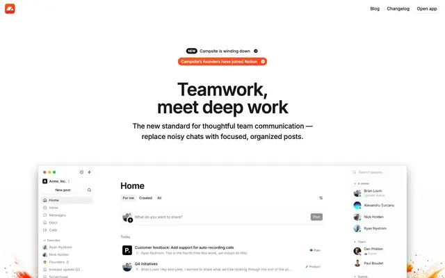
Campsite presents a pragmatic, focused interface, employing a bright white canvas with layered surfaces that subtly differentiate content. Typography is compact and precise, maintaining clarity in a dense information environment. A controlled palette of neutral grays is punctuated by a functional vivid green and contextual reds/yellows, guiding attention without visual clutter. Components favor soft, rounded forms and minimal elevation, suggesting approachable utility rather than heavy ornamentation.
The page primarily uses a contained layout with a maximum content width centered on the screen. The hero section is full-width, featuring a prominent centered headline over a clean background. Content sections follow a rhythm of consistent vertical spacing (48px section gap). Content is generally arranged in two-column text-left/visual-right patterns or as centered stacks of content cards. Card grids are used for features, suggesting a column-based system. The design is compact to semi-spacious, promoting information density without feeling cramped. Navigation is handled by a sticky top bar.
The site's primary imagery consists of product screenshots featuring the Campsite application's interface. These are often presented flush within content areas, occasionally with an asymmetric top-left corner radius of 8px. Photography is minimal, appearing incidentally within product screenshot content rather than as standalone hero images. Abstract graphics, characterized by vibrant, organic splashes of orange and red, are used sparingly as decorative accents, most notably peeking from sidebars in the product UI presentation. Icons are outlined, simple, and monochrome, adhering to a functional, rather than decorative, role. The overall density of imagery is balanced, with UI screenshots serving an explanatory function, integrated into text-dominant layouts.
Reminiscent of Notion, Linear, Superhuman.
# Campsite — Style Reference
> Whiteboard with sticky notes — clean, organized, and quietly structured.

**Theme:** light

**Site:** https://www.campsite.com

Campsite presents a pragmatic, focused interface, employing a bright white canvas with layered surfaces that subtly differentiate content. Typography is compact and precise, maintaining clarity in a dense information environment. A controlled palette of neutral grays is punctuated by a functional vivid green and contextual reds/yellows, guiding attention without visual clutter. Components favor soft, rounded forms and minimal elevation, suggesting approachable utility rather than heavy ornamentation.

## Tokens — Colors

| Name | Value | Token | Role |
|------|------|------|------|
| Forest Green | `#22c55e` | `--color-forest-green` | Green action color for filled buttons, selected navigation states, and focused conversion moments. Use as a supporting accent, not as a status color |
| Warning Red | `#ef4444` | `--color-warning-red` | Red action color for filled buttons, selected navigation states, and focused conversion moments. Use as a supporting accent, not as a status color |
| Harvest Gold | `#fef3c7` | `--color-harvest-gold` | Yellow wash for highlight backgrounds, decorative bands, and soft emphasis behind content. Use as a supporting accent, not as a status color |
| Warm Umber | `#451a03` | `--color-warm-umber` | Informational text, specific inline highlights, subtle accent text in content blocks |
| Ink Black | `#171717` | `--color-ink-black` | Primary text, headings, icons, primary UI elements, dark surface background (limited use in cards) |
| Arctic White | `#ffffff` | `--color-arctic-white` | Page backgrounds, primary card surfaces, ghost button text, essential interface backgrounds |
| Pale Gray | `#f5f5f5` | `--color-pale-gray` | Secondary card surfaces, muted icon fills, subtle background accents |
| Cream Canvas | `#fffdf9` | `--color-cream-canvas` | Dominant page background, base canvas |
| Ash Gray | `#a3a3a3` | `--color-ash-gray` | Muted body text, decorative fills |
| Off White | `#f0f0f0` | `--color-off-white` | Subtle background accents, dividers |
| Slate Gray | `#737373` | `--color-slate-gray` | Secondary text, link text, muted icon fills |
| Charcoal Text | `#525252` | `--color-charcoal-text` | Tertiary text, less prominent UI elements |

## Tokens — Typography

### Inter
- **Substitute:** system-ui, sans-serif
- **Weights:** 400, 500, 600
- **Sizes:** 10px, 11px, 12px, 13px, 14px, 15px, 16px, 17px, 18px, 20px, 22px, 29px, 58px
- **Line height:** 1, 1.2, 1.33, 1.4, 1.43, 1.5, 1.56, 1.63, 1.8
- **Letter spacing:** -0.0310em, -0.0180em, -0.0170em, 0.0250em
- **Role:** Primary typeface for all text content, providing a functional, modern feel. The varied letter spacing brings precision to larger display sizes and legibility to smaller body text.

### ui-monospace
- **Substitute:** monospace
- **Weights:** 400, 600
- **Sizes:** 12px
- **Line height:** 1
- **Role:** Applied to specialized content like code snippets or fixed-width data where character alignment is critical.

### emoji
- **Substitute:** sans-serif
- **Weights:** 500, 600
- **Sizes:** 12px, 14px
- **Line height:** 1
- **Role:** Used for displaying emojis consistently where they appear inline with text.

## Tokens — Type Scale

Augmented Fourth (1.414) from 14px base.

| Role | Size | Line height | Letter spacing |
|------|------|------|------|
| caption | 10px | 1.5 | 0.25px |
| body | 14px | 1.43 | 0.25px |
| body-lg | 16px | 1.5 | — |
| subheading | 18px | 1.56 | — |
| heading | 29px | 1.2 | -0.49px |
| display | 58px | 1 | -1.8px |

## Tokens — Spacing

- **Section gap:** 48px
- **Card padding:** 16px
- **Element gap:** 8px

## Tokens — Radius

- **circular:** 9999px
- **lg:** 12px
- **md:** 8px
- **none:** 0px
- **sm:** 4px

## Tokens — Elevation

- **Interactive Card:** `rgba(0, 0, 0, 0.05) 0px 3px 6px -3px, rgba(0, 0, 0, 0.05) 0px 2px 4px -2px, rgba(0, 0, 0, 0.05) 0px 1px 2px -1px, rgba(0, 0, 0, 0.05) 0px 1px 1px -1px, rgba(0, 0, 0, 0.05) 0px 1px 0px -1px`
- **Button/Link Hover:** `rgba(0, 0, 0, 0.08) 0px 1px 1px -1px, rgba(0, 0, 0, 0.08) 0px 2px 2px -1px, rgba(0, 0, 0, 0.06) 0px 0px 0px 1px, rgb(255, 255, 255) 0px 1px 0px 0px inset, rgb(255, 255, 255) 0px 1px 2px 1px inset, rgba(0, 0, 0, 0.06) 0px 1px 2px 0px inset`

## Layout

The page primarily uses a contained layout with a maximum content width centered on the screen. The hero section is full-width, featuring a prominent centered headline over a clean background. Content sections follow a rhythm of consistent vertical spacing (48px section gap). Content is generally arranged in two-column text-left/visual-right patterns or as centered stacks of content cards. Card grids are used for features, suggesting a column-based system. The design is compact to semi-spacious, promoting information density without feeling cramped. Navigation is handled by a sticky top bar.

## Imagery

The site's primary imagery consists of product screenshots featuring the Campsite application's interface. These are often presented flush within content areas, occasionally with an asymmetric top-left corner radius of 8px. Photography is minimal, appearing incidentally within product screenshot content rather than as standalone hero images. Abstract graphics, characterized by vibrant, organic splashes of orange and red, are used sparingly as decorative accents, most notably peeking from sidebars in the product UI presentation. Icons are outlined, simple, and monochrome, adhering to a functional, rather than decorative, role. The overall density of imagery is balanced, with UI screenshots serving an explanatory function, integrated into text-dominant layouts.

## Components

### Ghost Button
*Secondary action control*

Transparent background with Ink Black text, 9999px circular radius, 10px horizontal padding, with a subtle border from rgba(0, 0, 0, 0.1).

### Subtle Gray Button
*Tertiary action control, tag*

Pale Gray background with Ink Black text, a 6px radius, and 10px horizontal padding. The border is rgba(0, 0, 0, 0.1).

### Primary Action Button
*Call to action*

Forest Green background with Arctic White text, 9999px circular radius, 10px horizontal padding. Provides clear visual emphasis for primary actions.

### Interactive Card Shadowed
*Container for actionable content*

Arctic White background, 12px border radius, with a cascading shadow system: rgba(0, 0, 0, 0.05) 0px 3px 6px -3px, rgba(0, 0, 0, 0.05) 0px 2px 4px -2px, rgba(0, 0, 0, 0.05) 0px 1px 2px -1px, rgba(0, 0, 0, 0.05) 0px 1px 1px -1px, rgba(0, 0, 0, 0.05) 0px 1px 0px -1px.

### Secondary Surface Card
*Background for feature blocks or secondary content*

Pale Gray background, 12px border radius, with 16px internal padding on all sides. Lacks elevation, creating a flat, distinct surface.

### L-Shape Card
*Content container with an asymmetric radius*

Arctic White background, 8px 0px 0 radial corners, 0px 0px 0 non-radial, applying an elegant asymmetric cut. Features 16px padding and the standard cascading shadow.

### Standard Card
*Basic content container*

Arctic White background, 8px border radius, with standard cascading shadow. No internal padding, for content that manages its own spacing.

## Guidelines

### Do

- Always use Cream Canvas (#fffdf9) as the base page background to maintain visual spaciousness.
- Apply Forest Green (#22c55e) exclusively for primary actions and success indicators to ensure their high functional prominence.
- Use Inter for all primary text content. Vary letter spacing per type scale role: -1.8px for display text, -0.49px for headings, and 0.25px for body text to optimize legibility.
- Encapsulate interactive content within cards using a 12px border radius and the cascading shadow system for a subtle lift.
- Employ circular radius (9999px) for all button and tag elements to convey a friendly, approachable interaction point.
- Maintain a compact element spacing of 8px between sequential UI items where density permits.
- Utilize Pale Gray (#f5f5f5) for secondary background surfaces that require distinction without strong elevation.

### Don't

- Do not introduce additional vibrant colors; rely on Forest Green, Warning Red, and Harvest Gold for all chromatic needs.
- Avoid heavy drop shadows or strong gradients; surfaces should primarily be differentiated through background color and subtle elevation.
- Do not use generic system fonts; Inter is the established typeface for its specific character and legibility at various sizes.
- Prevent excessive spacing between adjacent elements; the design emphasizes a compact information density with an 8px base unit.
- Do not apply sharp corners to interactive elements; all buttons and tags must use a 9999px circular radius.
- Do not use full-width sections that break the contained layout unless specifically designed as a hero or decorative element.
- Avoid using Cream Canvas (#fffdf9) for interactive elements; it is reserved for the background plane.

## Agent Prompt Guide

Quick Color Reference:
text: #171717
background: #fffdf9
border: rgba(0, 0, 0, 0.1)
accent: #451a03
primary action: #22c55e (filled action)

Example Component Prompts:
1. Create a Primary Action Button: #22c55e background, #171717 text, 9999px radius, compact pill padding. Use this filled treatment for the main CTA.
2. Design a feature card: Arctic White (#ffffff) background, 12px border radius, apply the main cascading shadow system, with 16px internal padding, using Ink Black (#171717) for its headline (Inter 29px weight 600, letter-spacing -0.49px) and Slate Gray (#737373) for its body text (Inter 14px weight 400).
3. Generate a ghost button: Transparent background, Ink Black (#171717) text, 9999px circular radius, 10px horizontal padding, with a subtle border from rgba(0, 0, 0, 0.1), Inter font weight 400, 14px size.
4. Create a secondary content card: Pale Gray (#f5f5f5) background, 12px border radius, 16px internal padding, no shadow.
More like this








Keep what you find
A free account saves references to boards and can send you a weekly email of picks based on what you save.
To see every result, go Pro.