Preview image. Unlock full-res
Calm workspace, grounded neutrals
Color palette
Green action color for filled buttons, selected navigation states, and focused conversion moments
Violet decorative accent for icons, marks, and small graphic details. Do not promote it to the primary CTA color
Page backgrounds, large content sections — provides a warm, inviting default background
Secondary surface background, subtle visual separation from the main canvas
Component backgrounds, elevated cards, and feature blocks — creates visual lift and contrast
Primary text, prominent headings, main interactive button backgrounds
Dominant text for high contrast, occasionally used for button borders and fills
Secondary text, subheadings, and more subdued body copy
Tertiary text, descriptive labels, and supporting information
Inactive interface elements, subtle borders for ghost buttons and dividers
Subtle borders for cards and input fields, indicating containment without heaviness
Lowest contrast text, legal notices, and minor descriptive elements
Typography
- Weights
- 300, 400, 500, 600
- Sizes
- 8px, 12px, 13px, 14px, 16px, 18px, 20px, 24px, 40px, 50px, 72px
- Line height
- 1, 1.1, 1.2, 1.3, 1.4, 1.5, 1.6
- Letter spacing
- -0.05em (at 72px), -0.03em (at 50px, 40px), 0.01em (at 8px)
- Fallback
- Inter
Primary typeface for all page elements; its geometric yet friendly character supports both headlines and body text. The tight letter spacing for display sizes gives it a modern, efficient feel, while slight positive spacing for captions maintains readability.
- Weights
- 400, 600
- Sizes
- 16px, 20px
- Line height
- 1.3, 1.5
- Letter spacing
- -0.05em
- Fallback
- system-ui
Secondary typeface, primarily for body text, providing a highly legible and versatile option that complements Figtree without competing for attention. Tighter letter spacing indicates a functional, dense information layout.
Spacing & shape
Components
Filled with Vivid Evernote Green (#94e130), with Pure White (#ffffff) text. Features 5px border radius and generous 16px vertical, 40px horizontal padding for prominence.
Filled with Midnight Graphite (#141414), with white text if on a dark background or Deep Black (#000000) text if on a light background. Features 5px border radius and 10px vertical, 28px horizontal padding.
Transparent background, Deep Black (#000000) text. Minimal padding (0px vertical, 6px horizontal) and no border radius to appear as a discrete text link.
Pure White (#ffffff) background, 10px border radius, no box shadow, 32px padding on all sides. Used for showcasing main features or grouped content.
Surface Off-White (#f4eee5) background, with a prominent 16px border radius, no box shadow. Used for larger, illustrative content blocks with substantial top padding (80px) and side padding (40px).
Deep Black (#000000) text on transparent background, no border radius, 10px vertical and 28px horizontal padding. Muted Silver (#a1a1a1) for inactive states.
Guidelines
- Prioritize text legibility by using Midnight Graphite (#141414) or Deep Black (#000000) for primary content on light backgrounds like Canvas (#f9f6f2) or Pure White (#ffffff).
- Use Vivid Evernote Green (#94e130) exclusively for primary calls to action or key interactive states to maintain its impact and clarity.
- Apply 5px border radius for interactive elements like buttons and navigation items to give them a soft, approachable geometry.
- Maintain a clear content hierarchy using Figtree for all typographic elements, with display sizes (72px, 50px) using negative letter-spacing for impact.
- Segment content using distinct background colors: Canvas (#f9f6f2) for the main page, Pure White (#ffffff) for elevated cards, and Surface Off-White (#f4eee5) for secondary sections.
- Utilize an 8px base unit for all spacing values, ensuring consistent rhythm and density across layouts and components.
- Employ Light Gray Stroke (#e7e7e7) for all hairline borders and subtle dividers, maintaining a lightweight interface feel.
- Do not introduce new saturated colors; limit accents to Vivid Evernote Green (#94e130) with occasional Decorative Violet (#000015) for non-interactive elements.
- Avoid heavy drop shadows or complex gradients on cards; the system relies on background color shifts and solid borders for surface separation.
- Do not use letter-spacing on body text; it should remain at its default for optimal readability.
- Do not use Pure White (#ffffff) as a background for direct page sections; it's reserved for contained components like cards to appear elevated.
- Do not vary border radii arbitrarily; stick to 5px for interactive elements, 10px for standard cards, and 16px for larger feature cards.
- Avoid dense, information-heavy blocks without sufficient padding; use 32px padding for cards and sections to ensure comfortable breathing room.
- Do not introduce unnecessary iconography that distracts from core content; icons should be functional and simple, often with a subtle color accent.
About this system
ShowHide
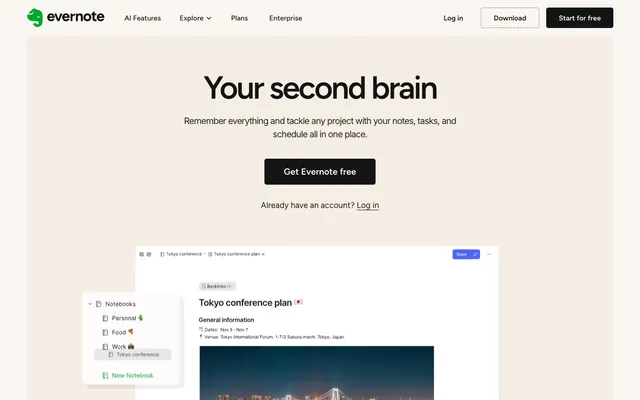
Evernote projects a calm, confident workspace aesthetic with an off-white canvas and muted neutral surfaces. Typography is grounded and readable, while a single vibrant green accent provides functional punctuation for primary actions and key highlights. Interaction elements are lightweight but clearly defined, emphasizing clarity and focus over heavy ornamentation.
The page adheres to a max-width 1320px centered container for main content, often bordered by the Canvas (#f9f6f2) background. Hero sections frequently feature a centered headline and description over either a full-bleed dark background with blurred abstract shapes or the primary Canvas (#f9f6f2). Section rhythm often alternates between the Canvas (#f9f6f2) and Surface Off-White (#f4eee5) backgrounds. Content is frequently arranged in multi-column grids or side-by-side text-and-image blocks. A prominent 3-column card grid is used for feature showcases. The navigation is a sticky top bar with clearly segmented interactive elements.
The site predominantly uses product screenshots within a simulated user interface, often presented on Pure White (#ffffff) cards to highlight functionality. Photography is minimal, mostly focused on business-oriented people in work settings. Illustrations are abstract and atmospheric, characterized by blurred, multi-colored organic shapes that serve as decorative background elements, particularly in hero sections, rather than conveying specific meaning. Icons are outlined, simple, and functional, occasionally with a fill in Vivid Evernote Green (#94e130) or other brand-related colors for clarity. Imagery largely serves to showcase product features and create a professional, contemporary atmosphere.
Reminiscent of Notion, Todoist, Slack (light theme).
# Evernote — Style Reference
> Calm workspace, grounded neutrals

**Theme:** light

**Site:** https://evernote.com

Evernote projects a calm, confident workspace aesthetic with an off-white canvas and muted neutral surfaces. Typography is grounded and readable, while a single vibrant green accent provides functional punctuation for primary actions and key highlights. Interaction elements are lightweight but clearly defined, emphasizing clarity and focus over heavy ornamentation.

## Tokens — Colors

| Name | Value | Token | Role |
|------|------|------|------|
| Vivid Evernote Green | `#94e130` | `--color-vivid-evernote-green` | Green action color for filled buttons, selected navigation states, and focused conversion moments |
| Decorative Violet | `#000015` | `--color-decorative-violet` | Violet decorative accent for icons, marks, and small graphic details. Do not promote it to the primary CTA color |
| Canvas | `#f9f6f2` | `--color-canvas` | Page backgrounds, large content sections — provides a warm, inviting default background |
| Surface Off-White | `#f4eee5` | `--color-surface-off-white` | Secondary surface background, subtle visual separation from the main canvas |
| Pure White | `#ffffff` | `--color-pure-white` | Component backgrounds, elevated cards, and feature blocks — creates visual lift and contrast |
| Midnight Graphite | `#141414` | `--color-midnight-graphite` | Primary text, prominent headings, main interactive button backgrounds |
| Deep Black | `#000000` | `--color-deep-black` | Dominant text for high contrast, occasionally used for button borders and fills |
| Carbon Gray | `#262626` | `--color-carbon-gray` | Secondary text, subheadings, and more subdued body copy |
| Medium Gray | `#4e4d4c` | `--color-medium-gray` | Tertiary text, descriptive labels, and supporting information |
| Muted Silver | `#a1a1a1` | `--color-muted-silver` | Inactive interface elements, subtle borders for ghost buttons and dividers |
| Light Gray Stroke | `#e7e7e7` | `--color-light-gray-stroke` | Subtle borders for cards and input fields, indicating containment without heaviness |
| Soft Gray | `#737373` | `--color-soft-gray` | Lowest contrast text, legal notices, and minor descriptive elements |

## Tokens — Typography

### Figtree
- **Substitute:** Inter
- **Weights:** 300, 400, 500, 600
- **Sizes:** 8px, 12px, 13px, 14px, 16px, 18px, 20px, 24px, 40px, 50px, 72px
- **Line height:** 1, 1.1, 1.2, 1.3, 1.4, 1.5, 1.6
- **Letter spacing:** -0.05em (at 72px), -0.03em (at 50px, 40px), 0.01em (at 8px)
- **Role:** Primary typeface for all page elements; its geometric yet friendly character supports both headlines and body text. The tight letter spacing for display sizes gives it a modern, efficient feel, while slight positive spacing for captions maintains readability.

### Inter
- **Substitute:** system-ui
- **Weights:** 400, 600
- **Sizes:** 16px, 20px
- **Line height:** 1.3, 1.5
- **Letter spacing:** -0.05em
- **Role:** Secondary typeface, primarily for body text, providing a highly legible and versatile option that complements Figtree without competing for attention. Tighter letter spacing indicates a functional, dense information layout.

## Tokens — Type Scale

Augmented Fourth (1.414) from 14px base.

| Role | Size | Line height | Letter spacing |
|------|------|------|------|
| body | 14px | 1.5 | — |
| subheading | 18px | 1.3 | — |
| heading-sm | 24px | 1.3 | — |
| heading | 40px | 1.2 | -0.48px |
| heading-lg | 50px | 1.1 | -0.75px |
| display | 72px | 1 | -1.08px |

## Tokens — Spacing

- **Max width:** 1320px
- **Section gap:** 32px
- **Card padding:** 32px
- **Element gap:** 8px

## Tokens — Radius

- **Buttons:** 5px
- **Cards:** 10px
- **circular:** 52px
- **largeCards:** 16px

## Layout

The page adheres to a max-width 1320px centered container for main content, often bordered by the Canvas (#f9f6f2) background. Hero sections frequently feature a centered headline and description over either a full-bleed dark background with blurred abstract shapes or the primary Canvas (#f9f6f2). Section rhythm often alternates between the Canvas (#f9f6f2) and Surface Off-White (#f4eee5) backgrounds. Content is frequently arranged in multi-column grids or side-by-side text-and-image blocks. A prominent 3-column card grid is used for feature showcases. The navigation is a sticky top bar with clearly segmented interactive elements.

## Imagery

The site predominantly uses product screenshots within a simulated user interface, often presented on Pure White (#ffffff) cards to highlight functionality. Photography is minimal, mostly focused on business-oriented people in work settings. Illustrations are abstract and atmospheric, characterized by blurred, multi-colored organic shapes that serve as decorative background elements, particularly in hero sections, rather than conveying specific meaning. Icons are outlined, simple, and functional, occasionally with a fill in Vivid Evernote Green (#94e130) or other brand-related colors for clarity. Imagery largely serves to showcase product features and create a professional, contemporary atmosphere.

## Components

### Primary Filled Button
*Call to action*

Filled with Vivid Evernote Green (#94e130), with Pure White (#ffffff) text. Features 5px border radius and generous 16px vertical, 40px horizontal padding for prominence.

### Secondary Filled Button
*Secondary call to action*

Filled with Midnight Graphite (#141414), with white text if on a dark background or Deep Black (#000000) text if on a light background. Features 5px border radius and 10px vertical, 28px horizontal padding.

### Ghost Text Button
*Tertiary action or navigation link*

Transparent background, Deep Black (#000000) text. Minimal padding (0px vertical, 6px horizontal) and no border radius to appear as a discrete text link.

### Primary Feature Card
*Content container*

Pure White (#ffffff) background, 10px border radius, no box shadow, 32px padding on all sides. Used for showcasing main features or grouped content.

### Secondary Content Card
*Informational container*

Surface Off-White (#f4eee5) background, with a prominent 16px border radius, no box shadow. Used for larger, illustrative content blocks with substantial top padding (80px) and side padding (40px).

### Muted Navigation Link
*Navigation items*

Deep Black (#000000) text on transparent background, no border radius, 10px vertical and 28px horizontal padding. Muted Silver (#a1a1a1) for inactive states.

## Guidelines

### Do

- Prioritize text legibility by using Midnight Graphite (#141414) or Deep Black (#000000) for primary content on light backgrounds like Canvas (#f9f6f2) or Pure White (#ffffff).
- Use Vivid Evernote Green (#94e130) exclusively for primary calls to action or key interactive states to maintain its impact and clarity.
- Apply 5px border radius for interactive elements like buttons and navigation items to give them a soft, approachable geometry.
- Maintain a clear content hierarchy using Figtree for all typographic elements, with display sizes (72px, 50px) using negative letter-spacing for impact.
- Segment content using distinct background colors: Canvas (#f9f6f2) for the main page, Pure White (#ffffff) for elevated cards, and Surface Off-White (#f4eee5) for secondary sections.
- Utilize an 8px base unit for all spacing values, ensuring consistent rhythm and density across layouts and components.
- Employ Light Gray Stroke (#e7e7e7) for all hairline borders and subtle dividers, maintaining a lightweight interface feel.

### Don't

- Do not introduce new saturated colors; limit accents to Vivid Evernote Green (#94e130) with occasional Decorative Violet (#000015) for non-interactive elements.
- Avoid heavy drop shadows or complex gradients on cards; the system relies on background color shifts and solid borders for surface separation.
- Do not use letter-spacing on body text; it should remain at its default for optimal readability.
- Do not use Pure White (#ffffff) as a background for direct page sections; it's reserved for contained components like cards to appear elevated.
- Do not vary border radii arbitrarily; stick to 5px for interactive elements, 10px for standard cards, and 16px for larger feature cards.
- Avoid dense, information-heavy blocks without sufficient padding; use 32px padding for cards and sections to ensure comfortable breathing room.
- Do not introduce unnecessary iconography that distracts from core content; icons should be functional and simple, often with a subtle color accent.

## Agent Prompt Guide

Quick Color Reference:
text: #262626
background: #f9f6f2
border: #e7e7e7
accent: #000015
primary action: #94e130 (filled action)

Example Component Prompts:
1. Create a Primary Action Button: #94e130 background, #000000 text, 9999px radius, compact pill padding. Use this filled treatment for the main CTA.
2. Design a feature card: Pure White (#ffffff) background, 10px border-radius, Light Gray Stroke (#e7e7e7) 1px border. Inside, use a heading 'Template' (Figtree weight 600, 24px, Midnight Graphite #141414) and body text 'Get further faster...' (Figtree weight 400, 14px, Deep Black #000000). Apply 32px padding on all sides.
3. Implement a main hero section heading: 'Your second brain' using Figtree weight 600, 72px, Midnight Graphite (#141414), letter-spacing -1.08px. Follow with a sub-headline 'Remember everything...' Figtree weight 400, 18px, Carbon Gray (#262626).
4. Create a secondary content card: Surface Off-White (#f4eee5) background, 16px border-radius. Padding 80px top, 40px left and right, 0px bottom. This card will contain a heading (Figtree weight 600, 40px, Midnight Graphite #141414) and secondary text (Figtree weight 400, 16px, Carbon Gray #262626).
More like this








Keep what you find
A free account saves references to boards and can send you a weekly email of picks based on what you save.
To see every result, go Pro.