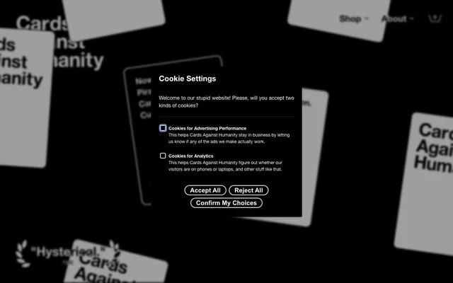
Preview image. Unlock full-res
High-contrast midnight game board
Color palette
Red accent for outlined action borders, linked labels, and lightweight interactive emphasis. Do not promote it to the primary CTA color
Badge backgrounds, decorative borders, card accents — adds a playful, distinct brand touch
Badge backgrounds, decorative borders, card accents — a vibrant, slightly off-kilter brand color
Badge text, card backgrounds — a bright, almost luminous accent for content
Badge text, card backgrounds — a strong, clear accent color
Card backgrounds, decorative elements
Card backgrounds, decorative elements
Card backgrounds, decorative elements
Card backgrounds, decorative elements
Page backgrounds, card backgrounds, primary text, solid buttons, default borders, and strong outlines
Primary text on dark backgrounds, ghost button text and borders, interactive element accents
Badge text, card backgrounds — a pale, desaturated counterpoint to the vibrant accents
Typography
- Weights
- 400, 800
- Sizes
- 12px, 14px, 16px, 20px, 24px, 28px, 40px, 55px, 65px, 80px
- Line height
- normal
- Fallback
- Arial
Primary typeface for all text elements: body, links, buttons, headings, and badges. Its strong presence and varied weights support the direct, bold aesthetic, making even small text feel assertive.
- Weights
- 700
- Sizes
- 21px
- Line height
- 1.38
Helvetica Neue — detected in extracted data but not described by AI
Spacing & shape
Elevation
Components
Background: transparent (rgba(0, 0, 0, 0)), Text: Canvas White (#ffffff). No padding.
Background: transparent (rgba(0, 0, 0, 0)), Text: Midnight Ink (#000000), Border: 1px solid Midnight Ink (#000000), Radius: 0px. Padding: 0px Top/Bottom, 12px Left/Right.
Background: Midnight Ink (#000000), Text: Canvas White (#ffffff). Radius: 64px. Padding: 0px Top/Bottom, 40px Left/Right.
Background: transparent (rgba(0, 0, 0, 0)), Text: Canvas White (#ffffff), Border: 1px solid Canvas White (#ffffff). Radius: 32px. No padding.
Background: transparent (rgba(0, 0, 0, 0)), Radius: 0px. Padding: 20px Top, 0px Right/Bottom/Left.
Background: Canvas White (#ffffff), Radius: 13px. No padding.
Background: Midnight Ink (#000000), Radius: 13px. No padding.
Background: transparent (rgba(0, 0, 0, 0)), Text: Midnight Ink (#000000), Border: 1px solid Midnight Ink (#000000), Radius: 0px. No padding.
Background: Stinger Red (#fe2f2f), Text: Neon Yellow (#fffe5b), Radius: 38px. Padding: 0px Top/Bottom, 20px Left/Right.
Background: Jester Violet (#7333f1), Text: Ghostly Violet (#ede5ff), Radius: 38px. Padding: 0px Top/Bottom, 20px Left/Right.
Background: Mischief Yellow (#d7b73b), Text: Electric Blue (#1b5bff), Radius: 38px. Padding: 0px Top/Bottom, 20px Left/Right.
Guidelines
- Always use Midnight Ink (#000000) for page backgrounds and primary text.
- Utilize Canvas White (#ffffff) for text on dark backgrounds and ghost button elements.
- Apply 64px border-radius to primary filled buttons and 38px to badges for consistent rounding.
- Emphasize content blocks with distinct background colors such as Neon Yellow (#fffe5b) or Electric Blue (#1b5bff) for cards.
- Use Stinger Red (#fe2f2f), Jester Violet (#7333f1), or Mischief Yellow (#d7b73b) for badge backgrounds and prominent decorative borders.
- Employ the Helvetica Neue LT typeface at varied weights for all text elements to maintain a unified, bold voice.
- Maintain a spacious density with a base element gap of 10px and card padding of 20px.
- Avoid soft shadows; the system relies on hard borders and high contrast for visual separation.
- Do not introduce gradients unless explicitly defined; use solid colors for all UI elements.
- Refrain from using desaturated color palettes; the brand's identity is built on vivid, high-contrast accents.
- Do not deviate from the Helvetica Neue LT font family; its specific weights are crucial to the brand's typographic tone.
- Avoid small, subtle text; the system prefers direct, legible typography, often in larger sizes.
- Do not use generic border radii; adhere to the defined values of 0px, 13px, 20px, 32px, 38px, and 64px for specific components.
- Do not obscure backgrounds with complex imagery; backgrounds should be stark and allow UI elements to pop.
About this system
ShowHide
Cards Against Humanity uses a stark, high-contrast dark mode aesthetic, reminiscent of classic card-game tabletop. Its visual system is built on a foundation of pure black and white, punctuated by vibrant, almost neon, accent colors primarily used in badges and card-like elements. Typography is bold and direct, often in all-caps, with content framed by clear borders but minimal use of soft shadows or gradients. The overall atmosphere is playful yet structured, with distinct elements standing out against the deep background.
The page primarily uses a full-bleed layout, where content stretches edge-to-edge, especially for hero sections and large visual elements. Within this, content is often centered vertically and horizontally, creating a sense of directness. Sections maintain consistent vertical spacing, often with visible dividers or alternating contrasting dark and light card-like backgrounds to break up the flow. Element arrangements vary from centered stacks to multi-column grids for presenting different products or features, with a preference for bold, eye-catching presentations that utilize vivid background colors for individual cards. Navigation is handled by a minimal sticky top bar.
The visual language of imagery largely consists of product shots of the game cards themselves, often in dynamic, scattered arrangements on a dark background. Photography is high-contrast and often features close-ups of card text. Illustrations are rare but lean towards flat, icon-like graphics that align with the game's direct and often humorous aesthetic. Icons are filled and bold, complementing the strong typography. Imagery serves a decorative atmosphere, showcasing the product playfully, and is image-heavy, contributing significantly to the page's visual impact and brand identity.
Reminiscent of Jackbox Games, Cards Against Humanity (UK), Exploding Kittens, Betrayal at House on the Hill.
# Cards Against Humanity — Style Reference
> High-contrast midnight game board

**Theme:** dark

**Site:** https://www.cardsagainsthumanity.com

Cards Against Humanity uses a stark, high-contrast dark mode aesthetic, reminiscent of classic card-game tabletop. Its visual system is built on a foundation of pure black and white, punctuated by vibrant, almost neon, accent colors primarily used in badges and card-like elements. Typography is bold and direct, often in all-caps, with content framed by clear borders but minimal use of soft shadows or gradients. The overall atmosphere is playful yet structured, with distinct elements standing out against the deep background.

## Tokens — Colors

| Name | Value | Token | Role |
|------|------|------|------|
| Stinger Red | `#fe2f2f` | `--color-stinger-red` | Red accent for outlined action borders, linked labels, and lightweight interactive emphasis. Do not promote it to the primary CTA color |
| Jester Violet | `#7333f1` | `--color-jester-violet` | Badge backgrounds, decorative borders, card accents — adds a playful, distinct brand touch |
| Mischief Yellow | `#d7b73b` | `--color-mischief-yellow` | Badge backgrounds, decorative borders, card accents — a vibrant, slightly off-kilter brand color |
| Neon Yellow | `#fffe5b` | `--color-neon-yellow` | Badge text, card backgrounds — a bright, almost luminous accent for content |
| Electric Blue | `#1b5bff` | `--color-electric-blue` | Badge text, card backgrounds — a strong, clear accent color |
| Sky Blue | `#a0e9ff` | `--color-sky-blue` | Card backgrounds, decorative elements |
| Vivid Pink | `#ffa0f0` | `--color-vivid-pink` | Card backgrounds, decorative elements |
| Lime Green | `#b4ff91` | `--color-lime-green` | Card backgrounds, decorative elements |
| Burst Orange | `#ff9559` | `--color-burst-orange` | Card backgrounds, decorative elements |
| Midnight Ink | `#000000` | `--color-midnight-ink` | Page backgrounds, card backgrounds, primary text, solid buttons, default borders, and strong outlines |
| Canvas White | `#ffffff` | `--color-canvas-white` | Primary text on dark backgrounds, ghost button text and borders, interactive element accents |
| Ghostly Violet | `#ede5ff` | `--color-ghostly-violet` | Badge text, card backgrounds — a pale, desaturated counterpoint to the vibrant accents |

## Tokens — Typography

### Helvetica Neue LT
- **Substitute:** Arial
- **Weights:** 400, 800
- **Sizes:** 12px, 14px, 16px, 20px, 24px, 28px, 40px, 55px, 65px, 80px
- **Line height:** normal
- **Role:** Primary typeface for all text elements: body, links, buttons, headings, and badges. Its strong presence and varied weights support the direct, bold aesthetic, making even small text feel assertive.

### Helvetica Neue
- **Weights:** 700
- **Sizes:** 21px
- **Line height:** 1.38
- **Role:** Helvetica Neue — detected in extracted data but not described by AI

## Tokens — Type Scale

Perfect Fourth (1.333) from 16px base.

| Role | Size | Line height | Letter spacing |
|------|------|------|------|
| caption | 12px | 1.3 | — |
| body-sm | 14px | 1.3 | — |
| body | 16px | 1.3 | — |
| subheading | 20px | 1.25 | — |
| heading-sm | 24px | 1.25 | — |
| heading | 28px | 1.25 | — |
| heading-lg | 40px | 1.07 | — |
| display | 80px | 0.98 | — |

## Tokens — Spacing

- **Section gap:** 30px
- **Card padding:** 20px
- **Element gap:** 10px

## Tokens — Radius

- **Default:** 0px
- **Buttons:** 64px
- **Cards:** 13px
- **badges:** 38px
- **largeCards:** 20px
- **mediumButtons:** 32px
- **smallButtons:** 28px

## Tokens — Elevation

- **Checkbox (focused/active):** `rgb(0, 0, 0) 0px 0px 0px 2px inset`
- **Checkbox (selected):** `rgb(255, 255, 255) 0px 0px 0px 2px inset`

## Layout

The page primarily uses a full-bleed layout, where content stretches edge-to-edge, especially for hero sections and large visual elements. Within this, content is often centered vertically and horizontally, creating a sense of directness. Sections maintain consistent vertical spacing, often with visible dividers or alternating contrasting dark and light card-like backgrounds to break up the flow. Element arrangements vary from centered stacks to multi-column grids for presenting different products or features, with a preference for bold, eye-catching presentations that utilize vivid background colors for individual cards. Navigation is handled by a minimal sticky top bar.

## Imagery

The visual language of imagery largely consists of product shots of the game cards themselves, often in dynamic, scattered arrangements on a dark background. Photography is high-contrast and often features close-ups of card text. Illustrations are rare but lean towards flat, icon-like graphics that align with the game's direct and often humorous aesthetic. Icons are filled and bold, complementing the strong typography. Imagery serves a decorative atmosphere, showcasing the product playfully, and is image-heavy, contributing significantly to the page's visual impact and brand identity.

## Components

### Ghost Button (Text)
*Invisible buttons with text only, used for secondary actions or navigation.*

Background: transparent (rgba(0, 0, 0, 0)), Text: Canvas White (#ffffff). No padding.

### Ghost Button (Outlined)
*Secondary action buttons with a border, minimal visual weight.*

Background: transparent (rgba(0, 0, 0, 0)), Text: Midnight Ink (#000000), Border: 1px solid Midnight Ink (#000000), Radius: 0px. Padding: 0px Top/Bottom, 12px Left/Right.

### Pill Button (Filled)
*Primary global action buttons, high contrast.*

Background: Midnight Ink (#000000), Text: Canvas White (#ffffff). Radius: 64px. Padding: 0px Top/Bottom, 40px Left/Right.

### Pill Button (Outlined)
*Distinct secondary action buttons, visually rounded.*

Background: transparent (rgba(0, 0, 0, 0)), Text: Canvas White (#ffffff), Border: 1px solid Canvas White (#ffffff). Radius: 32px. No padding.

### Base Card
*Background for product information or content blocks.*

Background: transparent (rgba(0, 0, 0, 0)), Radius: 0px. Padding: 20px Top, 0px Right/Bottom/Left.

### White Featured Card
*Elevated highlight card for special content.*

Background: Canvas White (#ffffff), Radius: 13px. No padding.

### Dark Featured Card
*Elevated highlight card on dark backgrounds.*

Background: Midnight Ink (#000000), Radius: 13px. No padding.

### Rounded Input
*Input fields for data entry.*

Background: transparent (rgba(0, 0, 0, 0)), Text: Midnight Ink (#000000), Border: 1px solid Midnight Ink (#000000), Radius: 0px. No padding.

### Pill Badge (Stinger Red)
*Status indicators or categorical labels.*

Background: Stinger Red (#fe2f2f), Text: Neon Yellow (#fffe5b), Radius: 38px. Padding: 0px Top/Bottom, 20px Left/Right.

### Pill Badge (Jester Violet)
*Status indicators or categorical labels.*

Background: Jester Violet (#7333f1), Text: Ghostly Violet (#ede5ff), Radius: 38px. Padding: 0px Top/Bottom, 20px Left/Right.

### Pill Badge (Mischief Yellow)
*Status indicators or categorical labels.*

Background: Mischief Yellow (#d7b73b), Text: Electric Blue (#1b5bff), Radius: 38px. Padding: 0px Top/Bottom, 20px Left/Right.

## Guidelines

### Do

- Always use Midnight Ink (#000000) for page backgrounds and primary text.
- Utilize Canvas White (#ffffff) for text on dark backgrounds and ghost button elements.
- Apply 64px border-radius to primary filled buttons and 38px to badges for consistent rounding.
- Emphasize content blocks with distinct background colors such as Neon Yellow (#fffe5b) or Electric Blue (#1b5bff) for cards.
- Use Stinger Red (#fe2f2f), Jester Violet (#7333f1), or Mischief Yellow (#d7b73b) for badge backgrounds and prominent decorative borders.
- Employ the Helvetica Neue LT typeface at varied weights for all text elements to maintain a unified, bold voice.
- Maintain a spacious density with a base element gap of 10px and card padding of 20px.

### Don't

- Avoid soft shadows; the system relies on hard borders and high contrast for visual separation.
- Do not introduce gradients unless explicitly defined; use solid colors for all UI elements.
- Refrain from using desaturated color palettes; the brand's identity is built on vivid, high-contrast accents.
- Do not deviate from the Helvetica Neue LT font family; its specific weights are crucial to the brand's typographic tone.
- Avoid small, subtle text; the system prefers direct, legible typography, often in larger sizes.
- Do not use generic border radii; adhere to the defined values of 0px, 13px, 20px, 32px, 38px, and 64px for specific components.
- Do not obscure backgrounds with complex imagery; backgrounds should be stark and allow UI elements to pop.

## Agent Prompt Guide

Quick Color Reference:
text: #ffffff
background: #000000
border: #000000
accent: #fe2f2f
primary action: #000000 (filled action)

Example Component Prompts:
1. Create a header navigation link: text 'Shop', Canvas White (#ffffff) using Helvetica Neue LT weight 400 at 16px, no padding or border, transparent background.
2. Create a 'Buy Now' button: text 'Buy Now', Canvas White (#ffffff) using Helvetica Neue LT weight 800 at 16px, background Midnight Ink (#000000), border 1px solid Canvas White (#ffffff), 64px border-radius, 40px left/right padding.
3. Create a 'Black Friday 2018' badge: text 'Black Friday 2018', Neon Yellow (#fffe5b) using Helvetica Neue LT weight 800 at 14px, background Stinger Red (#fe2f2f), 38px border-radius, 20px left/right padding.
4. Design a 'Cookie Settings' modal: Use Midnight Ink (#000000) for the background, 13px border radius. Titles should be Canvas White (#ffffff) Helvetica Neue LT weight 800 at 24px. Body text should be Canvas White (#ffffff) Helvetica Neue LT weight 400 at 16px. Outlined buttons 'Accept All' should have Canvas White (#ffffff) borders and text with 0px radius, 12px left/right padding. Checked checkboxes should have a rgb(0, 0, 0) 0px 0px 0px 2px inset box-shadow.
More like this







Keep what you find
A free account saves references to boards and can send you a weekly email of picks based on what you save.
To see every result, go Pro.