Preview image. Unlock full-res
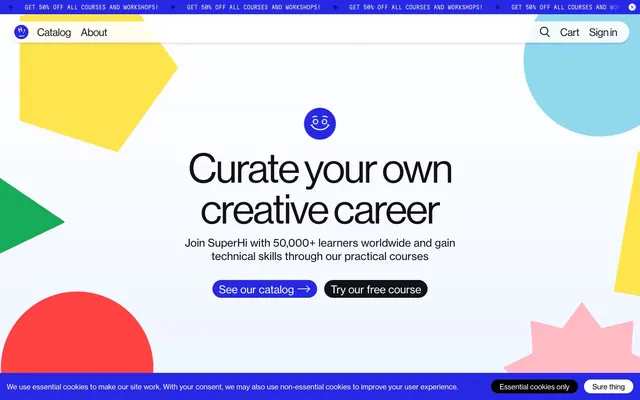
Vibrant geometry on a clean canvas — a digital workshop buzzing with creative shapes.
Color palette
Primary brand accent, used for all main call-to-action buttons, active navigation, and key interactive elements. Creates a high-energy focal point.
Decorative elements, secondary accents, and occasional badges—a burst of organic color.
Decorative geometric shapes and highlight elements, conveying a cheerful, bright sensibility.
Section backgrounds, footer backgrounds, offering a soft, cool base for content.
Decorative card backgrounds and unique icon fills for a touch of serene blue.
Decorative geometric shapes and highlight elements for a warm, inviting contrast.
Decorative geometric shapes, offering an energetic, warm counterpoint.
Accent fill for illustrative elements, providing a strong, vibrant punch.
Primary text color for headlines and body copy, subtle borders, and dark button backgrounds.
Page backgrounds, card surfaces, and text on dark interactive elements.
Input backgrounds, subtle section dividers—a barely-there tint of blue.
Typography
- Weights
- 400
- Sizes
- 16px, 20px, 22px, 24px
- Line height
- 1.1, 1.25, 1.35, 1.4
- Letter spacing
- -0.32px, -0.22px, -0.16px, -0.14px
- Fallback
- Inter
Primary typeface for all body text, navigation, card descriptions, and secondary headings. Its neutral, accessible nature ensures high readability across various content types.
- Weights
- 400
- Sizes
- 24px, 35px, 42px, 52px, 62px, 72px, 92px
- Line height
- 1, 1.1, 1.15, 1.35
- Letter spacing
- -0.72px, -0.70px, -0.84px, -0.94px, -1.24px, -1.44px, -2.76px
- Fallback
- Neue Haas Grotesk Display
Headline typeface, used for display-level text and prominent titles. Its crisp yet friendly form, especially with subtle negative letter-spacing at larger sizes, imparts a modern and engaging tone.
- Weights
- 400
- Sizes
- 12px, 17px
- Line height
- 1, 1.3, 1.35
- Letter spacing
- -0.16px
- Fallback
- Space Mono
Monospaced typeface used for small, functional text such as copyright, code snippets, or subtle metadata. Provides a technical counterpoint to the primary sans-serifs.
Spacing & shape
Components
Electric Blue (#2727e6) background with Canvas White (#ffffff) text. Features a 32px border-radius, `Haas Grot Disp` font at 24px weight 400. Padding of 2.4px top/bottom and 9.6px left/right. Used for primary interactive elements.
Electric Blue (#2727e6) background with Canvas White (#ffffff) text. Features a 48px border-radius, `Haas Grot Disp` font. Larger padding: 3.6px top/bottom and 14.4px left/right. Used for high-emphasis buttons like hero CTAs.
Transparent background with Storm Gray (#111118) text and no border-radius. `Haas Grot Text` font. No padding. Used for minimal, in-text actions or navigation.
Canvas White (#ffffff) background with Storm Gray (#111118) text. Features a 48px border-radius and `Haas Grot Disp` font. Padding of 3.6px top/bottom and 14.4px left/right. Used for less emphasized but still prominent actions, often alongside primary buttons.
Transparent background with no border-radius or shadow. Padding of 16px top/bottom and 0px left/right. Primarily used for content segmentation without distinct visual boundaries, often relying on typography for hierarchy.
Electric Blue (#2727e6) background with no border-radius or shadow. No padding. Likely used for full-bleed sections or backgrounds that function as cards.
Canvas White (#ffffff) background with Storm Gray (#111118) text. Features a 5000px border-radius (pill shape). Padding of 8px top/bottom and 16px left/right. Used for small, contained labels or tags.
Cool Aqua (#91d8ec) background with Storm Gray (#111118) text. Features a 5000px border-radius (pill shape). Padding of 8px top/bottom and 16px left/right. Used for visually distinct labels or tags.
Pale Mist (#f0f6ff) background with Storm Gray (#000000) text (placeholder). Features a 5000px border-radius (pill shape). Padding of 12px top/bottom, 68px right, and 16px left. The large right padding suggests an embedded icon.
Guidelines
- Use Electric Blue (#2727e6) for all primary call-to-action buttons and active states to maintain brand consistency.
- Prioritize `Haas Grot Disp` weight 400 with negative letter-spacing for all display-level headings to capture the system's distinctive visual tone.
- Apply the 32px or 48px border-radius to buttons and the 5000px (pill) radius for inputs and badges for a consistent soft, approachable feel.
- Leverage the full palette of accent colors (Lemon Zest #ffda00, Vivid Green #16ab59, Coral Glow #ffbac4, Cool Aqua #91d8ec) for geometric decorative shapes and illustrations to enhance visual interest.
- Maintain comfortable spacing: use 8px for `elementGap` between inline items and `cardPadding` of 16px where content is contained.
- Do not use generic square buttons; always apply either a 32px, 48px, or 5000px border-radius to interactive elements.
- Avoid applying heavy drop shadows; the design relies on bold shapes and colored backgrounds for depth, not elevation effects.
- Do not use monochromatic schemes; the brand identity is built on a diverse and vivid accent color palette.
- Refrain from using system fonts like Arial or Helvetica; `Haas Grot Text`, `Haas Grot Disp`, and `Martian Mono` are critical for the brand's unique typographic voice.
- Do not use text links with underlines; use the `Text Link Button` component which typically has no decoration.
About this system
ShowHide
This system expresses a playful, creative energy through a vibrant, almost primary color palette paired with a functional, crisp sans-serif typography. Geometric and organic shapes in vivid hues act as visual anchors and decorative elements. The intentional use of deep, saturated blue as the primary interactive color, alongside a large, friendly radius for buttons and inputs, creates an approachable but authoritative digital learning environment.
The layout primarily uses a full-bleed structure, extending background colors and decorative elements to the viewport edges. Content is generally centered and constrained, often utilizing a single column flow. The hero section is a full-width background with a centered headline and action buttons. Sections establish a visual rhythm through alternating background colors (Canvas White, Sky Tint, Pale Mist) or distinct decorative elements. Content arrangement often features centered stacks or implicit two-column layouts where text and a visual element are horizontally aligned. Navigation is a sticky top bar with a left-aligned logo and right-aligned actions. The page maintains a comfortable density with ample breathing room between sections, emphasizing key information.
The visual language is characterized by bold, two-dimensional geometric and organic shapes (circles, hexagons, triangles, abstract blobs) used as decorative background elements. These shapes employ the vivid accent color palette in a full-bleed, unmasked manner. Photography is either tightly cropped product/screen captures or highly stylized, sometimes within playful mask shapes, focusing on the content being created or the interfaces. Icons are monochromatic, typically filled with Storm Gray or Canvas White, contributing to functionality rather than decoration, distinct from the large geometric shapes. Imagery serves primarily a decorative and atmospheric role, adding life and context without being overly realistic or distracting.
Reminiscent of Framer, Gumroad, Codecademy, Webflow.
# SuperHi — Style Reference
> Vibrant geometry on a clean canvas — a digital workshop buzzing with creative shapes.

**Theme:** light

**Site:** https://superhi.com

This system expresses a playful, creative energy through a vibrant, almost primary color palette paired with a functional, crisp sans-serif typography. Geometric and organic shapes in vivid hues act as visual anchors and decorative elements. The intentional use of deep, saturated blue as the primary interactive color, alongside a large, friendly radius for buttons and inputs, creates an approachable but authoritative digital learning environment.

## Tokens — Colors

| Name | Value | Token | Role |
|------|------|------|------|
| Electric Blue | `#2727e6` | `--color-electric-blue` | Primary brand accent, used for all main call-to-action buttons, active navigation, and key interactive elements. Creates a high-energy focal point. |
| Vivid Green | `#16ab59` | `--color-vivid-green` | Decorative elements, secondary accents, and occasional badges—a burst of organic color. |
| Lemon Zest | `#ffda00` | `--color-lemon-zest` | Decorative geometric shapes and highlight elements, conveying a cheerful, bright sensibility. |
| Sky Tint | `#e1edff` | `--color-sky-tint` | Section backgrounds, footer backgrounds, offering a soft, cool base for content. |
| Cool Aqua | `#91d8ec` | `--color-cool-aqua` | Decorative card backgrounds and unique icon fills for a touch of serene blue. |
| Coral Glow | `#ffbac4` | `--color-coral-glow` | Decorative geometric shapes and highlight elements for a warm, inviting contrast. |
| Sunset Orange | `#ff7715` | `--color-sunset-orange` | Decorative geometric shapes, offering an energetic, warm counterpoint. |
| Flame Red | `#ff4141` | `--color-flame-red` | Accent fill for illustrative elements, providing a strong, vibrant punch. |
| Storm Gray | `#111118` | `--color-storm-gray` | Primary text color for headlines and body copy, subtle borders, and dark button backgrounds. |
| Canvas White | `#ffffff` | `--color-canvas-white` | Page backgrounds, card surfaces, and text on dark interactive elements. |
| Pale Mist | `#f0f6ff` | `--color-pale-mist` | Input backgrounds, subtle section dividers—a barely-there tint of blue. |

## Tokens — Typography

### Haas Grot Text
- **Substitute:** Inter
- **Weights:** 400
- **Sizes:** 16px, 20px, 22px, 24px
- **Line height:** 1.1, 1.25, 1.35, 1.4
- **Letter spacing:** -0.32px, -0.22px, -0.16px, -0.14px
- **Role:** Primary typeface for all body text, navigation, card descriptions, and secondary headings. Its neutral, accessible nature ensures high readability across various content types.

### Haas Grot Disp
- **Substitute:** Neue Haas Grotesk Display
- **Weights:** 400
- **Sizes:** 24px, 35px, 42px, 52px, 62px, 72px, 92px
- **Line height:** 1, 1.1, 1.15, 1.35
- **Letter spacing:** -0.72px, -0.70px, -0.84px, -0.94px, -1.24px, -1.44px, -2.76px
- **Role:** Headline typeface, used for display-level text and prominent titles. Its crisp yet friendly form, especially with subtle negative letter-spacing at larger sizes, imparts a modern and engaging tone.

### Martian Mono
- **Substitute:** Space Mono
- **Weights:** 400
- **Sizes:** 12px, 17px
- **Line height:** 1, 1.3, 1.35
- **Letter spacing:** -0.16px
- **Role:** Monospaced typeface used for small, functional text such as copyright, code snippets, or subtle metadata. Provides a technical counterpoint to the primary sans-serifs.

## Tokens — Type Scale

Minor Third (1.2) from 16px base.

| Role | Size | Line height | Letter spacing |
|------|------|------|------|
| body | 16px | 1.35 | — |
| body-lg | 20px | 1.4 | -0.22px |
| subheading | 22px | 1.1 | -0.16px |
| heading | 24px | 1.25 | -0.72px |
| heading-lg | 35px | 1.15 | -0.7px |
| display | 42px | 1.1 | -0.84px |
| display-lg | 52px | 1 | -0.94px |
| display-xl | 62px | 1 | -1.24px |
| display-xxl | 72px | 1 | -1.44px |
| display-max | 92px | 1 | -2.76px |

## Tokens — Spacing

- **Section gap:** 64px
- **Card padding:** 16px
- **Element gap:** 8px

## Tokens — Radius

- **Default:** 24px
- **Buttons:** 32px
- **input:** 5000px
- **pill:** 48px

## Layout

The layout primarily uses a full-bleed structure, extending background colors and decorative elements to the viewport edges. Content is generally centered and constrained, often utilizing a single column flow. The hero section is a full-width background with a centered headline and action buttons. Sections establish a visual rhythm through alternating background colors (Canvas White, Sky Tint, Pale Mist) or distinct decorative elements. Content arrangement often features centered stacks or implicit two-column layouts where text and a visual element are horizontally aligned. Navigation is a sticky top bar with a left-aligned logo and right-aligned actions. The page maintains a comfortable density with ample breathing room between sections, emphasizing key information.

## Imagery

The visual language is characterized by bold, two-dimensional geometric and organic shapes (circles, hexagons, triangles, abstract blobs) used as decorative background elements. These shapes employ the vivid accent color palette in a full-bleed, unmasked manner. Photography is either tightly cropped product/screen captures or highly stylized, sometimes within playful mask shapes, focusing on the content being created or the interfaces. Icons are monochromatic, typically filled with Storm Gray or Canvas White, contributing to functionality rather than decoration, distinct from the large geometric shapes. Imagery serves primarily a decorative and atmospheric role, adding life and context without being overly realistic or distracting.

## Components

### Hero CTA Button Group

### Promotional Announcement Banner

### Most Popular Section Header with CTA

### Primary Action Button
*Call to action*

Electric Blue (#2727e6) background with Canvas White (#ffffff) text. Features a 32px border-radius, `Haas Grot Disp` font at 24px weight 400. Padding of 2.4px top/bottom and 9.6px left/right. Used for primary interactive elements.

### Large Primary Action Button
*Prominent Call to action*

Electric Blue (#2727e6) background with Canvas White (#ffffff) text. Features a 48px border-radius, `Haas Grot Disp` font. Larger padding: 3.6px top/bottom and 14.4px left/right. Used for high-emphasis buttons like hero CTAs.

### Text Link Button
*Secondary action*

Transparent background with Storm Gray (#111118) text and no border-radius. `Haas Grot Text` font. No padding. Used for minimal, in-text actions or navigation.

### Tertiary White Button
*Alternative action*

Canvas White (#ffffff) background with Storm Gray (#111118) text. Features a 48px border-radius and `Haas Grot Disp` font. Padding of 3.6px top/bottom and 14.4px left/right. Used for less emphasized but still prominent actions, often alongside primary buttons.

### Default Card
*Content container*

Transparent background with no border-radius or shadow. Padding of 16px top/bottom and 0px left/right. Primarily used for content segmentation without distinct visual boundaries, often relying on typography for hierarchy.

### Accent Blue Card
*Highlighted content container*

Electric Blue (#2727e6) background with no border-radius or shadow. No padding. Likely used for full-bleed sections or backgrounds that function as cards.

### Circular Badge (White)
*Small informational tag*

Canvas White (#ffffff) background with Storm Gray (#111118) text. Features a 5000px border-radius (pill shape). Padding of 8px top/bottom and 16px left/right. Used for small, contained labels or tags.

### Circular Badge (Cool Aqua)
*Small informational tag with accent*

Cool Aqua (#91d8ec) background with Storm Gray (#111118) text. Features a 5000px border-radius (pill shape). Padding of 8px top/bottom and 16px left/right. Used for visually distinct labels or tags.

### Rounded Search Input
*User input field*

Pale Mist (#f0f6ff) background with Storm Gray (#000000) text (placeholder). Features a 5000px border-radius (pill shape). Padding of 12px top/bottom, 68px right, and 16px left. The large right padding suggests an embedded icon.

## Guidelines

### Do

- Use Electric Blue (#2727e6) for all primary call-to-action buttons and active states to maintain brand consistency.
- Prioritize `Haas Grot Disp` weight 400 with negative letter-spacing for all display-level headings to capture the system's distinctive visual tone.
- Apply the 32px or 48px border-radius to buttons and the 5000px (pill) radius for inputs and badges for a consistent soft, approachable feel.
- Leverage the full palette of accent colors (Lemon Zest #ffda00, Vivid Green #16ab59, Coral Glow #ffbac4, Cool Aqua #91d8ec) for geometric decorative shapes and illustrations to enhance visual interest.
- Maintain comfortable spacing: use 8px for `elementGap` between inline items and `cardPadding` of 16px where content is contained.

### Don't

- Do not use generic square buttons; always apply either a 32px, 48px, or 5000px border-radius to interactive elements.
- Avoid applying heavy drop shadows; the design relies on bold shapes and colored backgrounds for depth, not elevation effects.
- Do not use monochromatic schemes; the brand identity is built on a diverse and vivid accent color palette.
- Refrain from using system fonts like Arial or Helvetica; `Haas Grot Text`, `Haas Grot Disp`, and `Martian Mono` are critical for the brand's unique typographic voice.
- Do not use text links with underlines; use the `Text Link Button` component which typically has no decoration.

## Agent Prompt Guide

### Quick Color Reference
- Text: Storm Gray #111118
- Background: Canvas White #ffffff
- CTA: Electric Blue #2727e6
- Input BG: Pale Mist #f0f6ff
- Accent: Lemon Zest #ffda00
- Secondary Accent: Sky Tint #e1edff

### 3-5 Example Component Prompts
1. Create a primary hero button: Electric Blue background #2727e6, Canvas White text #ffffff, 32px border-radius, `Haas Grot Disp` font (24px, 400 weight, -0.72px letter-spacing), 2.4px top/bottom padding, 9.6px left/right padding. Text: 'See our catalog'.
2. Create a basic white card: Transparent background, no border-radius, no shadow, 16px top/bottom padding, 0px left/right padding. Place a `Haas Grot Text` headline (20px, 400 weight, -0.22px letter-spacing, Storm Gray #111118) inside.
3. Design a pill-shaped search input: Pale Mist background #f0f6ff, Storm Gray #000000 placeholder text, 5000px border-radius, `Haas Grot Text` font (16px, 400 weight), 12px top/bottom padding, 16px left padding, 68px right padding. Placeholder text: 'Search anything'.
4. Generate a section divider and headline: Background color Sky Tint #e1edff, `Haas Grot Disp` headline (42px, 400 weight, -0.84px letter-spacing, Storm Gray #111118). Apply 64px vertical section gap before and after.
More like this




Keep what you find
A free account saves references to boards and can send you a weekly email of picks based on what you save.
To see every result, go Pro.