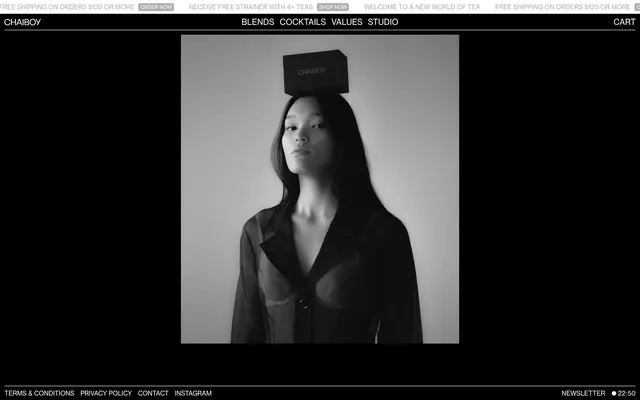
Preview image. Unlock full-res
Monochromatic minimalist canvas.
Color palette
Page backgrounds, prominent surface fills, footer background — creates a deep, infinite canvas
Muted text, inactive element borders, placeholder text within inputs. Provides visual separation without harsh contrast
Primary text, active element borders, button backgrounds for ghost buttons, primary input text — stands out vibrantly against the dark background
Typography
- Weights
- 400
- Sizes
- 11px, 14px, 18px, 54px
- Line height
- 0.89, 1.11, 1.27, 1.29
NeueHaasGroteskTP55R — detected in extracted data but not described by AI
- Fallback
- Helvetica Neue
The singular typeface for all content, from navigation to headlines. Its precise, neutral geometry supports the minimalist aesthetic, with 'case' font features ensuring consistent uppercase styling for certain elements, maintaining a crisp, editorial feel.
Spacing & shape
Components
Text is Frost Gray (#afafaf) on a transparent background, with a 1px Frost Gray border (#afafaf), 4px border-radius, and padding of 10px top, 16px right, 7px bottom, 16px left. Used for subtle calls to action.
Transparent background with Frost Gray text (#afafaf) and a 1px bottom border in Frost Gray (#afafaf). No border-radius. Padding is 6px top, 0px right, 6px bottom, 0px left.
Transparent background with Arctic White text (#ffffff) and a 1px bottom border in Arctic White (#ffffff). No border-radius. Padding is 7px top, 0px right, 5px bottom, 0px left.
Arctic White text (#ffffff) at 14px, NeueHaasGroteskTP55R weight 400. Hover state likely introduces a subtle border or color change (not specified).
Frost Gray text (#afafaf) at 11px, NeueHaasGroteskTP55R weight 400. Used for terms, privacy, and contact information.
Guidelines
- Use Midnight Ink (#000000) as the primary background color for all main sections and footers.
- Apply NeueHaasGroteskTP55R weight 400 across all typographic elements, prioritizing its unique 'case' font feature for uppercase styling.
- Emphasize content through high-contrast typography, pairing Arctic White (#ffffff) text on Midnight Ink (#000000) backgrounds.
- Implement Frost Gray (#afafaf) for all secondary text, inactive states, and subtle UI lines, ensuring a visual hierarchy without color.
- Maintain a uniform border-radius of 4px for all interactive elements like buttons and cards, contributing to a consistent, subtle softness.
- Structure information using a compact spacing philosophy, with an elementGap of 5px and sectionGap of 60px.
- Utilize 1px borders in Frost Gray (#afafaf) or Arctic White (#ffffff) for inputs and ghost buttons to define interactive areas subtly.
- Avoid using any saturated colors unless specifically introduced as a functional accent; the system is strictly monochromatic.
- Do not deviate from the NeueHaasGroteskTP55R font family or weight 400; font consistency is a core brand identifier.
- Refrain from heavy shadows or pronounced elevation; the design relies on flat surfaces and thin borders for depth.
- Do not introduce strong visual gradients; the aesthetic is built on solid color blocks and clear contrasts.
- Avoid large, image-dominant layouts unless the imagery itself is monochromatic and stark, maintaining visual continuity.
- Do not break the 4px border-radius standard; it is a critical micro-design element across interactive components.
- Do not use generic system fonts or default link styling; always apply brand-specific typography and color.
About this system
ShowHide
CHAIBOY presents a stark, high-contrast dark mode aesthetic, emphasizing minimalism and bold, clean typography. The visual language centers on a monochromatic palette of black, white, and various grays, creating a sophisticated and understated environment. Thin line accents found in borders and ghost buttons provide delicate structure against dark surfaces. The overall impression is one of controlled elegance, using visual sparseness to draw attention to refined products and content.
The page uses a full-bleed, dark background that extends edge-to-edge. Content appears to be horizontally centered within a maximal width, creating clear boundaries for readability within the expansive dark canvas. The hero section is characterized by a prominent visual element (a large black and white photograph) flanked by the stark black background. Navigation is minimal and positioned at the top, a simple, horizontal list of text links. Sections maintain consistent vertical spacing, creating a calm, unhurried rhythm.
Imagery is high-contrast, black and white photography, often featuring product or model shots with a stark, artistic feel. Images are primarily contained within content areas, without overlapping elements, and contribute to the overall minimalist and sophisticated mood. Icons are minimal, likely outlined, and monochromatic, integrated seamlessly into the high-contrast UI.
Reminiscent of Aēsop, COS, Bang & Olufsen, The Ordinary.
# CHAIBOY — Style Reference
> Monochromatic minimalist canvas.

**Theme:** dark

**Site:** https://wearechaiboy.com

CHAIBOY presents a stark, high-contrast dark mode aesthetic, emphasizing minimalism and bold, clean typography. The visual language centers on a monochromatic palette of black, white, and various grays, creating a sophisticated and understated environment. Thin line accents found in borders and ghost buttons provide delicate structure against dark surfaces. The overall impression is one of controlled elegance, using visual sparseness to draw attention to refined products and content.

## Tokens — Colors

| Name | Value | Token | Role |
|------|------|------|------|
| Midnight Ink | `#000000` | `--color-midnight-ink` | Page backgrounds, prominent surface fills, footer background — creates a deep, infinite canvas |
| Frost Gray | `#afafaf` | `--color-frost-gray` | Muted text, inactive element borders, placeholder text within inputs. Provides visual separation without harsh contrast |
| Arctic White | `#ffffff` | `--color-arctic-white` | Primary text, active element borders, button backgrounds for ghost buttons, primary input text — stands out vibrantly against the dark background |

## Tokens — Typography

### NeueHaasGroteskTP55R
- **Weights:** 400
- **Sizes:** 11px, 14px, 18px, 54px
- **Line height:** 0.89, 1.11, 1.27, 1.29
- **Role:** NeueHaasGroteskTP55R — detected in extracted data but not described by AI

### Neue Haas Grotesk Text
- **Substitute:** Helvetica Neue
- **Role:** The singular typeface for all content, from navigation to headlines. Its precise, neutral geometry supports the minimalist aesthetic, with 'case' font features ensuring consistent uppercase styling for certain elements, maintaining a crisp, editorial feel.

## Tokens — Type Scale

| Role | Size | Line height | Letter spacing |
|------|------|------|------|
| caption | 11px | 1.29 | — |
| body | 14px | 1.11 | — |
| heading-lg | 18px | 1.27 | — |
| display | 54px | 0.89 | — |

## Tokens — Spacing

- **Section gap:** 60px
- **Card padding:** 16px
- **Element gap:** 5px

## Tokens — Radius

- **Buttons:** 4px
- **Cards:** 4px
- **links:** 4px
- **overall:** 4px

## Layout

The page uses a full-bleed, dark background that extends edge-to-edge. Content appears to be horizontally centered within a maximal width, creating clear boundaries for readability within the expansive dark canvas. The hero section is characterized by a prominent visual element (a large black and white photograph) flanked by the stark black background. Navigation is minimal and positioned at the top, a simple, horizontal list of text links. Sections maintain consistent vertical spacing, creating a calm, unhurried rhythm.

## Imagery

Imagery is high-contrast, black and white photography, often featuring product or model shots with a stark, artistic feel. Images are primarily contained within content areas, without overlapping elements, and contribute to the overall minimalist and sophisticated mood. Icons are minimal, likely outlined, and monochromatic, integrated seamlessly into the high-contrast UI.

## Components

### Ghost Border Button - Frost
*Secondary action button*

Text is Frost Gray (#afafaf) on a transparent background, with a 1px Frost Gray border (#afafaf), 4px border-radius, and padding of 10px top, 16px right, 7px bottom, 16px left. Used for subtle calls to action.

### Underlined Input - Frost
*Standard text input field*

Transparent background with Frost Gray text (#afafaf) and a 1px bottom border in Frost Gray (#afafaf). No border-radius. Padding is 6px top, 0px right, 6px bottom, 0px left.

### Underlined Input - Arctic
*Prominent text input field*

Transparent background with Arctic White text (#ffffff) and a 1px bottom border in Arctic White (#ffffff). No border-radius. Padding is 7px top, 0px right, 5px bottom, 0px left.

### Header Navigation Link
*Primary navigation item*

Arctic White text (#ffffff) at 14px, NeueHaasGroteskTP55R weight 400. Hover state likely introduces a subtle border or color change (not specified).

### Footer Action Link - Muted
*Footer utility links*

Frost Gray text (#afafaf) at 11px, NeueHaasGroteskTP55R weight 400. Used for terms, privacy, and contact information.

## Guidelines

### Do

- Use Midnight Ink (#000000) as the primary background color for all main sections and footers.
- Apply NeueHaasGroteskTP55R weight 400 across all typographic elements, prioritizing its unique 'case' font feature for uppercase styling.
- Emphasize content through high-contrast typography, pairing Arctic White (#ffffff) text on Midnight Ink (#000000) backgrounds.
- Implement Frost Gray (#afafaf) for all secondary text, inactive states, and subtle UI lines, ensuring a visual hierarchy without color.
- Maintain a uniform border-radius of 4px for all interactive elements like buttons and cards, contributing to a consistent, subtle softness.
- Structure information using a compact spacing philosophy, with an elementGap of 5px and sectionGap of 60px.
- Utilize 1px borders in Frost Gray (#afafaf) or Arctic White (#ffffff) for inputs and ghost buttons to define interactive areas subtly.

### Don't

- Avoid using any saturated colors unless specifically introduced as a functional accent; the system is strictly monochromatic.
- Do not deviate from the NeueHaasGroteskTP55R font family or weight 400; font consistency is a core brand identifier.
- Refrain from heavy shadows or pronounced elevation; the design relies on flat surfaces and thin borders for depth.
- Do not introduce strong visual gradients; the aesthetic is built on solid color blocks and clear contrasts.
- Avoid large, image-dominant layouts unless the imagery itself is monochromatic and stark, maintaining visual continuity.
- Do not break the 4px border-radius standard; it is a critical micro-design element across interactive components.
- Do not use generic system fonts or default link styling; always apply brand-specific typography and color.

## Agent Prompt Guide

primary action: no distinct CTA color
- Create a secondary action button with a transparent background: Frost Gray (#afafaf) text (NeueHaasGroteskTP55R, 14px, weight 400), 1px Frost Gray (#afafaf) border, 4px border-radius, and 10px paddingTop, 16px paddingRight, 7px paddingBottom, 16px paddingLeft. Text reads 'ORDER NOW'.
More like this








Keep what you find
A free account saves references to boards and can send you a weekly email of picks based on what you save.
To see every result, go Pro.